I. Introduction
The World Wide Web has changed people’s life and information behaviour since it was created in 1990 by CERN physicist, Tim Berners-Lee (CERN, 2008).
With the development of the Internet, public libraries have designed their own websites,
which aim to provide a variety of materials for satisfying users’ information needs.
Moreover, the user of a public library not only includes patrons who visit the library but also has potential users coming from anywhere in the world.
IFLA Public Library Service Guidelines (Koontz & Gubbin, 2010) mentions that a
A Heuristic Evaluation of Metro Public Library Websites:
Taipei Public Library and Chicago Public Library
吳淮育 Huai-Yu Wu
龜山鄉立圖書館課員 Officer, Gueishan Public Library E-mail:Zena0118@gmail.com
【 Abstract】
The research aims to evaluate the usability of Taipei Public Library and Chicago Public Library websites by means of heuristic evaluation. There are 10 evaluators invited from Taiwan and the United States to find the usability problems of both websites. The research also examines whether the goals of both public libraries have been met.
Both of the websites have two major usability problems and most problems are minor or cosmetic. Briefly, the objectives of both public libraries have met the provision of services on the interfaces of the websites although there are a number of usability problems. The value of HE discovery is approved with respect to the process and results since it is indeed a cheap, quick and effective method. Finally, the recommendations for both websites are made and the results and conclusions could be applied to other metro public library websites.
Keywords: heuristic evaluation; usability; user friendly; Taipei Public Library;
Chicago Public Library
public library is filling the role of information navigator to guarantee users in obtaining accurate and reliable information in the digital age. If a website is easy to use and the information is useful, easy to find, download, save or print; users are more likely to keep using the website and coming back (George, 2008).
Firstly, a public library needs to understand their targeted users and the varying user population. Taipei Public Library (TPL) is the biggest public library in Taiwan. Chicago Public Library (CPL) is an appropriate contrast to facilitate the evaluation and comparison since these two libraries serve similar populations, around 2.6 million people, as well as having similar missions and policies. A metropolitan area contains a single core with a population of 2.5 million (U.S. Office of Management and Budget, 2003).Therefore, these two public libraries are seen as representatives of metro public libraries to examine the usability of websites.
The aims and objectives of the research The research evaluates the usability of Taipei Public Library (tpml.edu.tw) and Chicago Public Library (chipublib.org) websites by means of Nielsen’s Heuristic Evaluation. Heuristic evaluation (HE) is the main method to find the usability problems from a small group of five evaluators. The research could be helpful to improve the usability of the websites according to the
findings. For the research, the objectives are defined as the following:
1. To analyse the composition of population and features within two cities
2. To conduct Heuristic evaluation by involving five evaluators in each website 3. To find the usability problems of two
websites
4. To examine whether the goals of both public libraries have been met
5. To make suggestions to improve the websites
II. Literature Review
To prepare for the research, the literature review will concentrate on the following sections. Firstly, the term of usability is defined professionally.
I nv e s t i g a t i n g t h e p o p u l a t i o n a n d demographic structure of Taipei and Chicago is essential to know whom the public libraries serve. There is a need to survey the features and functions of a public library as well as the aims of TPL and CPL, which will be examined to see whether they match the usability heuristics.
A. Definition of usability
It is understood that web usability is defined as “ease of use” (Goto & Cotler, 2005). Bevan, et al. (1991) also think that
“ease of use” influences users’ performance and satisfaction, which determines whether
a product or a service can be used.
The term usability, “user friendly”
was commonly used to explain a system or a website which is easy to use. Nielsen, however, claims that the term is not really appropriate. Firstly, users do not anticipate websites to be friendly to them, and they only need websites that will not stand in their way when users getting their work done (Nielsen, 1993). Secondly, the reality is that different users have different information needs, and a website which is
“friendly” to one may feel be frustrating to use for another.
As in the above statement there are issues with the term “user friendly”, in describing user interface, so professionals have attempted to adopt other terms to replace it in recent years, such as CHI (computer-human interaction), HCI (human- computer interaction) or HMI (human- machine interface). Nielsen (1993) suggests using the word “usability” to represent the concept of ease-of-use user interface, which considers broader issues within the overall framework of traditional “user friendliness.”
ISO (International Organization for Standardization, 2002) defines usability as “The extent to which a product can be used by specified users to achieve specified goals with effectiveness, efficiency, and satisfaction in a specified context of use.”
B. Taipei and Chicago
Taipei and Chicago have similar characteristics of population, demographic structure, and employed population by industry (Taipei Department of Budget, Accounting & Statistics, 2011; U.S.
Census Bureau, 2012; U.S. Bureau of Labor Statistics, 2011). The following table shows their 2010 statistics on demographic structure, employed percentage by industry and unemployment rate as well as comparison to the respective countries.
Both cities are aging societies, which means the percentage of people who are aged 65 and over exceeds 7 percent of the population (Taipei Department of Budget, Accounting & Statistics, 2011; Taiwan National Statistics, 2011; U.S. Census Bureau, 2011; U.S. Census Bureau, 2012).
The percentage of people aged 0-18 is fewer in Taipei according to Table 1 The ethnic makeup the population is significantly different between two cities. In Chicago, 45 percent of the population was white and 32.9 percent was black in 2010;
the percentage of people of Hispanic or Latino origin was 28.9 percent persons (U.S.
Census Bureau, 2012). In contrast, the vast majority of people in Taipei are Taiwanese with only 1.62 percent of the population who are married to registered citizens in Taipei being from different countries (mainly China, Vietnam and Indonesia) in 2010 (Taipei Department of Budget, Accounting
& Statistics, 2011). It is clear that Chicago has more Black and Hispanic or Latino population compared to Illinois and the country according to Table 1 (U.S. Census Bureau, 2012).
There was a slight difference in the employed population by industry between the two cities. The percentage of the population employed in goods-producing industries in Taipei is almost nine percent more than in Chicago whilst the percentage of the population employed in services- producing industries in Taipei is lower by the same percentage (Taipei Department of Budget, Accounting & Statistics, 2011;
U.S. Bureau of Labor Statistics, 2012a).
The unemployment rate reveals potential needs with regard to employment in cities.
Chicago has an unemployment rate of 10.2 percent, almost two times the unemployment rate in Taipei and higher than the average rate in the United States (Taipei Department of Budget, Accounting & Statistics, 2011;
Taiwan National Statistics, 2011; U.S.
Bureau of Labor Statistics, 2012b).
In terms of demographic structure and the percentages of the populations employed in particular employment sectors, it is evident that Chicago and Taipei are quite similar. Chicago has greater ethnic diversity, and the number of new immigrants in the population has increased in Taipei over the past 10 years. This should be reflected on the objectives of public library strategies since the services of public library aim to
meet users’ needs.
C. Features and functions of a public library
The goals of a public library service are mentioned in the chapter of Meeting of the needs of the customers within IFLA Public Library Service Guidelines (Koontz
& Gubbin, 2010). It stresses the users’
needs to have access to electronic networks, remote access, and a public library website is seen as an information navigator.
1. Taipei Public Library
Taipei Public Library (TPL) was established in 1952. The library has one main library, 42 branches, and four intelligent libraries, eleven neighborhood reading rooms, two issue-and-returning stops, and four repositories for stock. TPL had collected 6,341,411 items, which includes electronic, video-audio materials and books by the end of 2011 according to the 2011 Annual Report of TPL (2012).
Moreover, 11,439,375 volumes were borrowed and 14,586,616 users visited TPL in 2011 (Taipei Public Library, 2012).
TPL is the biggest public library in Taiwan and it redesigned its website in 2009. TPL aims to serve users of all ages, which is reflected on the website: the Multicultural Information Centre is aimed at new immigrants who are mainly from South-East Asia; the Ministry of Education
Table 1: Demographic structure and employment in Taipei and Chicago in 2010
Taipei Taiwan Chicago Illinois USA
Population
2,618,772 23,123,866 2,695,598 12,830,632 308,745,538 Demographic Structure (%)
0-19 yrs 20.46 22.40 0-18 yrs 23.1 24.4 23.7
20-64 yrs 66.78 67.03 19-65 yrs 66.6 63.1 63
65 yrs and over 12.76 10.57 65 yrs
and over 10.3 12.5 13.3
New Immigrants(a) Race
1.29 2.43 White
persons(b) 45 71.5 78.1
Black
persons(b) 32.9 14.5 13.1
Taiwanese 98.71 97.57 Asian
persons(b) 5.5 4.6 5
Persons of Hispanic
or Latino origin (c)
28.9 15.8 16.7
Employed Percentage by Industry (%) Agriculture,
Forestry, Fishing, &
Animal Husbandry 0.19 5.24 0.05 5.02 0.71
Goods- Producing
Industries 19.26 35.92 10.4 13 10.91
Services-Producing
Industries 80.55 58.84 89.55 81.98 88.38
Unemployment Rate (%)
5.2 5.21 10.2 10.5 9.6
a. The data were the percentage of foreigners married to registered citizens in Taipei (Taipei Department of Budget, Accounting & Statistics, 2011).
b. Includes persons reporting only one race (U.S. Census Bureau,2012).
c. Hispanics may be of any race, so also are included in applicable race categories (U.S. Census
124 Senior Active Learning Center targets the elderly; and the Visually Impaired Archive offers resources for people who are blind.
Clearly the diverse population and groups have effects on the information services offered on library websites.
The aims of Taipei Public library
The usability of a website and the Internet security are emphasized in the TPL 2011-2015 strategic plan (Taipei Public Library, 2011a). Adopting new technology applies to build a fulfilling website. On the other hand, it is essential to build up a complete backup system to reduce the effects of disconnection as well as update anti-virus software and anti-hacker system.
Moreover, one of their missions is providing information by means of the website and
mobile technology (Taipei Public Library, 2011a).
“One-stop shopping” is TPL’s main objective within TPL’ White Paper (Taipei Public Library, 2011b), and attracts users who look for a wide range of information in a website which includes the OPAC, the reservation service, the recommendation, the personal loan record and the event information and databases. It also aims to build a digital library, provide e-resources and 24/7 access information services.
Besides, TPL provides abundant leisure and professional learning resources to serve all types of users by ages and diverse ethnics without discrimination, which achieves the vision of lifelong learning (Taipei Public Library, 2011b).
(b) Includes persons reporting only one race (U.S. Census Bureau,2012).
(c) Hispanics may be of any race, so also are included in applicable race categories (U.S.
Census Bureau, 2012).
C. Features and functions of a public library
The goals of a public library service are mentioned in the chapter of Meeting of the needs of the customers within IFLA Public Library Service Guidelines (Koontz & Gubbin, 2010). It stresses the users’ needs to have access to electronic networks, remote access, and a public library website is seen as an information navigator.
1. Taipei Public Library
Taipei Public Library (TPL) was built in 1952. The library has one main library, 42 branches, and four intelligent libraries, eleven neighborhood reading rooms, two issue-and-returning stops, and four repositories for stock. TPL had collected 6,341,411 items, which includes electronic, video-audio materials and books by the end of 2011 according to the 2011 Annual Report of TPL (2012). Moreover, 11,439,375 volumes were borrowed and 14,586,616 users visited TPL in 2011 (Taipei Public Library, 2012).
Figure 2.1 The Home page of Taipei Public Library Figure 1: The Home page of Taipei Public Library
125
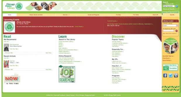
2. Chicago Public library
Chicago Public Library (CPL) is an appropriate contrast to facilitate the evaluation and comparison since these two libraries serve similar populations, around 2.6 million, as well as having similar missions and policies. CPL was created in 1871 after Chicago’s Great Fire. CPL has the Harold Washington Library Centre which was the world’s largest municipal public library at the time of its opening in 1991 and 78 branches. CPL had held 5,743,002 volumes by the end of September in 2010 (American Library Association, 2011). 9,764,381 items were borrowed and 11,182,193 visitors used the main library and branches in 2011 (Chicago Public Library, 2012).
The aims of Chicago Public Library Identically, Chicago Public Library 2010 (Chicago Public Library, 2010) is also a strategic plan for the next five years and beyond. It’s essential goal is to
“Expand information access, navigation and education: Develop broader capability to assist patrons with their information needs”
(Chicago Public Library, 2010). Firstly, CPL has been provided a wide range of materials, encompassing talking books, books, journals, newspapers and media.
Moreover, CPL 2010 plans to enhance access to online information by means of a series of strategies (Chicago Public Library, 2010).
O n e o f t h e v i s i o n s i s t h a t chicagopubliclibrary.org will be available
Figure 2.2 The Home page of Chicago Public Library The aims of Chicago Public Library
Identically, Chicago Public Library 2010 (Chicago Public Library, 2010) is also a strategic plan for next five years and beyond. There is an essential goal is “Expand information access, navigation and education: Develop broader capability to assist patrons with their information needs” (Chicago Public Library, 2010). Firstly, CPL has been provided a wide range of materials, encompassing talking books, books, journals, newspapers and media. Moreover, CPL 2010 plans to enhance access to online information by means of a series of strategies (Chicago Public Library, 2010).
One of the visions is that chicagopubliclibrary.org will be available to access the rich and various materials as a “virtual branch library.” CPL 2010 adopts and adapts new technology and resources for improving the usability of the website which will offer a uniform infrastructure to deliver more efficient service for users. It is a significant feature on information must be available in 24/7 and present well-organized, easy-to-use and accessible manner. A completely redesigned website will be embodied to incorporate with Integrated Library System (ILS). Finally, CPL aims to play a role of a bridge to solve the digital divide, such as providing open sources, educating patrons to be information seekers and enhancing their abilities of information literacy (Chicago Public Library, 2010).
Table 2.2Taipei Public Library and Chicago Public Library statistics in 2011
Collections Issues Visits
Taipei Public Library
6,341,411 11,439,375 14,586,616
Chicago Public Library5,743,002 (2010) 9,764,381 11,182,193
Figure 2: The Home page of Chicago Public Library
to access the rich and various materials as a “virtual branch library.” CPL 2010 adopts and adapts new technology and resources for improving the usability of the website which will offer a uniform infrastructure to deliver more efficient service for users. It is a significant feature on information must be available in 24/7 and present well-organized, easy-to-use and accessible manner. A completely redesigned website will be embodied to incorporate with Integrated Library System (ILS). Finally, CPL aims to play a role of a bridge to solve the digital divide, such as providing open sources, educating patrons to be information seekers and enhancing their abilities of information literacy (Chicago Public Library, 2010).
III. Methodology
The method of heuristic evaluation plays a key role in the research of the websites, so it is important to understand and comprehend the method and design a completed frame of the evaluation.
A. Heuristic evaluation
The objective of heuristic evaluation (HE) is to find the usability problems in the interface design which can be attended to as part of an iterative design process (Nielsen, 1993). It is the most popular of the usability inspection methods because of the quick, cheap, and easy evaluation of a user interface design (Nielsen, 2005). One main benefit of HE is that it only involves having a small set of reviewers to evaluate the interface and examine whether the interface conforms to the recognised usability principles. The ten
“heuristics” are more in the nature of rules of thumb than specific usability guidelines, which is clearly introduced in the section of 3.2 Usability Heuristics (Nielsen, 1993).
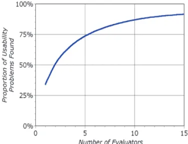
Generally, a single individual rarely achieves the most effective performance in HE since one evaluator would be unlikely to find all the usability problems in an interface (Nielsen, 1993). According to Nielsen &
Mack’s study (1994), five evaluators could find around 75 percent of usability problems but single one only found 35 percent of
Table 2:
Taipei Public Library and Chicago Public Library statistics in 2011
Collections Issues Visits
Taipei Public Library 6,341,411 11,439,375 14,586,616 Chicago Public Library 5,743,002 (2010) 9,764,381 11,182,193
127 11
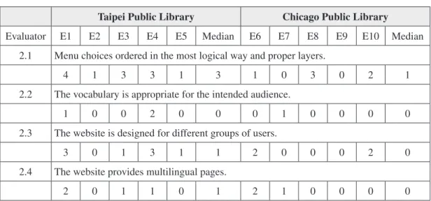
Figure 3.1 The curve displays the proportion of usability problems found by HE adopting different numbers of evaluators (Nielsen & Mack, 1994:33).
Figure 3.2 The curve shows how many times the benefits are greater than the costs for HE. The optimal number of evaluators is four with benefits that are 62 times greater than the costs (Nielsen & Mack, 1994:35).
Figure 3:
The curve displays the proportion of usability problems found by HE adopting different numbers of evaluators (Nielsen & Mack, 1994).
Figure 3.1 The curve displays the proportion of usability problems found by HE adopting different numbers of evaluators (Nielsen & Mack, 1994:33).
Figure 3.2 The curve shows how many times the benefits are greater than the costs for HE. The optimal number of evaluators is four with benefits that are 62 times greater than the costs (Nielsen & Mack, 1994:35).
Figure 4:
The curve shows how many times the benefits are greater than the costs for HE. The optimal number of evaluators is four with benefits that are
62 times greater than the costs (Nielsen & Mack, 1994).
the usability problems. Figure 3 illustrates the proportion of usability problems found as more and more evaluators are added and shows there are clear benefits from involving more than one evaluator (Nielsen
& Mack, 1994).
Figure 4 displays the varying ratio between benefits and costs for using various numbers of evaluators. The curve illustrates that the optimal number of evaluators in the cost-benefit analysis is four (Nielsen &
Mack, 1994). Therefore, Nielsen & Mack (1993; 1994) suggest that the use of around three to five evaluators to conduct the evaluation since “one does not obtain that much additional information by using larger numbers”.
B. Usability heuristics
Current usability guidelines have a large number of rules to follow but Nielsen
& Mack (1994) cut the complexity to 10
usability heuristics. Each set of usability heuristics can be used to explain a very large proportion of usability issues which one evaluator observes in a user interface (Nielsen, 1993). Therefore, each set of usability heuristics can be expanded to a number of usability principles which are clearer and easier to conduct the HE by evaluators.
The table 3 demonstrates the 10 heuristics which have summative definitions and explanations are with reference to Nielsen’s Usability Engineering (1993), Nielsen & Mack’s Usability Inspection Methods (1994), and modified from Ssemugabai & de Villiers (2007).
C. Selection of evaluators
It is vital to look for the evaluators who have sufficient experiences or educational background. Danino (2001) notes that expert reviewers will find as many as 81 to
Table 3: 10 Heuristics
i. Visibility of system status
➣ The websites should keep users informed about what is going on through constructive, appropriate and timely feedback.
ii. Match between system and the real world
➣ The websites should present the style of users’ language usage on words, phrases and concepts rather than system-oriented terms.
➣ Information represented corresponds to real-world concepts / metaphor and understandable and meaningful symbolic phrases used are intuitive within the context of the performed task.
➣ Information is arranged in a natural and logical order.
iii. User control and freedom
➣ Users feel free to control the website.
➣ Users can exit at any time within a clearly marked “emergency exit” to leave unwanted webpage immediately even though they may have entered mistakes.
➣ There are options to Undo and Redo.
iv. Consistency and standards
➣ Users do not need to wonder whether different words, situations, or actions mean the same thing.
➣ Common platform standards are followed.
v. Error prevention
➣ The website is designed such that users cannot easily make serious errors.
➣ If a user makes an error, the application will give an appropriate error message.
vi. Recognition rather than recall
➣ Users do not have to recall memory from one part of a dialogue to another.
➣ Objects to be well manipulated, options for selection, and actions to be taken are visible.
➣ Instructions on how to use the system should be visible or easily retrievable whenever appropriate.
➣ Displays are simple and multiple page displays are minimised.
vii. Flexibility and efficiency of use
➣ The website can cater to different levels of users, from novices to experts.
➣ Shortcuts or accelerators, unseen by novices, are provided to speed up interaction and task completion by frequent users.
➣ The website is flexible to enable users to adjust settings to suit themselves, such as a customised system.
viii. Aesthetic and minimalist design
➣ Site dialogues should contain relevant and needed information.
➣ Every extra unit of information in a dialogue distracts users when they perform tasks.
ix. Help users recognise, diagnose, and recover from errors
➣ Error messages are showed in plain language.
➣ Error messages precisely define problems and give quick, simple, constructive, and specific instructions for recovery.
x. Help and documentation
➣ It is necessary to provide help and documentation although it may be better if the website could be used without documentation.
➣ Information is easy to search, task-focused, and list concrete steps to be carried out, and not be too large.
90 percent of usability issues but reviewers who are experienced with usability standards and also with similar systems will provide the best results by means of finding the most usability issues. Therefore, it could be possible to invite five evaluators who are familiar with the concepts of the usability within the website respectively from the Unites States and Taiwan.
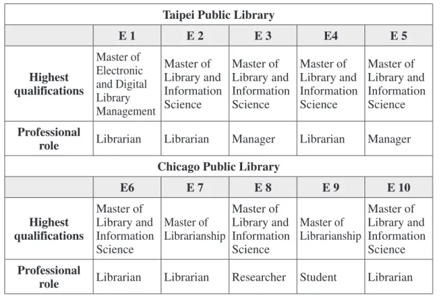
TPL evaluators used to be librarians or managers in TPL and have master degree in library and information science. CPL evaluators also have similar backgrounds and expertise in user interface design and concepts of usability. Table 4 shows the
simple profiles of 10 evaluators.
D. Evaluation design
The evaluation form has been designed in an online format since the evaluators are in Taiwan and the United States. The instructions, explanations of usability heuristics and a severity rating scale, and task scenarios within the online evaluation form are designed by the platform of Google Document. The online evaluation form has bilingual editions to make it suitable for the two groups of evaluators. Most task scenarios have the same queries but some
Table 4: Profiles of TPL and CPL evaluators
Taipei Public Library
E 1 E 2 E 3 E4 E 5
Highest qualifications
Master of Electronic and Digital Library Management
Master of Library and Information Science
Master of Library and Information Science
Master of Library and Information Science
Master of Library and Information Science Professional
role Librarian Librarian Manager Librarian Manager Chicago Public Library
E6 E 7 E 8 E 9 E 10
Highest qualifications
Master of Library and Information Science
Master of Librarianship
Master of Library and Information Science
Master of Librarianship
Master of Library and Information Science Professional
role Librarian Librarian Researcher Student Librarian
of them are created related to realistic and existing services in the respective websites.
Severity ratings can be adopted to allocate the most resources to deal with the most serious problems and also provide a rough estimate of the need for additional usability improvement (Nielsen & Mack, 1994). Therefore, Nielsen & Mack (1994) recommend a severity rating scale comprised of five levels of severity in the following. It will be used to evaluate 35 usability principles of the online evaluation form.
Stages in HE are the followings suggested by Pickard (2007).
1. Identifying the set of principles to be used as the accepted standard (the heuristics of the evaluation)
2. Identifying between three and five
“experts” to carry out the evaluation 3. Evaluators carrying out the evaluation
independently based on two “passes”
through the system
4 Identifying problems and issues as they are encountered, and nothing possible solutions
5 De-briefing evaluators to share their experiences and discuss potential solutions
6. Analysing all evaluators’ reports 7. Presenting findings
8. Recommending system revisions
1. Usability principles
The usability principles in the evaluation are designed as a checklist to examine the usability of a website. This evaluation form has 35 usability principles with reference to Nielsen’s (2005) 10 heuristics, Pierotti’s (1995) system checklist, and Chen’s (2006) dissertation. Except for the 10 heuristics, the usability principles increase the concept of user privacy (Pierotti’s, 1995) and the functionality of searching in a catalogue or databases (Chen’s, 2006) (see Appendix 1).
2. Task scenarios
The basic principle for test scenarios is that they should be decided to be as representative as possible of the uses to which the website will eventually be put
Table 5: A severity rating scale
0 No problem: I do not agree that this is a usability problem at all
1 Cosmetic problem only: need not be fixed unless time is available on project 2 Minor usability problem: fixing this should be given low priority
3 Major usability: important to fix, so should be given high priority
4 Usability catastrophe: imperative to fix this before product can be released
in the field (Nielsen, 1993). Moreover, all tests should be user-oriented and as realistic as possible. Therefore, in order to facilitate evaluators’ understanding of the tasks, it is essential to design a set of task scenarios based on the usability principles, which evaluators could carry out in response to the target website. It is appropriate to make from eight to fourteen scenarios for each task according to the statement of Dickstein
& Mills (2000). The evaluation form (see Appendix 1) encompasses 10 task scenarios with respect to the coverage of the most important parts of the user interface and library services which users intend to use.
Also, the task scenarios are designed in two editions with respect to the services provided from the websites of Taipei Public Library and Chicago Public Library whereas the goal of each task scenarios is the same.
3. Briefing the evaluators
It is crucial that evaluators are briefed about the purpose and process of HE, the domain of use of the target system and the task scenarios to work through the website, especially because the whole evaluation will be conducted online (Ssemugabai & de Villiers, 2007). Each evaluator will receive an information sheet (see Appendix 2) to understand the aims and involvement of the research, ethical issues and the estimated time (approximately 50 minutes) required to perform the evaluation. Also, a consent form (see Appendix 3) will be attached for
accepting the participation.
IV. Results of Heuristic Evaluation
It takes around three weeks to receive all of the rating scale data and comments on TPL and CPL websites from 10 evaluators.
The following tables record the results of using the severity rating scale according to Table 5. Since the median is one of a number of ways of summarising the typical values associated with members of a statistical population, it is used to represent a set of numbers from the evaluators (Weisstein, 2012). Moreover, in this research, the median is the middle number for a set of data and less affected by outlier data (Laerd Statistics, 2012).
Also, it is essential to extract the usability problems with reference to evaluators’ comments, which are compared and analysed by each of the usability heuristics in the following content.
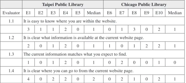
A. Visibility of system status
Taipei Public Library
The evaluators 1 and 3 however, made more comments about the difficulties of understanding what information is available and where you can go to from the TPL webpage. One is that the Home page has too many dazzling icons on the sides, so that users may miss the links of services
they are looking for. Also, the displays of breadcrumbs sometimes give wrong information, such as repeating phrases and the navigation trails may be variable from one page to another. They also claimed that some services do not provide enough information, such as the Document Delivery Service and the services of the Multicultural Information Center. Therefore, TPL has minor problems on the visibility of its system status.
Chicago Public Library
As evaluators of CPL, two of the evaluators stated the colour scheme and multiple layers make it difficult to immediately identify the breadcrumbs on the website. Moreover, the layout is not informative and intuitive enough, so the evaluator always used the “Home” button to start a new task. It was not always obvious
what the choices were from certain pages.
It may also take several steps longer than users expect to find the information they are looking for. Moreover, “Help” features should have been more accessible while using the catalogue to search. Overall, CPL only has cosmetic problems in this heuristic.
B. Match between system and the real world
Taipei Public Library
It is obvious that TPL has usability problems on menu order choices and layers according to Table 7. Most evaluators stressed that there are too many layers to find services which users frequently use, such as how to apply for a library card. It may be also frustrating to find the services
“Ask a librarian” and “Interlibrary Loan”.
Moreover, the similar names of services
Table 6: Visibility of system status
Taipei Public Library Chicago Public Library
Evaluator E1 E2 E3 E4 E5 Median E6 E7 E8 E9 E10 Median
1.1 It is easy to know where you are within the website.
3 1 1 2 0 1 0 1 3 0 2 1
1.2 It is clear what information is available at the current website page.
2 0 1 2 0 1 1 0 1 2 2 1
1.3 The current information matches what you expect to find.
1 0 1 2 0 1 0 2 0 0 1 0
1.4 It is clear where you can go to from the current website page.
4 0 2 2 0 2 0 2 1 0 2 1
make users confused. The website interface only has separate designs for general users and children, and the evaluators suggest that it may provide other editions for the elderly or specific groups. It is helpful to provide English and Japanese pages however the information is not updated as it is in Mandarin. Besides, the English pages include Chinese instructions.
Chicago Public Library
Some of the evaluators also found usability problems of inappropriate tab order in the CPL website. One of the evaluators thinks that the tabs of Help, opening hours, site map and many others tabs are not in their usual place. The website is designed for children and teenagers. It is suggested as the opinions of TPL evaluators to provide interfaces for the elderly or specific groups.
Spanish and Polish are the two
languages that the library currently has available. The evaluator considers that perhaps including specific languages based on the location via IP address may want to be looked at as an additional path of accessibility. However, it must be noted that after doing a book search when the Home page was in Polish the language reverted back to English. This would cause the patron unnecessary keystrokes to revert the page back to Polish if he or she wanted to see the contents. Generally, this website does not have major concerns of usability problems.
C. User control and freedom
Taipei Public Library
Nevertheless, the major services are hard to access from the Home page in the TPL website. It usually takes four or five steps to access the important information in
Table 7: Match between system and the real world
Taipei Public Library Chicago Public Library
Evaluator E1 E2 E3 E4 E5 Median E6 E7 E8 E9 E10 Median
2.1 Menu choices ordered in the most logical way and proper layers.
4 1 3 3 1 3 1 0 3 0 2 1
2.2 The vocabulary is appropriate for the intended audience.
1 0 0 2 0 0 0 1 0 0 0 0
2.3 The website is designed for different groups of users.
3 0 1 3 1 1 2 0 0 0 2 0
2.4 The website provides multilingual pages.
2 0 1 1 0 1 2 1 0 0 0 0
the opinions of the heuristic principle, 2.1.
Chicago Public Library
The website cannot find any links for the site map so that the evaluator has to enter a query to locate it according to the comments of the evaluator for the CPL website. It is also confusing for users to view their electronic collection or to download a book.
D. Consistency and standards
Taipei Public Library
TPL website should have a welcome splash page to guide different user groups and languages. Also, it is uneasy to find the page for people who have vision problems.
Searching within the website only has basic search functions so it is hard to efficiently find information. One of the evaluators
Table 8: User control and freedom
Taipei Public Library Chicago Public Library
Evaluator E1 E2 E3 E4 E5 Median E6 E7 E8 E9 E10 Median
3.1 It is always easy to return to the Home page.
1 0 0 1 0 0 0 0 0 0 0 0
3.2 It is easy to access all major parts of the website from the Home page.
4 0 2 1 0 1 0 0 0 1 1 0
Table 9: Consistency and standards
Taipei Public Library Chicago Public Library
Evaluator E1 E2 E3 E4 E5 Median E6 E7 E8 E9 E10 Median
4.1 Links are used and appear in standard web style.
3 0 0 2 0 0 1 0 0 0 2 0
4.2 The website follows conventions and expectations.
3 1 1 2 1 1 0 0 0 0 3 0
4.3 Commands are used in the same way and they mean the same thing in all parts of the website.
1 0 1 2 0 1 0 2 0 0 0 0
4.4 The website helps users to protect their own personal or private information.
1 1 1 2 1 1 0 0 0 0 0 0
however, thinks that it may not be necessary to have functions of commands when users are searching the catalogue or website.
Chicago Public Library
The links lack alternative text, and the speech programmes interpret the links in a very long and jargon filled pattern. Also, the links are in a non-standard colour scheme and while they still stand out their shade is extremely light, especially on a white background.
One of the evaluators considers that the search feature of commands should only be for the entire website rather than for specifically searching the catalogue. Finally, all evaluators agree that the website helps users to protect their own personal or private information.
E. Error prevention
Taipei Public Library
The TPL website only provides online
“Help” rather than any prevention from making errors while users are navigating or searching in the website.
Chicago Public Library
On the contrary, the CPL website does prevent users from any errors. When the evaluator tried to find the site map through the URL: www.chipublib.org/sitemap.xml, it was given another page, www.chipublib.
org/notfound page, which directed to the
“site search.”
F. Recognition rather than recall
Taipei Public Library
One of the evaluators argues that the TPL website has serious problems on the 6.1 and 6.3 usability principles. It seems that the information architecture is unclear and the information of breadcrumbs is inaccurate. The descriptions of labels may cause ambiguity, such as “E-resources” and
“Online databases”. Also, a few of the sub items need the issues of grouping headings and classification improving. Therefore, the usability of recognition rather than recall should be taken into account in the TPL website.
Chicago Public Library
Similarly, the actions are not always available and clearly presented in the interface of the CPL website. A crucial flaw is that if a user has search terms in the search box and goes to another webpage to check if the name is right, then the search box will clear the previous entry. It is very annoying if a user is not well versed in using a computer and does not know the shortcuts of ctrl-c or ctrl-v, then it could be frustrating as they try to go back and forth to get the name of the book right.
Moreover, there is no help offered or automatic search query assistance for either the basic or advanced search, however the
search buttons themselves are easy enough to locate. The page displays are simple enough, but there is a lot going on. Most tabs are divided up into two sections, sometimes three. They do not distract from the majority of the functions, but they may overwhelm a new user with all the information presented.
The Home page has a slightly uneven feel that makes it hard to find some items and draws users to other things, such as the button of Ask a Librarian which is unlike a
tab for questioning and the website search and catalogue search bars are unclear. Also, content is better collected as the user scrolls down the page, but until a user starts getting into an individual items page, the content could be hard to find.
The Home page has upcoming events, but no latest news. Overall, the Home page is both underwhelming in the quality of information and overwhelming in the amount of it.
Table 10: Error prevention
Taipei Public Library Chicago Public Library
Evaluator E1 E2 E3 E4 E5 Median E6 E7 E8 E9 E10 Median
5.1 The website prevents users from making errors whenever possible.
4 1 2 4 1 2 1 0 3 0 1 1
Table 11: Recognition rather than recall
Taipei Public Library Chicago Public Library
Evaluator E1 E2 E3 E4 E5 Median E6 E7 E8 E9 E10 Median
6.1 Available actions are always clearly presented.
4 1 2 3 0 2 2 1 3 1 2 2
6.2 Labels and links are described clearly.
2 1 2 3 0 2 1 0 1 0 3 1
6.3 Items have been grouped into logical zones, and headings have been used to distinguish between zones.
4 0 1 4 0 1 0 0 2 0 3 0
6.4 The latest news and important information are shown on the Home page.
2 0 0 2 0 0 2 0 0 0 3 0
G. Flexibility and efficiency of use
Taipei Public Library
I t i s e a s y t o u s e f u n d a m e n t a l commands, such as ctrl-f and ctrl-a whereas it seems that the website does not have the function of parameters which one of the evaluators thinks it does not need to provide. The Home page lacks the feature of adjusting settings while E-resources Metasearch System is flexible to choose preference and set options.
The instructions for advanced searches in the catalogue are not elaborate and some of the databases do not have instructions or samples to show people how to search. The search results in the catalogue can be ranked by different requirements, but it is hard to find the options. The catalogue has the function of metasearch but it usually fails to link to other libraries.
Chicago Public Library
The personal profile (My CPL) seems to give some customisation to the website, but the languages need to be persistent if the functionality is to be useful. While the search bar starts in the right hand corner, it jumps around by location depending on where a user is using it. On the catalogue display and site search (if you end up at a 404) are both on the offset left. The size of the bar also varies and the text inside varies when doing tabbed browsing.
Oddly enough the main search bar
defaults to a (presumed) keyword search, but when an error occurs by typing in gibberish the new search bar (now on the left side) gives the options of keyword, title or author.
Those choices should also be in the original search bar. There are no instructions or samples of advanced searching for the catalogue or the site. It could not verify subscription based on databases and should have more visible help features on the catalogue, for example how to find digital collections.
Relevance, author, date and title are the organisers of the results in the catalogue system, and the filters on the left hand side have more specific genres although the results cannot be sorted by topic. The search results of the website, however, can only be filtered by date and relevance.
There is no metasearch available besides the search that allows the local branches encompassed by the CPL.
An example of a metasearch is in the Interlibrary Loan section when it tells patrons that if they need a book urgently that they should ask a librarian to use WorldCat to look it up.
H. Aesthetic and minimalist design
Taipei Public Library
The left and right sides of the Home page occupy a lot of labels for government information which is unimportant or
unrelated. It also causes the Home page to be too long so that the essential information is difficult to find and there is no “Top” tab at the bottom of the page.
Chicago Public Library
A few redundancies exist between the tabs when a user is browsing through the website, and recommended books are repeated a few times. The Home page seems to reiterate a lot of information that already
Table 12: Flexibility and efficiency of use
Taipei Public Library Chicago Public Library
Evaluator E1 E2 E3 E4 E5 Median E6 E7 E8 E9 E10 Median
7.1 The website allows novice users to enter the simplest, most common form of each command and expert users to add parameters.
0 1 1 2 0 1 2 0 0 0 1 0
7.2 Users have the option of either clicking on fields or using a keyboard shortcut.
0 0 3 2 0 0 1 1 1 1 0 1
7.3 The website is flexible to enable users to adjust settings to suit themselves.
4 1 1 3 0 1 1 0 2 0 1 1
7.4 The Home page provides a search bar which is located in the familiar position.
3 0 0 1 0 0 3 3 0 0 0 0
7.5 The catalogue and database provide advanced search, instructions and samples of how to search.
2 0 0 2 0 0 3 0 0 1 2 1
7.6 Searching results in the website can be ranked by relevance, time, and topic.
1 0 3 4 0 1 1 0 1 1 0 1
7.7 Searching results in the catalogue can be ranked by relevance, published date, and topics.
2 0 1 2 0 1 1 0 0 0 0 0
7.8 The catalogue provides metasearch.
2 2 3 3 2 2 3 3 2 1 4 3
has some defined place.
The website lacks personality and is poorly designed, things are not obvious, and users have to look and read to find the links they are looking for. The aesthetics of website is not horrible, but neither is it very appealing.
The menu lists on Home page could be designed more clearly. For example, the
“Learn” and “Discover” headings are not really helpful for giving a clue of what is listed in those columns. Negative space is often alienating on this website possible because of the multiple boxes and labels.
I. Help users recognise, diagnose, and recover from errors
Taipei Public Library
It gives error messages when users are searching, but some messages do not clearly give instruction for the next step. If a user types the wrong search terms, the system gives the suggestive terms via matching prefix words rather than advising for the subject search.
It usually incurs the error “template, the catalog is unavailable” while a user is clicking on the tab “Find it in other libraries”, and there is no further assistance or contact information. A user only can passively read the instructions of how to operate the system.
If it takes a long time in the catalogue system, the system needs to be re-opened
again to protect the users’ personal information; however it does not provide messages to users making them feel confused and annoyed.
Chicago Public Library
One of the evaluators encountered error messages in clear and plain language while others did not receive any error messages. When given an error the evaluator was directed to search again, but not given the email address of the webmaster. That information can be found in the “Contact Us” link at the bottom of the page. Clicking on the Home tab always takes users to the Home page so that they are never trapped in an operation.
J. Help and documentation
Taipei Public Library
One of the evaluators argues that the online help is unclearly located in the website and the site map lists are too long and unorganised.
Chicago Public Library
Most evaluators feel it is hard to find online help. The help menus are either non- existent or gated by time constraints, such as emailing for help.
There is no site map available. Users could search the site, but if you do not know what is available, then it is difficult to search for it. Trying to go to the site map through
Table 13: Aesthetic and minimalist design
Taipei Public Library Chicago Public Library
Evaluator E1 E2 E3 E4 E5 Median E6 E7 E8 E9 E10 Median
8.1 Color choices allow for easy readability.
1 0 1 2 0 1 2 2 1 0 4 2
8.2 The website is aesthetically pleasing.
3 1 2 3 0 2 0 2 1 0 3 1
8.3 The website structure is simple and clear without unnecessary complications.
4 0 3 4 1 3 0 0 2 1 3 1
Table 14: Help users recognise, diagnose, and recover from errors
Taipei Public Library Chicago Public Library
Evaluator E1 E2 E3 E4 E5 Median E6 E7 E8 E9 E10 Median
9.1 If necessary, error messages are clear and in plain language.
2 2 2 3 1 2 0 0 1 0 3 0
9.2 If necessary, error messages provide contact details for assistance
2 1 2 3 1 2 2 0 2 0 1 1
9.3 It is easy to cancel or exit from operations.
1 0 2 2 1 1 0 0 0 0 0 0
Table 15: Help and documentation
Taipei Public Library Chicago Public Library
Evaluator E1 E2 E3 E4 E5 Median E6 E7 E8 E9 E10 Median
10.1 There is useful online help.
3 0 1 3 0 1 3 3 1 0 2 2
10.2 A site map or other navigational assistance is always readily available.
4 0 1 2 0 1 4 3 3 2 2 3
the .xml link proves to have a non-existing page attached to it.
Finally, Table 16 shows the numbers of usability problems found by 10 evaluators in the TPL and CPL websites based on major, minor and cosmetic problems. Both of the websites have two major problems respectively. In the TPL, the serious issues are that menu choices are unorganised and there are too many layers (principle 2.1). Also, the information architecture is complicated and unclear (principle 8.3). In the CPL, there is no site map or metasearch
available (principle 7.8 & 10.2). These problems should be given high priority for improvement. Moreover, the TPL website has more minor and cosmetic problems than the CPL website, but is of a lower priority for fixing or dealing with unless time is available.
V. Discussions and Recommendations
Table 17 reveals that the major usability issues of the TPL and CPL
Table 16:
Numbers of usability problems found based on the severity rating scale
Taipei Public Library Chicago Public Library
Major problems 2 2
Minor problems 8 3
Cosmetic problems 18 13
Table 17:
Major usability problems between TPL and CPL
Taipei Public Library Chicago Public Library
Major Usability Problems
Information Architecture Search
Search Navigation
Navigation Page Layout
Accessibility (Readability) Accessibility (Readability)
Category Names Others
Others
143 websites arranged from the previous chapter, IV. TPL has serious usability problems in information architecture, functions of search, category names, navigation, accessibility and others. On the other hand, CPL also has similar problems but less severely, encompassing search, navigation, page layout, accessibility and others.
With reference to the research of Nielsen & Loranger (2006), some usability problems are too severe to overcome for general users. The Chart 1 displays the
factors that caused users to fail on a website either by leaving it, giving up on a task, or incorrectly completing a task. Nielsen and Loranger (2006) state that search, information architecture, content, product information and workflow are the five biggest factors in failing a task on a website.
It is clear that search and information architecture are major problems which seriously make users fail tasks since it does matter if users cannot find what they are looking for.
Chart 5.1 Usability problems weighted by how frequently they caused users to fail a task (Nielsen & Loranger, 2006:132).
A. Information architecture, navigation and category names
Most evaluators think that TPL website has severe problems of information architecture, which encompasses disordered menus, excessive layers and distractive icons on the Home page. It easily causes users get lost in the website and then leave it. Poor information architecture can therefore alienate users.
Moreover, the features of navigation and category names are closely associated with information architecture. Obviously, the TPL website involves these usability problems.
Breadcrumbs
Breadcrumbs is a term used to describe the navigation trail which tells users where they are on a website. Bases on the research of Nielsen & Pernice (2010:156), users look at breadcrumbs 31 percent of the time when they are browsing in a website. The highest benefit of making use of breadcrumbs is that users can look to these helpful little morsels when they want to backtrack or cut through all the design noise (Nielsen & Pernice, 2010:156).
The TPL website has designed breadcrumbs, but it sometimes produces wrong navigation trails. There may be bugs or an incorrect design in the website, so the breadcrumbs should be examined and fixed.
Chart 1: Usability problems weighted by how frequently they caused
users to fail a task (Nielsen & Loranger, 2006).
Except for the problems of information architecture and search, the category names, layout and navigation in Table 17 which corresponds to the Chart 1 are also the causes to results in failures. The following content is for the improvement of the usability problems in Table 17.
A. Information architecture, navigation and category names
Most evaluators think that TPL website has severe problems of information architecture, which encompasses disordered menus, excessive layers and distractive icons on the Home page. It easily causes users get lost in the website and then leave it.
Poor information architecture can therefore alienate users.
Moreover, the features of navigation and category names are closely associated with information architecture. Obviously, the TPL website involves these usability problems.
Breadcrumbs
Breadcrumbs is a term used to describe the navigation trail which tells users where they are on a website. Bases on the research of Nielsen & Pernice (2010), users look at breadcrumbs 31 percent of the time when they are browsing in a website. The highest benefit of making use of breadcrumbs is that users can look to these helpful little morsels when they want to backtrack or cut through
all the design noise (Nielsen & Pernice, 2010).
The TPL website has designed breadcrumbs, but it sometimes produces wrong navigation trails. There may be bugs or an incorrect design in the website, so the breadcrumbs should be examined and fixed.
Links and category names
In the CPL website, it shows vague words and category labels, such as
“discover”, “learn” and “read” which are trite and unclear even with the description. A label such as “how to search in the library”
would give more useful information.
Catchy names are useless if they do not assist users to predict what is behind the link or label (Nielsen & Loranger, 2006).
On the other hand, the TPL website has a number of confusing names of tabs, such as “E-recourses” and “Online databases”, should be used to choose specific words and be easily identifiable.
Vertical dropdown menus have become a widely adopted navigational tool, such as in the TPL website, because they save space on screens. However, dropdown menus tend to be narrow and only allow little space for descriptive category names.
The TPL website design allows users to click on the main heading and it then takes them to another page that clearly lists their choices properly (Nielsen & Loranger, 2006). Unfortunately, there are too many levels of menus to find essential information
since users are normally only willing to take three levels to find information (Nielsen
& Loranger, 2006). Therefore, the TPL website should be rearranged and sorted so the submenus are within three layers.
B. Search
Based on the goals of the TPL and CPL, they aim to establish a website as a digital library. Therefore, the functionality of search plays an important role in a website compared to other commercial ones.
Searching
The search box should allow users to type longer queries, a whole sentence, or even a whole paragraph, no matter if it is for the content of a website or the catalogue (Nielsen & Loranger, 2006; Witten, et al, 2009). The interface should avoid using the words “Boolean” and “Ranked” to keep the language as simple as possible for users. It is suggested to design “Preference page” to control the process of searching and results, such as an advanced query mode: a mode of displaying search history (Witten, et al, 2009, p.441). Also, the website should provide a detailed “Help” page which the TPL and CPL must improve in their websites.
Search results page
The number one guideline of the search results page is to provide a linear list
with the most recommended being on the top (Nielsen & Loranger, 2006). The search results page should provide a number of choices to sort the results, such as date, type of collections, subjects or languages.
When there is no result found to a user’s query, the first requirement for this page is to clearly state that no results are found (Nielsen & Loranger, 2006).
Secondly, the page should assist users in modifying their search terms to get better results or suggest them to search other libraries with a link for a metasearch. The CPL should use this to enhance searches in the catalogue. While the TPL website has the function for a metasearch, it seems to have bugs in the system and should be removed.
C. Accessibility (Readability)
To be accessible, a website must be approachable by all types of users with various levels of abilities (Nielsen &
Loranger, 2006). As a public library aiming to serve all users, it should take into account for users who may have problems of disability in using a website interface, such as the elderly, vision-impaired users.
Font size
Both of the public library websites aim to provide services for all types of users, which was mentioned in the literature review chapter. The CPL website provides
a relative size scheme instead of fixed type sizes, while the TPL does not set text size.
Moreover, the goals of both libraries claim to cater to senior citizens and people who have vision-impaired problems.
Diverse user groups
According to the Table 1, Chicago had 28.9 percent Hispanic persons, which was significantly more than the percentage in Illinois and the United States. This feature also presents on the CPL website which designs Spanish pages for those who can read Spanish. It also implies that there are a large number of Polish people using the website.
On the other hand, the TPL website provides English and Japanese pages but the content in those pages is not updated and informative. The website also designs the pages for the elderly and new immigrants who are foreigners married to registered citizens in Taipei. However, the information structure of the pages is much different from the Home page, so that users are forced to get used to the new structure before they can make use of it.
D. Page layout
Colour scheme
There are approximately 8 percent of men and 0.5 percent of women that are colour blind (Nielsen & Loranger, 2006).
Therefore, the CPL website should instantly
improve the colour scheme since it uses green text on red background that users who have colour blindness cannot read.
Splash pages
One of the TPL evaluators suggested that the TPL website should have a splash page to divide users into specific pages, such as English, Japanese pages and the pages for the elderly. In fact, it is not a good navigational page if a splash screen offers users a choice of three places to go, because all options should be provided on the Home page (Nielsen & Loranger, 2006).
VI. Limitations
Even though the method of HE is quick, effective, and economical, it still has a number of disadvantages and limitations in the research.
Does not involve users
The main disadvantage of HE is not involved users provide feedbacks about the experiences of using the interface. This then depends on experts’ knowledge and experience (Jordan, cited in George, 2008).
The issues of evaluators
The 10 evaluators are from Taiwan and the United States, so there are a number of limitations on designing the evaluation form and when they would conduct their evaluation.
Firstly, the evaluation form was translated into Mandarin for Taiwanese evaluators, and the design of task scenarios also needed to be adapted to different situations for both websites by changing a number of questions. Therefore, the variable factors may affect the process of the evaluations and results. Moreover, the translation between English and Mandarin could imply different meanings.
Secondly, the whole process of evaluations was carried out online in different places. It was impossible to brief the procedures and obtain feedback face to face. The experimenter could not answer evaluators’ questions or be given hints via an online evaluation (Neilson, 1993). After they finished the evaluation, it was hard to obtain their explanations if the experimenter has any questions with respect to the comments they made.
Finally, the evaluators may have different cognition and understanding of HE to conduct an evaluation although they have similar backgrounds. Moreover, the Taiwanese evaluators used to work for TPL so they are already familiar with the website target but the American evaluators are not. Also, the websites were separately assessed by two groups of evaluators, so the evaluators did not compare the two websites.
VII. Conclusions
One of the aims of the research is to examine whether the objectives of both public libraries have met the provision of services on the interfaces of the websites.
Both of the websites stress the importance of usability, so most of goals have been met according to the results of HE although they still have some problems of usability that need to be improved.
The TPL is placing emphasis on strengthening Internet security and decreasing the occurrence of errors, but it has minor problems on error preventions and recoveries. The information services for all types of users are also promoted on the interface of the website, such as for seniors and people who have visionary problems.
However, the mission of providing information via mobile technology still needs enhancing and is not found on the website.
On the other hand, the information architecture of the website has proved to meet the goals of CPL strategies. It also meets the goals of being well-organised and easy-to-use in an accessible manner even though minor or cosmetic problems still exist.
Therefore, the value of HE discovery is approved according to the process and results since it is indeed a cheap, quick and effective method. Also, it is appropriate to invite five evaluators to conduct a HE.
However, it would be helpful that all of evaluators conducted the HE for both of the websites, so they could compare the websites with each other and then make more impartial scores and comments.
Based on the numbers of usability problems found, it is interesting that most usability problems are cosmetic: 18 items in TPL and 13 items in CPL. The websites do not have to fix them until have the time or budget. Moreover, the minor problems mainly are in the way of presentation.
Therefore, it is easy to deal with these problems by using plain language and making messages clear.
The total number of major problems is four, which only three of them being serious within the TPL and CPL websites. The problems are that the menu has too many layers and the information architecture in the TPL website is complicated. There is also no function for metasearch in the CPL website; whilst the site map is an assistant tool for utility navigation and could be replaced by searching the website instead.
Overall, the CPL website is better than TPL website according to the results of HE.
Not only is the information architecture clearer but also there are fewer usability problems. The TPL has more usability problems but it is not difficult to cope with them. Generally, both of the websites have efficient and effective usability of interfaces.
Finally, the comprehension of the research is pleasing. The results and recommendations could become a set of usability principles for other metro public libraries for inspecting the usability of websites during the process of designing or redesigning them. However, if there is no limitation of cost and time, the targets of metro public libraries could be broadened to more than five from different countries, such as Japan, Britain, Canada and China.
Also, it is possible to invite evaluators who are bilingual, so they could compare each website and make impartial and convincing scores and comments. Therefore, the results will be reliable as a benchmark of assessing a metro public library website.
References
陳弘寬(2007)。亞洲「國家圖書館」網站資訊架構好用性之比較研究。未出版之
碩士論文,國立臺灣師範大學圖書資訊學研究所在職進修碩士班,臺北市。
American Library Association. (2012). The Nation’s Largest Libraries: A Listing By Volumes Held. Chicago: American Library Association. Retrieved June 25, 2012, from http://www. ala. org/tools/libfactsheets/alalibraryfactsheet22
Bertot, J. C., Snead, J. T., Jaeger, P. T. & McClure, C. R. (2006). “Functionality, usability, and accessibility: Iterative user-centered evaluation strategies for