國 立 交 通 大 學
統計學研究所
碩 士 論 文
基因表現量晶片資料模擬器-使用公開之晶片資料庫
Gene expression microarray data generator
using a reference training set from publicly
available databases
研 究 生:吳芝賢
指導教授:黃冠華 博士
基因表現量晶片資料模擬器-使用公開之晶片資料庫
Gene expression microarray data generator
using a reference training set from publicly
available databases
研 究 生:吳芝賢 Student: Chih-Hsien Wu
指導教授:黃冠華
Advisor: Dr. Guan-Hua Huang
國 立 交 通 大 學
統計學研究所
碩 士 論 文
A Thesis
Submitted to institute of Statistics College of Science
National Chiao Tung University in Partial Fulfillment of the Requirements
for the Degree of Master
in Statistics July 2009
Hsinchu, Taiwan, Republic of China
基因表現量晶片資料模擬器-使用公開之晶片資料庫
研究生:吳芝賢 指導教授:黃冠華 博士
國立交通大學統計學研究所
摘要
微陣列晶片已經成為一種廣泛被應用的基因技術,許多分析方法也應運而 生。我們嘗試建立經驗模型去模擬每個基因的基因表現量,這些模擬的基因表現 量可用於評估各種分析方法。為了達到基因組織的多樣性,使用 MaRe 蒐集在 GEO 與 Affy 這兩資料庫儲存的基因原始表現資料,我們著重的平臺是艾菲爾 (Affymetrix)公司所製造的 HG-U133A 基因晶片。將這些資料用 justRMA 預處理 後,可得到22283 個基因表現量的經驗分配模型,其中有 5005 個基因的基因表 現量分佈呈現兩個或多個眾數,此 5005 個基因被認為是在某些組織是未表現 的;17278 個只有一個眾數的基因則被認為在所有組織都呈現有表現或未表現 的。我們運用這22283 個分配去模擬基因表現量。在此論文中提供了模擬方法的 步驟,並嘗試模擬了多組不同片數的嵌釘(spike-in)資料,觀察基因表現量模擬值 和原始值的差異。 關鍵字:艾菲爾基因晶片、模擬Gene expression microarray data generator
using a reference training set from publicly
available databases
Student: Chih-Hsien Wu Advisor: Dr. Guan-Hua Huang
Institute of Statistics
National Chiao Tung University
ABSTRACT
Microarray expression analysis has become one of the most widely used functional genomics tools. Since that, many analytical methods have been proposed. It is desirable to develop realistic models that can be applied in simulating expression values of each gene, and can then be used to assess the analysis methods and testing approaches. We downloaded publicly available raw data of the Affymetrix HG-U133A platform for varied tissues, using Microarray Retriever. These raw data were first preprocessed using the R function justRMA, and then, for each gene, the expression intensity distribution was determined. Among 22283 genes, 5005 genes had two or more modes, 17278 genes had one mode. Genes displaying only one mode are believed either expressed in all tissues or unexpressed in all tissues. Therefore there were 5005 genes can be divided to expressed and unexpressed. In this thesis, we provided the process of simulation, and simulated various arrays of spike-in data to observe the difference between simulated data and real spike-in data.
誌 謝
首先,非常感謝黃冠華老師的指導,從一開始懵懵懂懂連 microarray
都搞不懂是什麼,到現在可以初窺生物晶片領域的奧秘,都是老師的
功勞。有些時候我不夠積極,老師也從來不厲聲苛責,永遠都是那麼
有耐性的解決我們的問題,能當老師學生的我真的是很幸運。
這一年寫論文的日子心情總是起起落落,很謝謝在這些日子裡陪伴我
的家人與朋友,每個禮拜回家總是急著煮一大堆東西給我吃的媽媽,
煩躁時聽我抱怨一大堆的朋友們,還有跟我同門的好夥伴淑慎,謝謝
你們!
同時我也要感謝口試委員李御賢教授、陳君厚教授與洪志真教授於口
試時提供寶貴意見與指導,使論文內容更加完善。還有被大家深切依
賴的郭姐,如果不是妳,我們口試的過程、論文的繳交不知道會變得
多麼煩雜。最後再感謝一次黃冠華老師,老師,真的很謝謝您,讓我
這一年可以過得如此充實。
Contents
Abstract (in Chinese)
i
Abstract (in English)
ii
Acknowledgements (in Chinese)
iii
Contents
iv
List of Tables
vi
List of Figures
vii
LIST OF FIGURES ...VII 1 INTRODUCTION... - 1 -
2 LITERATURE REVIEW... - 3 -
2.1 BACKGROUND OF MICROARRAY...-3-
2.2 AFFYMETRIX GENECHIP ARRAY...-3-
2.3 DATASET...-4-
2.3.1 Microarray retriever ... - 4 -
2.3.2 Microarray repository... - 5 -
2.3.3 Affymetrix human genome U133A dataset (HGU133A) ... - 6 -
2.3.4 Affymetrix HGU-133A spike in dataset... - 6 -
2.4 BAR CODE...-7-
2.5 PREPROCESSING METHODS USED...-8-
justRMA... - 8 -
2.6 QUALITY ASSESSMENT...-8-
2.6.1 Scale Factor ... - 9 -
2.6.2 Averages background ... - 10 -
2.6.3 3’ to 5’ ratios ... - 10 -
2.6.4 Number of genes called present (% Present) ... - 10 -
2.7 SIX DIFFERENTIAL EXPRESSION METHODS USED...-11-
2.7.1 Fold change ... - 11 -
2.7.2 Two sample t-test... - 11 -
2.7.3 Welch t-test ... - 12 -
2.7.4 SAM (Significance Analysis of Microarrays)... - 13 -
2.7.5 EBarrays ... - 14 -
2.7.6 limma... - 15 -
3 MATERIALS AND METHODS... - 17 -
3.1 THE REFERENCE TRAINING SET...-17-
3.1.1 Microarray Retriever ... - 17 -
3.1.2 Obtaining normal controls... - 18 -
3.1.3 Quality assessment metrics ... - 18 -
3.2 GENE-SPECIFIC EXPRESSION DISTRIBUTION...-20-
3.3 PROCESS OF SIMULATION...-22-
3.4 COMPARISON WITH THE HG-U133A TAG SPIKE-IN DATASET...-23-
3.5 SIMULATION BASED ON THE SPIKE-IN DATASET (EXP 4 VS. EXP10)...-24-
4 RESULTS... - 26 -
4.1 GENE-SPECIFIC EXPRESSION DISTRIBUTION...-26-
4.2 COMPARISON WITH THE HG-U133A TAG SPIKE-IN DATASET...-26-
4.3 SIMULATION BASED ON THE SPIKE-IN DATASET (EXP 4 VS. EXP10)...-28-
5 DISCUSSION ... - 30 -
REFERENCE... - 32 -
List of Tables
Table 2.1. Affymetrix human genome U133 dataset contains 14 spike-in gene groups in each of 14 experimental groups. This table shows the spiked-in
concentrations (pM)...34 Table 2.2. Probe IDs for the seventeen additional probe sets annotated in the
HG-U133Atag CDF. ...35 Table 3.1. Summary of the amount of delete data in QC step...35 Table 3.2. The frequency distribution among tissue types of the reference training set.
List of Figures
Figure 3.1. The deleted data in each quality assessment step. ...38 Figure 3.2. The total deleted data in each quality assessment step. ...39 Figure 3.3. These histograms are the log (base 2) expression distribution for gene
“200886_s_at”. The color lines are the smoothed densities, using various “n” and “adjust” in function density(n, adjust) of R. . ...40 Figure 3.4. The rates of correctly identifying the two experiments (conditions) to be
differentially expressed among 34 spike-in genes under various K, and the rates of correctly identifying the two experiments (conditions) to be not differentially expressed among 4993 genes which were not in spike-in genes and had multiple modes.under various K. . ...41 Figure 4.1(a) Log (base 2) intensity distribution of one-mode gene. . ...42 Figure 4.1(b) Log (base 2) intensity distribution of two-mode gene which the second
mode is close to the first mode. .. ...42 Figure 4.1(c) Log (base 2) intensity distribution of two-mode gene which the second
mode is more distant to the first mode. ...43 Figure 4.1(d) Log (base 2) intensity distribution of gene which has more than two
modes and the second mode is far away from the first mode. ...43 Figure 4.2. Different combinations of arguments to fit the density smoother/ . ...44 Figure 4.3. The empirical intensity distributions and spike-in intensity distributions
for two genes that are included as the spike-in genes and have multiple modes. ...45 Figure 4.4. The empirical intensity distributions and spike-in intensity distributions
for two genes that are included as spike-in genes and have only one mode. ....45 Figure 4.5.1. The empirical intensity distribution and spike-in intensity distribution
for a gene that is not included as the spike-in gene and has multiple modes, where the second mode is distant from the first mode. ...46 Figure 4.5.2. The empirical intensity distribution and spike-in intensity distribution
for a gene that is not included as the spike-in gene and has multiple modes, where the second mode is close to the first mode. ...47 Figure 4.5.3. The empirical intensity distribution and spike-in intensity distribution
for a gene that is not included as the spike-in gene and has multiple modes, where the second mode is far away from the first mode. . ...48 Figure 4.6.1. The empirical intensity distribution and spike-in intensity distribution
for a gene that is not included as the in spike-in gene and has only one mode. 49 Figure 4.6.2. The empirical intensity distribution and spike-in intensity distribution
for a gene that is not included as the spike-in gene and has only one mode. ....50 Figure 4.7. ROC curves for six differential-expression methods, comparing the three
replicate arrays from the 4th experimental group of the spike-in dataset with the three replicate arrays from the 10th experimental group. ...51 Figure 4.8. ROC curves with FPs<100 for six differential-expression methods,
comparing the three replicate arrays simulated based on the 4th experimental group of the spike-in dataset with the three replicate arrays simulated based on the 10th experimental group. . ...52 Figure 4.9. ROC curves with FPs<1000 for six differential-expression methods,
comparing the three replicate arrays simulated based on the 4th experimental group of the spike-in dataset with the three replicate arrays simulated based on the 10th experimental group. . ...53 Figure 4.10. ROC curves with FPs<100 for six differential-expression methods,
comparing the five replicate arrays simulated based on the 4th experimental group of the spike-in dataset with the five replicate arrays simulated based on
the 10th experimental group. . ...54 Figure 4.11. ROC curves with FPs<100 for six differential-expression methods,
comparing the ten replicate arrays simulated based on the 4th experimental group of the spike-in dataset with the ten replicate arrays simulated based on the 10th experimental group. . ...55
1
Introduction
Microarray expression analysis has become one of the most widely used functional genomics tools. Since that, many methods have been proposed for accomplishing the purposes of classification and discovery. Nevertheless the statistical attributes of such methods generally are not well established. It is desirable to develop realistic models that can be applied in simulating expression values of each gene, and can then be used to assess the analysis methods and testing approaches. Because not every gene is normally distributed as we assumed previously, we developed an empirical approach that can characterize the true expression values of each gene.
We downloaded publicly available raw data of the Affymetrix HG-U133A platform for varied tissues, using Microarray Retriever(Ivliev et al., 2008). These raw data were first preprocessed using the R function justRMA, and then, for each gene, the expression intensity distribution was determined. This gene-specific empirical density can be the foundation for simulating gene expression values. It is believed that any given gene will only be expressed in some tissues. As a result, multiple modes of the intensity distribution should be observed in some genes, and the lowest intensity mode is assumed to appear due to a lack of expression (Zillion and Irizarry, 2007). Expression estimates to the left of this lowest intensity mode were then used to estimate the standard deviation of unexpressed genes. For a pre-selected constant K, the gene is defined to be expressed in the tissue when the log expression value was K standard deviations larger than the unexpressed mean. Genes displaying only one mode are recognized as either expressed in all tissues or unexpressed in all tissues. We can then simulate expressed and unexpressed intensity values from genes showing two or more modes, and can thus generate genes with differential expression.
To examine the validity of the proposed simulation method, we compared our simulated intensities with the expression values from the spike-in dataset of the Affymetrix HG-U133A tag platform. Based on either simulated data or spike-in data, ROC curves were created for various differential expression detecting methods. Characteristics of the plots from two different datasets are compared.
2
Literature
Review
2.1 Background of microarray
Microarray explores an avenue of studying expression level of tens of thousands of genes by supplying one or more oligonucleotide probe(s) for each transcript studied. It gives an answer to what genes are expressed in a particular cell type of an organism, at a particular time, under particular conditions. Microarray can be divided to two categories: two-color and one-color detections. Two-color microarrays are typically hybridized with cDNA prepared from two samples to be compared (e.g. diseased tissue versus healthy tissue). Thus the relative intensities are measured. In one-color microarrays, the arrays measure the absolute levels of gene expression. Therefore the comparison of two conditions requires two separate arrays. This thesis focuses on Affymetrix GeneChip, which is one of the one-color systems.
2.2 Affymetrix GeneChip array
Affymetrix provides one of the most prominent commercial platforms of DNA microarrays. Affymetrix GeneChip arrays are high throughput assays for measuring the expression levels of many thousands of gene transcripts simultaneously in a particular tissue or cell type. These hybridizations contain short oligonucleotides (25mers) probe sets which in turn represent different transcripts or genes. There are several file types generated by Affymetrix software. For example, CDF file describes the layout for an Affymetrix GeneChip array and DAT file contains the raw image of the scanned GeneChip array. In this thesis we used the raw data (CEL file), which stores the results of the intensity calculations on the pixel values of the DAT file.The
cell intensity file assigns x,y coordinates to each cell which as probe intensity on the array and evaluates the representative intensity of each cell. This file can be used to re-analyze data with different expression algorithm parameters. There are some public repositories such as Gene Expression Omnibus and ArrayExpress created to house for these data,
2.3 Dataset
2.3.1 Microarray retriever
Microarray retriever is a software tool providing an access to the two major public microarray repositories: Gene Expression Omnibus and ArrayExpress. MaRe allows the user to search GEO and ArrayExpress for experiments with accession numbers, authors, species, dates, platforms or on keywords of unspecified type. There are three boxed for input of parameters in the MaRe web interface.
Accessions(A):accepts accession numbers of GEO experiments, accession numbers of ArrayExpress experiments and PubMed IDs of papers.
Authors/keywords(B):specifies authors and keywords to be searched for in the meta-data present in the microarray repositories and/or PubMed.
Species/date/platform(C):enables searching on or limiting searches on specific species, date of submission to the repository and platforms.
And to retrieve raw data for experiments or to retrieve only the processed data can also be selected.
The search structure is further outlined in following figure. Microarray retriever is a software tool providing an access to the two major public microarray repositories: Gene Expression Omnibus and ArrayExpress
An email address should be entered before the search since MaRe will send a notification with the URL of the data archive to this email address after choosing which data to download. (Ivliev et al., 2008)
2.3.2 Microarray repository
DNA microarray technology has influencing many aspects of biological research, made the expression of many thousands of gene transcripts possible to be monitored simultaneously. It was widely figured that a basic repository of this information should be created to accommodate these data. (Brazma et al., 2000) This allows potentially essential additional information like various contexts to be gleaned by re-interpretation by other researchers. Thus, major efforts to store such data were made, namely the Gene Expression Omnibus (GEO) and ArrayExpress. These repositories contain more than 82,000 and 50,000 microarray samples of data, respectively.
ArrayExpress (http://www.ebi.ac.uk/arrayexpress)
ArrayExpress is an international public repository for well-annotated microarray data. It contains experiments from Stanford MicroArray Database (SMD;http://genome-www5.stanford.edu) and some experiments have also been extracted from GEO.
Gene Expression Omnibus (GEO) (http://www.ncbi.nlm.nih.gov/geo)
Gene Expression Omnibus is a public repository that archives and freely distributes high throughput gene expression data submitted by the scientific community. GEO currently houses approximately a billion individual gene expression measurements, derived from over 100 organisms, addressing a wide range of biological issues.
2.3.3 Affymetrix human genome U133A dataset (HGU133A)
The Human Genome U133 Set exclusively from Affymetrix is consisting of two arrays. These set contained enormous unique oligonucleotide features covering more than 39,000 transcript variants, which in turn represent greater than 33,000 of the well-substantiated human genes. (Affymetrix, 2003) The Human Genome U133A array is one of GeneChip of this powerful family. This array is containing 247,965 probe pair sequences which one after another represent 22283 human genes that can be used to explore human biology and disease processes. The platform accession number “GPL96” and “A-AFFY-33” can be used to find HG-U133A dataset in Gene Expression Omnibus and ArrayExpress respectively.
2.3.4 Affymetrix HGU-133A spike in dataset
Due to the transcripts were spiked in at known concentrations for these data sets, the Affymetrix HGU-133A spike-in data set has been used for evaluating the sensitivity and specificity of various analytical approaches of microarray data. The
HG-U133A spike-in experiment is made of 42 specific transcripts that are spiked in at 14 concentrations ranging from 0 pM to 512 pM, again arranged in a Latin Square design. For example, the concentration of the 14 gene groups in the first experimental group is 0, 0.125, 0.25, 0.5, 1, 2, 4, 8, 16, 32, 64, 128, 256, and 512pM. Each following experimental group alternates the spike-in concentrations by one group; i.e. experimental group 2 begins with 0.125pM and ends at 0pM, experimental group 14 begins with 512pM and ends with 256pM. There are three transcripts spiked-in at each concentration and three replicate arrays for each experiment, thus a total of 42 arrays. Table 2.1 gives a list of the 42 probe sets that were defined as the spiked-in transcripts in the experiment and their associated concentrations with each hybridization experiment.
The CDF for the HG-U133A spike-in experiment is named “HG-U133A tag”. There are 17 tag probe sets that only exist in the HG-U133A tag but not exist in the HG-U133A. These additional probe sets are shown in Table2.2.
2.4 Bar code
Since the “probe effect” is considerable but consistent across different arrays, it implies that relative measures of expression for one gene are more valuable than absolute ones. For any given gene it is essential to know what intensity identified with no expression. To accomplish that, downloading the raw data for a variety of tissues from the public repositories and preprocessing with the same algorithm. Then, for each gene the intensity distribution can be achieved. It is believed that any given gene will only be expressed in some tissues. As a result, multiple modes should be observed in some genes and the lowest intensity mode is assumed appears due to a lack of expression. Expression estimates to the left of this lowest intensity mode were
then made use of estimating the standard deviation of unexpressed genes. The gene, which is in the location where the log expression estimates were K standard deviations larger than the unexpressed mean, is defined as expressed. K is a selected constant which can be chosen by cross-validation assessment. And genes displaying only one mode are recognized as either expressed in all tissues or unexpressed in all tissues. (Zillion and Irizarry, 2007)
2.5 Preprocessing methods used
justRMA
justRMA is a wrapper for just.rma that permits the user to simplify RMA function. RMA (Irizarry et al., 2003a), Robust Multi-array Analysis, is an expression measure composing of three particular preprocessing steps: convolution background correction, quantile normalization, and summarization. The justRMA() command that was contributed by the affy package calls the same C routines used by rma() but it differs from the rma() and expresso() commands. If the function is called with no arguments justRMA(), then all the CEL files in the working directory are read, converted to an expression measure using RMA and put into an ExpressionSet. However, this argument can provide a substantial time savings and give the user great flexibility.
2.6 Quality Assessment
Quality assessment is an crucial first phase ensures the successful data analysis. Before any comparisons can be conducted it is necessary to make sure that there were no problems with array processing and that arrays are of adequate quality to be
worked in a experiment. Therefore, Affymetrix provides a collection of QC metrics and accompanying guidelines that assist the user to identify the problematic arrays in Affymetrix platform.
These QC functions are within simpleaffy package which can download from BioConductor. The simpleaffy function qc generates the most commonly used metrics:
1. Scale factor
2. Average background
3. 3’ to 5’ ratios for β-actin and GAPDH 4. Number of genes called present
All of these values are parameters computed for/from the MAS 5.0 algorithm. The standard recommendations from Affymetrix are as follows:
2.6.1 Scale Factor
Due to the assumption that gene expression does not change significantly for the vast majority of arrays in the same experiment, the trimmed mean intensity for each array should be constant. MAS 5.0 scales the intensity for every sample to make each array have the same mean. The level of scaling applied is described by the ‘scale factor’. Consequently, scale factor provides an evaluation of the overall expression level for an array and a reflection of how much labelled RNA is hybridised to the chip. Large variations in scale factors signal implies where the normalisation assumptions are likely to fail due to things with sample quality or amount of starting material. Alternatively, they might occur if there have been appreciable issues with RNA extraction, labeling, scanning or array manufacture. In order to successfully compare data produced using various chips, Affymetrix recommend that their scale factors should be within 3-fold of one another, which is, the log (base 2) scale factors are
recommended in the region between the borders 1.5 up or down from the mean log (base 2) scale factors of all arrays.
2.6.2 Averages background
The significant difference between average backgrounds of arrays is the result of great change in brightness of different arrays. It might just because the overall signal from the array is greater, perhaps because different amounts of cRNA were present in the hybridization cocktails, or because the hybridization was more efficient in one of the reactions. Since these reasons, the average backgrounds should be similar across all chips.
2.6.3 3’ to 5’ ratios
Most cell types seem to express β-actin and GAPDH everywhere. These are relatively long genes, and the majority of Affymetrix chips contain separate probesets targeting the 5’, mid and 3’ regions of their transcripts. By comparing the amount of signal from the 3’ probesets to either the mid or 5’ probesets, it is possible to obtain a measure of the quality of the RNA hybridized to the chip. If the ratios are high then this indicates the presence of truncated transcripts. This may occur if the in vitro transcription step has not performed well or if there is general degradation of the RNA. Hence, the ratio of the 3’ and 5’ signal gives a measure of RNA quality. Affymetrix suggests that the beta-actin 3’:5’ ratio should be below 3 and the GAPDH 3’:5’ ratio less than 1.25 is acceptable.
2.6.4 Number of genes called present (% Present)
Present/Marginal/Absent calls are generated by looking at the difference between PM and MM values for each probe pair in a probeset. Probesets are appeared Marginal or Absent when the PM values for that probeset are not considered to be significantly above the MM probes. The large differences between the numbers of
genes called present on different arrays can be found when different amounts of labeled RNA have been hybridized well to the chips. The “% Present” call is the percentage of probesets called Present on an array. So the significant variations in % Present call across the arrays should be treated with care since it may be the result that some cells express more genes than other. Since that, the present percent are required similar.
2.7 Six differential expression methods used
2.7.1 Fold change
The standard definition of the fold-change for gene g is
Where and are the raw expression levels of gene g in replicate j in the control and treatment, respectively. And gene g was called significantly changed if or (Tusher et al., 2001).The fold-change method is the most commonly used method but has some disadvantages. Since a vast majority of genes are expressed at low levels where the signal-to-noise ratio is very low, 2-fold changes in gene expression occur at random for a large number of genes. Conversely, for higher levels of expression, smaller changes in gene expression may be real, but these changes are rejected by fold-change methods.
2.7.2 Two sample t-test
The t test is a simple, statistically based method for detecting differentially expressed genes. In replicated experiments, the error variance can be estimated for each gene from the log (base 2) ratios, and a standard t test can be conducted for each
gene. This gene-specific t test is not affected by heterogeneity in variance across genes because it only uses information from one gene at a time. In addition, the variances estimated from each gene are not stable: for example, if the estimated variance for one gene is small, by chance, the t value can be large even when the corresponding fold change is small. The two sample t-test method assumes the samples are drawn from normal distributions with equal variance and different means. Here we described this method briefly.
Two sample t-test for equal variance:
. 2 ) ( ) ( , ~ 1 1 : : : H ) , ( ~ ,..., : 2 ) , ( ~ ,...., : 1 1 2 1 2 2 2 2 1 1 2 1 0 2 2 1 2 1 1 − + − + − = + − ≠ =
∑
∑
= = − + N M Y Y X X S where T S N M Y X statistic test H versus N Y Y condition N X X condition N i i M i i p N M p gN g gM g μ μ μ μ σ μ σ μAfter performing the test and the conclusion leads to rejectH , we consider that this 0
gene is a differentially expressed gene. 2.7.3 Welch t-test
Welch t-test makes the same assumption as the two sample t-test that the samples are drawn from normal distributions, but allows for different variances between classes. For any given gene g, suppose that the number of samples in condition1 and in condition2 are M and N respectively. Here we described this method briefly.
. ) 1 ( ) 1 ( ) ( ) ( 1 1 , ) ( 1 1 ), ( ~ ) ( : : : H ) , ( ~ ,..., : 2 ) , ( ~ ,...., : 1 2 4 2 4 2 2 2 1 2 2 1 2 2 2 2 2 1 1 2 1 0 2 2 2 1 2 1 1 1 − + − + = − − = − − = + − ≠ =
∑
∑
= = N N S M M S N S M S and Y Y N S X X M S where ely approximat T N S M S Y X statistic test H versus N Y Y condition N X X condition Y X Y X N i i Y M i i X v Y X gN g gM g ν μ μ μ μ σ μ σ μAfter performing the test and the conclusion leads to rejectH , we consider that this 0
gene is a differentially expressed gene.
2.7.4 SAM (Significance Analysis of Microarrays)
In this version of the t test, a small positive constant is added to the denominator of the gene-specific t test. With this modification, genes with small fold changes will not be selected as significant; this removes the problem of stability. Our approach was based on analysis of random fluctuations in the data. However, even for a given level of expression, we found that fluctuations were gene specific. To account for gene-specific fluctuations, we defined a statistic based on the ratio of change in gene expression to standard deviation in the data for that gene.
For each gene g, the “relative difference” dg in gene expression is:
Here sg is a standard deviation of each gene, and s is an exchangeability factor. 0
permutations of the repeated measurements to estimate the percentage of genes identified by chance. (Tusher et al., 2001)
2.7.5 EBarrays
The empirical Bayes approach is equivalent to shrinkage of the estimated sample variances towards a pooled estimate, resulting in far more stable inference when the number of arrays is small. (Smyth, 2004)
This model attempts to describe the probability distribution of expression measurements taken on a gene g. Measurements are considered as independent random deviations from a gene-specific mean value and, more specifically, as arising from an observation distribution . When comparing expression samples between two groups, the sample set {1, 2,…,N} is partitioned into two subsets, say and , contains the samples in group k. The
distribution of measured expression may not be affected by this grouping, in which case our baseline hypothesis above holds and we say that there is equivalent expression, , for gene g. Alternatively, there is differential expression,
Assume that measurements sharing a common mean expression level arise independently and identically from an observation component , and arise from some genomewide distribution . Denote as the pdf for the data indexed by subset .
Let p denote the fraction of genes that are differentially expressed ; then 1 – p denotes the fraction of genes equally expressed . The marginal distribution of the data becomes
and he posterior probability of differential expression is calculated by Bayes’ rule as
2.7.6 limma
The limma method approach is to fit a linear model to the expression data for each gene (Smyth, 2004). The linear model for gene g is:
Where contains the expression data for the gene g, is the design matrix, and is a vector of coefficients. Certain contrasts of the coefficients are assumed to be of biological interest and these are defined by
In general, we are interested in testing whether individual contrast values are equal to 0.
2.8 ROC curve
Receiver Operating Characteristic (ROC) curve is widely used to evaluate the differential expression methods in microarray analysis. In a ROC curve, the true positive rate (Sensitivity) is plotted in function of the false positive rate (1-Specificity) for different cut-off points. In a two-class prediction problem (binary classification), the outcomes are labeled either as positive or negative class. There are four possible
outcomes from a binary classifier. If the outcome from a prediction is positive and the actual value is also positive, then it is called a true positive (TP); however if the actual value is negative then it is said to be a false positive (FP). We defined sensitivity as the probability that the test lead to make positive decision given that the truth is actually a positive case. This is also known as the true positive rate. Specificity is defined as the probability that a negative decision is made when the truth is negative. The ROC curve is represented equivalently as a plot of the false positive (FP) rate as the x coordinate versus the true positive (TP) rate as the y coordinate.
3 Materials and Methods
Our purpose is to simulate the expressions of gene. To achieve this, the vast amount of publicly available data sets was used. In order to have a wide representation of tissues, we downloaded all the raw data of the “normal control” samples we could find from the public repositories. The raw data were preprocessed using the R function justRMA, and then, for each gene, the intensity distribution was determined. We can use this empirical density to simulate the intensity values of each gene.
3.1 The reference training set
3.1.1 Microarray Retriever
We download all the raw data (CEL file) of Human Genome U133A Arrays which we could find from Gene Expression Omnibus (GEO) and ArrayExpress (AE) by Microarray Retriever (MaRe) (Ivliev et al., 2008). The MaRe web interface contains three boxes for input of the query term. To limit search on human species and HG-U133A arrays, choose "Homo sapiens" as the specified specie and input “GPL96” and “A-AFFY-33”, the platform accession numbers of HG-U133A, to the platform accessions field. Since only individual gene expressions were needed, “Retrieve only GSE” was chosen for GEO. “Not retrieved from GEO” was chosen for ArrayExpress to avoid the overlapping with the experiments that already existed in GEO. “Retrieve raw data” checkbox should also be checked. Then we entered an email address in the “Start search” box to start the search. The search can return a bunch of raw data that meet our searching criteria. There is a total of 701 experiments obtained from the MaRe.
3.1.2 Obtaining normal controls
Downloaded raw data contain samples from a variety of different conditions. Only normal controls were used for creating the reference training set. For example, series GSE10072 from GEO was an experiment with 49 samples of normal lung tissue and 58 samples of adenocarcinoma of the lung. In this case, we only retained 49 samples of normal lung tissue but discarded 58 samples of adenocarcinoma of the lung. After removing files that were not from normal controls, 1886 .CEL files from GEO and 559 .CEL files from AE were kept.
3.1.3 Quality assessment metrics
The data quality for each array was verified by the qc function within the simpleaffy package in BioConductor. The qc function can generate the most commonly used quality assessment metrics as described in the following. All these metrics are parameters that are computed for/from the MAS 5.0 (Microarray Suite software, Version 5.0) algorithm. (Wilson et al., 2009)
Scale Factor
Due to the assumption that gene expression does not change significantly for the vast majority of transcripts in an experiment, the trimmed mean intensity for each array should be constant. MAS 5.0 scales the intensity for every sample to make each array have the same mean. Since “Scale Factor” represents the amount of scaling applied, it provides a measure of the overall expression level for an array. (Wilson et
al., 2009)
In our quality assessment process, we propose to perform a “stepwise” scale factor refinement. First of all, the scale factors of our samples should be within 6-fold of one another. To obtain the 6-fold region, we calculated the mean and the of log (base 2) scale factors from all arrays in advance, and the region was the one between
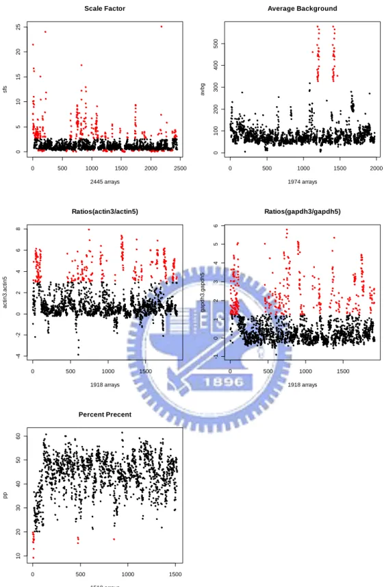
the borders of 3 up or down from the mean value. Arrays whose log (base 2) scale factors were out of this area were removed. Then, for the remaining samples, their scale factors should be within the 4-fold of each other. After removing the arrays that were not in the 4-fold range, we then further removed those out of the 3-fold of the scale factors of the samples that were still retained. At the end, 1974 arrays were kept. Averages background
The significant difference between average backgrounds of arrays is the result of great change in brightness of different arrays. The average backgrounds should be similar across all chips. (Wilson et al., 2009) To avoid dramatic variation in arrays’ intensity, we removed the array which had extreme average background. According to the picture, we recommended that the average background value should be below 300. We had 1918 arrays after that.
3’ to 5’ ratios
The ratio of the 3’ and 5’ is a value comparing the amount of signal from the 3’ probset to either the mid or 5’ probset. So it is possible not only to measure the quality of the RNA hybridize to the chip but also measure the RMA quality. Affymetrix suggests that the beta-actin 3’:5’ ratio should be below 3 and the GAPDH 3’:5’ ratio less than 1.25 is acceptable. (Wilson et al., 2009) After removing the unsatisfactory arrays, we had 1501 arrays.
Number of genes called present (% Present)
The difference between PM and MM values for each probe pair in a probeset can be categorized as Present/Marginal/Absent calls. Marginal or Absent call appears when the PM probes’ values are not considered to be significantly above the MM probes. The large differences between the numbers of genes called present on different arrays can be found when different amounts of labeled RNA have been hybridized well to the chips. The “% Present” call is the percentage of probesets
called Present on an array. So the significant variations in % Present call across the arrays should be treated with care since it may be the result that some samples express more genes than other. Since that, the present percent are required to be similar. (Wilson et al., 2009) The criterion we set was the value 20%. We removed the arrays whose present percent was below 20%. And all we kept were 1501 arrays.
Among 1501 arrays having passed quality assessment, there existed 222 arrays that were not the same type with other 1279 arrays and cannot input into R-2.3.0. We got rid of these 222 arrays. The remaining 1279 arrays were the reference training set we used.
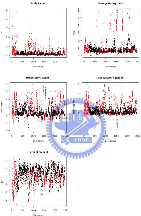
The brief summary of the amount of delete data in each step is shown in Table 3.1. Figure 3.1 shows the deleted data in each step. Figure 3.2 shows the comparison between total delete data and1501 saved data after quality assessment. For those 1279 arrays in the reference training set, they belonged to 74 different tissue types. The frequency distribution among these tissue types can be found in Table 3.2.
3.2 Gene-specific expression distribution
The raw data for all the 1279 arrays were preprocessed using justRMA (MacDonald and Bolstad, 2009) of R-2.3.0.
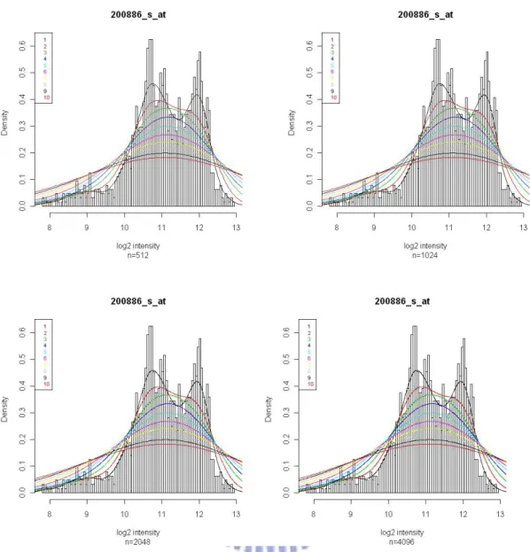
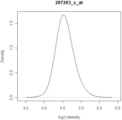
Then, for each gene, the preprocessed log (base 2) expression values were used to empirically determine its intensity distribution. (Zillion and Irizarry, 2007) The density distribution is obtained by fitting a density smoother, using the density(n, adjust) function of R. The argument “n” represents the number of equally spaced points at which the density is to be estimated and “adjust” represents the bandwidth used for smoothing. We plotted histograms of log (base 2) expression values for some randomly selected genes. Smoothing curves created by different argument settings
were fit to these histograms. One of the plots is shown in Figure 3.3. After examining all these plots, we decided to set the smoothness parameters n=512 and adjust=3 for the use of creating the density distributions.
It is believed that any given gene will only be expressed in some tissues; as a result, multiple modes should be observed in some genes. The lowest intensity mode is assumed to appear due to a lack of expression (Zillion and Irizarry, 2007). The modes were computed and the mode with the smallest location was considered the expected intensity of an unexpressed gene. The standard deviation of unexpressed genes was estimated by the expression estimates to the left of this mode. We then selected a constant K and defined genes expressed in tissues where the log (base 2) expression estimates were K standard deviations larger than the unexpressed mean. The constant K can be 6 or selected based on the data of interest.
Among 22283 genes in Affymetrix HG-U133A, 5005 genes had two or more modes, 17278 genes had one mode. Genes displaying only one mode are believed either expressed in all tissues or unexpressed in all tissues. Therefore there were 5005 genes can be divided to expressed and unexpressed.
3.3 Process of simulation
In the following, we describe the approach for generating expression intensities from two groups of individuals (e.g., cases versus controls) where certain genes are differentially expressed, using the empirical intensity distributions derived from the reference training set. The idea is to first pick up a subset of the 5005 multiple-mode genes, and then, for each gene in the subset, generate controls’ intensities from the empirical intensity distribution to the left of the selected cut-off point and cases’ intensities from the distribution to the right of the cut-off point, or vice versa. The detailed steps are:
1. Decide constant K. Compute the cut-off points for the 5005 genes that contain two or more modes.
2. Determine the expression statuses (express or unexpressed) of controls in these 5005 multiple-mode genes. To be more realistic, we first select a tissue type from the reference training set. For reference arrays belonging to the selected tissue type, calculate their average log (base 2) expression estimates of all genes. For each of the 5005 multiple-mode genes, compare its average log (base 2) expression estimate with the corresponding cut-off point. If the average estimate is larger than the cut-off point, this gene is considered as an expressed gene in controls. Conversely, if the average value is smaller than the cut-off point, this gene is considered as an unexpressed gene in controls.
3. Determine the expression statuses of cases in the 5005 multiple-mode genes. A subset of the 5005 multiple-mode genes is chosen as the differentially expressed genes. Cases’ expression statuses in these selected genes are set to be different from controls’, and their expression statuses in unselected genes are set to be the same as
controls’.
4. For one-mode genes, cases’ and controls’ intensities are generated through these genes’ empirical intensity distributions derived from the reference training set. Simulating intensities for genes with two or more modes need some care. Expression intensities of cases and controls for multiple-mode genes are generated based on their expression statuses derived in steps 2 and 3. If the gene is an expressed gene, simulate intensities from the empirical intensity distribution to the right of this gene’s cut-off point. If the gene is unexpressed, simulate intensities from the empirical intensity distribution to the left of the cut-off point.
Above simulation processes can be easily extended to the case where three or more groups are compared.
3.4 Comparison with the HG-U133A tag spike-in dataset
The CDF for the HG-U133A spike-in experiment is named “HG-U133A tag”. There are 17 tag probe sets that only exist in the HG-U133A tag but not in the HG-U133A (Mcgee and Chen, 2006). These additional probe sets are shown in Table2.2.
After removing these 17 additional probe sets, the spike-in dataset contains exactly same probe sets as those in the HG-U133A. We used the RefPlus package of R (Chang and Harbron, 2007)to preprocess the spike-in dataset that has removed 17 additional probe sets. Preprocessing method RMA is first applied to the reference training set and some characteristics of RMA are extracted and stored by RefPlus. Using these stored characteristics, RefPlus can then preprocess the spike-in dataset as if it was RMA-re-preprocessed along with the reference training set. The empirical intensity distributions from the training set can be compared with the intensities from
preprocessed spike-in data. We plotted both the empirical density and spike-in density for 34 spike-in genes in the HG-U133A tag spike-in dataset and for non-spike-in genes.
3.5 Simulation based on the spike-in dataset (exp 4 vs. exp10)
Here we aim to simulate gene expression intensities of cases and controls, which mimic the expression patterns shown in the spike-in dataset experiment no. 4 and no. 10.
1. Our controls were generated based on the 4th experimental group of the spike-in dataset and cases based on the 10th experimental group.
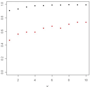
2. Determine the K that can best discriminate exp. 4 and exp. 10 in 5005 multiple-mode genes. In Figure 3.4, the red dots represent the rates of correctly identifying the two experiments (conditions) to be differentially expressed among 34 spike-in genes under various K. The blue dots are the rates of correctly identifying the two experiments (conditions) to be not differentially expressed among 4993 genes which were not in spike-in genes and had multiple modes. We chose K=6 by this picture. Use training set to compute the cut-off of the 5005 genes which have multiple modes.
3. Select the 34 spike-in genes as the differentially expressed genes. Among these 34 spike-in genes, 22 genes have only one mode in the reference set. The cut-off points for these 22 one-mode genes are generated, using the same method as what we propose for multiple-genes.
4. Use the 4th experimental group of the spike-in dataset to determine the expression statuses (express or unexpressed) of controls in 5005 multiple-mode genes and 22 selected differentially expressed one-mode genes, as done in step 2 of the simulation process.
5. Determine the expression statuses of cases in the 5005 multiple-mode genes and 22 selected differentially expressed one-mode genes, as done in step 3 of the simulation process.
6. Generate cases’ and controls’ intensities, as done in step 4 of the simulation process.
We plotted ROC curves for 6 differential expression methods (i.e., fold-change, two sample t-test, Welch t-test, SAM, EBarrays and limma), using the 4th experimental group from the spike-in dataset as controls and the 10th experimental group as cases. The ROC curves for the same differential expression methods using the intensities that we simulated were also created. How well our simulation process is can be seen by compare these two types of ROC curves.
4
Results
4.1 Gene-specific expression distribution
After the raw data of all 1279 arrays were preprocessed together using justRMA, we fitted density smoother using density(n=512, adjust=3) function for all genes. The characteristics of intensity distributions of some randomly selected genes have been shown in Figure 4.1. In Figure 4.1(a), the gene displays only one mode and is believed to be either expressed or unexpressed in all tissues. From Figure 4.1(b) to Figure 4.1(d), multiple modes are observed. By assumption, the lowest intensity mode appears due to a lack of expression. We can discover that the second mode is close to the first mode in Figure 4.1(b), and the two modes are more distant in Figure 4.1(c). More than two modes can be seen in Figure 4.1(d). Among 22283 genes in Affymetrix HG-U133A, 5005 genes have multiple modes and have distributions similar to Figure 4.1(b), Figure 4.1(c) or Figure 4.1(d), and 17278 genes have one mode and have distributions just like Figure 4.1(a).
4.2 Comparison with the HG-U133A tag spike-in dataset
After removing 17 tag probe sets existing only in HG-U133A tag but not in HG-U133A, 42 spike-in arrays contained exactly the same 22283 genes as HG-U133A arrays. We used the RefPlus package of R to preprocess the spike-in dataset after removing 17 additional tag probe sets, and, therefore, the obtained log (base 2) expressions were computed by the same scale of RMA which the reference set used (Chang et al., 2006).
was used. We plotted histograms of log (base 2) expression values for some randomly selected genes. Smoothing curves created by different argument settings were fit to these histograms (Figure 4.2). After examining all these plots, we decided to set the smoothness parameters n=512 and adjust=3 for the use of creating the density distributions.
Then for each gene, we can compare the empirical distributions using the training set with the intensity distributions accomplished by spike-in data. Genes can be divided into 4 categories, including spike-in genes with multiple modes (Figure 4.3), spike-in genes with only one mode (Figure 4.4), non-spike-in genes with multiple modes (Figure 4.5), and non-spike-in genes with one mode (Figure 4.6). In these figures, the solid lines represent the empirical distribution computed by 1279 arrays of the reference training set, and the dotted lines represent the intensity distribution computed by 42 spike-in arrays. The brilliant ticks act for the observed values of spike-in samples with color denoting the experimental group to which the observation belongs. For the spike-in genes, although the empirical densities are different from the spike-in densities, the patterns of these two resemble each other (Figure 4.3 and Figure 4.4) In Figure 4.5 and Figure 4.6, since the densities of the training set and spike-in data varied greatly from each other, we plotted the empirical distribution and spike-in intensity distribution separately to see their pattern clearly. Foe genes that are not included as spike-in genes and have multiple modes, if the first mode and the second mode do not distance too far, same essence between the empirical density and spike-in intensity distribution can be found (Figure 4.5.1 and Figure 4.5.2). On the contrary, in Figure 4.5.3, the genes whose the first mode and second mode are in the distance seem not to have identical patters comparing the empirical density with the spike-in intensity distribution. For genes in Figure 4.6.1 and Figure 4.6.2, we can also discovery same character between the two distributions.
4.3 Simulation based on the spike-in dataset (exp 4 vs. exp10)
The Affymetrix HG-U133A spike-in data set is used for determining the sensitivity and specificity of various methods for the analysis of microarray data (Choe and Boutros, 2005). Since true differentially expressed spike-in genes were already known, the performance of five differential expression methods can be assessed. The six differential expression methods were fold-change, two sample t-test, Welch t-test, SAM, EBarrays and limma. Here we simulate gene expression intensities of cases and controls, which mimic the expression patterns shown in the spike-in dataset experiment no. 4 and no. 10. We aim to observe whether these simulated expression values can assess the performance of six differential expression methods as well as obtain similar conclusion as what the spike-in dataset does.
Three replicate arrays for the 4th experimental group and the 10th experimental group were simulated separately. It cost us around two minutes to simulate one group. Then we created ROC curves for six differential expression methods and compared the simulation data with the real spike-in dataset (Figure 4.7 and Figure 4.8). The ROC curves here are created as the graphs of the number of false positives (FPs) as the x coordinate versus the number of true positives (TPs) as the y coordinate. Under spike-in dataset, the growth in TPs for these six differential expression methods had already become flat gradually after FPs>100, therefore,we first focused on the part of FPs<100 in both spike-in dataset and simulation dataset. Although the amount of the replicate arrays of simulation and real spike-in data were the same, the ability of detect differentially expressed genes using simulated data was not as good as the ability using real spike-in dataset. Since the growth in TPs under simulated data still surged after FPs>100, the ROC curve on the part of FPs<1000 based on simulated
data was obtained in order to see the more complete pattern (Figure 4.9). We compared it with the pattern of the ROC curve using the real spike-in dataset and discovered that there were comparable trend of these two ROC curves. The performance of differential expression methods such as EBarrays(LNN), FC, limma is outstanding in both real spike-in dataset and simulated dataset. On the contrary, Welch t-test performs disappointingly in both dataset. The performance of SAM is apparently quite different in in real spike-in dataset and simulated dataset.
To improve power of detecting differentially expressed genes, we simulated more replicate arrays for the same two experimental groups. Simulation of five arrays needed about three minutes for each group. Comparing with the real spike-in dataset, despite the augmentation of the simulated replicate arrays, the ability of detecting differentially expressed genes was still less powerful in the simulated data (Figure 4.10). In Figure 4.10, the performance of differential expression methods such as limma and SAM is excellent in both real spike-in dataset and simulated dataset. But the methods like FC and EBarrays(LNN) have different performance in different datasets. FC and Ebarrays(LNN) appear admirable ability of detecting differentially expressed genes in real spike-in dataset, but show poor quality of detection in the simulated dataset. In addition, simulation of ten arrays cost about five minutes. The performance of differential expression methods is shown In Figure 4.11. The six differential expression methods except FC and EBarrays(LNN) perform great power of detecting differentially expressed genes.
5
Discussion
The proposed simulation method for gene expression data is based on an empirical distribution obtained from 1279 HG-U133 arrays. Genes displaying only one mode are recognized as either expressed in all tissues or unexpressed in all tissues. These genes do not provide information for the purpose of differentiating between expressed and unexpressed. To distinguish abnormal tissues from normal tissues, we can just focus on 5005 genes which have multiple modes. To simulate a set of arrays, our simulation method recommends that first identifying each of 5005 genes as expressed or unexpressed, and then using this expression status to acquire these 5005 genes’ simulated expression values. The rest of the 22283-5005 genes will be simulated by one-mode empirical distributions.
The empirical distribution follows similar pattern with intensity distribution obtained from the spike-in dataset. It implies that the empirical distribution imitates some characteristics of real gene intensity distribution successfully. The derived simulated data can be used to evaluate various differential expression methods objectively. With three replicate arrays, the performances of compared sixdifferential expression methods are all of inferior quality when using simulated data than using real spike-in data. This may be explained by the reason that the spike-in dataset contains technical replicates only, but our simulated data also contain variations from biological replicates. The ability of detecting differentially expressed genes with these six approaches except for SAM is of the same rank. Using five and ten replicate arrays, there will be some changes of the performance of these six methods. The fold-change and EBarrays-based analyses are superior in the low replication situation. But when the replicate arrays increased, the performance of the two methods is not as excellent as it appears formerly. Besides, the capability of distinguishing differentially
expressed genes with SAM becomes better while augmenting the replicate arrays. This simulation method has some limitation. First of all, we preprocessed all the row data of 1279 arrays from normal tissues using justRMA. Consequently, the empirical intensity distributions are generated through RMA-preprocessed data, and there is no way to evaluate varied preprocessing methods. Besides, simulation of 5005 genes has some problems. This simulation method considered the empirical distribution which had multiple modes as a complete distribution and ignored the fact that the expressed part and unexpressed part might come from the different distributions. That is, when simulating gene expressions from these multiple-mode genes, the expressed expression will always larger than the unexpressed expression. Therefore, as the replicate arrays increase to a vast amount, the ability of differential expression methods will be too sensitive to evaluate.
With this simulation method, three replicate arrays for each group can be obtained within two minutes, and it is convenient to simulate an enormous amount of imitative data. Arising from the expensive price of Affymetrix chips, microarray experiment size was restricted and it would limit the power of microarray analysis methods. It is believed that the proposed simulation method of gene expression data can benefit the development of the microarray analysis tools.
Reference
Affymetrix. (2002) Statistical algorithms description document.
http://www.affymetrix.com/support/technical/whitepapers/sadd_whitepaper.pdf Affymetrix. (2003) GeneChip Human Genome Array
http://www.affymetrix.com/support/technical/datasheets/human_datasheet.pdf Brazma,A., Robinson,A.,Cameron,G. and Ashburner,A. (2000) One-stop shop for
microarray data. Nature, 403, 699-700.
Chang,K.M, Harbron,C. and South,M.C. (2007) The vignette of RefPlus package in Bioconductor.
http://www.bioconductor.org/packages/2.4/bioc/vignettes/RefPlus/inst/doc/RefPl us.pdf
Chang,K.M., Harbron,C., South,M.C. (2006) An Exploration of Extensions to the RMA Algorithm.
http://bioconductor.org/packages/2.4/bioc/vignettes/RefPlus/inst/doc/Extensions _to_RMA_Algorithm.pdf
Choe,S.E., Boutros,M., Michelson,A.M., Church,G.M. and Halfon,M.S. (2005) Preferred analysis methods for Affymetrix GeneChips revealed by a wholly defined control dataset. Genome Biology, 6:R16
Ivliev,A.E., Hoen,P.A.C., Villerius,M.P., Dunnen,J.T. and Bradndt,B.W. (2008) Microarray retriever: a web-based tool for searching and large scale retrieval of public microarray data. Nucleic Acids Research, 36, 327–331.
MacDonald,J. and Bolstad,B. (2009) The manuals of affy package in Bioconductor. http://www.bioconductor.org/packages/2.4/bioc/manuals/affy/man/affy.pdf Mcgee,M. and Chen,Z. (2006) New Spiked-In Probe Sets for the Affymetrix
HGU-133A Latin Square Experiment. COBRA Preprint Series, Article 5. http://biostats.bepress.com/cobra/ps/art5
Smyth,G.K. (2004) Linear models and empirical bayes methods for assessing differential expression in microarray experiments. Statistical Applications in
Genetics and Molecular Biology, 3, Article 3.
Tusher, V. G., Tibshirani, R. and Chu, G. (2001) Significance analysis of microarrays applied to the ionizing radiation response, Proceedings of the National Academy
of Sciences of the United States of America, 98, 5116–5121.
Wilson,C., Pepper,S.D. and Miller,C.J. (2009) The vignette of simpleaffy package in Bioconductor.
http://www.bioconductor.org/packages/2.4/bioc/vignettes/simpleaffy/inst/doc/Q CandSimpleaffy.pdf
Zilliox,M.J. and Irizarry,R.A. (2007) A gene expression bar code for microarray data.
Table 2.1. Affymetrix human genome U133 dataset contains 14 spike-in gene groups in each of 14 experimental groups. This table shows the spiked-in concentrations (pM).
Spike-in Gene Groups
203508_at 204563_at 204513_s_at 204205_at 204959_at 207655_s_at 204836_at 205291_at 209795_at 207777_s_at 204912_at 205569_at 207160_at 205692_s_at 212827_at 209606_at 205267_at 204417_at 205398_s_at 209734_at 209354_at 206060_s_at 205790_at 200665_s_at 207641_at 207540_s_at 204430_s_at 203471_s_at 204951_at 207968_s_at AFFX-r2-TagA_at AFFX-r2-TagB_at AFFX-r2-TagC_at AFFX-r2-TagD_at AFFX-r2-TagE_at AFFX-r2-TagF_at AFFX-r2-TagG_at AFFX-r2-TagH_at AFFX-DapX-3_at AFFX-LysX-3_at AFFX-PheX-3_at AFFX-ThrX-3_at HGU133 1 2 3 4 5 6 7 8 9 10 11 12 13 14 1 0 0.125 0.25 0.5 1 2 4 8 16 32 64 128 256 512 2 0.125 0.25 0.5 1 2 4 8 16 32 64 128 256 512 0 3 0.25 0.5 1 2 4 8 16 32 64 128 256 512 0 0.125 4 0.5 1 2 4 8 16 32 64 128 256 512 0 0.125 0.25 5 1 2 4 8 16 32 64 128 256 512 0 0.125 0.25 0.5 6 2 4 8 16 32 64 128 256 512 0 0.125 0.25 0.5 1 7 4 8 16 32 64 128 256 512 0 0.125 0.25 0.5 1 2 8 8 16 32 64 128 256 512 0 0.125 0.25 0.5 1 2 4 9 16 32 64 128 256 512 0 0.125 0.25 0.5 1 2 4 8 10 32 64 128 256 512 0 0.125 0.25 0.5 1 2 4 8 16 11 64 128 256 512 0 0.125 0.25 0.5 1 2 4 8 16 32 12 128 256 512 0 0.125 0.25 0.5 1 2 4 8 16 32 64 13 256 512 0 0.125 0.25 0.5 1 2 4 8 16 32 64 128 Experimental Gr oups 14 512 0 0.125 0.25 0.5 1 2 4 8 16 32 64 128 256
Table 2.2. Probe IDs for the seventeen additional probe sets annotated in the HG-U133Atag CDF.
Spike Ins Non Spike Ins AFFX-r2-TagA_at AFFX-r2-TagO-3_at AFFX-r2-TagB_at AFFX-r2-TagO-5_at AFFX-r2-TagC_at AFFX-r2-TagIN-3_at AFFX-r2-TagD_at AFFX-r2-TagIN-5_at AFFX-r2-TagE_at AFFX-r2-TagQ-3_at AFFX-r2-TagF_at AFFX-r2-TagQ-5_at AFFX-r2-TagG_at AFFX-r2-TagJ-3_at AFFX-r2-TagH_at AFFX-r2-TagJ-5_at AFFX-r2-TagIN-M_at
Table 3.1. Summary of the amount of delete data in QC step. GEO AE Total Before QC 1886 559 2445 Scale factor -359 -112 -471 Averages background -56 0 -56
3’/5’ ratios -302 -98 -400 Percent present calls -4 -13 -17 After QC 1165 336 1501 Remove different type 943 336 1279
Table 3.2. The frequency distribution among tissue types of the reference training set. beta cell islets 1 Normal cervix 8 T cells resting 23
medulla oblongata 1 prostate 8 cerebellum 24
Normal Breast 1 TERV (cell line) 8 Normal Kidney 25
Normal Colon 1 smooth muscle 9 uterus 25
Normal Corpus 1 primary fibroblast cell
line 9
esophageal
epithelium 26 Normal Stomach 1 PBSC CD34 selected
cells 10 Frontal Cortex 26
Normal Thalamus 1 Baseline macrophages 11
blood (cell type : mononuclear cells from venous blood) 26 normal tissue adjacent to Renal Cell Carcinoma
1 Normal Bladder 11 blood (monocyte) 27
Normal Adrenal
Gland 2 testis 11
placental basal
plate 27
Fetal Cartilage from
Distal Femur 2 tonsil 11 blood CD4 T cells 27
Normal Heart 2 synovial membrane 11 brain 29
pancreas 2 B-cells 12 unknow tissue
type 29
spinal cord 2 SH-SY5Y
neuroblastoma cells 12 skeletal muscle 33
salivary gland 2 Stratagene Universal Human Reference RNA 12 Normal Caudate Nucleus 33
pituitary 2 peripheral blood CD8
Normal Amygdala 3 umbilical cord blood 13 duodenal tissue 40 intestinal xenograft tissue 3 thymus 14 human post-mortem brain tissue 43
trachea 3 Post-mortem medial
substantia nigra 15
peripheral blood
(human PBMC) 47
Pulp tissue 4 skin 16 white blood cells 48
occipital lobe 4 Undifferentiated
human ES cells 16 lateralis muscle 48
Theca cell 4 lymphoblastoid cell
lines 17
Human umbilical vein endothelial
cells
53
Normal_Ovary 5 Human optic nerve
head astrocytes 18 bone marrow 56 thyroid gland
(thyrocytes) 7 hypothalamus 22 lung 63
Normal Spleen 7 liver 22 whole blood 67
0 500 1000 1500 2000 2500 0 5 10 15 20 25 Scale Factor 2445 arrays sf s 0 500 1000 1500 2000 0 100 20 0 300 400 50 0 Average Background 1974 arrays av bg 0 500 1000 1500 -4 -2 0 2468 Ratios(actin3/actin5) 1918 arrays ac ti n3. ac ti n5 0 500 1000 1500 -1 01 234 5 6 Ratios(gapdh3/gapdh5) 1918 arrays g apdh3. ga pdh5 0 500 1000 1500 10 20 30 40 50 6 0 Percent Precent 1518 arrays pp
Figure 3.1. The deleted data in each quality assessment step. The red dots represent data deleted in this step. The block dots are the data still kept after this step.
0 500 1000 1500 2000 2500 0 5 10 15 20 25 Scale Factor 2445 arrays sf s 0 500 1000 1500 2000 2500 0 1 00 2 00 300 400 500 600 Average Background 2445 arrays av bg 0 500 1000 1500 2000 2500 -4 -2 0 2468 Ratios(actin3/actin5) 2445 arrays ac ti n3. ac ti n5 0 500 1000 1500 2000 2500 -2 02 46 Ratios(gapdh3/gapdh5) 2445 arrays g apdh3. ga pdh5 0 500 1000 1500 2000 2500 10 20 30 40 50 6 0 Percent Precent 2445 arrays pp
Figure 3.2. The total deleted data in each quality assessment step. The red dots represent all deleted data. The block dots are the data still kept after all the quality assessment steps.
Figure 3.3. These histograms are the log (base 2) expression distribution for gene “200886_s_at”. The color lines are the smoothed densities, using various “n” and “adjust” in function density(n, adjust) of R.
Figure 3.4. The red dots represent the rates of correctly identifying the two experiments (conditions) to be differentially expressed among 34 spike-in genes under various K. The blue dots are the rates of correctly identifying the two experiments (conditions) to be not differentially expressed among 4993 genes which were not in spike-in genes and had multiple modes.
Figure 4.1(a) Log (base 2) intensity distribution of one-mode gene.
Figure 4.1(b) Log (base 2) intensity distribution of two-mode gene which the second mode is close to the first mode.
Figure 4.1(c) Log (base 2) intensity distribution of two-mode gene which the second mode is more distant to the first mode.
Figure 4.1(d) Log (base 2) intensity distribution of gene which has more than two modes and the second mode is far away from the first mode.
Figure 4.2. Different combinations of arguments to fit the density smoother. Combinations using the same adjust are assigned to the same color as shown in the legend.
Figure 4.3. The empirical intensity distributions and spike-in intensity distributions for two genes that are included as the spike-in genes and have multiple modes. The solid lines are the empirical distributions obtained through 1279 arrays of the reference training set, and the dotted lines are the intensity distributions using 42 spike-in arrays. The brilliant ticks act for the observed values of spike-in samples with color denoting the experimental group to which the observation belongs.
Figure 4.4. The empirical intensity distributions and spike-in intensity distributions for two genes that are included as spike-in genes and have only one mode. The solid lines are the empirical distributions obtained through 1279 arrays of the reference training set, and the dotted lines are the intensity distributions using 42 spike-in arrays. The brilliant ticks act for the observed values of spike-in samples with color denoting the experimental group to which the observation belongs.
(a)
(b) (c)
Figure 4.5.1. The empirical intensity distribution and spike-in intensity distribution for a gene that is not included as the spike-in gene and has multiple modes, where the second mode is distant from the first mode. In (a), the empirical intensity distribution and spike-in intensity distribution are put together. (b) is for the empirical intensity distribution only, and (c) is for the spike-in intensity distribution only. The brilliant ticks act for the observed values of spike-in samples with color denoting the experimental group to which the observation belongs.