Part 2-GRAPHING (作圖)
http://www.rit.edu/~uphysics/graphing/graphingpart1.html, Vern Lindberg, Copyright July 1, 2000
A manual on Uncertainties, Graphing and the Vernier Caliper
Part 1-Uncertainties and Error Propagation (不準確度和誤差傳遞) Part 2-GRAPHING (作圖)
Part 3-The Vernier Caliper (游標尺)
Contents of Part 2-GRAPHING (作圖)
1. Introduction to Graphing, Graph Paper, Computer Graphics 2. Basic Layout of a Graph
3. Curve Fitting
4. Straight Lines on Linear Graph Paper 5. Uncertainties and Graphs: Error Bars 6. Slopes on logarithmic graph paper .
a. Slopes and intercepts on log-log graph paper.
b. Slope and intercept for semi-log graph.
7. Examples of bad graphs 8. Glossary
1. Introduction:
to Graphing, Graph Paper, Computer GraphicsGraphs are a means of summarizing data so that the results may be easily understood. Working graphs are done on fine grid graph paper so that data may be easily read from the graph. New data may be extracted from the graph that would be hard to otherwise obtain. In this document, we will only discuss rectangular graphs (台灣常稱之為方格紙) with linear (線性刻度) and logarithmic scales (對數刻度).
Graph Paper.
In this course you will make graphs using regular and logarithmic graph paper. Since these will be working graphs you will need to purchase graph paper. Purchase paper which has 20 squares to the inch or 10 squares to the centimeter. Coarse graph paper is not acceptable! Under no circumstances purchase "quadrille paper", even if it is mislabeled "graph paper." Figure 1 shows some good and bad choices of graph paper. Figure 5, 6, and 7 are shown on proper graph paper.
Computer graphs.
Computer generated graphs are only acceptable with the prior permission of your instructor. Some graphing packages still make "connect-the-dot" lines which is totally unacceptable. Others provide a smooth line passing through all the points, which is generally not what we want. You will be required to make graphs on regular graph paper during lab exams so get in practice with the labs.
Graphing packages will produce graphs very quickly, however the user must still adjust the axes and enter information for labels. If you are allowed to use computer graphs be sure to create graphs that are large (at least 7x 9 inches) and that have fine grid lines to make it easy to read values from the graph. A working computer graph should look as close as possible to a graph produced on regular graph paper. Some examples of graphs generated within Excel are included in Figures 5, 7, and 8. Comments on their limitations will be made later.
2. Basic layout of a graph
Certain conventions are used when plotting graphs. Refer to Figure 2 for a general description and Figures 5, 7, and 8 for examples.
(a) The horizontal axis is called the abscissa and the vertical axis is called the ordinate. You can use the terms horizontal and vertical just as well.
(b) The graph must have a title which clearly states the purpose of the graph. This should be located on a clear space near the top of the graph. A possible title for a graph would be
"Figure 1. Variation of Displacement With Elapsed Time for a Freely Falling Ball."
The title should uniquely identify the graph --you should not have three graphs with the same title. You may wish to elaborate on the title with a brief caption. Do not just repeat the labels for the axes!
Example Poor choices of titles:
"y vs t" The title should be in words and should not just repeat the symbols on the axes!
"Displacement versus time"
This title is in words, but just repeats the names on the axes.
The title should add information.
"Data from Table 1"Again, this adds minimal information. It may be useful to include this information, but tell what the graph is and what it means.
(c) Normally you plot
the independent variable (the one over which you have control) on the abscissa (horizontal), and the dependent variable (the one you read) on the ordinate (vertical).
If for example you measure the position of a falling ball at each of several chosen times, you plot the position on the ordinate (vertical) and the time on the abscissa (horizontal.) In speaking of a graph you say "I plotted vertical versus horizontal or ordinate versus abscissa". If you are told to plot current versus voltage, voltage goes on the abscissa (horizontal).
(d) The scale should be chosen so that it is easy to read, and so that it makes the data occupy more than half of the paper. Good choices of units to place next to major divisions on the paper are multiples of 1, 2, and 5. This makes reading subdivisions easy. Avoid other numbers, especially 3, 6, 7, 9, since you will likely make errors in plotting and in reading values from the graph.
The zero of a scale does not need to appear on the graph.
Computer plotting packages should allow you control over the minimum and maximum values on the axis, as well as the size of major and minor divisions. The packages should allow you to include a grid on the plot to make it look more like real graph paper.
(e) Tick marks should be made next to the lines for major divisions and subdivisions. Look at the sample graphs to see examples. Logarithmic scales are pre-printed with tick marks.
(f) Axis label. The axes should be labeled with words and with units clearly indicated. The words describe what is plotted, and perhaps its symbol. The units are generally in parentheses.
An example would be
Example: Displacement, y, of ball (cm)
On the horizontal axis (abscissa) the label is oriented normally, as are the numbers for the major divisions. The numbers for the major divisions on the vertical axis are also oriented normally.
The vertical axis label is rotated so that it reads normally when the graph paper is rotated 1/4 turn clockwise. See the sample graphs for examples.
Avoid saying Diameter in meters (x 10-4) since this confuses the reader. (Do I multiply the value by 10-4 or was the true value multiplied by this before plotting?) Instead state Diameter (x 10-4 meters) or use standard prefixes like kilo or micro so that the exponent is not needed: "Diameter (mm)".
(g) Data should be plotted as precisely as possible, with a sharp pencil and a small dot. In order to see the dot after it has been plotted, put a circle or box around the dot. If you plot more than one set of data on the same axes use a circle for one, a box for the second, etc., as shown in Figure 3.
3. Curve Fitting
We are free to make many plots from a given set of data. For instance if we have position (x) as a function of time (t) we can make plots of x versus t, x versus , log(x) versus t, or any number of any choices. If possible, we choose our plot so that it will produce a straight line. A straight line is easy to draw, we can quickly determine slope and intercept of a straight line, and we can quickly detect deviations from the straight line.
If we have the guidance of a theory we can choose our plot variables accordingly. If we are using data for which we have no theory we can empirically try different plots until we arrive at a straight line. Some common functions are listed in Table 1 along with plots which yield straight lines.
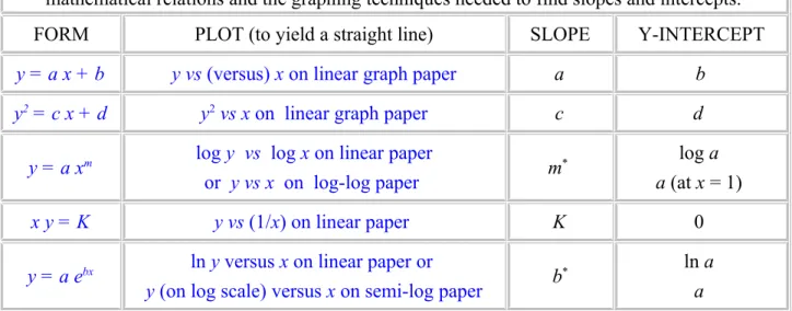
Table 1. Different graphs for different functions. This summarizes some of the most common mathematical relations and the graphing techniques needed to find slopes and intercepts.
FORM PLOT (to yield a straight line) SLOPE Y-INTERCEPT
y = a x + b y vs (versus) x on linear graph paper a b
y2 = c x + d y2 vs x on linear graph paper c d
y = a xm log y vs log x on linear paper
or y vs x on log-log paper m* log a a (at x = 1)
x y = K y vs (1/x) on linear paper K 0
y = a ebx ln y versus x on linear paper or
y (on log scale) versus x on semi-log paper b* ln a a
* Special techniques are needed when using logarithmic graph paper. These will be discussed in a later section.
4. Straight line graphs on linear graph paper.
Suppose that we have plotted a graph with Y on the ordinate and X on the abscissa and the result is a straight line. We know that the general equation for a straight line is
Y = M X + B where M is the slope and B is the intercept on the Y-axis (or Y-intercept).
The capital forms of Y and X are chosen to represent any arbitrary variables we choose to plot. For example we may choose to plot position, x, on the Y-axis versus mass, m, on the X-axis, so we need different symbols for our general case. Refer to Figure 4 to see what is being done.
We choose two points, (X1,Y1) and (X2,Y2), from the straight line that are not data points and that lie near opposite ends of the line so that a precise slope can be calculated. (Y2-Y1) is called the rise of the line, while (X2-X1) is the run. The slope is
Eq. 1
Slope has units and these must be included in your answer!
The point where the line crosses the vertical axis is called the intercept (or the Y-intercept). The intercept has the same units as the vertical axis. The equation of the straight line with Y on the vertical axis and X on the horizontal axis is
Eq. 2
The line can be extended to cross the horizontal axis as well. The value of X where this happens is called the X-intercept, with the same units as variable X, and will be used only rarely.
If the line goes directly through the origin, with intercepts of zero, we say that Y is directly proportional to X. The word proportional implies that not only is there a linear (straight line) relation between Y and X, but also that the intercept is zero.
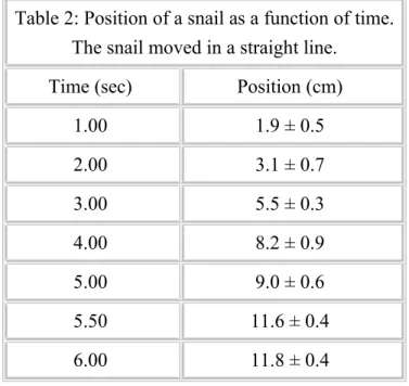
Consider the data in Table 2 which are plotted in Figure 5 . The points are carefully plotted (see the next section for the explanation of the bars on the data points), and we see that the points do not fit perfectly a straight line. Since we expect some uncertainties in the measurements, this is not surprising.
The solid line drawn on the graph is the "best" fit to the data. Each person could have a different line for the best fit.
Table 2: Position of a snail as a function of time.
The snail moved in a straight line.
Time (sec) Position (cm)
1.00 1.9 ± 0.5
2.00 3.1 ± 0.7
3.00 5.5 ± 0.3
4.00 8.2 ± 0.9
5.00 9.0 ± 0.6
5.50 11.6 ± 0.4
6.00 11.8 ± 0.4
The horizontal and vertical dashed lines show points chosen to determine the slope. Notice that they are far apart, spanning the graph. The rise and run are determined and the slope is calculated as
.
The intercept is read from the intersection of the line with the vertical axis and is Intercept = - 0.68 cm.
Thus the line is
Position = (2.09 cm/s) Time - (0.68 cm)
It is good practice to check that this equation is correct by picking a time and seeing if the equation predicts the correct position. If I choose a time of 4.5 sec the equation predicts a position of 8.72 cm and the graph shows a position of 8.75 cm. The equation seems to be correct.
Figure 5(a) The hand drawn graph has been reduced from its original size.
Figure 5(b) This graph was done in Excel 98 on a Macintosh computer. Instructions on how to make this plot in Excel are included in the download. Download Excel 98 Source. (should work on WINTEL or MAC)
5. Uncertainties and Graphs: Error Bars
(a) Error Bars
Data that you plot on a graph will have experimental uncertainties. These are shown on a graph with error bars, and used to find uncertainties in the slope and intercept. In this discussion we will describe simple means for finding uncertainties in slope and intercept; a full statistical discussion would begin with "Least Squares Fitting."
Consider a point with coordinates X ± ΔX and Y ± ΔY.
(1) Plot a point, circled, at the point (X,Y).
(2) Draw lines from the circle to X + ΔX, X - ΔX, Y + ΔY, and Y - ΔY and put bars on the lines, as shown in Figure 6(a). These are called error bars.
(3) The true value of the point is likely to lie somewhere in the oval whose dimension is two deviations, i.e. twice the size of the error bars.
The oval shown in Figure 6(c) shows the uncertainty region (at 95% confidence--this is statistics speak). It is not usually drawn on graphs.
Often the error bars may be visible only for the ordinate (vertical), as Figure 6(b).
Draw the best error bars that you can! If they cannot be seen, make a note to that effect on the graph.
(b) Uncertainties in Slope and Intercept Using Error Bars
Once the graph is drawn and the slope and intercept are determined we wish to find uncertainties in the slope and intercept. Refer to Table 2 and Figure 5(a) to see the procedure.
A. To find the uncertainties in the slope:
(1) Data are plotted on this graph with error bars shown. The uncertainty in time is so small that no horizontal error bars are visible.
(2) A solid line is shown which best fits the data and has a slope of (2.09 cm/s) and a Y- intercept of (- 0.68 cm) (on the vertical axis).
(3) Using the error bars as a guide we have drawn dashed lines which conceivably fit the data, although they are too steep or too shallow to be considered best fits. This is a judgment call on your part.
(4) The slopes of the dashed lines are 2.32 cm/s and 1.79 cm/s.
(5) Half the difference of these is 0.27 cm/s which we take as the uncertainty in the slope of the best line.
(6) We round off the uncertainty to the proper number of significant figures, and round the slope to match, resulting in
slope = (2.1 ± 0.3) cm/s .
(7) The differences between the best slope and either of the extreme slopes should equal the uncertainty in the slope. Here the differences are (2.09 - 1.79) = 0.30 cm/s and (2.32 - 2.09)
= 0.23 cm/s, which are basically the same as the ± 0.3 cm/s above.
B. Determining the uncertainty in the intercept:
(1) We try to make the three lines cross in the middle of our data. If we draw them this way we can determine the uncertainty in the intercept.
(2) The dashed lines have intercepts of -1.52 cm and +0.20 cm and
(3) The half of the difference between these is 0.86 cm which we use as the uncertainty in the intercept.
Intercept = (-0.7 ± 0.9) cm.
C. It is more difficult to do this on the computer graph:
But we can try as is suggested on Figure 5(b). On the Excel download I show lines and calculations resulting in an uncertainty in slope of +/- 0.4 cm/s and uncertainty in intercept of +/-1.2 cm. Also on the Excel spreadsheet I show a statistical analysis of the line resulting in a standard error of 0.13 cm/s in slope and 0.55 cm in intercept. Doubling these to get to 95%
confidence results in values close to what we get graphically.
(c) Uncertainties in Slope and Intercept When There Are No Error Bars
Even if we lack error bars we use the same approach to find the errors in slope and intercept.
Using this method it is possible to get good estimates of uncertainty in the slope and intercept.
Generally you will have less confidence in the intercept uncertainty.
(d) What is being done in statistical terms
The process described in parts (b) and (c) above estimates the statistical procedure of finding standard errors in the slope and intercept. Statistics programs will allow this to be done
automatically (in Excel see the LINEST function). The values of uncertainties you get by visual estimation will be similar to the values obtained by a full regression analysis.
6. Logarithmic scales, log-log plots, and semi-log plots
If we have a graph in which we wish to plot the logarithm of a value we can save time by using special graph paper. Semi-log paper has a logarithmic scale on one axis and a linear scale on the other; log-log paper has logarithmic scales on both axes.
The logarithmic scale has numbers (1,2,3 ... 9) printed on the axis. These numbers are spaced in proportion to the logarithms of the numbers. A cycle refers to one complete set of numbers from 1 to 10. We can have several cycles along one axis. It is important to purchase paper with the correct number of cycles for your application. Table 3 has a possible 2-cycle axis. (Some points are omitted for brevity.)
Table 3. The basic idea of a logarithmic scale is to space the points according to the logarithm of the value to be plotted. The paper is doing the logarithms implicitly, but is labeling the points with the
original values.
Number 1 2 3 4 6 8 10 20 30 40 60 80 100
Log 0.00 0.30 0.48 0.60 0.79 0.90 1.00 1.30 1.48 1.60 1.79 1.90 2.00 Location of
mark (cm) 0.0 6.0 9.6 12.0 15.8 18.0 20.0 26.0 29.6 32.0 35.8 38.0 40.0 The numbers on the graph's log scale are marked 1, 2, 3 ... 9, 1, 2, 3, ... 1: you must use these numbers, but you can choose the decimal point. Thus a two cycle scale could start at 0.001 and go to 0.1 or it could start at 10 and go to 1000. Finding a slope on a semi-log or log-log plot takes some care. You must not compute rise/run as you did for linear paper.
(a) Slopes and intercepts on log-log graph paper.
Suppose we have data which could match a theoretical curve Y = A XM. For a log-log plot the slope is the value of the exponent M, and is computed as
Eq. 3
On a log-log plot the slope, M, has no units. Either common (base 10) or natural logs can be used and give the same value of slope. The intercept, A, on a log-log plot is taken to be at the point where the horizontal variable has a value of 1. The value is read directly from the scale for the vertical axis. The units for the intercept are derived by looking at the form of the equation, Y = A XM, as is shown in the next example.
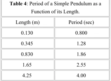
The data in Table 4 are plotted on Figure 7, with the slope calculation shown on the Figure 7(a).
The slope here is 0.45 which is close to 1/2 meaning that the power may represent a square root.
Table 4: Period of a Simple Pendulum as a Function of its Length.
Length (m) Period (sec)
0.130 0.800
0.345 1.28
0.830 1.86
1.65 2.55
4.25 4.00
8.90 5.50
The intercept in Figure 7 is 2.06. The units are derived by looking at the form of the equation, Y = A XM. Since Y (which really is T) has units of seconds and X (which really is L) has units of meters and the power M is a square root, the intercept is 2.06 s m-1/2. The equation is then
.
We check this by picking a length of L = 3.0 m and predict a period of T = 3.57 sec which agrees fairly closely with the value on the graph of 3.45 sec. The agreement would be closer if we used the exponent of 0.45 rather than the square root.
Figure 7(a) The hand drawn graph has been reduced to 90% of its original size.
Figure 7(b) This graph was done in Excel 98 on a Macintosh computer. Instructions on how to make this plot in Excel are included in the download. Download Excel 98 Source.
(b) Slope and intercept for semi-log graph.
Suppose we expect our data to match a theoretical curve Y = A eM X. The slope, M, on a semi-log plot is computed by
Eq. 4
The slope, M, on a semi-log plot has units which are the inverse of the units on the X-axis. Natural logs must be used here. The intercept, A, is the value where the line intersects the vertical axis at X
= 0. It has the units of Y.
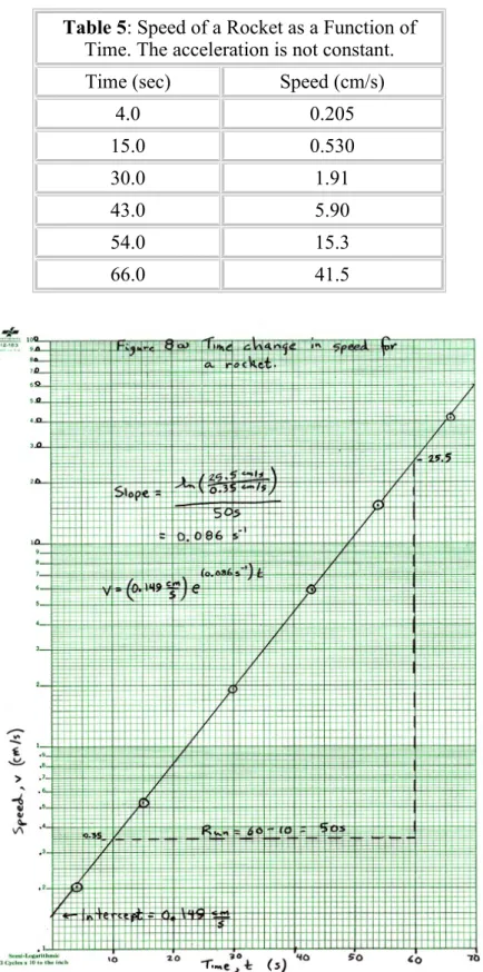
An example of a semi-log plot are the data in Table 5 which are plotted on Figure 8. The slope is found to be 0.0854 s-1and the intercept is found to be 0.150 cm/sec, as shown Figure 8(a). The equation for the rocket speed is then
We can check this equation by choosing a time, say 40.0 sec, and predicting the speed. The prediction is 4.57 cm/sec which agrees with the result on the graph of 4.60 cm/s.
Table 5: Speed of a Rocket as a Function of Time. The acceleration is not constant.
Time (sec) Speed (cm/s)
4.0 0.205
15.0 0.530
30.0 1.91
43.0 5.90
54.0 15.3
66.0 41.5
Figure 8(a) The hand drawn graph has been reduced from its original size.
Figure 8(b) This graph was done in Excel 98 on a Macintosh computer. Instructions on how to make this plot in Excel are included in the download.Download Excel 98 source.
7. Examples of bad graphs
It is instructive to look at graphs that have mistakes. Look at each of the following graphs and determine the mistakes in them. There are usually several mistakes on each graph.
(a) Here is a linear graph on the computer. Find 7 mistakes. Here is what I found.
Problems in this linear graph.
1. The graph should occupy most of a sheet of paper. This is too small.
2. A better title is needed. It should be written in words and should explain the significance of what is plotted, not just repeat the axis labels.
3. The title here says v versus t, but what is plotted is t versus v.
4. Axis labels should have the name of the variable in words, not just symbols, and the unit inside parentheses. For example, "Time, t (s)."
5. There should be gridlines to make it easy to read data from the graph.
6. On the velocity axis, the data run from 100 to 130, so the velocity axis can start at 100. The 0 does not need to be on the graph.
7. A line should be fit to the data, and its equation given. Under "Chart" choose "Add trendline",
"Linear", and "Options-Display Equation". Once the line is in place you can edit it to insert the correct variable symbols and units.
Below is a corrected version of the graph.
(b) Here is a hand-drawn linear graph. Can you find10 mistakes? Here is what I found.
Problems with this linear graph shown in the below figure:
1. The title is very poor. It should be in words and explain what is being plotted.
2. The axis labels should have the quantity in words, for example, "Position, x (cm)."
3. The label on the vertical axis is reversed from the orientation it should have.
4. The axis should have tick marks indicating the major and minor divisions.
5. The horizontal scale is poorly chosen, with 20 squares = 0.7 sec. This makes it very hard to plot a point at 1.32 s, for example.
6. Data points should be small dots surrounded by a circle.
7. A ruler should be used to fit a line to the data.
8. Use widely separated points in order to calculate a slope.
9. Slope and intercept should have units.
10. The equation should use the symbols used for the axes, and should have units included. So write
"x = (4.0 cm/s) t + (0.3 cm)."
A corrected version of this graph is below.
A corrected version of this graph is below.
(c) Here is another computer drawn linear graph with problems. Can you find 7 mistakes? Here is my answer.
Corrections to this graph:
1. The figure is too small!
2. A much better title is needed.
3. The axes should be labeled with name and units.
4. A linear fit should be made to the data, not "connect the dots."
5. Gridlines should be on both axes, and should be finely spaced.
6. Bill Gates likes to have the plot area shaded gray. This is not the normal scientific procedure which leaves the area white.
7. The equation of the fit should be on the graph.
Here is an improvement.
(d) Here is a poor log-log graph on a computer. Can you find 7 mistakes? Here is my answer.
7 Mistakes in a Log-Log plot
1. The graph is too small.
2. A better title is needed.
3. Axis labels should include the name of the quantity and its units.
4. Minor gridlines should be shown as well as major gridlines.
5. Axis labels should be at the left or bottom of the graph. To do this, double click on the axis, use the "Patterns" and make "Tick Mark Labels Low".
6. The vertical axis can start at 10, not 1. To do this double click on the axis, and on "Scale" make
"Minimum 10".
7. Fit the data with a line and display its equation. This is done by "Chart", "Add Trendline",
"Power" and the "Options", "Display equation".
The following is a better graph.
(e) Here is a poor semi-log graph. Can you find 8 mistakes? Here is my answer.
Fixing a poor semi-log plot
1. Every graph needs a title.
2. Axes should be labeled with words and units, for example "Pressure, P (Torr)."
3. The vertical axis should be rotated counterclockwise by 90 degrees.
4. You should have tick marks on the horizontal axis.
5. The horizontal axis has a mistake, it is missing "30": 10, 20, 40, 50, 60!
6. A logarithmic scale is set up already with numbers next to the tick marks. You cannot change these numbers, you can only move the decimal point on them. I really screwed this up here!
7. You do not compute rise on a log scale. Instead use the methods described in the manual to find slope.
8. The equation of the line should appear on the graph.
Below is my fix to this graph.
(f) Here is a bad semi-log on a computer. Can you find 6 mistakes? Here is my answer.
A bad computer drawn semi-log plot.
1. The graph is too small.
2. There should be minor gridlines more closely spaced.
3. There should be a good title.
4. Axes should be labeled with name of quantity and unit, for example, "Pressure, P (Torr)."
5. The horizontal axis label should be at the bottom. Do this by double clicking on the axis, and choosing "Patterns", "Tick Mark Labels Low".
6. Fit the data with a line. Do this by "Chart", "Add trendline exponential", then "Options", "Display equation on chart." The equation will use y and x as variables, and have no units. You can edit this equation to include units and proper symbols.
Here is a corrected version.
8. Glossary
Abscissa The horizontal axis. Usually the independent variable is plotted on the abscissa. See ordinate.
Axis Label Each axis is labeled with the name of the variable, possibly the symbol of the variable, and the units.
Dependent Variable
The variable which we do not control, but only measure. Normally it is plotted on the vertical or ordinate. See independent variable.
Directly Proportional
A linear relationship with an intercept of zero. A graph of a linear relationship passes through the origin.
Error Bars Vertical and/or horizontal marks indicating the possible range of values in a graph point. Usually one standard deviation long.
Graph Paper
Finely divided grid on which graphs can be drawn. Typically 10 squares to the inch, 20 squares to the inch, or 10 squares to the centimeter. Other types of graph paper exist. See quadrille paper.
Independent The variable over which we have control. Normally it is plotted on the horizontal or
Variable abscissa.
Intercept
For linear or semi-log graphs, the value of the ordinate (vertical) coordinate of a graph when the abscissa (horizontal) is zero. For log-log graphs, the value of the ordinate when the abscissa equals 1. It is also called the Y-intercept. It has the units of the ordinate. See slope, X-intercept, Y-intercept.
Log-Log Paper
Both axes are logarithmic scales. The divisions are marked on the paper and cannot be changed except to move the decimal point (tick mark 2 can be 0.02, 0.2, 2, 20, etc.) Special techniques are used to find slope and intercept.
Ordinate The vertical axis. Usually the dependent variable is plotted on the ordinate. See abscissa.
Quadrille Paper Usually a coarse grid (4 squares to the inch) useful for making engineering drawings, but not suitable for graphs. See graph paper.
Rise The difference in the vertical coordinates of two points used to find the slope. The points should be far apart. See run.
Run The difference in the horizontal coordinates of two points used to find the slope.
The points should be far apart. See rise.
Scale The choice of how many graph paper squares will represent 1 unit of the data. To allow easy reading of the graph choose 1 unit = 2, 5, or 10 squares.
Semi-Log Paper
Graph paper with one axis (usually the horizontal) that is linear and one (usually vertical) that is logarithmic. The divisions on the log scale are marked and cannot be changed except to move the decimal point. Special techniques are used to find slope and intercept.
Slope
The quantity M in the straight line equation Y = MX+B, it equals Rise/Run and usually has units. See intercept. Special techniques are used to find slope and intercept on graphs with log scales.
Tick Marks Marks that extend into the margins of the graph paper to show exactly where the division label (number) is to be applied. See examples on graphs in this manual.
Title The title of a graph should include a Figure number, and useful information about what is being plotted. It should not just repeat the axis labels.
X-Intercept
For linear or semi-log graphs, the value of the abscissa (horizontal) coordinate of a graph when the ordinate (vertical) is zero. For log-log graphs, the value of the abscissa when the ordinate equals 1. It has the units of the abscissa. See slope, Intercept, Y-intercept.
Y-Intercept Another name for the intercept. See the definition there. See slope, Intercept, Y- intercept.
Comments and corrections to Vern Lindberg