行政院國家科學委員會專題研究計畫 成果報告
創意圖像文字設計之情緒驅動研究 研究成果報告(精簡版)
計 畫 類 別 : 個別型
計 畫 編 號 : NSC 100-2410-H-011-030-
執 行 期 間 : 100 年 08 月 01 日至 101 年 07 月 31 日 執 行 單 位 : 國立臺灣科技大學工商業設計系
計 畫 主 持 人 : 王韋堯 共 同 主 持 人 : 李佳穎
計畫參與人員: 博士班研究生-兼任助理人員:陳盈君
報 告 附 件 : 國外研究心得報告
出席國際會議研究心得報告及發表論文
公 開 資 訊 : 本計畫可公開查詢
中 華 民 國 101 年 10 月 04 日
中 文 摘 要 : 本計畫針對「圖像文字設計」,探討其設計特徵對受測者情 緒之影響,並運用「事件相關電位 ERP」與「認知情緒問 卷」進行實驗調查,透過本計劃探查出生理腦電波對情緒認 知與創造力的反應波形,期許建立未來商業評測系統。研究 目的如下。
(1) 透過腦波實驗方式,研究圖像文字設計特徵對觀者「事 件相關電位 ERP」波段振幅的影響。
(2) 透過問卷實驗方式,研究圖像文字設計特徵對觀者「情 緒維度」的影響。
(3) 綜合探討圖像文字設計特徵之情緒與「創造力」的關 係。
不同圖像與文字的搭配設計,在意義傳達上有著相乘作用,
影響人們對宣傳物資訊的理解與情緒感受。透過專家小組討 論與腦波實驗調查,本研究發現圖字意義聯結性越高,能引 起受測者之越大「情緒、記憶」腦波振幅。意即設計與字義 聯結性高的圖像,易喚起觀者情緒,並進而對設計有所記 憶;就結構完整性來看,結構完整性越低,引起之「注意、
情緒」波段振幅越大。故設計師在設計圖像文字時,在替代 區塊上,選擇以筆劃(完整度低)的方式做替代,可引起觀 者注意並進而造成情緒喚起,成為設計的記憶點。本研究之 兩設計特徵「圖字意義聯結性」與「結構完整性」對情緒之 影響結果,有助於設計產業、未來商業評測系統與設計知識 跨領域的發展。
中文關鍵詞: 圖像文字設計、腦事件相關電位、情緒效價、喚起度 英 文 摘 要 : This project aimed at ’pictorial characters’ to
explore the emotional impacts of the subjects to the designed features by using ’event-related potential
(ERP)’ and ’questionnaire of cognitive emotion’
for experimental investigation. The response waveform of brain waves on emotional recognition and
creativities was prospected by the project and is expected to establish the future business evaluation system.
The purposes of this research are as following.
(1) To study the impact on the viewers’ band amplitude of ’event-related potentials ERP’ by pictorial characters features through the EEG experiments.
(2) To study the impact on the views’ ’emotional dimensions’ by pictorial characters
features to the viewers through experimental questionnaires.
(3) To discuss the relationship between the emotion of pictorial characters features
and ’creativity.’
The collocation of pictorial character design has multiplying effect during communication which changes people‘s understanding and emotional feelings to the promoted information. Through the expert group
discussion and brainwave experimental investigation, this study discovered that the subjects show
greater ’emotion and memory’ brainwave amplitudes when the association between the graphic and context is stronger. This means that the graphic with highly associated design and context can easily arouse the viewers‘ emotion so that they remember the design;
from the aspect of structural integrity, the lower the structural integrity the greater the ’attention, emotion’ amplitude is aroused. As the memory point of the design that attract viewers‘ attention and emotional evoke, the designer may choose the (low integrity) strokes as the alternative in the
alternative block. The research result of how the two design features of this study, ’graphic-context association’ and ’structural integrity’, affect emotion will contribute to the design industry, future commercial evaluation system and
interdisciplinarity of design knowledge development.
英文關鍵詞: pictorial characters, event-related potentials, affective valence, arousal
2
行政院國家科學委員會專題研究計畫成果報告
創意圖像文字設計之情緒驅動研究
A study of creative pictorial characters as emotion triggers
計畫編號:NSC 100-2410-H-011-030- 執行期限:100年 8月 1日至 101年 7月 31日
主持人:王韋堯 國立台灣科技大學工商設計系 共同主持人:李佳穎 中央研究院語言學研究所 計畫參與人員:陳盈君 國立台灣科技大學工商設計系
摘要
不同圖像與文字的搭配設計,在意義傳達上有 著相乘作用,影響人們對宣傳物資訊的理解與情緒 感受。透過專家小組討論與腦波實驗調查,本研究 發現圖字意義聯結性越高,能引起受測者之越大
「情緒、記憶」腦波振幅。意即設計與字義聯結性 高的圖像,易喚起觀者情緒,並進而對設計有所記 憶;就結構完整性來看,結構完整性越低,引起之
「注意、情緒」波段振幅越大。故設計師在設計圖 像文字時,在替代區塊上,選擇以筆劃(完整度低)
的方式做替代,可引起觀者注意並進而造成情緒喚 起,成為設計的記憶點。本研究之兩設計特徵「圖 字意義聯結性」與「結構完整性」對情緒之影響結 果,有助於設計產業、未來商業評測系統與設計知 識跨領域的發展。
關鍵詞:圖像文字設計、腦事件相關電位、情緒
Abstract
The collocation of pictorial character design has multiplying effect during communication which changes people's understanding and emotional feelings to the promoted information. Through the expert group discussion and brainwave experimental investigation, this study discovered that the subjects show greater "emotion and memory"
brainwave amplitudes when the association between the graphic and context is stronger.
This means that the graphic with highly associated design and context can easily
arouse the viewers' emotion so that they remember the design; from the aspect of structural integrity, the lower the structural integrity the greater the "attention, emotion"
amplitude is aroused. As the memory point of the design that attract viewers' attention and emotional evoke, the designer may choose the (low integrity) strokes as the alternative in the alternative block. The research result of how the two design features of this study,
"graphic-context association" and "structural integrity", affect emotion will contribute to the design industry, future commercial evaluation system and interdisciplinarity of design knowledge development.
Keywords: pictorial character design, event-related potential (ERP), emotion.
一、前言
文字為設計宣傳最佳利器,因其在資訊傳遞上 優於其他設計元素(文字>造型>圖形>色彩)
(陳新華, 2008; 顏鎮榮, 1998)。現今平面設 計的文字呈現更是以強烈視覺效果及強化品 牌形象為最終設計目標,表現方式以商標、品 牌、標準字 為重(周穆謙 & 王韋堯, 2007; 陳 俊宏 & 姚村雄, 2001; 鄧成連, 1990)。文字 中融入圖像所構成之「圖像文字」,意義傳達 上更有相乘作用(丘永福, 2005; 陳宥升, 2004;
蘇宗雄, 1985)。藉由不同圖像的搭配設計,
文字可引發多種變化的創意思考,形成強烈視 覺或品牌形象之魅力。
3 目前文字中的部首具有象形字之特徵,顯
示中文字結構與造形中,文字與圖像之間有極 大的可替換性存在(顏鎮榮, 1998)。文字是
「讀的符號」,為理性與客觀的傳達,圖像是
「看的形體」,為感性與主觀的表達(陳宥升, 2004)。故結合圖像與文字的圖像文字設計,
更能表達出趣味性與設計師情感,達到豐富傳 達內容的需求(李尉郎,2004)。運用圖像文 字設計可強化品牌的個性、形象,產生愉悅 感,引起人們正面情緒,提高宣傳效益,使理 性的閱讀轉為情緒性的欣賞行為。基此,透過 收集圖像文字樣本,了解圖像文字設計特徵,
為本研究目的一。
本研究操作創意圖像文字設計特徵,探討 其對受測者情緒之影響,應用腦波實驗及情緒 維度認知問卷調查,綜合探討觀者「腦波」與
「情緒維度」關係,目的在探討創意圖像文字 設計影響腦波波段振幅與情緒類型之關係模 式,為本研究目的之二。
二、名詞定義
本研究之圖像文字(pictorial characters),
即藉由圖像之設計將文字部分區塊特徵替代 的設計手法,即「圖像設計」與「替換區塊」
交互搭配而形成之視覺設計,藉以添加其趣味 及意境。並針對圖像設計的部分提出「圖字意 義聯結性」的設計特徵;替換區塊的部分則提 出「結構完整性」的設計特徵。
本 研 究 採 用 「 自 然 觀 察 法 ( naturalistic observation method)」,並藉由「立意抽樣
(purposive sampling)」選定樣本,記錄台北 市東區之百貨超市及零售超級市場(Breeze Super、Sogo復興館city'super、Sogo忠孝館生 鮮超市、頂好Welcome忠孝店、新光三越台北 信義新天地生鮮超市)、與街頭店家之招牌、
商品包裝、與商業行銷用途之平面廣告印刷 品,目的在於廣泛了解創意圖像文字運用之範 圍與現況,以便分析其對於圖像之運用。觀察 過程以數位相機記錄相關圖像文字,共計105 個樣本。本研究召集6位具備設計及相關知識 背景與實務經驗專家進行樣本分析。依據文獻 探討與樣本設計特徵調查,將創意圖像文字設
計之圖字意義聯結性,量化成「高度聯結」、
「中度聯結」與「低度聯結」三種程度;將圖 像文字設計之結構完整性,量化成「筆劃」、
「輪廓」、「部件」三種不同程度,針對105 個樣本進行圖像文字之設計特徵分析、分類,
作為本研究探討「圖字意義聯結性」的變數設 計。
2.1 圖字意義聯結性的分類
在本研究中,「圖字意義聯結性」表示創 意圖像文字設計中,所設計之圖像意義與字義 間的聯結性。依據文獻探討與樣本設計特徵調 查,將圖像文字設計之圖字意義聯結性,量化 成「高度聯結」、「中度聯結」與「低度聯結」
三種不同程度。其結果顯示:樣本數量中以「高 度聯結」為最多,占38.1%,其次為「低度聯 結」(30.5%)和「中度聯結」(31.4%)。顯 示圖像文字設計偏好,除圖像意義與字義相同 之「高度聯結」外,可提供聯想產生新義之「中 度聯結」和「低度聯結」也常見於平面設計作 品。推論目前運用的設計手法不僅在增添整體 視覺感受,更是進一步希望創造出其獨特性,
進而運用不同的創意聯結,選用不同圖像做搭 配。
2.2 結構完整性分類
在本研究中,「結構完整性」表示創意圖 像文字設計中,被圖像替換之不同文字結構,
其構成字之完整性。透過文獻探討與樣本設計 特徵調查,將圖像文字設計之結構完整性,量 化成「筆劃」、「輪廓」、「部件」三種不同 程度。其結果顯示:在105個樣本中,「筆劃」
數量最多(51.5%),其次為「部件」(32.3%)
和「輪廓」(16.2%)。推論在圖像文字設計 中,「筆劃」所占整體文字比例較少,故圖像 在與文字搭配時,仍可清晰辨識其文字,不會 造成觀者在閱讀圖像文字時的困擾。
兩自變項交互作用在樣本上,以「筆劃」
搭配「高度聯結」、「中度聯結」、「低度聯 結」為數量的前三,推測圖像文字設計考量 上,是以文字易於辨識、閱讀為主,進而搭配 不同之圖像,為設計師偏好的方式。但其變化
4 性不高,相同或相似之文字,圖像常替換於相
同或相對之位置。
經數量統計後發現:焦點團體所提出之兩 自變項「圖字意義聯結性」與「結構完整性」
交互組合搭配,是具市場與價值性的。
三、腦波實驗
本研究欲瞭解在不同類型創意圖像文字 設計裡,消費者在「腦波」上的反應。本研究 是在實驗室進行實驗,每次以一位受測者進行 受測,將廣告樣本呈顯在電腦螢幕中,研究者 在一旁記錄受測的腦波資料。
3.1 腦波的實驗程序
研究者先為受測者穿戴帶好電極帽並連 接與測試好腦波收錄的儀器。而後開始進行實 驗程序的解說,當受測者完全清楚實驗流程則 開始進行實驗。在正式實驗時螢幕中會隨機出 現 18種圖像文字實驗樣本,每次實驗樣本出 現之前,畫面的正中央會先顯示 0.5秒的十字 符號,提醒受測者圖片即將出現,而每張實驗 樣本在實驗中會隨機出現16次,每次出現的時 間為3秒,共計腦波實驗時間為19分鐘。
3.2 實驗的腦波儀器
實驗設備為由美國 Neuroscan 公司研發 的 兩 個 系 統 : 「 生 理 訊 號 記 錄 系 統
( physiological data record system)」與「視 覺影像呈現系統(visual image displaysystem)」
的軟硬體實驗設備。「生理訊號記錄系統」的 設備有:電極帽( Quik-Cap)、放大器(Scan NuAmps Express)、電腦主機 1 / SCAN 4.3.3 軟 體。「視覺影像呈現系統」的設備有:電腦主 機 2 / STIM2 軟體、23吋液晶螢幕、鍵盤。
3.3 實驗室環境
本研究實驗場地為台灣科技大學之腦波 觀察實驗室,實驗室周圍無噪音干擾。受測者 以舒適的坐姿面對螢幕進行受測,螢幕置於 70公分高的桌面,調整螢幕中心位置於受測者 視線 10 – 20度間,距離受測者 60 - 70 公 分,使坐姿調整至最舒適的位置,讓受測者能
不費力的直視完整樣本畫面。室內溫度控制在 23 - 25℃,實驗進行過程中,受測者與研究人 員以布幕隔開,單獨於受測區進行實驗作答。
3.4 受測者
受測者為台灣科技大學工商業設計系設 計研究所碩士生,男性 7位與女性 7位,年齡 20-30歲,共計 14人。受測者視力矯正後達 0.8 以上,無色盲、視覺功能障礙、神經學上或認 知功能上的病史,受測者都為自願參加者,並 於接受實驗測試前確認受測者情緒狀態。
3.5 腦波的資料處理
每一位受試者實驗後得出的腦波數據,將 會使用 SCAN 4.3.3軟體進行資料的處理,其 程序如下: 1.去除眼電干擾( ocular artifact reduction ) 、 2. 分 段 ( epoching ) 、 3. 濾 波
(filtering)、4.基準線校正(baseline correct)、
5.去除干擾信號(artifact rejection)、6.平均
( average)、7.總平均(grand average)。最 後,將不同波段腦電位平均振幅的數據運用 SPSS 12.0統計軟體進行分析。
四、結果與討論
腦波實驗的結果採用 SPSS 12.0中文版 統計軟體,進行數據統計與分析。使用的統 計 方 法 為 描 述 統 計 分 析 ( descriptive statistics)、雙因子變異數分析( two-way ANOVA ) 與 杜 凱 氏 差 距 檢 定 ( Tukey’s HSD),以瞭解不同程度的「圖字意義聯結 性」與「結構完整性」對「腦波」影響。
4.1創意圖像文字設計的腦波分析
4.1.1 圖字意義聯結性的腦波分析 不同「圖字意義聯結性」對左、中、右腦 所 造 成 的 影 響 在 「 注 意 轉 情 緒 P200 」
(F=5.853,P=0.004<0.01)、「情緒(P300)」
(F=4.314,P=0.017<0.05)與「情緒轉記憶
(SW)」(F=8.231,P=0.001<0.001)波段有 顯著差異,經 Tukey’s HSD事後比較後發現:
「注意轉情緒 P200」時,圖字意義聯結性之
5 高度聯結>中度聯結、低度聯結;「情 緒(P300)」
時,高度聯 結>低度聯結;「情緒轉記憶(SW)」
時高度聯結>中度聯結、低度聯結,請見 表4.1。
不同圖字意義聯結性對「左、中、右腦」
電極所造成的影響在「情緒轉記憶(SW)」
(F=6.249,P=0.003<0.01)波段有顯著差異,
經Tukey’s HSD事後比較後發現:中央>左 腦、右腦。
達顯著性之不同圖字意義聯結性對額、
中、頂葉所造成的影響在「注意轉情緒(P200)」
(F=6.831,P=0.002<0.01)、「注意轉情緒
(N200)」(F=7.531,P=0.001<0.001)、「情 緒(P300)」(F=16.813,P=0.000<0.001)與
「 情 緒 轉 記 憶 ( SW ) 」 ( F=11.723 , P=0.000<0.001)波段有顯著差異,經Tukey’s HSD事後比較後發現:在P200、N200、P300、
SW時,圖字意義聯結性皆為高度聯結>中度 聯結、低度聯結。
不同圖字聯結對「額、中、頂葉」電極所 造成的影響在「注意轉情緒 P200」(F=8.912,
P=0.000<0.001)、「注意轉情緒(N200)」
(F=47.243,P=0.000<0.001)、「情緒(P300)」
(F=105.286,P=0.000<0.001)與「情緒轉記 憶(SW)」(F=23.952,P=0.000<0.001)波 段有顯著差異,經Tukey’s HSD事後比較後發 現: P200時,大腦區域之額葉、中葉>頂葉;
N200與P300波段時,頂葉>中間>額葉;SW 時,頂葉、中間>額葉。
由上述分析可得知,圖像文字設計之「圖 字意義聯結性」之聯結性越高,引起「情緒、
記憶」波段之振幅越大。過去相關研究指出,
P200為受到注意調節的階段,發生速度很早,
與早期的注意知覺有關(羅躍嘉, 黃宇霞,
2006),亦具情緒刺激的成分(黃宇霞、羅躍 嘉,2004)。而SW為情緒性的刺激資訊處理 階段,可能導致較佳的記憶形成(Dolcos &
Cabeza, 2002;Olofsson, Nordin, Sequeira, &
Polich, 2008),故設計師在設計圖像文字時,
在圖像的設計上,設計與字義聯結性高的圖 像,較易喚起觀者的情緒,進而對設計有所記 憶。
4.1.2 結構完整性的腦波分析
不同結構完整性(筆劃、輪廓、部件)對 左、中、右腦所造成的 影響在「注意(N100)」
(F=6.311,P=0.003<0.01)波段有顯著差異,
經Tukey’s HSD事後比較後發現:結構完整性 之筆劃>輪廓。對「左、中、右腦」電極所造 成的影響在「情緒轉記憶(SW)」(F=5.100,
P=0.008<0.01)波段有顯著差異,經Tukey’s HSD事後比較後發現:SW時,中央>左腦、
右腦,請見表4.1。
對額、中、頂葉電極ERP波段所造成的影 響 在 「 注 意 ( N100 ) 」 ( F=6.610 , P=0.002<0.01)、「情 緒(P300)」(F=4.552,
P=0.014<0.05)波段有顯著差異,經Tukey’s HSD事後比較後發現:N100時,結構完整性 之筆劃、部件>輪廓;P300時,筆劃>輪廓。
對「額、中、頂葉」電極所造成的影響在「注 意 轉 情 緒 ( P200 ) 」 ( F=8.035 , P=0.001<0.001)、「注意轉情緒(N200)」
( F=41.225 , P=0.000<0.001 ) 、 P300
( F=80.576 , P=0.000<0.001 ) 與 SW
(F=18.121,P=0.000<0.001)波段有顯著差 異,經Tukey’s HSD事後比較後發現:P200時,
額葉、中間>頂葉;N200與P300時,頂葉>
中間>額葉;SW時,中間、頂葉>額葉。
由上述分析可得知,圖像文字設計之結構 完整性(筆劃、輪廓、部件)越低,引起之 ERP 振幅越大。其引起之振幅為「注意、情緒」
波段;而在「注意」波段中, 完整性越高,
引起之 ERP 振幅也越大,故設計師在設計圖像 文字時,在替代區塊上,選擇以筆劃(完整度 低)、部件(完整度高)的方式做替代,可引 起觀者注意,唯筆劃之影響可進而造成情緒喚 起,成為設計的記憶點。
圖像文字設計(圖字意義聯結性與結構完 整性)在「記憶」歷程中,對大腦作用於中央 區域電極而無偏側效應。「P200」時,大腦「額 葉」、「中間」區域電極之活化作用大於「頂 葉」電極。「N200、P300、SW」時,「頂葉」
區域電極較為顯著,顯示隨著認知歷程,大腦 的活化由額葉轉移至頂葉。
6 隨認知歷程改變,圖像文字設計(圖字意
義聯結性與結構完整性)對於大腦的活化由額 葉電極轉移至頂葉電極。相關研究中,典型的 ERP 皆在頂葉的部分電極有最高的振幅結果
(Dolcos & Cabeza, 2002; Keli, et al., 2002;
Junghöfer, et al., 1983;吳佳穎,2008;胡劍鋒 等,2008;陳汶軍,2008),顯示不同刺激物 的的刺激下,可得到雷同之反應結果。
表 4.1 不同圖像文字設計之腦波分析
自變項 依變項 實驗結果
圖像文字設計 大腦區域 ERP 波段 圖像文字設計的關係 大腦區域
圖字意義聯結性
左、中、右腦
N100(90-150ms) ─ ─
P200(170-220ms) 高度 > 中度、低度
(4.45) (3.69) (3.60) ─
N200(220-250ms) ─ ─
P300(250-450ms) 高度 > 低度
(5.62) (4.52) ─
SW(450-700ms) 高度 > 中度、低度 (8.00) (6.89) (6.80)
中 > 左、右 (7.90) (6.92) (6.86)
額、中、頂葉
N100(90-150ms) ─ ─
P200(170-220ms) 高度 > 中度、低度 (4.45) (3.69) (3.61)
額、中 > 頂 (4.41) (4.30) (3.31) N200(220-250ms) 高度 > 中度、低度
(3.31) (2.38) (2.18)
頂 > 中 > 額 (4.27) (2.28) (1.31) P300(250-450ms) 高度 > 中度、低度
(5.62) (4.68) (4.52)
頂 > 中 > 額 (6.42)(4.94) (3.45) SW(450-700ms) 高度 > 中度、低度
(8.01) (6.89) (6.80)
頂、中 > 額 (7.49) (8.04) (6.17)
結構完整性
左、中、右腦
N100(90-150ms) 筆劃 > 輪廓
(1.27) (0.58) ─
P200(170-220ms) ─ ─
N200(220-250ms) ─ ─
P300(250-450ms) ─ ─
SW(450-700ms) ─ 中 > 左、右
(7.91) (6.93) (6.86)
額、中、頂葉
N100(90-150ms) 筆劃、部件 > 輪廓
(1.27) (1.07) (0.58) ─
P200(170-220ms) ─ 額、中 > 頂
(4.14) (4.30) (3.31)
N200(220-250ms) ─ 頂 > 中 > 額
(4.28) (2.28) (1.31) P300(250-450ms) 筆劃 > 輪廓
(5.33) (7.08)
頂 > 中 > 額 (6.42) (4.94) (3.45)
SW(450-700ms) ─ 頂、中 > 額
(7.49) (8.04) (6.17) 註:「>」代表兩者間有顯著差異;「─」代表無顯著差異;「括號( )」中代表平均數。
五、計畫成果自評
設計師設計圖像文字時,可參考與運用
「圖字意義聯結性」與「結構完整性」兩設 計特徵之影響結果:以圖字意義聯結性來 看,「高度聯結」的運用,可引起觀者 ERP「情 緒~記憶」波段振幅;就結構完整性來看,「筆
劃」的運用,可引起觀者 ERP「注意、情緒」
波段振幅;「部件」的運用,可引起觀者 ERP
「注意」波段振幅。現今的圖像文字的設計,
經文獻探討與焦點團體分析出其設計特徵:
圖字意義聯結性與結構完整性。筆劃與高度 聯結之收集樣本數量占兩設計特徵中的多 數。推論是因其數量上的結果,影響了觀者
7 對於設計特徵之創造力結果,數量上較少之
設計特徵因其新奇感及罕見之特性,形成差 異化而擁有較高的注意力,進而引發情緒並 形成記憶。
六、參考文獻
1. Dolcos, F., & Cabeza, R. (2002).
Event-related potentials of emotional memory: Encoding pleasant, unpleasant, and neutral pictures. Cognitive, Affective, &
Behavioral Neuroscience, 2(3), 52-263.
2. Junghofer, M., Bradley, M. M., Elbert, T.
R., & Lang, P. J. (2001). Fleeting images: a new look at early emotion discrimination.
Psychophysiology, 38, 175–178.
3. Keil, A., Bradley, M.M., Hauk,O., Rockstroh, B.,Elbert, T., & Lang, P. J.
(2002). Large-scale neural correlates of affective picture processing.
Psychophysiology, 39, 641–649.
4. Olofsson J. K., Nordin S., Sequeira H., &
Polich J. ( 2008 ) . Affective picture processing: An integrative review of ERP findings. Biological Psychology, 77, 247–265.
5. 丘永福 (2005)。字學。台北:藝風堂。
6. 吳佳穎 (2006)。包裝圖像文字之情緒維 度與腦事件相關電位研究. 國立台灣科 技大學,台北。
7. 李尉郎 (2004)。圖像文字中圖像意涵與 替換位置對視認性之影響. 國立臺灣科 技大學, 台北。
8. 周穆謙, & 王韋堯 (2007)。設計師與消費 者在食品包裝理解力傳達設計之認知差 異. 設計學報, 12(4), 21-42。
9. 胡劍鋒、熊建英、何科榮(2008)。應 用 neuroscan腦電紀錄系統評價概念相似漢 字與圖片加工的事件相關電位差異。中國 組織工程研究與臨床康復,12(30),
5896-5899。
10. 黃宇霞、羅躍嘉(2004)。情緒的ERP相 關成分與心境障礙的ERP變化。心理科學 發展,12(1),10-17。
11. 陳汶軍(2008)。包裝插畫喚起之情緒維 度與事件相關電位研究。國立台灣科技大 學設計研究所碩士論文。
12. 陳俊宏, & 姚村雄 (2001)。品牌文字造型 變化對消費者熟悉商品包裝之意象與識 別效果影響研究。台中技術學院商業設計 學報。
13. 陳宥升 (2004)。中英文美術字體設計。
台北:北星圖書公司。
14. 陳新華 (2008)。元素與原創:識別設計 能力基礎訓練。南京:江蘇美術出版社。
15. 鄧成連 (1990)。現代包裝設計三版。台 北:北星。
16. 顏鎮榮 (1998)。設計字法。臺北:全華 科技圖書。
17. 羅躍嘉, 黃宇霞 (2006)。情緒對認知加工 的影響:事件相關腦電位系列研究。心理 科學展。14(4),505-510.
18. 蘇宗雄 (1985)。文字造形與文字編排。
臺北:檸檬黃文化事業。
1
國科會補助專題研究計畫項下赴國外(或大陸地區)出差或研習心得報告
日期: 101 年 4 月 13 日
計畫編號 NSC 100 - 2410 - H - 011 - 030 - 計畫名稱 創意圖像文字設計之情緒驅動研究 出國人員
姓名
王韋堯 服務機構及職稱 國立臺灣科技大學 工商業設計系 出國時間 101 年 3 月 30 日至
101 年 4 月 3 日
出國地點 新加坡
一、國外(大陸)研究過程
此次參訪國立新加坡大學工業設計系 NUS Division of Industrial Design (NUSDID)歷程,說明如下。
1. 國立新加坡大學(National University of Singapore, NUS) 是新加坡歷史最悠久且最富聲望大 學。2012 年《泰晤士報高等教育特輯》(Times Higher Education)之“全球大學聲譽排行榜”
中名列第二十三名,於亞洲大學中名列第三。NUS 是一所重要的學術研究大學,擁有 14 個 國家級、16 個大學級以及 80 個學院級的研究所與研究中心。NUS 與國際知名院校如麻省 理工、哈佛、斯坦佛、約翰斯.哈普津等大學合辦專業項目。另分別與斯坦福大學、賓夕法 尼亞大學、復旦大學合作,設立了三所海外分校,再與荷蘭 Eindhoven 理工大學合作開設設 計科技碩士班,是新加坡首個工業設計研究生課程,其教學及研究與國際緊密接軌。
2. 甫自建築學院中獨立出來的工業設計系,成立於 1999 年,是新加坡第一個大學等級的工業 設計學程。學生表現獲得許多國際設計比賽大獎肯定,短短十年即名列 iF 前 30 名設計學校,
也曾負責參與策展德國 Red dot award 的相關展覽。國立新加坡大學工業設計系的 The Design Incubation Centre 為設計研究實驗室,又稱為 D.lab,探究與發展設計新工具,以找出設計實 務的新可能性。2005 年至今共發展 12 個設計專案、設計實驗室、大型設計活動、媒體,2010 年執行 5 個全年齡醫療、交通、教育等領域設計專案與 workshop,由於實行成效良好,不到
2
十年時間即成為新加坡國立大學的重點發展系所,2011 年則專注於品牌設計議題上,可見設 計實驗室之重要性。
3. 此次參訪國立新加坡大學工業設計系 NUS Division of Industrial Design (NUSDID),主為找尋 跨領域研究與產學合作之可能性,相似的文化背景,利於探索創意圖像文字設計之適用性,
以建立較完整之創意圖像文字庫。此外,藉鏡 NUSDID 之設計實驗室經驗,更能完善腦波認 知設計實驗室,以進一步建立華文情緒感知認知資料庫。
二、 研究成果
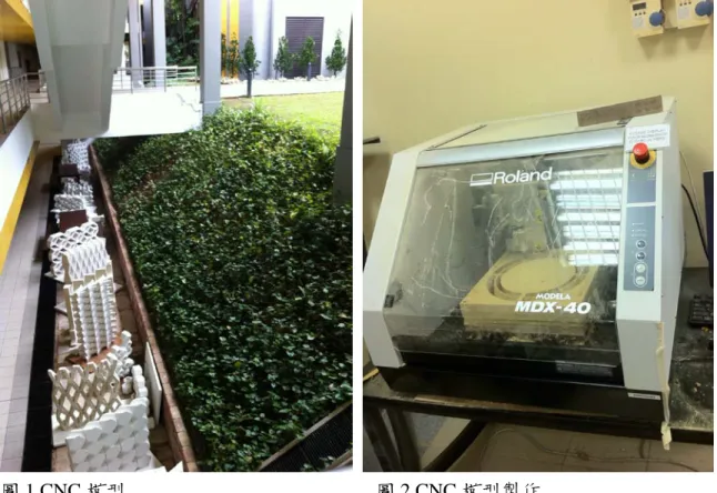
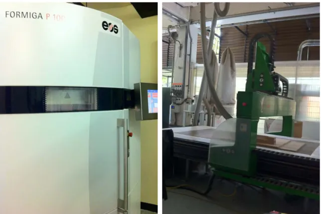
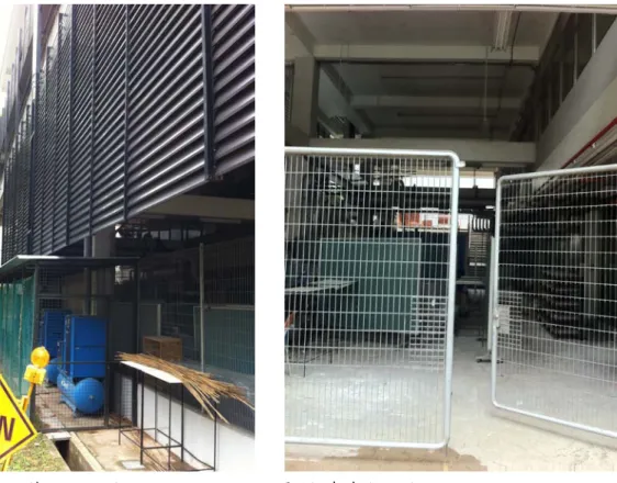
此次參訪國立新加坡大學工業設計系 NUS Division of Industrial Design (NUSDID) 之設計實驗 室,可借鏡之 NUSDID 實驗室設備照片與說明,如下。
圖 1.CNC 模型 圖 2.CNC 模型製作
3
圖 3.CNC 模型製作 2 圖 4. CNC 模型製作 3
圖 5.CNC 模型製作 4-可製作汽車模型 圖 6.大型切割機
4
圖 7.掃描投影機-即時掃描簡報時新增資料 圖 8.經濟型迷你 RP
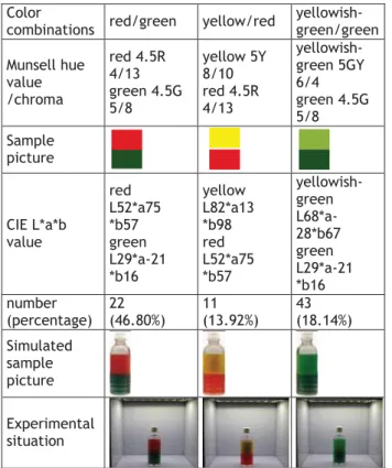
圖 9.噴漆室主機設置環境 圖 10.噴漆室環境
5
三、建議 無 四、其他
無
圖 11.12.13
符合歐盟環保噴漆室- 可噴等比例汽車模型
1
國科會補助專題研究計畫項下出席國際學術會議心得報告
日期:100年 1
1 月 9 日
一、參加會議經過
這次以腦波實驗結果投稿,參與設計領域兩年一度的重要研討會,實是難得經驗。
由於實驗所運用的腦波探測技術,與設計領域常見的研究探討方式不太相同。此次
研究結果證實,即使刺激物與探討主題不同,但人的大腦反應類似,故所獲得的研
究結果與相關腦波研究結果雷同,這讓兩位 reviewers 有著截然不同的意見與反
應,但仍獲准以口頭方式發表論文。上傳全文與註冊後,大會還會將同一場次的論
文 email 給與會發表者及主持人。此外,會議最後一天的參觀活動也會不斷 email
確認相關訊息,是個注重細節且盛大的國際設計研討會。此次參加幾位老師一同組 計畫編號 NSC 100-2410-H-011-030
計畫名稱 創意圖像文字設計之情緒驅動研究 出國人員
姓名 陳盈君
服務機構 及職稱
國立台灣科技大學工商業設計系 博士班二年級
會議時間
2011年10月31日 至
2011年11月4日
會議地點
荷蘭/歐洲/Delft
會議名稱
(中文)2011 年第四屆國際設計研究研討會
(英文)IASDR2011 4th World Conference on Design Research
發表論文 題目
(中文)色誘大腦之設計特徵探討
(英文)The Investigation of Design Features of Brainwaves
Induced by Colors
2
團的研討會團至荷蘭參與盛會,由於單趟飛行時間需要 17 小時,所以 10 月 29 日
即出發前往。到荷蘭的隔日晚上即參加大會第一個 SOCIAL EVENTS 的「Ice breaking
party」,隔天即展開連續三日的研討會議程。其後三個 social events「Opening
session」、「Conference dinner buffet & dance」、「Closing session」分別穿插
於每日議程中,最後一日為「Design research meets industry」參觀荷蘭設計公
司。會議結束隔日即搭機返台。
二、與會心得
此次是第二次出國參與國際設計研討會。由於有上一次法國 KEER2010 經驗,這次
較清楚如何在 15 分鐘內傳達論文重點。此外,也很期待能再度體會國際研討會的
討論研究議題氛圍。由於此次完全參與大會的 KEYNOTES 演講與 SOCIAL EVENTS,所
以除了了解近年設計研究傾向與大師看法外,更能藉由這些活動進一步認識設計研
究者,並進一步交流、討論。
今年大會特地開闢「設計期刊」與「設計教育」兩個特別的議程,讓與會的教
授與學生,能針對所參與的主題,提出相關問題,例如,我參加的是「設計期刊」
此議程,除了 Design studies, International Journal of Design, The Design
Journal, Empirical Studies of the Arts, and the International Journal of
Design, CoDesign 以及 Journal of Engineering Design 的主編到現場說明各設計
期刊的標準與目前狀況(排名) 外,也回應在場學者提出的問題,例如 Don
Norman(情感設計:我們為何喜歡(或討厭)日常用品之作者)提出,若非身為學會的
一員,例如他本人,即使在大學教授設計二十年,也完全無管道接觸到「Design
3
Studies」等排名第一的設計研究期刊論文,但他很喜歡排名第 9、完全採取線上開
放論文的「International Journal of Design」期刊,因此建議這些大期刊能考
慮開放。由於這議題牽扯到期刊經營的困境,但不可否認開放論文是種趨勢,因此
這也讓期刊主編們花了些時間討論,也納入之後的可能方案中。
此次研討會針對 Design & emotion、Design education、Design methods &
tools、Design & usability、Design activity、Co-design、Design case studies、
Sustainable design、Design theory 等主要設計議題分別討論外,另就近年新興
的設計議題 ,例如,Service design、Design & culture、Design research approach、
Universal design、Design management、Design & aesthetics、Design thinking、
Design history 開闢專區討論。其中「Design & emotion」開闢了 8 次議程,其次
是 7 次議程的「Design education」,可見這兩項是目前活躍與主要的設計研究議
題。也的確,在參與的論文發表場次中,「Design & emotion」是我期待聆聽與收
獲較多的論文發表主題。
三、考察參觀活動(無是項活動者略)
「DELFT AND THE HAGUE PROGRAMME」共參觀三間荷蘭設計公司,包含「Fabrique」、
「Q42」、「Muzus」,除了「Q42」是工程師為主的設計顧問團隊,「Fabrique」與「Muzus」
皆是除了提供工業設計或商業設計專業服務外,另運用了設計研究的精神與手法,
替客戶提供設計策略與服務設計。與國內產業不同的是,荷蘭的商家尊重與接受設
計的專業,設計服務者提供自己當時的畢生絕學,因此彼此信賴產生正向連結與循
環,創造雙贏局面,例如「Fabrique」與「GIANT」。此外,荷蘭的設計教育強調人
4
性與設計思考,如此鼓勵與培育擁有獨立具洞見的設計師,傾向以研究、人文與文
化為骨、美學為肉地提出設計建議,甚至設計策略、公司經營策略等,值得我們借
鏡與檢討學習。
四、建議
此次參加最大的心得是,歐美學者皆注重議題討論與提問回饋,越是有趣的議題,
提問與討論的人數越多,即使那是 Keynote 演講,也想舉手表達自己的想法與問題,
而台上的學者也很樂於回答所有的問題,即便有些問題答案無法立刻提供。這樣與
國內迥異的研討會氛圍,或許是我們也可以努力營造與經營的,相信對國內研究的
深廣度,皆有所助益。
五、攜回資料名稱及內容
包含此次會議之發表者名牌、發表相關注意事項、日程議程、論文集光碟、IASDR 2011
International Conference 大會專刊、樓層介紹、修改時間的場次。此外有關 DRS
2012:BANGKOK-Design Research Society2012 International Conference 會議活
動相關日期及 Call for paper and Workshops 時間表。
六、其他
荷蘭是注重生命與思想開放、前衛的國度,接受與尊重各種不同的生命體與職業,
一個真正實現「職業不分貴賤」的國家。例如「紅燈區」的設立,在回國班機上的
報紙,正好刊登相關議題,在台灣,應該沒人願意住在「紅燈區」的附近,更何況
是樓上。然而,荷蘭人尊重各樣職業,因此紅燈區不准攝影,但常見一樓是紅燈區
的櫥窗女郎,二樓以上是一般住家。我想,各國的風俗民情與文化不同,所以價值
5
觀不同,也相對的開放程度不同。若我們想學習某些好的價值觀,真的得從教育著
手,才能打造更寬闊開放的社會。此外,荷蘭也是個執法嚴厲的國家,火車查票可
一次動用八個警察堵住一節車廂各出口,抓到罰 10 倍票價。這也是我們向來重情
凌駕理法的國度所辦不到的,也或許,我們做我們自己就好,才具特色。
IASDR2011 Keynote speech 集錦
其他荷蘭觀察照片集錦
Ivy Chen <[email protected]>
1 message
IASDR 2011 <[email protected]> Tue, Aug 2, 2011 at 2:51 PM
Reply-To: [email protected] To: [email protected]
Dear Ying-Chun Chen,
We are pleased to inform you that your paper (ID:67-"The Investigation of Design Features of Brainwaves Induced by Colors") is accepted for an oral presentation at IASDR 2011. Please complete the following two requests to help us produce the proceedings and the book of abstracts. The deadline for submitting your final paper is 2 September.
## Request 1. Prepare and upload the final version of your paper in the conference management system.
Below you will find remarks by the reviewers and review committee. Please address these remarks in the final version of your paper.
Do not forget to add the personal information (name(s), affiliation(s) and email address of the contact author), which was removed for the review process.
The size of the paper should be 4-12 pages in the conference template. Papers must be formatted as pdf files.
The template for submissions can be found on the website (URL = http://www.iasdr2011.org/?id=2&sub=4).
Instructions for uploading your submission are also shown there.
Once your final version is ready, please access the Upload File page (URL =http://140.118.10.117/
openconf/author/upload.php) to upload the PDF file. To confirm if the file was successfully uploaded, please open the View File page (URL =http://140.118.10.117/openconf/author/paper.php) to check if you can open the file. If you want to update your file, please upload it again. Then, the previous file will be automatically replaced with the new one.
## Request 2. Re-edit the abstract of your paper.
After you have uploaded the final version of your paper, please access the Edit Submission page (URL
=http://140.118.10.117/openconf/author/edit.php) to update your submission data (Title, Abstract, Keywords, and Author’s Information). The abstract in the submission form will be published in a book of abstracts. Please re-edit this abstract carefully when updating your data. This abstract may be longer than the abstract in the paper but no more than 250 words.
For more information please refer to the conference website under "instructions for submissions" (URL = http://www.iasdr2011.org/?id=2&sub=4).
If you have any problems with uploading your paper please contact Dr. Yaliang Chuang
Finally, we are pleased to inform you that the registration for the conference is now open, so you can start to organize your travel.
Thank you for presenting your work at IASDR2011. We wish you a wonderful experience in Delft.
Sincerely,
Norbert Roozenburg Lin-Lin Chen
Conference Chair Chair Review Committee
***************************************************************
In this experimental study, the results indicated the red/green combination was most positively responded in the area of aesthetic response. Since EEG cannot clearly isolate specific brain activities, effects of association from
Gmail - [IASDR 2011] Your paper is accepted for an oral presentation!... https://mail.google.com/mail/?ui=2&ik=de6f5e41cb&view=pt&search=...
1/2 2011/08/02 下午 10:30
the existing experiences cannot be eliminated. How can you tell that result is not effected by subjects' former experience with existing bottle design? The paper does not specify what types of beverage.
in the statement "red/green combination can catch consumers’ attention more quickly, connect to sensory memory faster, produce designs with desires and memory, and contribute to the final buying action more easily,"
the late part "produce designs with desires and memory, and contribute to the final buying action more easily"
cannot be claimed by the experimental study.
***************************************************************
Very interesting paper; very thorough methodology and procedures.
This is a strong fundamental research; when the authors want to bring it to consumer design and consumer design research (applied design) is looses much of its interest since the findings (that red/green induces greater attention, and ultimately pushes sales more quickly) have been taught in design schools the world over for ages.
Perhaps they could emphasize how this information could help construct complex interactive experiences.
2 questions: Do the results of your research relate strictly to the red/green pair, or could they be expanded (in future studies) to all complementary coulours (colours at 180 degrees on the Munsell wheel)? And more significantly: How did you make sure that you were not accidentally reproducing the Liu (2010) experiment on foreground/background contrast? Looking at tables 1 & 3, it appears that the red/green combinations were always the darkest tonal pair, showing the strongest contrast with the white background. This could be a big issue. Please specify.
On the structure of the article: The discussion and conclusion are somewhat repetitive; some of the work cited in the discussion should have been presented earlier in the paper (before the methods); the english is sometimes difficult to understand (for example: "The results of this study clearly revealed colours, aesthetics brainwaves, and the activation of the brain, and found that:" is an incomplete sentence.)
Gmail - [IASDR 2011] Your paper is accepted for an oral presentation!... https://mail.google.com/mail/?ui=2&ik=de6f5e41cb&view=pt&search=...
2/2 2011/08/02 下午 10:30
///////////////////////////////////////////////////////////////////////////////////////////////////////////////////////////////////
THE INVESTIGATION OF DESIGN FEATURES OF BRAINWAVES INDUCED BY COLORS.
ġġ
ABSTRACT
The display design of experience-oriented retail stores strongly affects consumers’ emotions by lights, music, and colors. Colors can attract consumers’
attention and influence their preferences, expectation, and decision-making toward the products. The present study is to investigate the effects of different color temperatures of store display on aesthetic brainwaves. We control the display color temperature at 6500K with matched colors red/green, yellow/red, and yellowish-
green/green as the stimuli. Research findings showed that: (1) red/green combination induced greater aesthetic brainwave and attracted consumers’
attention, aroused their emotions, interests, and desires more quickly, which contributed to the final buying behavior (action); (2) parietal lobe is a reliable area for observing color-induced brain responses. The results revealed that colors induced aesthetic brainwaves and activated brain regions situations. It is hoped that it will be beneficial for the color design in commercial application and cross- disciplinary development.
Keywords: color combination, memory, P300.
INTRODUCTION
The package colors of the products in the market can attract consumers’ attention and influence the degree of their preferences and expectation, which contribute to buying behavior (Gstón & Rosires, 2010). Research has found that colors of objects help to define perception completely and adjust affective process related to trigger memories (Cano, Class, &
Polich, 2009). Attention- and color-related
brainwave research also indicated that detections of
associated targets resulted in aesthetic brainwaves (Polich, 2007; Wijers, Mulder, Okita, Mulder, &
Scheffers, 1989). Moreover, aesthetic brainwaves play important roles in synesthesia in terms of early stage of perceptions, late stage of attention or during the inhibition process (Gebuis, Nijboer, & Van Der Smagt, 2009). The present study was conducted to understand the relationships between color combinations and aesthetic brainwaves. The purpose of the study is to: (1) understand the effects of different color combinations on aesthetic brainwaves;
(2) to compare the relationships among different aesthetic brainwaves aroused by different color combinations. Also it takes aesthetic brainwaves as the index of changing attention, memory, and other psychological patterns to investigate the effects of different color combinations and to provide suggestions for application in commercial designs.
DEFINITION OF TERMS AESTHETIC BRAINWAVES
When the stimulus detections connect with memory processing, it will activate P300 components (Polich, 2007), the positive potential between 300 and 1000 milliseconds. This wave is related to visual stimuli (Carretie, Iglesias, Garcia, & Ballesteros, 1997) and is produced for processing attention and memory (Polich, 2007). The typical scalp distribution of P300 is across the central electrode area (Fz,Cz,Pz), the amplitude gradually increases from frontal lobe to parietal lobe (Polich, 2007). P300 is active in the right parietal lobe cortex, which dominates visual spatial ability and is related to the target stimulus evaluation. Research results have revealed that the attention networks from frontal lobe to parietal lobe are broader in the right hemisphere than the left one.
Therefore, compared with the left hemisphere or the
DIVERSITY AND UNITY
2 central area, the right hemisphere can activate
larger P300 amplitude (Polich, 2007). When the brain processes tasks related to spatial locations, the interactive connection of information from right hemisphere to left hemisphere is stronger (Simon- Dack, et al., 2009). Inductive reasoning and other visual-related cognitive tasks are closely related to the right hemisphere, so the original waveform is lateralized to the right hemisphere (Chen, et al., 2007; Schmidt-Kassow, Schubotz, & Kotz, 2009).
P300 as one of the ERP components has been widely investigated, which related to attention, recognition, decision-making, memory and other cognitive
abilities. It is the result of several brain areas working together, and is influenced by many factors like subjective probability, relevant tasks, the importance of stimuli, decision-making, the
confidence of decision-making, uncertainty of stimuli, attention, memory, affections and so on (Chen, et al., 2007; Gilmore, Clementz, & Berg, 2009; Olofsson, Nordin, Sequeira, & Polich, 2008; Polich, 2007;
Polich & Criado, 2006). When there are changes of stimuli, environment, the distribution of target attention, updates of the neural representation or memory, P300 will be aroused by the sensations (Polich, 2007) to construct the connection between attention and associative cortex storage (Chen, et al., 2007). The changes of stimuli attention and the need of basic memory processing affect the amplitude of P300. If the encoding of the stimuli successfully helps to store the memory which leads to the recovery of memory and cognition, the amplitude of P300 will increase (Polich, 2007). The present study defined P300 as the aesthetic brainwave to observe brain responses induced by colors.
METHODS PARTICIPANTS
The participants of this study were 12 right-handed undergraduate and graduate students, whose ages were from 18 to 23 years old (21.16 on average), of college of design in one university of science and technology in Taiwan, including 4 males and 8 females. Every participant should pass the red-green color vision defects test to make sure that he/she does not have visual deficiencies or if his/her eyesight is above 0.8 after correction. Only who
passed the test can participate in the experiment.
Forty-eight hours before the experiment, each participant stopped using stimuli such as caffeine, which will affects brainwaves, and avoided intense activities, in order to exclude other interference effects from brain wave records.
MATERIALS
According to the results of market observation, most convenience stores, supermarkets, and other retail stores display their products under 6500K color temperature lights (61.65%). These stores sell mainly juice, tea, water, energy drinks, soft drinks, coffee and so on, which were mostly in 1/3 (71.84%)aspect ration round-shaped PET bottles. According to observation, the colors of the PET bottles are mainly matched by two visual base colors. Research has indicated that when two colors of the same square measure putting together, the harmony of colors perceived by people would be more consentient (Jhuang Míng Jhen & Ye Cing Lín, 1998). The present study was aimed to investigate two colors
combination, so the experimental stimuli were designed in 1:1 square measure with up-down juxtaposition. The present study was based on the Munsell color wheel, the representative example of color appearance system, and considered the angles of two colors on the Munsell color circle (Mahyar, Cheung, & Westland, 2010; Pridmore, 2008;
Westland, Laycock, Cheung, Henry, & Mahyar, 2007;
Uchita, 2008) to analyze the survey results of the color combinations of 360 PET and retort pouch samples in markets in Wan-Hua District of Taipei in Taiwan (see Note 1).Three categories applied most often in the markets served as the representatives of the stimuli: red/green (46.80%), yellow/red (13.92%), and yellowish-green/green (18.14%). Three color combinations in 80% of the bottle’s square measure were put on three 1/3 aspect ratio round-shaped PET bottles respectively, and were collocated with white cap as the experimental stimuli of the present study.
Among all the physical factors in the illumination environment, light intensity and color temperature have the biggest and most direct effects on human bodies (Jiang Jhe Míng, Wang Wei, Liou Jian Jhìh, &
Chen Jìng Wun, 2007). The light intensity of most convenience stores in Taiwan is above 1,000Lux, and
3 between 1,000~3,000Lux in exhibit areas of
supermarkets (Bureau of Standards, Metrology &
Inspection, 1987). Therefore, the display color temperature was controlled in 6,500K, and the light intensity was set between the convenience stores and the exhibit areas of supermarkets as 2,000Lux.
After choosing appropriate LED, the light box was customized. In order to decrease other interference effects in the illumination environment, the
experiment was conducted in a laboratory in which the lights were turned off. The experimental stimuli were designed as in Table 1.
Color
combinations red/green yellow/red yellowish- green/green Munsell hue
value /chroma
red 4.5R 4/13 green 4.5G 5/8
yellow 5Y 8/10 red 4.5R 4/13
yellowish- green 5GY 6/4 green 4.5G 5/8 Sample
picture
CIE L*a*b value
red L52*a75
*b57 green L29*a-21
*b16
yellow L82*a13
*b98 red L52*a75
*b57
yellowish- green L68*a- 28*b67 green L29*a-21
*b16 number
(percentage) 22 (46.80%)
11 (13.92%)
43 (18.14%) Simulated
sample picture
Experimental situation
Table 1. Experimental sample design
Before the experiment, participants briefly practiced to familiarize with the measurement of the
brainwave experiment; during the experiment, every stimulus randomly appeared for 30 times, and the same kind of stimuli did not appear continuously.
The total amount is 90 times. The experiment was conducted in a brainwave observation laboratory in the college of design of one university of science and technology in Taiwan. The experimental environment was strictly controlled to avoid interference effects such as noises, lights, room temperature and so on.
The experimental light box was placed on a 70 cm high table and was at a distance of 70-80 cm from the participant. The horizontal viewing angle was adjusted to 10-20.
The experiment recorded aesthetic brainwaves and the results were analyzed by the SPSS 12.0 statistic software through multivariate statistical analysis.
RESULTS
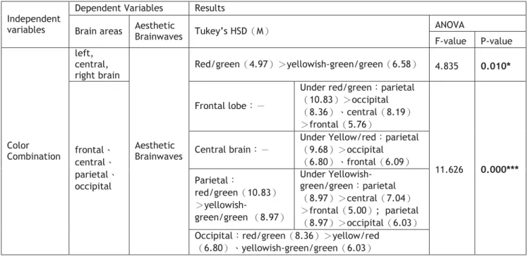
The aesthetic brainwave results, which were induced by experimental samples of color combination designs, were recorded from 12 electrodes and categorized the brain into 3 areas—“left hemisphere, central, and right hemisphere” and 4 areas—“frontal lobe, central, parietal lobe, and occipital lobe.” The statistic analysis results of the aesthetic brainwave data and the brain areas are as follows (see Table 2).
The experimental samples of three color combinations have significant effects on Ⱦleft, central, and right hemispheresȿ in terms of aesthetic brainwave amplitudes (F = 4.835炻P = 0.010<0.05). The results of TukeyȽs HSD post hoc comparison showed that: the aesthetic brainwave amplitude induced by “red/green” combinations was greater than “yellowish-green/green” one. The interaction between experimental samples of three color combinations and “frontal lobe, central, parietal lobe, and occipital lobe” has significant effects on aesthetic brainwave amplitudes on average, multivariate test revealed that Wilks’Λ value was 0.508 (P = 0.015 <0.01).The results of Tukey’s HSD post hoc comparison indicated that in parietal lobe area, aesthetic brainwave amplitudes induced by “red/green” combination was greater than “yellowish-green/green” one; in occipital lobe area, aesthetic brainwave amplitude induced by
“red/green” combination was greater than
“yellow/red” or “yellowish-green/green” ones; in
“red/green” combination, aesthetic brainwave amplitude in parietal lobe was greater than in occipital lobe and central brain, which was also greater than in frontal lobe; in “yellow-red”
combination, aesthetic brainwave amplitude in parietal lobe was greater than in the occipital lobe and frontal lobe; in “yellowish-green/green”
combination, aesthetic brainwave amplitude in parietal lobe was greater than in central brain, which was greater than in frontal lobe, and the aesthetic brainwave amplitude in parietal lobe was greater than in the occipital lobe.