行政院國家科學委員會專題研究計畫 成果報告
台灣日治時期平面廣告中的女性圖像︰圖像符號學分析
研究成果報告(精簡版)
計 畫 類 別 : 個別型 計 畫 編 號 : NSC 96-2412-H-004-013- 執 行 期 間 : 96 年 08 月 01 日至 97 年 07 月 31 日 執 行 單 位 : 國立政治大學廣告學系 計 畫 主 持 人 : 孫秀蕙 計畫參與人員: 碩士級-專任助理:陳儀芬 報 告 附 件 : 出席國際會議研究心得報告及發表論文 處 理 方 式 : 本計畫涉及專利或其他智慧財產權,2 年後可公開查詢中 華 民 國 97 年 07 月 30 日
台灣日治時期平面廣告中的女性圖像:
圖像符號學分析
報告內容 1894 年(光緒二十年),中國與日本爆發甲午戰爭。戰敗的清廷與日本簽定 馬關條約,將台灣割讓給日本。隔年六月十七日,日本總督樺山資紀在台北城舉 行「始政式」,展開對台灣長達五十年的統治。 日人對台灣的殖民統治,伴隨著工業革命以降的大量生產形式,以及企業集 團的形成,催生了現代台灣廣告業。當時風行於日本的廣告設計,隨著以日人為 主的廠商在台灣設立代理公司,販售日製商品,出現在台灣的大眾傳播媒體及公 共場所的宣傳海報上。 然而,關於台灣現代廣告之發展,日治時期的台灣與其他國家相較,有一個 最大的不同點,那就是殖民者牢不可破的政治與經濟的控制。台灣在廣告業發展 之始,明顯受到了總督府的掌控。無論是代表施政官方的總督府、配合施政的商 人組成的「商工會」、亦或是官方色彩濃厚,被視為總督府喉舌的《台灣日日新 報》,都是日治時期推動廣告業的重要角色。他們不但引進了現代商業活動中的 促銷特賣活動,更廣泛地運用報紙平面廣告、海報、紀念明信片等工具,以收商 品或觀念宣傳之效。尤有甚者,在日治中期以後,更由中央或地方統治者主導, 舉辦各式各樣的展覽,甚至以大型博覽會,全民動員的模式,以宣揚日人治台之 政績(呂紹理,2005)。換言之,日治時期的「廣告」,並不是單純的商品宣傳工 具,它更是政令宣導,教化人心的利器,進行社會及文化控制,以鞏固殖民統治 為核心目標。 關於台灣現代化的研究及殖民統治史,近年來蓬勃發展,其研究結果有目共 睹。然而,台灣日治廣告中的符號學研究應用,或是女性圖像的研究,其累積的 研究成果仍然很少。即使有少量研究,也仍處於基本性的探討及初步的分類,缺乏一個更具系統性的論述(例如:姚村雄,2002)。關於日治時期的台灣廣告應 如何建立一套適切的符號研究模式?其分析原則與步驟又是如何?若以日治時 期廣告中的「女性圖像」為分析對象,其研究結果如何影響我們對當時台灣女性 地位及處境的了解?其中隱含的社會、文化、政治權力鬥爭又應如何掌握?與此 一方面的相關探討,實是不足。本文的研究目標如左: 一、針對日治時期(1895-1945)台灣廣告中的女性圖像,以圖像符號分析 法出發,並以新歷史主義理論為詮釋基調,嘗試再現並分析日治時期女 性角色、地位,並說明商業設計中隱含的文化、社會、政治權力鬥爭, 藉以豐富日治時期廣告研究論述。 二、透過整體的研究過程,包含文獻整理、研究方法選擇、實例分析與結果 呈現等,提供一個符號學、廣告學及文化史研究等學門之整合及對話的 研究範例,對於文本分析、廣告史、性別研究等論述均能有所啟示。 三、本研究橫跨了台灣五十年之日治殖民歷史,並從女性意象的角度切入, 除可釐清日治時期台灣之廣告與社會、歷史、文化發展之間的關係,豐 富廣告史及文化研究之內涵之外,將有助於在日治史研究領域中,開闢 一個以性別政治為主軸的學術對話空間。 女性形象究竟如何在日治時期時被建構?以台灣日治時期最大的婦女組織 「愛國婦人會」為例,它由總督府協助成立,以協助社會風俗改革(如宣導解放 纏足)、支援戰爭(在台灣則是「理蕃」、「討蕃」)時的醫療看護,並募款以撫慰 因討伐「叛亂」而傷亡的軍警及其家屬。「愛國婦人會」按照「國策」發展,透 過台灣中上階級女性的集結,加上它號召而匯集的錢財,對於貫徹政策的男性統 治者而言,是不可或缺的重要資源。因此,在國家體制的動員下,具有濃厚官方 色彩的「愛國婦人會」,早在 1908 年 10 月便發行《愛婦台灣支部報》,以女性讀 者為目標,隔年改為《台灣愛國婦人》。在台灣日治時期扮演了形塑「女性」形 象的重要角色(竹中信子,2007)。 關於日治時期台灣女性地位與角色的描述,楊翠作了這樣的結論:
「對一向蟄居一方小天地的台灣女性而言,這的確是一個身體解放、走出家 庭的新契機,她們可以被帶領出來,找到一個全新的活動舞台。因為『國語』的 學習,她們在社會上可以有聲音;因為各種職業技能的養成,她們有了生產力; 因為社會事業的參與,她們存在的位置逐漸開闊,角色變得多元;但這並不是所 謂的『婦女解放』,因為即使在初階段的『婦女解放』中,也必須包含有意識上 的自主性,這個條件是婦解的必備條件,而我們在其中找不到這種條件的存在, 反而看到『資本家—殖民者—父權』三重支配的型態正在建構化與正當化。」(楊 翠,1993:64) 本研究的分析重點,朝兩大方向進行:一是以日治時期廣告中的女性為分析 文本,建議適切的符號研究模式。前人相關的研究,固然有針對廣告中的視覺設 計進行符號分析(例如:姚村雄,2001),惟迄今為止,無論是台灣日治廣告中 的符號學研究應用,或是女性圖像的研究,仍處於基本性的探討及初步的分類。 關於日治時期的台灣廣告,若以女性圖像為例,應如何建立一套適切的符號研究 模式?其分析原則與步驟又是如何?這方面的探討可說是付之闕如。 二是日治時期台灣廣告的相關研究,至今多由設計學界進行,固然累積了初 步的成果,但誠如林曼麗所言: 「自從台灣史的研究成為台灣學術界的顯學之後,台灣美術史的研究也呈現 較為活潑的現象,但是多偏重於資料的蒐集、整理,或流於研究者個人主觀的詮 釋,缺乏宏觀的歷史視野,難於深入剖析探討其歷史意涵……易拘限於『點』的 說明,缺乏全面性的掌握。」(林曼麗,1996:127) 關於日治時期的廣告活動研究,研究者常以「藝術社會學」的理論觀點作為 依據,分析視覺呈現與社會變遷之間的關係。廣告中的視覺表現本來就可以與當 時的社會變遷作一對照,然而考察現有的相關文獻及研究成果,所謂的「社會變 遷」,僅止於將日治時期按照施政模式分為三期,並試著將統治者的重大施政及 設計表現作一連結,卻缺乏細部資料的佐證及說明,遑論加入性別觀點(姚村雄,
廣告主勢力、消費者特質……等均有密切關連,但這方面的資料蒐集,至目前為 止仍相當零碎,缺乏有系統的整理。而在廣告「女性」圖像的呈現方面,相關研 究並未深入分析台灣日治時期女性角色及地位之變遷,因此也就無法有效說明日 治五十年間,台灣廣告中女性形象再現的變化,以及這些變化與社會情境的改 變,究竟有何實質關連?這也是本研究可著力之處。 因此,本研究提出四個研究問題如左: 一、 關於日治時期的台灣圖文廣告中的「女性」形象呈現,我們應如何建立一 套適切的符號研究模式?其分析原則與步驟又是如何? 二、 關於日治時期的台灣圖文廣告中的「女性」形象呈現,我們應如何建立一 套適切的研究史觀,以補充現有的台灣廣告或設計史論述之不足? 三、 日治時期台灣現代廣告的誕生及發展,與當時的統治政策、傳播環境、商 業市場、廣告主勢力、消費者特質……等均有密切關連。本研究擬以日治 時期的台灣圖文廣告中的「女性」為例,說明這些廣告圖像反映了何社會 價值(例如:兩性互動、家庭及社會關係)與文化?而這些社會價值與文 化,是否隨著時間而變遷?其變遷方向為何? 四、 以圖像符號研究模式分析日治時期的台灣圖文廣告中的「女性」形象,在 廣告的表意過程中,它的符號運作原則為何?如何呈現其宣傳效用與說服 功能? 本研究主要發現如左: 綜觀日治時期的女性地位,不難觀察到台灣婦女地位實受到總督府的統治方 針,如中期的「殖民地內地化」政策,以及為推動經濟生產而展開一連串的「現 代化」措施等因素的影響。殖民當局利用各種體制內教育或婦女團體來控制台灣 女性,其目標則著重於透過教育及活動的方式培養認同與生產力、涵養「日本國 民性」與「日本女性美德」,將台灣女性塑造為勤奮勞動、賢妻良母以及忠良愛 國的角色(游鑑明,1987)。從茶葉廣告中勤奮勞動的採茶女形象,觀察其符號 (圖像與文字)配置,可知「採茶女」的形象不但用於鼓勵(上層階級的日本與
北美市場)消費,也說明了勞動女性作為經濟作物生產者的重要性。在日治後期, 由於軍國主義盛行,台灣在「皇民化」風潮之下,被捲入了戰爭,婦女被宣傳動 員,除加強經濟生產之外,也投入了社會救助與救護行業,作為戰爭之後援,此 種戰爭後援角色,亦廣泛見於當時之廣告海報(楊翠,1993)。曾有學者指出, 在日治時期,日本統治者以國家力量動員台灣婦女,試圖塑造三種角色典範,分 別為:「皇國婦女」(真正的日本國婦女)、「軍國之母」(「日」軍的母親與妻子) 及「產業戰士」(戰爭後援的角色)等(楊雅惠,1993 & 1994;張淑卿,1999)。 不過,根據本研究的分析結果,以報紙廣告、廣告海報及雜誌封面為例,除了上 述三種代表「典範」的女性形象之外,廣告所描繪的女性角色毋寧是更為多元化 的。例如:採茶女的勤奮勞動生產、推銷茶葉,身穿傳統漢服與和服的婦女、被 稱之為「高砂族」(即今之原住民),著傳統服飾之部落婦女,她們被統治者用來 「推銷」台灣的農產品或觀光勝地。換言之,透過廣告的描繪,日治時期的台灣 女性,擔任的是農業生產、產品推銷和戰爭後援角色,展現了結合和、漢傳統美 德中所強調勤奮與服從。因此,本研究結論指出,大部分台灣婦女之地位不但未 見任何提升,其廣告所反映的,反而是資本主義、父權、種族歧視與殖民主義的 多重剝削之結果。 綜合以上討論,我們不難發現,台灣現代廣告之發展與其他地域(如中國上 海)最大的不同是,雖然都是外來產物,但伴隨著殖民政治及經濟之箝制,台灣 現代新聞及廣告業發展之始,就明顯受到了統治者—台灣總督府—牢牢的掌控。 無論是代表施政官方的總督府、配合施政的商人組成的「工商會」、亦或是官方 色彩濃厚,被視為總督府喉舌的《台灣日日新報》,都在日治時期廣告業發展的 過程中,扮演了重要的角色。而廣告作為觀念或商品促銷的重要工具之一,其視 覺表現及採用的符號,莫不與日人統治及和式文化有密切關係。而本研究也驗證 了姚村雄(2001)的研究結果:台灣「女性」形象已經不是單純的藝術創意或自 由揮灑下的設計成果,「女性」作為一設計符號,與當時的政令教化目標結合,
參考文獻 王凱薇(2005)。《日治時期台灣地方意識的建立:以顔水龍美術,廣告與工藝創 作為例》。國立中央大學藝術學硏究所碩士論文。 李佳螢(2006)。《報紙廣告中之台灣庶民生活影像:1950-1999》。國立政治大學 廣告研究所碩士論文。 呂紹理(2006)。《展示台灣:權力、空間與殖民統治的形象表述》。台北:麥田。 周兆良(2003)。〈戰爭與媒體—日治時期台灣國際廣播媒體「台北放送局」角色 變遷之初探研究〉,《傳播管理學刊》:4:1:53-61。 林品章(2003)。《台灣近代視覺傳達設計的變遷:1895-1990 之共進會、展覽會、 博覽會以及設計相關活動》。台北:全華科技。 林麗雲(2000)。〈為台灣傳播研究另闢蹊徑?:傳播史研究與研究途徑〉,《新聞 學研究》:63:35-54。 洪桂已(1957)。《台灣報業史的研究》。台北:國立政治大學新聞研究所。 姚村雄(2001)。〈從記號學角度探討日治專賣時期台灣酒類標貼設計之視覺符號 運作〉,《設計研究》:1:121-140。 姚村雄(2002)。〈日治時期台灣美術設計中的「台灣女性圖像」研究〉,《設計學 報》:7:2:117-136。 姚村雄(2004)。《釀造時代─1895-1970 台灣酒類標貼設計》。台北:遠足文化。 姚村雄(2005)。《設計本事─日治時期台灣美術設計案內》。台北:遠足文化。 孫秀蕙(1998)。〈台灣網際網路發展與問題初探〉,《廣播與電視》第十二集:1-20 孫秀蕙(2000)。〈網路時代的企業公關--格魯尼模式的理論性重構〉,《廣告學研 究》第十五集:1-25。 孫秀蕙(2003)。 〈建立企業網頁公關效果評估指標—以 2002 年台灣五百大服 務業為例〉,《廣告學研究》第二十一集:1-28。
孫秀蕙(2005a)。〈符號、敘事結構與公共關係中的「說服」:以九一一事件布希 演講稿為例〉,《關係管理研究》第一集:115-159。 孫秀蕙(2005b)。〈初探網路謠言中「女性」符號運作,以東森新聞台「網路追 追追」為例〉,《廣告學研究》第二十四集:1-29。 孫秀蕙(2007,即將刊登)。〈變動中的媒體環境對於公關教育課程規劃的影響: 以『公共關係理論專題:網路傳播』課程為例〉,《廣告學研究》第二十七 集。 高錦惠(2000)。《明治時期「台灣日日新報」的版面編排設計之硏究》。國立台 灣科技大學設計研究所碩士論文。 游鑑明(1987)。《日據時期臺灣的女子教育》。國立臺灣師範大學歷史硏究所碩 士論文。 張淑卿(1999)。〈近來年台灣地區的「台灣婦女史」學位論文研究回顧 (1991-1998)〉,《近代中國婦女史研究》,7:193-209。 張宏庸(2005)。《台灣茶廣告百年》。台北:遠足文化。 溫振華(1989)。〈日據時期的都市化:以台北市為例〉,《歷史月刊》,15: 135-138。 葉龍彥(1996)。〈台灣海報的由來〉,國立台灣藝術教育館(編)《世紀容顔回顧: 百年版畫海報精品展》。台北:台灣藝術教育館。 葉龍彥(1998)。《日治時期台灣電影史》。台北市:玉山。 楊翠(1993)。《日據時期台灣婦女解放運動:以〈台灣民報〉為分析場域 (1920-1932)》。台北:時報文化。 楊雅惠(1993)。〈日據末期的台灣女性與皇民化運動〉,《台灣風物》,43:2:69-84。 楊雅惠(1994)。《戰時體制下的台灣婦女(1937-1945)--日本殖民政府的教化 與動員》。清華大學歷史所碩士論文。 楊孟哲(1999)。《日治時代台灣美術教育》。台北:前衛。
樓怡婷(2001)。《台灣日治時期商業市招及其構成元素設計形式之硏究》。國立 台灣科技大學設計硏究所碩士論文。 樊志育(1989)。《中外廣告史》。台北:著者發行,三民經銷。 鍾淑敏(1994)。〈館藏「台灣日日新報」的史料價值及其利用〉,中央圖書館台 灣分館(編)《館藏與台灣史研究論文發表研討會彙編》,台北:國立中央 圖書館台灣分館。 謝里法(1992)。《台灣美術運動史》。台北:藝術家。 戴維怡(2006)。《台灣報紙廣告風格之演變:1945-2005》。國立政治大學廣告研 究所碩士論文。
Barthes, R. (1972). Mythologies. New York: Hill and Wang. Barthes, R. (1977). Image-Music-Text. New York: Hill and Wang.
Beasley, R. and M. Danesi (2002). Persuasive Signs: The Semiotics of Advertising. Berlin: Mouton de Gruyter.
Browne, B. A.(1998). Gender stereotypes in advertising on children’s television in the 1990’s: A cross-national analysis. Journal of Advertising, 27, 1, 83-96. Buker, E. A. (1996). Sex, sign and symbol: Politics and feminist semiotics. Women
and Politics, 16, 1,31.
Carani, M. (1988). Sémiotique de la perspective picturale. In Protée, 16, 1-2, 171-181.
Carlyle, Thomas (1831). Characteristics. EDINBURGH REVIEW, 105. Coombs, W. T. (1998). The Internet as potential equalizer: New leverage for
confronting social irresponsibility. Public Relations Review, 24, 3, 289-303. Eco, U. (1976). A Theory of Semiotics. Bloomington: Indiana University Press. Eco, U. (1977). The influence of Roman Jakobson on the development of semiotics.
In D. Armstron and C.H. Van Schooneveld (eds.). Roman Jakobson. Echoes of
his scholarship. Lisse: Peter de Ridder Press, 39-58.
Floch, Jean-Marie (1984). Petites mythologies de l’œil et l’esprit. Paris: Hadès Floch, Jean-Marie (1986a). Les formes de l’empreinte. Périgueux: Pierre Fanlac. Floch, Jean-Marie (1986b). entries. In A. J. Greimas and Hrsg J. Courtès (Eds).
Sémiotique. Dictionnaire raisonné de la théorie du langage. Tome II. Paris:
Hachette.
Foucault, Michel (1986). The Foucault Reader. Ed. Paul Rabinov. Harmondsworth: Penguin.
Fowles, J. (1996). Advertising and Popular Culture. Thousand Oaks, CA: Sage. Genette, G. (1972). Narrative discourse. Trans. J. E. Lewin. New York: Cornell
University Press.
Greenblatt, Stephen (1980). Renaissance Self-Fashioning: from More to
Shakespeare. Chicago: Chicago University Press.
Group μ(1979). Iconique et plastique: sur un fondement de la rhétorique visuelle. In
Revue d’ésthétique. 1-2, 173-192.
Group μ(1992). Traité du signe visuel. Pour une rhétorique de l’image. Paris: Seuil.
Goffman, E. (1979). Gender Advertisements. New York: Harper and Row.
Gorman, F. E. (2005). Advertising images of females in Seventeen: positions of power or powerless
positions? Media Report to Women, 33, 1, 13-20.
Jakobson, R. (1971). Closing statement: Linguistics and poetics. In T. A. Sebeok (ed.) Style in language. Cambridge: MIT Press, 350-377.
advertisement: A semiotic analysis. Australian Journal of Communication, 18, 2, 42-65.
Levinson, Marjorie (1986). Wordsworth’s Great Period Poems: Four Essays. Cambridge: Cambridge University Press.
Levison, Marjorie & Marilyn Butler & Jerome Mcgann & Paul Hamiltion (1989).
Rethinking Historicism. Oxford: Blackwell.
Levi-Strauss, C. (1963). Structural Anthropology. Claire Jacobson & Brooke Crundfest Schoepf (Trans.). New York: Basic Books.
Lindekens, R. (1971). Eléments por une sémiotique de la photographie. Paris and Bruxelles: Didier.
Lindekens, R. (1976). Eléments de sémiotique visuelle. Paris: Klincksieck. Myers, D. G. (1989). The New Historicism in Literary Study. Academic Questions
2, 27-36.
O’Toole, M. (1994). The Language of Displayed Art. London: Leicester University Press.
Page, J. T. (2005). The perfect host: indexical images of the female body as persuasive strategy in House
Beautiful. Media Report to Women, 33, 3, 14-20.
Peirce, C. S. (1931-1958).Collected papers. Vols.1-6. Charles Hartshorne and Paul
Weiss (Eds); vols. 7-8. Arthur W. Burks (ed.). Harvard University Press. Rakow, L. F. (1992). “Don’t hate me because I’m beautiful”: Feminist resistance to
advertising’s irresistible meanings. The Southern Communication Journal, 57, 2, 132-142.
Saint-Martin, F. (1987). Les fondements topologiques de la peinture. Montréal: Hurtubise.
l’Université du Québec.
Saint-Martin, F. (1990). La théorie de la Gestalt et l’art visuel. Québec: Presse de l’Université du Québec.
Saussure, F. (1966). Course in General Linguistics. C. Balley and A. Sechehaye (eds.). Wade Baskin (Trans.). New York: McGraw-Hill.
Signorielli, N., D. McLeod & Healy, E. (1994). Gender stereotypes in MTV
commercials: The beat goes on. Journal of Broadcasting and Electronic Media, 38, 1, 91-101.
Sonesson, G. (1992). The semiotic function and the genesis of pictorial meaning. In Eero Tarasti (ed.). In the representations and institutions. Imatra:
International Semiotics Institute, 211-256.
Streeter, Thomas (1996). The “new historicism” in media studies. Journal of
Broadcasting and Electronic Media, 40, 553-557.
Sun, H. H., T. Y. Lau & R. Kuo (2002). The Internet as a public relations medium: An exploratory study of PR professionals in Taiwan. Asia Pacific Media Educator, 12/13, 168-184.
Thülemann, F. (1982). Paul Klee. Analyse sémiotique de trios peintures. Lausanne: L’Age d’Hommes.
Thülemann, F. (1990). Vom Bild sum Raum. Beiträge zu einer semotischen
Kunstwissenschaft. Kölin. DuMont.
Tillyard, E. M. W. (1998). The Elizabethan World Picture. London: Pimlico Books.
Williams, R. (1993) . Advertising:The magic system, in Simon During (ed.) The
Cultural Studies: Reader. London, Routledge, 320-336.
計畫結果自評
析模式,並將研究成果寫成英文論文,與國際學術社區對話。自 2006 年起,筆者以 重新書寫華人廣告史為長程目標,取廣告中的女性圖像研究為切面,分別進行上海租 界時期和台灣日治時期的廣告符號研究。首先,申請者執行為期一年(2006-2007) 的國科會研究計畫「平面廣告的圖像符號學分析:以上海老月份牌廣告畫為例」。針 對以女性為主題的老月份牌廣告畫進行圖像符號文本分析,意圖建構合於目標文本特 性、適切性高的圖像符號分析方法,並從文本訊息的表層出發,觀察其符號結構及功 能,詮釋女性圖像再現的社會、文化意涵。接下來則執行日治時期的廣告圖像研究 (2007-2008),嘗試深入瞭解殖民地時代的台灣女性角色與地位。短期來說,希望能 夠先提供一個符號學與廣告學門整合的研究範例,對於文本分析及廣告文化等相關研 究論述有所啟示,長期而言,希望能釐清廣告與社會之間錯綜複雜的互動的關係,並 豐富廣告史研究內涵。 上述研究成果先於於 2007 年「第十五屆中華民國廣告暨公共關係學術與實務研
討會」以中文發表,接下來改寫為英文論文,於 2008 年The Annual Conference of
International Communication Association 的 Feminist Scholarship Division,以及 The 26th International Association for Media and Communication Research (IAMCR) International Congress 的 Gender Communication 領域,以英文分別發表兩篇學術會議論文,亦獲 得與會者正面評價與回應,而筆者在未來也會參酌(會議論文)匿名評論者和與會者 之意見,將分析與結論部分寫得更完整周全,投稿至國際學術期刊。因此,本研究計 畫總共發表兩篇英文會議論文,不但建立了針對平面廣告的圖像符號學分析模式,更 透過圖像符號學進行深入觀察與詮釋女性在華人社會中的角色與地位,研究計畫的研 究成果可謂相當豐碩。
出席國際學術會議心得報告
計畫編號 NSC 96-2412-H-004-013 計畫名稱 台灣日治時期平面廣告中的女性圖像:圖像符號學分析 出國人員姓名 服務機關及職稱 孫秀蕙,政治大學廣告系教授會議時間地點 2008.5.22~5.26, Montreal, Quebec, Canada
會議名稱 58th Annual International Communication Association (ICA) Conference
發表論文題目 The Framed Female Image:A Pictorial Semiotic Analysis of Classic Shanghai Calendar Posters of the 1910’s-1930’s
一、參加會議經過 筆者近五年來致力於整理符號學相關論述,將研究觀點與分析方法應用於傳播文 本之研究,藉此理解不同種類的傳播文本如何建構其修辭策略,並發揮其說服效用。 筆者曾分別以總統演講詞、網路謠言、電視政論性節目等為符號文本分析對象,在學 術期刊與研討會發表論文。在〈符號、敘事結構與公共關係中的『說服』:以九一一 事件布希演講稿為例〉一文中,筆者建立了一個分析宣戰文稿的範例,呈現出符號、 敘事結構研究與公關理論的對話可能,以及對戰爭宣傳發言策略的補述。同時,針對 檢驗說服效應的方法及步驟上提出建議。不但幫助開拓公關研究視野,更提供公關從 業人員在戰爭宣傳策略方面的修辭建議。 另外,在〈初探網路謠言中『女性』符號運作,以東森新聞台『網路追追追』為 例〉一文中,筆者透過「公關管理」、「性別研究」和「修辭學」等研究領域之互相結 合,自東森新聞台「網路追追追」網站上,有系統的蒐集網路謠言個案,找出其中「女 性」符號運作的模式,呼應與修辭學取向的公共關係理論模式,並提供公關管理方面 的建議,裨益公關從業人員處理以女性消費者為訴求的網路謠言。在研究中發現,面 對網路謠言中「女性」符號的操作,公關人員必須正視其中所造成的恐懼心理與被剝 奪感,並以保護照顧女性為內涵的公關行動來應對。 筆者另有行政院研考會委託之政策建議書「社會互信與媒體責任」一案,以電視
政論節目為分析對象,結案報告已於 2007 年改寫成會議論文,發表於國際會議「第 五屆世界華文傳媒與華夏文明傳播學術研討會」,並送相關學術期刊審稿中。研究發 現,電視政論節目的製作是以製造對立為符號運作的基本邏輯。政論性節目對於社會 互信造成傷害之主因,在於節目中所充斥的「不負責任的言論」,也是將「言論自由」 與「合理推論」無限上綱的不良結果。在政論節目與新聞惡質化難分難解的狀況下, 針對討論的議題,「求證」幾乎不可能存在於製作電視政論節目的過程中。公共議題 討論中的所應呈現的理性與共識的追求被犧牲,弱勢邊緣的意見被極端的意識形態所 取代。 近年來,筆者致力於研究國際化,並以圖像符號學研究方法為基礎,以建立平面 廣告之圖像符號學分析模式。分析的標的,係以女性圖像為主,重新觀察華人廣告與 其文化再現,書寫女性觀點的華人廣告史,重新敘述廣告中所呈現的華人女性主體建 構過程。自 2006 年起,筆者以重新書寫華人廣告史為長程目標,取廣告中的女性圖 像研究為切面,分別進行上海租界時期和台灣日治時期的廣告符號研究。短期來說, 希望能夠先提供一個符號學與廣告學門整合的研究範例,對於文本分析及廣告文化等 相關研究論述有所啟示,從而釐清廣告與社會之間的關係,並豐富廣告史的研究內涵。 上述研究成果先於於 2007 年「第十五屆中華民國廣告暨公共關係學術與實務研 討會」以中文發表,接下來改寫為英文論文,在國科會研究計畫經費贊助之下,於 2008 年The Annual Conference of International Communication Association,在 Feminist
Scholarship Division 中發表論文(如附件一),亦獲得與會者正面評價與回應,Feminist
Scholarship Division 副主席 Diana Rios 副教授(任職於 Department of Communication Sciences and Puerto Rican/Latino Studies Institute PRLS, University of Connecticut)以拉 丁裔美國人的文化經驗,提供了她對於本篇論文的寶貴看法,並期待未來東西方學者 可從性別傳播觀點,進行更深入的跨文化學術對話。而筆者在未來也會參酌兩位(會 議論文)匿名評論者和與會者之意見,將分析與結論部分寫得更完整周全,投稿至國 際學術期刊。
號學的深入觀察與詮釋,由洋商所引進的廣告畫已不單純扮演促銷產品的作用,畫中 所展示的女性形象,正標示了中國邁向現代化過程中新話語的開始。除此之外,筆者 也認為應在原本的文化研究架構上,除新歷史觀之外,應加上殖民主義與跨文化研究 的探討,才能充分釐清華人社會中,商業廣告中所呈現的資本、文化、種族、性別等 多重剝削層次(capitalistic, cultural, racial and sexual exploitations),並觀察出在殖民時 期特殊的環境下,台灣女性形象的呈現與歷史性變化。在場與會者,包括來自印度、 韓國與美國的學者,也提出了他們的問題(包含性別再現的不平衡?1940 年之後的上
海廣告的發展等),並有相當豐富而多元的學術討論。
二、與會心得(及收穫)
綜合以上所述,參與本項會議(58th Annual International Communication Association Conference)的心得及收穫有: 一、將研究論述英語化,促進性別與廣告傳播領域的跨文化學術對話。 二、申請人為本校補助期刊《廣告學研究》主編,由於《廣告學研究》同時接受 中、英文稿件,透過國際會議的參與,目前已邀請若干廣告相關領域學者及 研究人員投稿,同時擬成立英文網頁說明英文投稿事宜,以提升《廣告學研 究》學術水平,並促進《廣告學研究》國際化。 三、會議論文將參酌與會學者之專業意見,改寫成期刊論文,並投至 SSCI 學術 期刊,以協助提升本校學術水平。
附件一 發表之 ICA 國際會議論文
The Framed Female Image:
A Pictorial Semiotic Analysis of Classic Shanghai Calendar Posters of
the 1910’s-1930’s
Abstract
The present study conducts a pictorial semiotic analysis of the female image in Classic Shanghai Calendar Posters of the 1910’s-1930’s. First of all, we review Roland Barthes’ and Göran Sonesson’s theoretical perspectives towards pictorial semiotics and then propose four essentials to distinguish the features of pictorial texts, especially those of print advertisements. These four essentials are types of code, goals, media and textuality. Furthermore, we find the Calendar Posters’ “textuality,” the configuration of both linguistic text and pictures that produces meanings, is in the pattern of that pictorial meanings are restrained by linguistic text, and the core visual sign of this genre is “the framed female image.” At last, the present study explores different layers of the significances of the two major signs—“the frame” and “the female image.”According to the analysis, from prostitutes to movie actresses, there had been dramatic changes of female characters in the posters due to the invading capitalism accompanied by economic growth and western modern culture. The female image in these Calendar Posters represents no longer an object of desire for male gaze as those in common commercial posters depicted by Goffman, Buker or Page. In fact, the significances of the female image go far beyond the frame of feudalization and tradition, signifying the consumers’ expectation of a better future, and this “better future” will be achieved by a healthy, well-educated and independent fine woman. “The female image” signifies beyond “the frame.” The female image
of Classic Shanghai Calendar Posters subverts the patriarchy embedded in Chinese feudalistic tradition and Western capitalism, and it finally reserves a precious moment of revisiting Chinese women history from the perspective of pictorial semiotics.
Keywords: Classic Shanghai Calendar Posters, female image, frame, pictorial
The Framed Female Image:
A Pictorial Semiotic Analysis of Classic Shanghai Calendar Posters of
the 1910’s-1930’s
Introduction
In the early twentieth century, an era of capitalistic colonialism began. Western powers invaded China in predominant forces. Meanwhile, China was undergoing a tremendous social, economic, and cultural transformation due to the industrialization, business trust, and mass production accompanied by Western powers. Commercial advertisements thus grew rapidly in order to stimulate consumption. Classic Shanghai Calendar Posters are exactly one of the results of the Western business invasion of China. “Calendar Poster,” regarded as the origin of Chinese modern commercial advertisement, is a trinity of painting, calendar and advertisement (Chiang, 1994; Chuo, 1993; Chaou, 2002).1
According to modern business logics, no matter in visual or linguistic messages, “product” should always be the focus of an ad, whereas on Classic Shanghai Calendar Posters, during the period of 1910’s-1930’s, products were seldom placed at the focus but at the marginal frames or corners. What attracts the consumers’ attention are the various and gesturing Chinese women at the center of the Calendar Posters. That is to say, “female image” as the theme is the most significant feature of Classic
1 Po-tang Chuo argues that there was no official name for these posters and some of
the posters in later period did not necessarily include calendars. Chuo thus suggests they merely be named as “Commercial Posters.” However, from the social,
historical and aesthetical perspectives, “Commercial Posters” cannot convey fully the significance of these posters as the derivation of Chinese modern advertisements and their unique visual expression. Therefore, this study prefers “Classic Shanghai Calendar Posters” as named by Yeng-fong Chiang, an important collector of these posters.
Shanghai Calendar Posters (Chuo, 1993; Wang, 1997).
This study aims to analyze the female image in Classic Shanghai Calendar Posters and to explore the signifying process and sign system, so as to understand how and what the female gender role was reflected by these posters in the
contemporary social-cultural context. From the perspectives of Shanghai’s urbanism of that period, advertisers’ influence, and the characteristics of consumers, this study also tries to explain what sort of ideology and value system were re-presented by the posters. Besides, through theoretical discussion of the existent pictorial semiotics and the features of the target text, this study demonstrates an example of pictorial semiotic analysis, in the sense of pertinence, which can be appropriated to the future studies on the print advertisements containing both pictorial and linguistic messages. Finally, this study hopes to offer an interdisciplinary research model to the fields of semiotics, feminism, and advertising and sheds light on the scholarship of textual analysis and advertising culture.
Development of Semiotics and Pictorial Semiotics
American pragmatist Charles Sanders Peirce and Swiss linguist Ferdinand de Saussure are the two founders of modern semiotics. Almost at the same time, though apart by the Atlantic, Peirce initiated his theory of signs as semiotics, while Saussure named it semiology. Based on notes taken from Saussure’s lectures, his students edited Course in General Linguistics and published it in 1915. As for Peirce, eight-volumed Collected Papers recording most of his notions was published some years after his death.
“A science that studies the life of signs within society is conceivable; it would be a part of social psychology and consequently of general psychology; I shall call it
signs, what laws govern them,” Saussure defines (Saussure, 1966: 16). Accordingly, a sign contains two elements, the signifier and the signified; and the link between them generates meanings. However, the relation between the signifier and the signified is by no means natural but arbitrary. The link is sustained only by the common practice within a certain cultural context. It is more than obvious that between the signifier and the signified, there is not a natural link but in fact, an artificial one. Derived from this understanding of signs, French Structuralists develop methodologies like Structuralistic approach toward Myth (e. g. Levi-Strauss, 1963), Structuralist Poetics (e. g. Jakobson, 1971), and Narratology (e. g. Genette, 1972). Scholars apply Saussure’s linguistic methods, examining texts from the aspect of the syntagmatic and the paradigmatic relations, to reduce a text into some basic elements in the sense of Structuralism and to elucidate the effect caused by every single element and their combination. In short, they explore the structure and operation of language use in a text as a sign system (Sun, 2005a & 2005b).
Peirce categorizes signs into three types: iconic sign, indexical sign and
symbolical sign. This typology explains how the sign refers to its object. The iconic sign is related to its object by a quality of its own, like in the cases of portrait,
sculpture and onomatopoeia. The indexical sign, by real connection, causality mostly, is related to its object. A sign of smoke means fire is a typical example of the index. As for the symbolical one, it is related to its object by a habit or rule, namely conventional, for its interpretant. Language is a perfect example for the symbolic signs (Peirce, 1931-1958).
Italian semiotician Umberto Eco indicates that Peirce’s definition of sign, avoiding any emphasis on its artificial or communicative quality, helps to remove the materialism and the utilitarianism from Saussure’s theory which presupposes sign as the very medium of human expression and communication. Eco furthermore adopts
Danish linguist Louis Hjelmslev’s opinions about sign, separating the contents of sign, the signifier and the signified, from the referent that is outside of the sign itself. He prefers discussing the “sign function” than merely the “sign,” in which the relation between the expression and the content can be fully described (Eco, 1976).
This discussion of the relation between the expression and the content is especially important for pictorial semiotic studies, because the relation between the signifier and the signified is not always arbitrary as Saussure asserts. That is to say, the link between the signifier and the signified is not necessarily artificial and the break between them is not that obvious for most of the pictorial signs, the icons. This type of sign has a feature that the relation between the signifier and the signified, or the sign function in terms of Eco, is based on similarity, likeness and semblance. As Swedish scholar Göran Sonesson points out, people tend to “see” the pictorial sign (icon) “into” its actual expression, although the icon also contain signifier/signified (and of course the break within) like verbal languages (Sonesson, 1992). Thus, it is critical to reflect on the pertinence of applying linguistic semiotics to pictorial sign studies. To adjust and rethink the research principles and steps becomes necessary.
Pictorial semiotics is to study pictures as vehicles to convey meanings, which is different from semiotics that aims at language only. It focuses on the material, structure and signifying process of pictures. Scholars, either revising linguistic approach or innovating new theoretical models, devotes themselves to the study of pictorial semiotics.
Roland Barthes in his “Rhetoric of the Image” points out that the composition of an image is a signifying complex, and especially in the photography, “the denoted image naturalizes the symbolic message . . . [and] innocents the semantic artifice of connotation” (Barthes, 1977: 45). Barthes’ keen observation on pictorial sign
As in his analysis of Pazani, a colorful print advertisement of pasta, he defines three messages in the pictorial text: linguistic message, coded iconic message, and
non-coded iconic message. Nevertheless, he clarifies the two functions of the linguistic message with regard to the (two fold) iconic message: “anchorage”—“the text directs the reader through the signifieds of image . . . remote-control[ing] him towards a meaning chosen in advance”; “relay”—“text . . . and image stand in a complementary relation . . . and the unity of the message is realized at [the] level of the story” (Barthes, 1977: 39-40).
Barthes’ “Rhetoric of the Image” is a cornerstone of pictorial semiotics, establishing the primary model and research steps toward the study of image. With his theoretic basis of linguistics, he pays more attention to how the content and the referent are linked to the ideology in the real world.
The same trace of linguistic methodology can be found in Eco’s pictorial
semiotics. He regards the signifying process of image as the one of idioms. At first, he tries to reduce the image into some basic elements, and names the smallest unit “iconeme” as a parallel to Saussure’s “phoneme,” the smallest contrastive unit in the sound system of a language that does not carry any meaning, in order to perform the structural analysis on image. However, it is impossible for the small units in an image to mean nothing. For instance, when a pure single color represents the smallest unit, it still carries meanings in different cultures (Eco, 1976 & 1977). Besides Saussurean semiotics, there are other methodologies adopted or adjusted to study the image. René Lindekens discusses the issue of conventionality and double articulation by blending Hjelmslevian semiotics, Greimas school,
phenomenology, and experimental psychology of perception from Gestalt school (Lindekens, 1971 & 1976). Later on, Jean-Marie Floch and Felix Thürlemann, applying Greimas’ theory, illustrate the double layer of signification in the picture:
iconic and plastic levels, in order to explain how the concrete or the abstract concepts are transmitted by the picture. Floch, applying structural semiotics, further argues that pictorial signification exists and exercises in the structure of binary opposition (Floch, 1984 & 1986a & 1986b; Thürlemann, 1982 & 1990).
Other than linguistics and structuralism, there are also Liege School, so-called Group μ and Quebec School contributing ideas to the field of pictorial semiotics. Group μ uses the classification of figures in the classic rhetoric to analyze image and combines theories of mathematics to establish their “general rhetoric.” They treat figure as a deviation from the norm, and figures often stand as redundancy as what Greimas calls isotopy. They also probe into issues of iconic and plastic levels brought up by Floch and Thürlemann. They assert the existence of the
iconico-plastic figures in the plastic level actually results from the function of redundancy. Given that a blue man in a comic that is supposed to be in the plastic level and carrying abstract meanings, the abstract meaning of “blue man” will be produced only because the redundancy/isotopy of “man,” as a norm, that can generate the “blue man” as a deviation (Group μ, 1979 &1992).
Fernande Saint-Martin, a leading figure of Quebec School, reckons that the image is by all means a visual product serving the visual perception selectively and can be efficiently analyzable according to six variables: color/tonality, texture, dimension/quantity, implantation into the plane, orientation/vectorality, and
frontiers/contours generating shapes (Saint-Martin, 1987 & 1989 & 1990). Other members of Quebec School, like Marie Carani and Michael O’Toole, also offer their criticism on Greimasian approach and suggest some analytical tools for the pictorial semiotics. They challenge Group μ’s applying binary opposition to visual sign system, redefine the representation, modal and composition of the image and suggest
psychology, philosophical and phenomenological theories of perception, etc (Carani, 1988; O’Toole, 1994).
Works of different schools and scholars provide various theoretical and
analytical models to study image. However, as mentioned above, from language to image, semioticians encounter the problem of pertinence when applying linguistic methodology to the study of image. Nevertheless, although the image is the target object of pictorial semiotics, its essential material and signifying system are still different whenever the composition of the object changes. It is still difficult to assert that there is a single theory or an analytical model suitable for all kinds of pictorial texts. Advertisements are different from pictures, not only because of the material element (photography or watercolor) but also because of the communication intention (commercial or aesthetical expression). Therefore, the dichotomous development of the pictorial semiotics, i.e. the semiotics of publicity and the semiotics of visual art, becomes inevitable. Actually, more and more scholars admit the necessity of adjusting and theorizing analytical tools for every individual visual object. Then there will not be too much emphasis on appropriating pertinent theory and
methodology to different types of advertisements (print ad, TV commercial or classified ad) according to their own characteristics and social context.
The Semiotics of Advertising and Female Images
Barthes establishes the core concepts and steps of semiotic approach for the advertising in his “Rhetoric of the Image” (Barthes, 1977). Later on, based on the heritage from Barthes, Ron Beasley and Marcel Danesi publish Persuasive Signs: The
Semiotics of Advertising, attempting to elucidate various aspects of advertising,
including brand naming, package, logo creation and copywriting (Beasley & Danesi, 2002).
Beasley and Danesi especially pay attention to how the text of advertisement produces certain meanings and layers of connotation by using Biblical stories or Greek mythology. They fully explore Barthes’ concept of mythologizing and point out the signification of the ad is closely related to the convention and the social context. The form (signifier) and the meaning (signified) of visual sign are linked at the first moment of its appearance to its interpreters in certain context and will
immediately become a new sign waiting to be interpreted, and the process may go on and on. This is the “connotative chain” representing how the meaning of image expands and increases as different connotations. Take “apple” as an example. For most of the Western audience, a picture of an apple, first of all, signifies the concept of the fruit “apple” and then, almost simultaneously will bestow the symbolism rooted in Genesis, forbidden sex or forbidden knowledge (Beasley & Danesi, 2002).
However, given that the sign “apple” appears in different cultures, the same symbolism (apple=forbidden sex or forbidden knowledge) will not occur to the audience so easily.
The more abundant meanings the connotative chain will produce, the more audience the ad will attract, as Beasley and Danesi find. However, more audience does not necessarily mean more buyers. Advertising is to persuade. The
naturalization of visual sign is to blur the break between the signifier and the signified and so to make people believe what they are made to see in the ad. The persuasive power lies in the ad design that helps to fix the meaning (what the advertiser wants to convey to the audience), instead of that creates more layers of connotation.
Thus, reviewing from semiotics to pictorial semiotics, and finally to the pictorial semiotics of advertising, this study benefits from the previous scholars and find that a pictorial semiotic approach to the advertising is, in short, to observe the interior and
to the interior, context and effect, the exterior.
Then, it is time to move a step further to take a look at the female image in the advertising. According to Jib Fowles, “gender” as a sign, especially represented by the female image, is the most popular sign used in ads, and its re-presentation is also a major concern for the academic (Fowles, 1996). Erving Goffman, an American sociologist, tries to decipher the gender relations embedded in the ads by analyzing the gesture, pose and facial expression of female models (Goffman, 1979). Later on, Nancy Signorielli, Douglas McLeod and Elaine Healy’s research on the female image in music video confirmed Goffman’s findings (Signorielli & et al, 1994). The female characters are designed to be the desired object of male gaze. Moreover, gender stereotypes are duplicated continuously in different categories of ads (Browne, 1998). “Beautiful” and “sexy” are the essential qualities of the female image
portrayed in ads.
As for feminist studies on the female image in ads, they are more likely to pursue an ideological interpretation than to conduct a structural (or even semiotic) analysis of the image itself. They point out the re-presentation of the female image in ads is indeed a mean of the social control of patriarchy (Rakow, 1992; Buker, 1996; Page, 2005). Although “power feminism,” may argue that new generation’s
confident exhibition of female body becomes a self-empowerment of women, it is still hard to alter the conventional and core concepts of beauty, sexiness and femininity passed down from the previous generations (Fowles, 1996; Gorman, 2005). The similar conclusion can be found in Asian culture. Tomiko Kodama, a Japanese semiotician, finds that the female image in a real estate ad serves to reinforce the stereotype of Japanese woman, dependent and motherly, in order to sustain the group-ness, peace and order in Japanese society (Kodama, 1991).
emphasis on the social, cultural or even political effects brought out by the ads and the sexual discrimination reflected by the ads. That is to say, these studies pay more attention to “the exterior” elements than “the interior” ones as defined by the present paper. Sociologists find the ads are mirroring real life in terms of gender relation; feminists’ discourse hardly reaches beyond the objectified female body. They simply reveal the truth that what the advertisers request is to sell products; provoking controversy or challenging the value system of the mainstream will be the last choice for them to attract and persuade consumers. This “prone-to-exterior” methodology of the female image study often leads to a research report of the status quo.
Academic roars, in this case, cannot scare away the advertisers with the vested interest in capitalism and patriarchy.
After all, a strategic move, slightly toward the “interior” of the female image study, becomes important, because the “interior” (semiotic or structural) approach may help to discover the subversive power lying beneath the surface of the text. The analysis of the image-text’s material and texture provides the opportunity to find the clue of that the text is not totally subordinate to the context. Text and context are actually in a dialectical relation promising the multi-interpretation of the ads. Hence, the female image in ads will not always be condemned politically incorrect, and the feminists can empower rather than criticize the female image in ads finally to challenge the status quo.
Classic Shanghai Calendar Posters shall serve as a perfect target for this adjusted pictorial semiotic and feminist approach to the female image study for its historical background and unique features of the commercial design.
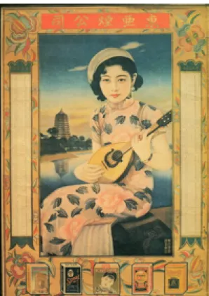
flourished in 1930s, a glowing era of Shanghai culture (Li, 2003). At the very beginning, calendar posters were imported to Shanghai by Western traders and then widely adopted by Chinese businessmen as a gift attached to products. These posters are the earliest form of commercial posters and ads in modern China. The naming of “Calendar Posters” (yue fen pai guang gau hua) comes from the
juxtaposition of paintings and calendars. More than seventy percent of the collected posters of now show that female characters are the theme and the focus of the
paintings (Wang, 1997). Diverse female characters include Peking opera actor (e. g. Lan-fang Mei), movie actress (e. g. Ling-yu Juan and Li-hua Li), fictional heroines in dramas or novels (e. g. Dai-yu Lin in Dream of the Red Chamber) and fashion models. Their facial expression, clothing and the background of the painting all reflect the most trendy fashion, decoration and culture in the contemporary Shanghai (Chiang, 1994; Chaou, 2002). The image of the product that should be at the visual center is on the contrary placed on the margin frames. This is the feature that makes these posters exclusive and a special genre in advertising.
At first, women were not the sole theme of the calendar posters. Western traders introduced to China not only the paintings with women but also those with knights, landscape, still life and even religious stories. However, they found Chinese consumers are not interested in these subjects and gradually sense the need of
localization. Chinese landscape paintings, folklores, festival icons and traditional dramas all had been themes of the early posters. Finally, the calendar posters depicting beautiful women and modern life style became the most popular genre of the ad posters in Shanghai, a shining and rising modern city in China. Also because of the pragmatic function of calendars (usually with both the western and lunar ones), customers used to hang the poster for a whole year. Beautiful modern women calendar posters turned to be a part of daily life, a practical but also appealing home
deco item, and thus the effect of the publicity had been highly increased (Chiang, 1994).
According to Yeng-fong Chiang, a collector of calendar posters, besides
Western ad design, the other origin of the posters is the Chinese traditional woodcut. In fact, women in western dresses appearing in the calendar posters are the inevitable result from a semi-colonized city life in Shanghai. Citizens admire the fashion and modern culture introduced by the Westerners. She also points out that the large circulation of ad posters is simply because paintings are easier for people (of different classes) to understand than words on newspapers. These posters even get so popular to be exported to the overseas Chinese societies in Singapore and Malaysia (Chiang, 1994).
In late 1930’s, the technique of photography was greatly improved, and then the newly developed photomechanical process replaced the paintings. Meanwhile, economic slump occurred due to the Sino-Japanese War and the Chinese civil war. After 1949, certain numbers of the calendar posters still had circulated for a short period but soon deteriorated since ads, representing capitalism, was severely attacked especially during the Cultural Revolution. 2 Artists and painters were denounced and condemned in the movement of abolishing the “Four Olds” (Wang, 1994). These beautiful women calendar posters gradually become history and have been collected as Classic Shanghai Calendar Posters (CSCP) till now.
Painters of CSCP are indebted to Yo-ju Wu, a famous folk customs painter in late Ch’ing Dynasty, and the traditional Chinese “court lady” paintings (Chiang, 1994). Wu’s realistic style of paintings used to be published on Tienshihchai
2 In the short period after 1949, the advertisers substituted modest farmer and laborer
Huabao portraying the daily lives of common people and also introducing Western
novelties to the local people.3 Wu’s delicate lines, strokes and merging modernity and tradition in paintings allegedly bring new life to Chinese folk customs paintings (Wu & et al, 2005). Another influence of Wu is his paintings collected as Haishang
Baiyentu (translated as “Shanghai Ladies” by the authors); most of the paintings are
about the family life of married women and their children (Wu & et al, 2005). Following artists often applied Wu’s techniques and the subject matter to the calendar posters.
Chinese court lady paintings achieved maturity after Han Dynasty and since then the style of the female image in Chinese paintings was officially established (Liu & Chang, 2003). The content of court lady paintings mainly aimed at teaching women about virtues (chastity and obedience) and social responsibilities (weaving and reproducing). Of course, the aesthetic and entertaining purposes cannot be excluded. However, women’s talents to be writers or power to be fighters are seldom illustrated in the traditional court lady paintings because of “a woman without talents is therefore virtuous,” a concept deeply rooted in Chinese feudalistic society.
Although CSCP and court lady paintings both use women as the major visual sign in the composition, their motives are quite different. The former is to create a visual stimulation to the (male) watchers or consumers and to achieve almost an immediate purpose of selling products (Sun, 2003). Comparatively, the theme of the latter is often didactic and moral (Yi, 2005). Certainly, it can be argued that as long as the female image is designed by male artists and for male watchers, the lack of the
3 In May 1884, Tienshihchai Huabao was at first delivered as an eight-paged
attachment to the subscribers of Shenbao (a daily Chinese newspaper published in Shenghai), and later sold as a magazine. Tienshihchai Huabao stopped publishing in 1898, accumulating up to four thousand paintings in fourteen years.
female individuality and subjectivity is an obvious phenomenon of both the CSCP and court lady paintings, no matter they are modern commercials or ancient arts.
However, this expected and even predictable interpretation is exactly the result of the “prone-to-exterior” feminist analysis of the female image regardless of its material, motive or features of composition.
Therefore, a strategic shift of methodology is a necessity in order to avoid the presupposed idea of the “objectified female body,” an ideological trap into which feminists used to fall, while studying the female image. This study will take CSCP as the target text and propose a pictorial semiotic analytical model to study the female image on the color print advertisement with linguistic and iconic messages in the early twentieth century.
Features of the Print Advertisement and CSCP
This study shares the same opinion rendered by Sonesson that pictorial semiotic analysis should pay more attention to the features of the target text (Sonesson, 1993). The four viewpoints—“rules of construction,” “effects which they intend to produce,” “the channels through which pictures circulate,” “the nature of the
configuration”—Sonesson proposes to differentiate the features of various pictorial texts pave the way for applying pictorial semiotics to the advertising studies
(Sonesson, 1993). As mentioned above, this study concludes the previous pictorial semiotics of advertising as a structural analysis of the exterior and the interior elements of ads. From the perspective of structural semiotics, “the channels” and “the effects” of the pictures actually belong to the exterior level, “rules of
construction” and “the configuration,” the interior, as suggested by this study. Moreover, Sonesson’s terms like “the channels” and “the effects” can be
of construction” and “the configuration” can be “types of code” and “textuality” of the composition of the ads.4 This study finds that these four essentials can depict the features of different kinds of advertisement and help to efficiently complete a
structural semiotic observation of the ads.
In the case of CSCP, a color print advertisement with not only the pictures but also the linguistic messages, its “goals” are obviously to attract the audience and sell products, and its “media” belong to the category of print advertisement. As for its “types of code,” they include (1) color painting of female characters, products and background in a realistic style; 5 (2) stylish rectangular frames; (3) the company name and products in traditional Chinese or Western characters; (4) Western and lunar calendars on two sides or at the bottom of the poster. In short, iconic messages and linguistic messages are juxtaposed on the posters.
“Textuality” is a particular way of constituting a text as a text generates
meanings. It is like “figures of speech” in rhetoric consisting of certain structure or rules. In advertising, the image of product can be placed together with or replaced by another object on the screen in order to create the effect of simile or metaphor (Forceville, 1996). Both the visual and the linguistic signs have their own textuality;
4 Although this study agrees with Sonesson’s idea of differentiating the features of
pictorial texts as the first and the most important step of pictorial semiotics, it still finds that Sonesson’s definition of these four viewpoints are more like an
announcement of departing from the linguistic tradition of semiotics than a practical analytical model can be applied to the study of image. Therefore, this study directly appropriates the four terms often used by Mass Communication scholars in order to efficiently theorize them and establish a research model.
5 The distinctive and popular technique of CSCP painters, tsapitantsaihuafa, a fusion
of fusain and watercolor on paper, was first used by Man-tuo Cheng in 1910’s. This technique specializes in the description of facial features and the modulation of skin color.
nevertheless, there is also textuality lying between them, which is described as “anchorage” and “relay” by Barthes, i.e. the “intertextuality” of the iconic and the linguistic message. Then, what is the textuality of CSCP?
CSCP is consisted of the iconic and linguistic signs. Pictures are mostly vertical framed; names of the products and company, slogans and calendars are blended into the design of margin areas and frames, as showed in Figure 1 and Figure 2. 6
Given that there are no frames around the picture, products and linguistic messages are placed at the marginal part of the poster as in Figure 3. Or even when the products appears in the picture, they still need the linguistic message on the frames to make clear the brand name and the copywriting as in Figure 4.
6 The target texts of this study are selected from the collections of Yeng-fong Chiang
(from Taiwan) and Po-tang Chuo (from Hong Kong). Yi-wen Wang’s research indicates there are around one thousand plates of CSCP left now since 1949 (Wang, 1997). Chiang’s collection had reached up to six hundred pieces when she published
Lao yue fen guang gao pai. In 2006, Chiang told the authors of this study the
number of her collection was already more than one thousand. Comparatively, Chiang prefers modern and fashion women posters, while Chuo’s collection shows
Fig 1 Hatamen Cigarette (Chiang, 1994) Fig 2 Toa Tobacco (Chiang, 1994)
Fig 3 Jintan (Chiang, 1994) Fig 4 Insecticidal Incense (Chiang, 1994)
Visually, the picture is framed, and expressively, its signifying meanings are limited by the linguistic message (product and company names). That is to say, from
the perspectives of visual effect and signifying process, the framed image and the limited signification simultaneously happen on the plate of CSCP. This structure of framed image meeting the goal of selling products is exactly the typical “textuality” of CSCP—a picture (iconic message) is framed (limited) by words (linguistic message).
This type of textuality may remind us of Barthes’ notions about “anchorage” and “relay” in Rhetoric of Image (1977). However, the female image in CSCP seldom creates implication, connotation or symbolism after the anchorage and the relay functioned by the linguistic message. Opposite to Barthes’ case of Pazani, the connection between the iconic message (female image) and the linguistic message (frame) of CSCP is very weak. A picture (a woman) can always be replaced by another picture (another woman) without influencing the communication goal of publicity. In other words, Barthes’ analytic model is not efficient for the study of CSCP, because the clear fissure between picture and words cancels the possible function of anchorage and relay, and thus hinders the possible interpretation of the image. On the other hand, through the process of clarifying the features of the pictorial text, the most important structural semiotic elements of CSCP, “the (female) image” and “the (linguistic) frame,” reveal, and so does the fissure between them.
Based on the four essentials to distinguish the features of pictorial texts, this study finds CSCP, as a genre, has the feature in terms of textuality that image (meaning) is framed (limited) by words. Its presentation of the visual sign is structured as “the framed female image.” Therefore, “the frame” and “the female image” are the most important signs in CSCP.
Artists created the beautiful women paintings to be bought by merchandisers and then framed by products, firm name, and calendars. The technique of duplicate
process of CSCP, from visual arts to commercials, seems to tell the story of Chinese social transformation, from feudalism to capitalism, re-presented as in the structure of “pictorial sign/woman/arts framed by linguistic sign/product/capitalism.”
Is “the framed female image” the icon of the era signifying Shanghai in the period of 1910’s - 1930’s? Were women as well as Shanghai, the early modern city in China, actually restricted by some power as on the layout of the posters? Or does the specific textuality of CSCP, an ostensive fissure between “the frame” and “the female image,” actually imply an embedded instability of signification and
interpretation? Then, the signifying process and the signification of “the frame” and “the female image” of CSCP within the context of 1910’s - 1930’s shall be further examined.
Frame: Besides Women
Women may always be eye-catching and the focus of the posters, but the frame is the essential element to define CSCP, a picture as a poster. Without the frame, these beautiful women pictures are merely color portraits that may not necessarily be valued as art pieces, not to mention commercials. When the women pictures are framed, they immediately become gifts, practical home deco items, and one-year-long lasting commercial posters. But what are the contents of “the frame”? What cultural significance can be decoded from “the frame” as one of the essential signs of CSCP?
From the viewpoint of art design, most of CSCP are vertical framed and the pattern of the frame includes both Chinese and Western styles. There are often product names, company names, slogans, and calendars merged into the frame. The juxtaposition of Chinese and Western characters is actually the manifestation of a mixed culture that blends Chinese and Western, traditional and modern components
into Shanghai society. “The frame,” in the narrow sense, means the composition of art design and a technique to confine the visual realm. In the broad sense, “the frame” signifies the multi-cultures hidden in its contents. Besides the visual signs, the linguistic signs especially indicate the dimension, Shanghai, the Paris of the East, in the early twentieth century. In other words, “the frame” symbolizes a limitation of signification and a confinement of the tempro-spatial and cultural context of the poster as in Figure 5.
Fig 5 British American Tobacco (Wu & et al, 1994)
This “British American Tobacco” (BAT) poster in 1916 can be a perfect example to see how Shanghai in the preliminarily modern China is illustrated and depicted by the “the frame.” Although the poster belongs to the earlier stage of CSCP, the frame style of this poster is rather typical and standard: calendars on the sides, products and company names on the top and the bottom. Some posters of the later years may not have calendars attached (e. g. “Indanthrene Cloth” or “The
Palmolive Company” posters) (Chiang, 1994; Wu & et al, 1994). The style and arrangement of the frame remain almost the same (Chuo, 1993).
The style of the picture in the BAT poster is under the influence of Renaissance portraits. The human figure is against the background of perspective scenery. The picture is firmly framed mostly by linguistic message. Calendars are placed on two sides, one as “Western Calendar 1915-1916” on the left hand side, the other as
“Republic of China 4th year, Lunar Calendar year of Yi Mao” on the right hand side. Both calendars are put in Chinese characters. The company name “British American Tobacco” in Chinese is on the top of the poster, and various kinds of cigarette pack, “The Three Castles,” “Atlas,” “Peacock,” “Pin Head,” and “Pirate” are painted at the bottom.
The opposed Western and lunar calendars though stands for the clues of Western culture in daily life, the use of Chinese characters and the Chinese style of calendar layout imply that Western calendar is actually subordinate to Chinese lunar calendar. Since the opening of Five-Treaty-Ports and English Concessions in 1843, Western culture had been introduced to Shanghai for quite a while by 1916. However, people still lived their lives according to the lunar calendar as in the agricultural society. It indicates that, at that time, during the period of World War One, the life in Shanghai was still economically agricultural and ideologically feudalistic.
The company name in Chinese helps people who do not know any foreign language to figure out what kind of product is promoted. Nevertheless, the co-existing Chinese and Western characters prove that Shanghai people are used to foreign objects and exotic cultures in their daily life. Since 1845, following the English, the Western powers began to establish concessions in Shanghai. “Countries within the country” became an idiosyncratic phenomenon of Shanghai. After 1890, mass production and capitalism resulted from the Industrial Revolution and the idea