D.3 Definition and Examples of Real Faults and Failures D-10 D.4 I/O Performance, Reliability Measures, and Benchmarks D-15
D.5 A Little Queuing Theory D-23
D.6 Crosscutting Issues D-34
D.7 Designing and Evaluating an I/O System—
The Internet Archive Cluster D-36
D.8 Putting It All Together: NetApp FAS6000 Filer D-41
D.9 Fallacies and Pitfalls D-43
D.10 Concluding Remarks D-47
D.11 Historical Perspective and References D-48
Case Studies with Exercises by Andrea C. Arpaci-Dusseau
and Remzi H. Arpaci-Dusseau D-48
D
Storage Systems
1I think Silicon Valley was misnamed. If you look back at the dollars shipped in products in the last decade, there has been more revenue from magnetic disks than from silicon. They ought to rename the place Iron Oxide Valley.
Al Hoagland A pioneer of magnetic disks (1982)
Combining bandwidth and storage . . . enables swift and reliable access to the ever expanding troves of content on the proliferating disks and . . . repositories of the Internet . . . the capacity of storage arrays of all kinds is rocketing ahead of the advance of computer performance.
George Gilder
“The End Is Drawing Nigh,”
Forbes ASAP (April 4, 2000)
The popularity of Internet services such as search engines and auctions has enhanced the importance of I/O for computers, since no one would want a desk- top computer that couldn’t access the Internet. This rise in importance of I/O is reflected by the names of our times. The 1960s to 1980s were called the Comput- ing Revolution; the period since 1990 has been called the Information Age, with concerns focused on advances in information technology versus raw computa- tional power. Internet services depend upon massive storage, which is the focus of this chapter, and networking, which is the focus of Appendix F.
This shift in focus from computation to communication and storage of infor- mation emphasizes reliability and scalability as well as cost-performance.
Although it is frustrating when a program crashes, people become hysterical if they lose their data; hence, storage systems are typically held to a higher standard of dependability than the rest of the computer. Dependability is the bedrock of storage, yet it also has its own rich performance theory—queuing theory—that balances throughput versus response time. The software that determines which processor features get used is the compiler, but the operating system usurps that role for storage.
Thus, storage has a different, multifaceted culture from processors, yet it is still found within the architecture tent. We start our exploration with advances in magnetic disks, as they are the dominant storage device today in desktop and server computers. We assume that readers are already familiar with the basics of storage devices, some of which were covered in Chapter 1.
The disk industry historically has concentrated on improving the capacity of disks. Improvement in capacity is customarily expressed as improvement in areal density, measured in bits per square inch:
Through about 1988, the rate of improvement of areal density was 29% per year, thus doubling density every 3 years. Between then and about 1996, the rate improved to 60% per year, quadrupling density every 3 years and matching the traditional rate of DRAMs. From 1997 to about 2003, the rate increased to 100%, doubling every year. After the innovations that allowed this renaissances had largely played out, the rate has dropped recently to about 30% per year. In 2011, the highest density in commercial products is 400 billion bits per square inch. Cost per gigabyte has dropped at least as fast as areal density has increased, with smaller diameter drives playing the larger role in this improve- ment. Costs per gigabyte improved by almost a factor of 1,000,000 between 1983 and 2011.
D.1 Introduction
D.2 Advanced Topics in Disk Storage
Areal density Tracks
--- on a disk surfaceInch Bits
Inch--- on a track
×
=
Magnetic disks have been challenged many times for supremacy of secondary storage. Figure D.1 shows one reason: the fabled access time gap between disks and DRAM. DRAM latency is about 100,000 times less than disk, and that per- formance advantage costs 30 to 150 times more per gigabyte for DRAM.
The bandwidth gap is more complex. For example, a fast disk in 2011 trans- fers at 200 MB/sec from the disk media with 600 GB of storage and costs about
$400. A 4 GB DRAM module costing about $200 in 2011 could transfer at 16,000 MB/sec (see Chapter 2), giving the DRAM module about 80 times higher bandwidth than the disk. However, the bandwidth per GB is 6000 times higher for DRAM, and the bandwidth per dollar is 160 times higher.
Many have tried to invent a technology cheaper than DRAM but faster than disk to fill that gap, but thus far all have failed. Challengers have never had a product to market at the right time. By the time a new product ships, DRAMs and disks have made advances as predicted earlier, costs have dropped accordingly, and the challenging product is immediately obsolete.
The closest challenger is Flash memory. This semiconductor memory is non- volatile like disks, and it has about the same bandwidth as disks, but latency is 100 to 1000 times faster than disk. In 2011, the price per gigabyte of Flash was 15 to 20 times cheaper than DRAM. Flash is popular in cell phones because it comes in much smaller capacities and it is more power efficient than disks, despite the cost per gigabyte being 15 to 25 times higher than disks. Unlike disks
Figure D.1 Cost versus access time for DRAM and magnetic disk in 1980, 1985, 1990, 1995, 2000, and 2005. The two-order-of-magnitude gap in cost and five-order-of-magnitude gap in access times between semiconductor memory and rotating magnetic disks have inspired a host of competing technologies to try to fill them. So far, such attempts have been made obsolete before production by improvements in magnetic disks, DRAMs, or both.
Note that between 1990 and 2005 the cost per gigabyte DRAM chips made less improvement, while disk cost made dramatic improvement.
0.1 1 10 100 1000 10,000 100,000 1,000,000
1 10 100 1000 10,000 100,000 1,000,000 10,000,000 100,000,000
Cost ($/GB)
Access time (ns) Access time gap 1980
1980 1985
1985 1990
1990 1995
1995 2000
2000 2005
2005 DRAM
Disk
and DRAM, Flash memory bits wear out—typically limited to 1 million writes—
and so they are not popular in desktop and server computers.
While disks will remain viable for the foreseeable future, the conventional sector-track-cylinder model did not. The assumptions of the model are that nearby blocks are on the same track, blocks in the same cylinder take less time to access since there is no seek time, and some tracks are closer than others.
First, disks started offering higher-level intelligent interfaces, like ATA and SCSI, when they included a microprocessor inside a disk. To speed up sequential transfers, these higher-level interfaces organize disks more like tapes than like random access devices. The logical blocks are ordered in serpentine fashion across a single surface, trying to capture all the sectors that are recorded at the same bit density. (Disks vary the recording density since it is hard for the elec- tronics to keep up with the blocks spinning much faster on the outer tracks, and lowering linear density simplifies the task.) Hence, sequential blocks may be on different tracks. We will see later in Figure D.22 on page D-45 an illustration of the fallacy of assuming the conventional sector-track model when working with modern disks.
Second, shortly after the microprocessors appeared inside disks, the disks included buffers to hold the data until the computer was ready to accept it, and later caches to avoid read accesses. They were joined by a command queue that allowed the disk to decide in what order to perform the commands to maximize performance while maintaining correct behavior. Figure D.2 shows how a queue depth of 50 can double the number of I/Os per second of random I/Os due to bet- ter scheduling of accesses. Although it’s unlikely that a system would really have 256 commands in a queue, it would triple the number of I/Os per second. Given buffers, caches, and out-of-order accesses, an accurate performance model of a real disk is much more complicated than sector-track-cylinder.
Figure D.2 Throughput versus command queue depth using random 512-byte reads. The disk performs 170 reads per second starting at no command queue and doubles performance at 50 and triples at 256 [Anderson 2003].
0 300
200
100 400
I/O per second
500 600
0 150 200 250 300
Queue depth
Random 512-byte reads per second
100 50
Finally, the number of platters shrank from 12 in the past to 4 or even 1 today, so the cylinder has less importance than before because the percentage of data in a cylinder is much less.
Disk Power
Power is an increasing concern for disks as well as for processors. A typical ATA disk in 2011 might use 9 watts when idle, 11 watts when reading or writing, and 13 watts when seeking. Because it is more efficient to spin smaller mass, smaller-diameter disks can save power. One formula that indicates the impor- tance of rotation speed and the size of the platters for the power consumed by the disk motor is the following [Gurumurthi et al. 2005]:
Thus, smaller platters, slower rotation, and fewer platters all help reduce disk motor power, and most of the power is in the motor.
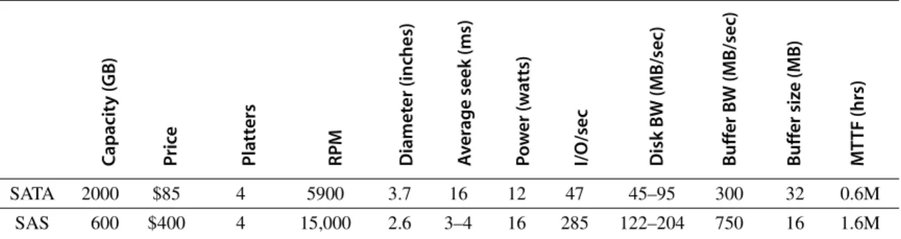
Figure D.3 shows the specifications of two 3.5-inch disks in 2011. The Serial ATA (SATA) disks shoot for high capacity and the best cost per gigabyte, so the 2000 GB drives cost less than $0.05 per gigabyte. They use the widest platters that fit the form factor and use four or five of them, but they spin at 5900 RPM and seek relatively slowly to allow a higher areal density and to lower power. The corresponding Serial Attach SCSI (SAS) drive aims at performance, so it spins at 15,000 RPM and seeks much faster. It uses a lower areal density to spin at that high rate. To reduce power, the platter is much narrower than the form factor.
This combination reduces capacity of the SAS drive to 600 GB.
The cost per gigabyte is about a factor of five better for the SATA drives, and, conversely, the cost per I/O per second or MB transferred per second is about a factor of five better for the SAS drives. Despite using smaller platters and many fewer of them, the SAS disks use twice the power of the SATA drives, due to the much faster RPM and seeks.
Capacity (GB) Price Platters RPM Diameter (inches) Average seek (ms) Power (watts) I/O/sec Disk BW (MB/sec) Buffer BW (MB/sec) Buffer size (MB) MTTF (hrs)
SATA 2000 $85 4 5900 3.7 16 12 47 45–95 300 32 0.6M
SAS 600 $400 4 15,000 2.6 3–4 16 285 122–204 750 16 1.6M
Figure D.3 Serial ATA (SATA) versus Serial Attach SCSI (SAS) drives in 3.5-inch form factor in 2011. The I/Os per second were calculated using the average seek plus the time for one-half rotation plus the time to transfer one sector of 512 KB.
Power≈Diameter4.6×RPM2.8×Number of platters
Advanced Topics in Disk Arrays
An innovation that improves both dependability and performance of storage sys- tems is disk arrays. One argument for arrays is that potential throughput can be increased by having many disk drives and, hence, many disk arms, rather than fewer large drives. Simply spreading data over multiple disks, called striping, automati- cally forces accesses to several disks if the data files are large. (Although arrays improve throughput, latency is not necessarily improved.) As we saw in Chapter 1, the drawback is that with more devices, dependability decreases: N devices gener- ally have 1/N the reliability of a single device.
Although a disk array would have more faults than a smaller number of larger disks when each disk has the same reliability, dependability is improved by add- ing redundant disks to the array to tolerate faults. That is, if a single disk fails, the lost information is reconstructed from redundant information. The only danger is in having another disk fail during the mean time to repair (MTTR). Since the mean time to failure (MTTF) of disks is tens of years, and the MTTR is measured in hours, redundancy can make the measured reliability of many disks much higher than that of a single disk.
Such redundant disk arrays have become known by the acronym RAID, which originally stood for redundant array of inexpensive disks, although some prefer the word independent for I in the acronym. The ability to recover from fail- ures plus the higher throughput, measured as either megabytes per second or I/Os per second, make RAID attractive. When combined with the advantages of smaller size and lower power of small-diameter drives, RAIDs now dominate large-scale storage systems.
Figure D.4 summarizes the five standard RAID levels, showing how eight disks of user data must be supplemented by redundant or check disks at each RAID level, and it lists the pros and cons of each level. The standard RAID levels are well documented, so we will just do a quick review here and discuss advanced levels in more depth.
■ RAID 0—It has no redundancy and is sometimes nicknamed JBOD, for just a bunch of disks, although the data may be striped across the disks in the array.
This level is generally included to act as a measuring stick for the other RAID levels in terms of cost, performance, and dependability.
■ RAID 1—Also called mirroring or shadowing, there are two copies of every piece of data. It is the simplest and oldest disk redundancy scheme, but it also has the highest cost. Some array controllers will optimize read performance by allowing the mirrored disks to act independently for reads, but this optimi- zation means it may take longer for the mirrored writes to complete.
■ RAID 2—This organization was inspired by applying memory-style error- correcting codes (ECCs) to disks. It was included because there was such a disk array product at the time of the original RAID paper, but none since then as other RAID organizations are more attractive.
■ RAID 3—Since the higher-level disk interfaces understand the health of a disk, it’s easy to figure out which disk failed. Designers realized that if one extra disk contains the parity of the information in the data disks, a single disk allows recovery from a disk failure. The data are organized in stripes, with N data blocks and one parity block. When a failure occurs, we just “sub- tract” the good data from the good blocks, and what remains is the missing data. (This works whether the failed disk is a data disk or the parity disk.) RAID 3 assumes that the data are spread across all disks on reads and writes, which is attractive when reading or writing large amounts of data.
■ RAID 4—Many applications are dominated by small accesses. Since sectors have their own error checking, you can safely increase the number of reads per second by allowing each disk to perform independent reads. It would seem that writes would still be slow, if you have to read every disk to calcu- late parity. To increase the number of writes per second, an alternative RAID level
Disk failures tolerated, check space overhead for
8 data disks Pros Cons
Company products 0 Nonredundant
striped
0 failures, 0 check disks
No space overhead No protection Widely used
1 Mirrored 1 failure,
8 check disks
No parity calculation; fast recovery; small writes faster than higher RAIDs;
fast reads
Highest check storage overhead
EMC, HP (Tandem), IBM
2 Memory-style ECC 1 failure, 4 check disks
Doesn’t rely on failed disk to self-diagnose
~ Log 2 check storage overhead
Not used 3 Bit-interleaved
parity
1 failure, 1 check disk
Low check overhead; high bandwidth for large reads or
writes
No support for small, random reads or writes
Storage Concepts 4 Block-interleaved
parity
1 failure, 1 check disk
Low check overhead; more bandwidth for small reads
Parity disk is small write bottleneck
Network Appliance 5 Block-interleaved
distributed parity
1 failure, 1 check disk
Low check overhead; more bandwidth for small reads
and writes
Small writes → 4 disk accesses
Widely used
6 Row-diagonal parity, EVEN-ODD
2 failures, 2 check disks
Protects against 2 disk failures
Small writes → 6 disk accesses; 2
×
check overhead
Network Appliance
Figure D.4 RAID levels, their fault tolerance, and their overhead in redundant disks. The paper that introduced the term RAID [Patterson, Gibson, and Katz 1987] used a numerical classification that has become popular. In fact, the nonredundant disk array is often called RAID 0, indicating that the data are striped across several disks but without redundancy. Note that mirroring (RAID 1) in this instance can survive up to eight disk failures provided only one disk of each mirrored pair fails; worst case is both disks in a mirrored pair fail. In 2011, there may be no commercial imple- mentations of RAID 2; the rest are found in a wide range of products. RAID 0 + 1, 1 + 0, 01, 10, and 6 are discussed in the text.
approach involves only two disks. First, the array reads the old data that are about to be overwritten, and then calculates what bits would change before it writes the new data. It then reads the old value of the parity on the check disks, updates parity according to the list of changes, and then writes the new value of parity to the check disk. Hence, these so-called “small writes”
are still slower than small reads—they involve four disks accesses—but they are faster than if you had to read all disks on every write. RAID 4 has the same low check disk overhead as RAID 3, and it can still do large reads and writes as fast as RAID 3 in addition to small reads and writes, but con- trol is more complex.
■ RAID 5—Note that a performance flaw for small writes in RAID 4 is that they all must read and write the same check disk, so it is a performance bot- tleneck. RAID 5 simply distributes the parity information across all disks in the array, thereby removing the bottleneck. The parity block in each stripe is rotated so that parity is spread evenly across all disks. The disk array control- ler must now calculate which disk has the parity for when it wants to write a given block, but that can be a simple calculation. RAID 5 has the same low check disk overhead as RAID 3 and 4, and it can do the large reads and writes of RAID 3 and the small reads of RAID 4, but it has higher small write band- width than RAID 4. Nevertheless, RAID 5 requires the most sophisticated controller of the classic RAID levels.
Having completed our quick review of the classic RAID levels, we can now look at two levels that have become popular since RAID was introduced.
RAID 10 versus 01 (or 1 + 0 versus RAID 0 + 1)
One topic not always described in the RAID literature involves how mirroring in RAID 1 interacts with striping. Suppose you had, say, four disks’ worth of data to store and eight physical disks to use. Would you create four pairs of disks—each organized as RAID 1—and then stripe data across the four RAID 1 pairs? Alter- natively, would you create two sets of four disks—each organized as RAID 0—
and then mirror writes to both RAID 0 sets? The RAID terminology has evolved to call the former RAID 1 + 0 or RAID 10 (“striped mirrors”) and the latter RAID 0 + 1 or RAID 01 (“mirrored stripes”).
RAID 6: Beyond a Single Disk Failure
The parity-based schemes of the RAID 1 to 5 protect against a single self- identifying failure; however, if an operator accidentally replaces the wrong disk during a failure, then the disk array will experience two failures, and data will be lost. Another concern is that since disk bandwidth is growing more slowly than disk capacity, the MTTR of a disk in a RAID system is increasing, which in turn increases the chances of a second failure. For example, a 500 GB SATA disk could take about 3 hours to read sequentially assuming no interference. Given that the damaged RAID is likely to continue to serve data, reconstruction could
be stretched considerably, thereby increasing MTTR. Besides increasing recon- struction time, another concern is that reading much more data during reconstruc- tion means increasing the chance of an uncorrectable media failure, which would result in data loss. Other arguments for concern about simultaneous multiple fail- ures are the increasing number of disks in arrays and the use of ATA disks, which are slower and larger than SCSI disks.
Hence, over the years, there has been growing interest in protecting against more than one failure. Network Appliance (NetApp), for example, started by building RAID 4 file servers. As double failures were becoming a danger to cus- tomers, they created a more robust scheme to protect data, called row-diagonal parity or RAID-DP [Corbett et al. 2004]. Like the standard RAID schemes, row- diagonal parity uses redundant space based on a parity calculation on a per-stripe basis. Since it is protecting against a double failure, it adds two check blocks per stripe of data. Let’s assume there are p + 1 disks total, so p – 1 disks have data.
Figure D.5 shows the case when p is 5.
The row parity disk is just like in RAID 4; it contains the even parity across the other four data blocks in its stripe. Each block of the diagonal parity disk con- tains the even parity of the blocks in the same diagonal. Note that each diagonal does not cover one disk; for example, diagonal 0 does not cover disk 1. Hence, we need just p – 1 diagonals to protect the p disks, so the disk only has diagonals 0 to 3 in Figure D.5.
Let’s see how row-diagonal parity works by assuming that data disks 1 and 3 fail in Figure D.5. We can’t perform the standard RAID recovery using the first row using row parity, since it is missing two data blocks from disks 1 and 3.
However, we can perform recovery on diagonal 0, since it is only missing the data block associated with disk 3. Thus, row-diagonal parity starts by recovering one of the four blocks on the failed disk in this example using diagonal parity.
Since each diagonal misses one disk, and all diagonals miss a different disk, two diagonals are only missing one block. They are diagonals 0 and 2 in this example,
Figure D.5 Row diagonal parity for p = 5, which protects four data disks from dou- ble failures [Corbett et al. 2004].This figure shows the diagonal groups for which par- ity is calculated and stored in the diagonal parity disk. Although this shows all the check data in separate disks for row parity and diagonal parity as in RAID 4, there is a rotated version of row-diagonal parity that is analogous to RAID 5. Parameter p must be prime and greater than 2; however, you can make p larger than the number of data disks by assuming that the missing disks have all zeros and the scheme still works. This trick makes it easy to add disks to an existing system. NetApp picks p to be 257, which allows the system to grow to up to 256 data disks.
0 1 2 3
1 2 3 4
2 3 4 0
3 4 0 1
4 0 1 2
0 1 2 3 Data disk 0 Data disk 1 Data disk 2 Data disk 3 Row parity Diagonal parity
so we next restore the block from diagonal 2 from failed disk 1. When the data for those blocks have been recovered, then the standard RAID recovery scheme can be used to recover two more blocks in the standard RAID 4 stripes 0 and 2, which in turn allows us to recover more diagonals. This process continues until two failed disks are completely restored.
The EVEN-ODD scheme developed earlier by researchers at IBM is similar to row diagonal parity, but it has a bit more computation during operation and recovery [Blaum 1995]. Papers that are more recent show how to expand EVEN-ODD to protect against three failures [Blaum, Bruck, and Vardy 1996;
Blaum et al. 2001].
Although people may be willing to live with a computer that occasionally crashes and forces all programs to be restarted, they insist that their information is never lost. The prime directive for storage is then to remember information, no matter what happens.
Chapter 1 covered the basics of dependability, and this section expands that information to give the standard definitions and examples of failures.
The first step is to clarify confusion over terms. The terms fault, error, and failure are often used interchangeably, but they have different meanings in the dependability literature. For example, is a programming mistake a fault, error, or failure? Does it matter whether we are talking about when it was designed or when the program is run? If the running program doesn’t exercise the mistake, is it still a fault/error/failure? Try another one. Suppose an alpha particle hits a DRAM memory cell. Is it a fault/error/failure if it doesn’t change the value? Is it a fault/error/failure if the memory doesn’t access the changed bit? Did a fault/
error/failure still occur if the memory had error correction and delivered the cor- rected value to the CPU? You get the drift of the difficulties. Clearly, we need precise definitions to discuss such events intelligently.
To avoid such imprecision, this subsection is based on the terminology used by Laprie [1985] and Gray and Siewiorek [1991], endorsed by IFIP Working Group 10.4 and the IEEE Computer Society Technical Committee on Fault Toler- ance. We talk about a system as a single module, but the terminology applies to submodules recursively. Let’s start with a definition of dependability:
Computer system dependability is the quality of delivered service such that reli- ance can justifiably be placed on this service. The service delivered by a system is its observed actual behavior as perceived by other system(s) interacting with this system’s users. Each module also has an ideal specified behavior, where a service specification is an agreed description of the expected behavior. A system failure occurs when the actual behavior deviates from the specified behavior.
The failure occurred because of an error, a defect in that module. The cause of an error is a fault.
When a fault occurs, it creates a latent error, which becomes effective when it is activated; when the error actually affects the delivered service, a failure occurs.
D.3 Definition and Examples of Real Faults and Failures
The time between the occurrence of an error and the resulting failure is the error latency. Thus, an error is the manifestation in the system of a fault, and a failure is the manifestation on the service of an error. [p. 3]
Let’s go back to our motivating examples above. A programming mistake is a fault. The consequence is an error (or latent error) in the software. Upon activa- tion, the error becomes effective. When this effective error produces erroneous data that affect the delivered service, a failure occurs.
An alpha particle hitting a DRAM can be considered a fault. If it changes the memory, it creates an error. The error will remain latent until the affected mem- ory word is read. If the effective word error affects the delivered service, a failure occurs. If ECC corrected the error, a failure would not occur.
A mistake by a human operator is a fault. The resulting altered data is an error. It is latent until activated, and so on as before.
To clarify, the relationship among faults, errors, and failures is as follows:
■ A fault creates one or more latent errors.
■ The properties of errors are (1) a latent error becomes effective once acti- vated; (2) an error may cycle between its latent and effective states; and (3) an effective error often propagates from one component to another, thereby cre- ating new errors. Thus, either an effective error is a formerly latent error in that component or it has propagated from another error in that component or from elsewhere.
■ A component failure occurs when the error affects the delivered service.
■ These properties are recursive and apply to any component in the system.
Gray and Siewiorek classified faults into four categories according to their cause:
1. Hardware faults—Devices that fail, such as perhaps due to an alpha particle hitting a memory cell
2. Design faults—Faults in software (usually) and hardware design (occasionally) 3. Operation faults—Mistakes by operations and maintenance personnel
4. Environmental faults—Fire, flood, earthquake, power failure, and sabotage Faults are also classified by their duration into transient, intermittent, and perma- nent [Nelson 1990]. Transient faults exist for a limited time and are not recurring.
Intermittent faults cause a system to oscillate between faulty and fault-free opera- tion. Permanent faults do not correct themselves with the passing of time.
Now that we have defined the difference between faults, errors, and failures, we are ready to see some real-world examples. Publications of real error rates are rare for two reasons. First, academics rarely have access to significant hardware resources to measure. Second, industrial researchers are rarely allowed to publish failure information for fear that it would be used against their companies in the marketplace. A few exceptions follow.
Berkeley’s Tertiary Disk
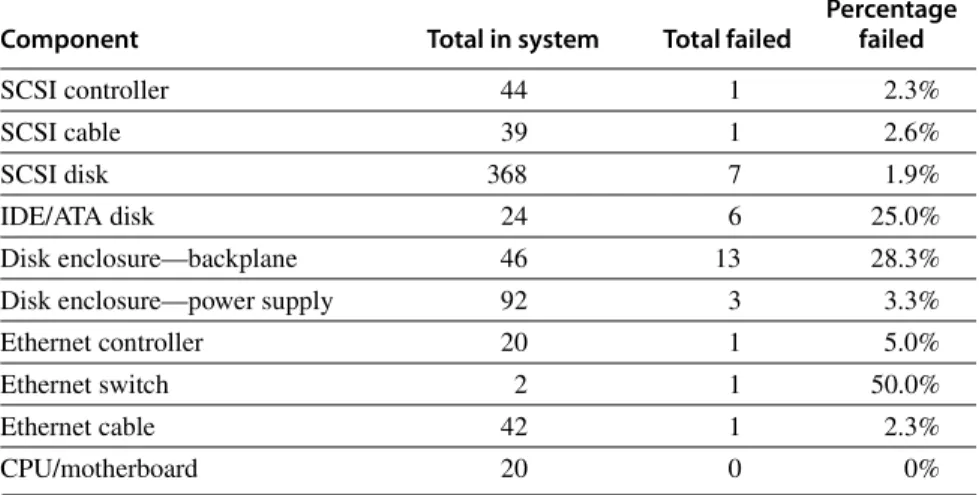
The Tertiary Disk project at the University of California created an art image server for the Fine Arts Museums of San Francisco in 2000. This database con- sisted of high-quality images of over 70,000 artworks [Talagala et al., 2000]. The database was stored on a cluster, which consisted of 20 PCs connected by a switched Ethernet and containing 368 disks. It occupied seven 7-foot-high racks.
Figure D.6 shows the failure rates of the various components of Tertiary Disk.
In advance of building the system, the designers assumed that SCSI data disks would be the least reliable part of the system, as they are both mechanical and plen- tiful. Next would be the IDE disks since there were fewer of them, then the power supplies, followed by integrated circuits. They assumed that passive devices such as cables would scarcely ever fail.
Figure D.6 shatters some of those assumptions. Since the designers followed the manufacturer’s advice of making sure the disk enclosures had reduced vibra- tion and good cooling, the data disks were very reliable. In contrast, the PC chas- sis containing the IDE/ATA disks did not afford the same environmental controls.
(The IDE/ATA disks did not store data but helped the application and operating system to boot the PCs.) Figure D.6 shows that the SCSI backplane, cables, and Ethernet cables were no more reliable than the data disks themselves!
As Tertiary Disk was a large system with many redundant components, it could survive this wide range of failures. Components were connected and mir- rored images were placed so that no single failure could make any image unavail- able. This strategy, which initially appeared to be overkill, proved to be vital.
This experience also demonstrated the difference between transient faults and hard faults. Virtually all the failures in Figure D.6 appeared first as transient faults. It was up to the operator to decide if the behavior was so poor that they needed to be replaced or if they could continue. In fact, the word “failure” was not used; instead, the group borrowed terms normally used for dealing with prob- lem employees, with the operator deciding whether a problem component should or should not be “fired.”
Tandem
The next example comes from industry. Gray [1990] collected data on faults for Tandem Computers, which was one of the pioneering companies in fault-tolerant computing and used primarily for databases. Figure D.7 graphs the faults that caused system failures between 1985 and 1989 in absolute faults per system and in percentage of faults encountered. The data show a clear improvement in the reliability of hardware and maintenance. Disks in 1985 required yearly service by Tandem, but they were replaced by disks that required no scheduled maintenance.
Shrinking numbers of chips and connectors per system plus software’s ability to tolerate hardware faults reduced hardware’s contribution to only 7% of failures by 1989. Moreover, when hardware was at fault, software embedded in the hard- ware device (firmware) was often the culprit. The data indicate that software in
1989 was the major source of reported outages (62%), followed by system opera- tions (15%).
The problem with any such statistics is that the data only refer to what is reported; for example, environmental failures due to power outages were not reported to Tandem because they were seen as a local problem. Data on operation faults are very difficult to collect because operators must report personal mis- takes, which may affect the opinion of their managers, which in turn can affect job security and pay raises. Gray suggested that both environmental faults and operator faults are underreported. His study concluded that achieving higher availability requires improvement in software quality and software fault toler- ance, simpler operations, and tolerance of operational faults.
Other Studies of the Role of Operators in Dependability
While Tertiary Disk and Tandem are storage-oriented dependability studies, we need to look outside storage to find better measurements on the role of humans in failures. Murphy and Gent [1995] tried to improve the accuracy of data on operator faults by having the system automatically prompt the operator on each
Component Total in system Total failed
Percentage failed
SCSI controller 44 1 2.3%
SCSI cable 39 1 2.6%
SCSI disk 368 7 1.9%
IDE/ATA disk 24 6 25.0%
Disk enclosure—backplane 46 13 28.3%
Disk enclosure—power supply 92 3 3.3%
Ethernet controller 20 1 5.0%
Ethernet switch 2 1 50.0%
Ethernet cable 42 1 2.3%
CPU/motherboard 20 0 0%
Figure D.6 Failures of components in Tertiary Disk over 18 months of operation.
For each type of component, the table shows the total number in the system, the number that failed, and the percentage failure rate. Disk enclosures have two entries in the table because they had two types of problems: backplane integrity failures and power supply failures. Since each enclosure had two power supplies, a power supply failure did not affect availability. This cluster of 20 PCs, contained in seven 7-foot- high, 19-inch-wide racks, hosted 368 8.4 GB, 7200 RPM, 3.5-inch IBM disks. The PCs were P6-200 MHz with 96 MB of DRAM each. They ran FreeBSD 3.0, and the hosts were connected via switched 100 Mbit/sec Ethernet. All SCSI disks were connected to two PCs via double-ended SCSI chains to support RAID 1. The primary application was called the Zoom Project, which in 1998 was the world’s largest art image data- base, with 72,000 images. See Talagala et al. [2000b].
boot for the reason for that reboot. They classified consecutive crashes to the same fault as operator fault and included operator actions that directly resulted in crashes, such as giving parameters bad values, bad configurations, and bad application installation. Although they believed that operator error is under- reported, they did get more accurate information than did Gray, who relied on a form that the operator filled out and then sent up the management chain. The Figure D.7 Faults in Tandem between 1985 and 1989. Gray [1990] collected these data for fault-tolerant Tandem Computers based on reports of component failures by customers.
Unknown
Environment (power, network) Operations (by customer) Maintenance (by Tandem) Hardware
Software (applications + OS)
20 40 60
Faults per 1000 systemsPercentage faults per category
80 100 120
100%
80%
4%
6%
9%
19%
29%
34%
5%
6%
15%
5%
7%
62%
5%
9%
12%
13%
22%
39%
60%
40%
20%
0%
0
1985 1987 1989
1985 1987 1989
hardware/operating system went from causing 70% of the failures in VAX sys- tems in 1985 to 28% in 1993, and failures due to operators rose from 15% to 52% in that same period. Murphy and Gent expected managing systems to be the primary dependability challenge in the future.
The final set of data comes from the government. The Federal Communica- tions Commission (FCC) requires that all telephone companies submit explana- tions when they experience an outage that affects at least 30,000 people or lasts 30 minutes. These detailed disruption reports do not suffer from the self- reporting problem of earlier figures, as investigators determine the cause of the outage rather than operators of the equipment. Kuhn [1997] studied the causes of outages between 1992 and 1994, and Enriquez [2001] did a follow-up study for the first half of 2001. Although there was a significant improvement in failures due to overloading of the network over the years, failures due to humans increased, from about one-third to two-thirds of the customer-outage minutes.
These four examples and others suggest that the primary cause of failures in large systems today is faults by human operators. Hardware faults have declined due to a decreasing number of chips in systems and fewer connectors. Hardware dependability has improved through fault tolerance techniques such as memory ECC and RAID. At least some operating systems are considering reliability implications before adding new features, so in 2011 the failures largely occurred elsewhere.
Although failures may be initiated due to faults by operators, it is a poor reflection on the state of the art of systems that the processes of maintenance and upgrading are so error prone. Most storage vendors claim today that customers spend much more on managing storage over its lifetime than they do on purchas- ing the storage. Thus, the challenge for dependable storage systems of the future is either to tolerate faults by operators or to avoid faults by simplifying the tasks of system administration. Note that RAID 6 allows the storage system to survive even if the operator mistakenly replaces a good disk.
We have now covered the bedrock issue of dependability, giving definitions, case studies, and techniques to improve it. The next step in the storage tour is per- formance.
I/O performance has measures that have no counterparts in design. One of these is diversity: Which I/O devices can connect to the computer system? Another is capacity: How many I/O devices can connect to a computer system?
In addition to these unique measures, the traditional measures of performance (namely, response time and throughput) also apply to I/O. (I/O throughput is sometimes called I/O bandwidth and response time is sometimes called latency.) The next two figures offer insight into how response time and throughput trade off against each other. Figure D.8 shows the simple producer-server model. The producer creates tasks to be performed and places them in a buffer; the server takes tasks from the first in, first out buffer and performs them.
D.4 I/O Performance, Reliability Measures, and Benchmarks
Response time is defined as the time a task takes from the moment it is placed in the buffer until the server finishes the task. Throughput is simply the average number of tasks completed by the server over a time period. To get the highest possible throughput, the server should never be idle, thus the buffer should never be empty. Response time, on the other hand, counts time spent in the buffer, so an empty buffer shrinks it.
Another measure of I/O performance is the interference of I/O with processor execution. Transferring data may interfere with the execution of another process.
There is also overhead due to handling I/O interrupts. Our concern here is how much longer a process will take because of I/O for another process.
Throughput versus Response Time
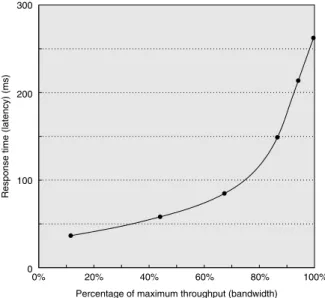
Figure D.9 shows throughput versus response time (or latency) for a typical I/O system. The knee of the curve is the area where a little more throughput results in much longer response time or, conversely, a little shorter response time results in much lower throughput.
How does the architect balance these conflicting demands? If the computer is interacting with human beings, Figure D.10 suggests an answer. An interaction, or transaction, with a computer is divided into three parts:
1. Entry time—The time for the user to enter the command.
2. System response time—The time between when the user enters the command and the complete response is displayed.
3. Think time—The time from the reception of the response until the user begins to enter the next command.
The sum of these three parts is called the transaction time. Several studies report that user productivity is inversely proportional to transaction time. The results in Figure D.10 show that cutting system response time by 0.7 seconds saves 4.9 sec- onds (34%) from the conventional transaction and 2.0 seconds (70%) from the graphics transaction. This implausible result is explained by human nature: People need less time to think when given a faster response. Although this study is 20 years old, response times are often still much slower than 1 second, even if processors are Figure D.8 The traditional producer-server model of response time and through- put. Response time begins when a task is placed in the buffer and ends when it is com- pleted by the server. Throughput is the number of tasks completed by the server in unit time.
Producer Server
Queue
Figure D.9 Throughput versus response time. Latency is normally reported as response time. Note that the minimum response time achieves only 11% of the throughput, while the response time for 100% throughput takes seven times the mini- mum response time. Note also that the independent variable in this curve is implicit; to trace the curve, you typically vary load (concurrency). Chen et al. [1990] collected these data for an array of magnetic disks.
Figure D.10 A user transaction with an interactive computer divided into entry time, system response time, and user think time for a conventional system and graphics system. The entry times are the same, independent of system response time.
The entry time was 4 seconds for the conventional system and 0.25 seconds for the graphics system. Reduction in response time actually decreases transaction time by more than just the response time reduction. (From Brady [1986].)
300
0%
Percentage of maximum throughput (bandwidth)
Response time (latency) (ms)
20% 40% 60% 80% 100%
200
100
0
0
Time (sec) High-function graphics workload
(0.3 sec system response time)
5 10 15
High-function graphics workload (1.0 sec system response time) Conventional interactive workload (0.3 sec system response time) Conventional interactive workload (1.0 sec system response time)
Workload
–70% total (–81% think)
–34% total (–70% think)
Entry time System response time Think time
1000 times faster. Examples of long delays include starting an application on a desk- top PC due to many disk I/Os, or network delays when clicking on Web links.
To reflect the importance of response time to user productivity, I/O bench- marks also address the response time versus throughput trade-off. Figure D.11 shows the response time bounds for three I/O benchmarks. They report maximum throughput given either that 90% of response times must be less than a limit or that the average response time must be less than a limit.
Let’s next look at these benchmarks in more detail.
Transaction-Processing Benchmarks
Transaction processing (TP, or OLTP for online transaction processing) is chiefly concerned with I/O rate (the number of disk accesses per second), as opposed to data rate (measured as bytes of data per second). TP generally involves changes to a large body of shared information from many terminals, with the TP system guaranteeing proper behavior on a failure. Suppose, for example, that a bank’s computer fails when a customer tries to withdraw money from an ATM. The TP system would guarantee that the account is debited if the customer received the money and that the account is unchanged if the money was not received. Airline reservations systems as well as banks are traditional customers for TP.
As mentioned in Chapter 1, two dozen members of the TP community con- spired to form a benchmark for the industry and, to avoid the wrath of their legal departments, published the report anonymously [Anon. et al. 1985]. This report led to the Transaction Processing Council, which in turn has led to eight bench- marks since its founding. Figure D.12 summarizes these benchmarks.
Let’s describe TPC-C to give a flavor of these benchmarks. TPC-C uses a database to simulate an order-entry environment of a wholesale supplier, including entering and delivering orders, recording payments, checking the sta- tus of orders, and monitoring the level of stock at the warehouses. It runs five concurrent transactions of varying complexity, and the database includes nine tables with a scalable range of records and customers. TPC-C is measured in transactions per minute (tpmC) and in price of system, including hardware, I/O benchmark Response time restriction Throughput metric TPC-C: Complex
Query OLTP ≥90% of transaction must meet response time limit; 5 seconds for most types of transactions
New order transactions per minute TPC-W: Transactional
Web benchmark
≥90% of Web interactions must meet response time limit; 3 seconds for most types of Web interactions
Web interactions per second SPECsfs97 Average response time ≤40 ms NFS operations
per second Figure D.11 Response time restrictions for three I/O benchmarks.
software, and three years of maintenance support. Figure 1.16 on page 39 in Chapter 1 describes the top systems in performance and cost-performance for TPC-C.
These TPC benchmarks were the first—and in some cases still the only ones—that have these unusual characteristics:
■ Price is included with the benchmark results. The cost of hardware, software, and maintenance agreements is included in a submission, which enables evalu- ations based on price-performance as well as high performance.
■ The dataset generally must scale in size as the throughput increases. The benchmarks are trying to model real systems, in which the demand on the system and the size of the data stored in it increase together. It makes no sense, for example, to have thousands of people per minute access hundreds of bank accounts.
■ The benchmark results are audited. Before results can be submitted, they must be approved by a certified TPC auditor, who enforces the TPC rules that try to make sure that only fair results are submitted. Results can be chal- lenged and disputes resolved by going before the TPC.
■ Throughput is the performance metric, but response times are limited. For example, with TPC-C, 90% of the new order transaction response times must be less than 5 seconds.
■ An independent organization maintains the benchmarks. Dues collected by TPC pay for an administrative structure including a chief operating office.
This organization settles disputes, conducts mail ballots on approval of changes to benchmarks, holds board meetings, and so on.
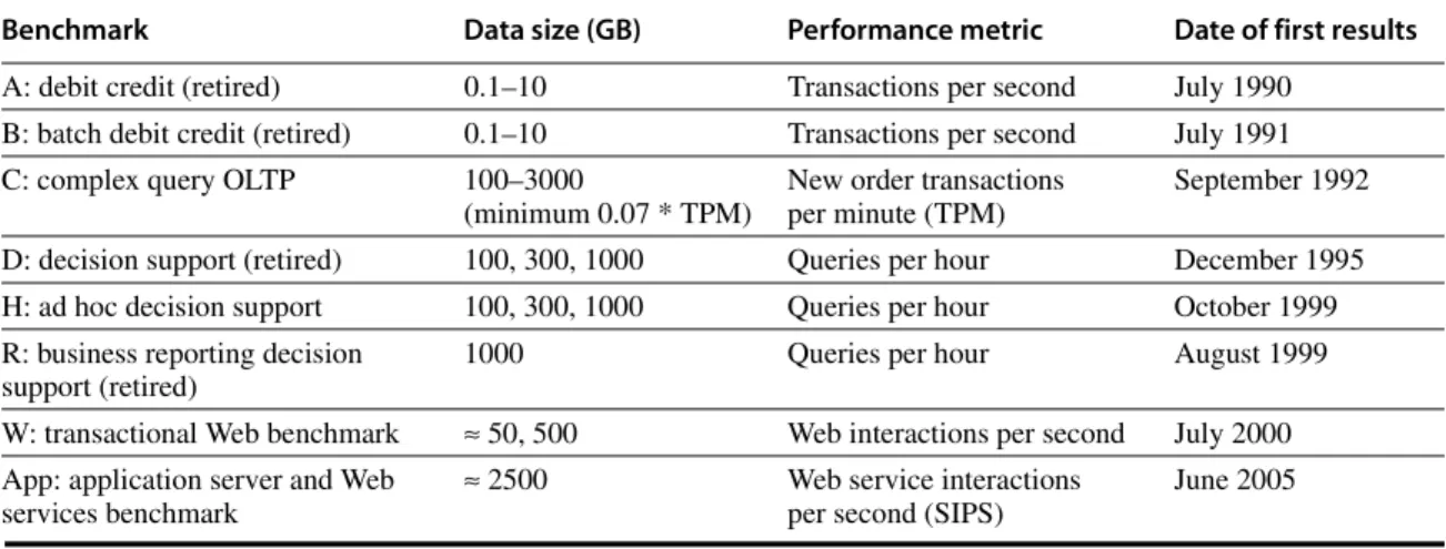
Benchmark Data size (GB) Performance metric Date of first results
A: debit credit (retired) 0.1–10 Transactions per second July 1990
B: batch debit credit (retired) 0.1–10 Transactions per second July 1991
C: complex query OLTP 100–3000
(minimum 0.07 * TPM)
New order transactions per minute (TPM)
September 1992 D: decision support (retired) 100, 300, 1000 Queries per hour December 1995
H: ad hoc decision support 100, 300, 1000 Queries per hour October 1999
R: business reporting decision support (retired)
1000 Queries per hour August 1999
W: transactional Web benchmark ≈ 50, 500 Web interactions per second July 2000 App: application server and Web
services benchmark
≈ 2500 Web service interactions
per second (SIPS)
June 2005
Figure D.12 Transaction Processing Council benchmarks. The summary results include both the performance metric and the price-performance of that metric. TPC-A, TPC-B, TPC-D, and TPC-R were retired.
SPEC System-Level File Server, Mail, and Web Benchmarks
The SPEC benchmarking effort is best known for its characterization of proces- sor performance, but it has created benchmarks for file servers, mail servers, and Web servers.
Seven companies agreed on a synthetic benchmark, called SFS, to evaluate systems running the Sun Microsystems network file service (NFS). This bench- mark was upgraded to SFS 3.0 (also called SPEC SFS97_R1) to include support for NFS version 3, using TCP in addition to UDP as the transport protocol, and making the mix of operations more realistic. Measurements on NFS systems led to a synthetic mix of reads, writes, and file operations. SFS supplies default parameters for comparative performance. For example, half of all writes are done in 8 KB blocks and half are done in partial blocks of 1, 2, or 4 KB. For reads, the mix is 85% full blocks and 15% partial blocks.
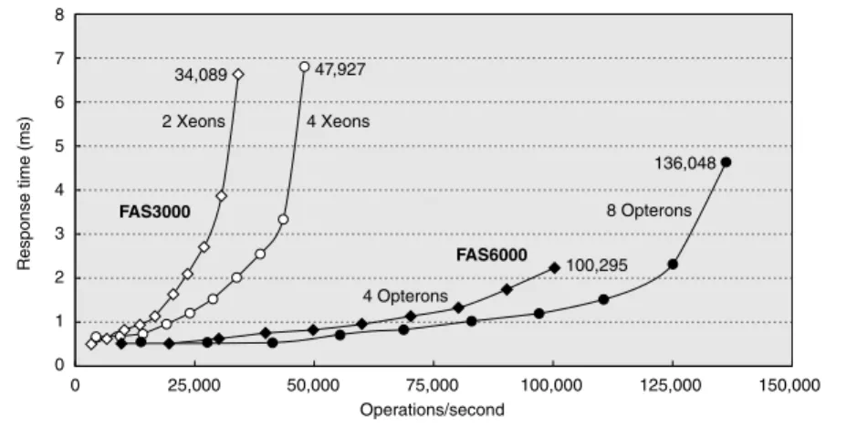
Like TPC-C, SFS scales the amount of data stored according to the reported throughput: For every 100 NFS operations per second, the capacity must increase by 1 GB. It also limits the average response time, in this case to 40 ms. Figure D.13 shows average response time versus throughput for two NetApp systems.
Unfortunately, unlike the TPC benchmarks, SFS does not normalize for different price configurations.
SPECMail is a benchmark to help evaluate performance of mail servers at an Internet service provider. SPECMail2001 is based on the standard Internet proto- cols SMTP and POP3, and it measures throughput and user response time while scaling the number of users from 10,000 to 1,000,000.
Figure D.13 SPEC SFS97_R1 performance for the NetApp FAS3050c NFS servers in two configurations. Two processors reached 34,089 operations per second and four processors did 47,927. Reported in May 2005, these systems used the Data ONTAP 7.0.1R1 operating system, 2.8 GHz Pentium Xeon microprocessors, 2 GB of DRAM per processor, 1 GB of nonvolatile memory per system, and 168 15K RPM, 72 GB, Fibre Channel disks. These disks were connected using two or four QLogic ISP-2322 FC disk controllers.
0 1 2 3 5
4 6
Response time (ms)
7 8
0 125,000 150,000
34,089
2 Xeons
FAS3000
FAS6000 4 Xeons
8 Opterons
4 Opterons 47,927
100,295 136,048
100,000 75,000
Operations/second 50,000
25,000
SPECWeb is a benchmark for evaluating the performance of World Wide Web servers, measuring number of simultaneous user sessions. The SPECWeb2005 workload simulates accesses to a Web service provider, where the server supports home pages for several organizations. It has three workloads: Banking (HTTPS), E-commerce (HTTP and HTTPS), and Support (HTTP).
Examples of Benchmarks of Dependability
The TPC-C benchmark does in fact have a dependability requirement. The bench- marked system must be able to handle a single disk failure, which means in practice that all submitters are running some RAID organization in their storage system.
Efforts that are more recent have focused on the effectiveness of fault toler- ance in systems. Brown and Patterson [2000] proposed that availability be mea- sured by examining the variations in system quality-of-service metrics over time as faults are injected into the system. For a Web server, the obvious metrics are performance (measured as requests satisfied per second) and degree of fault tol- erance (measured as the number of faults that can be tolerated by the storage sub- system, network connection topology, and so forth).
The initial experiment injected a single fault––such as a write error in disk sector––and recorded the system’s behavior as reflected in the quality-of-service metrics. The example compared software RAID implementations provided by Linux, Solaris, and Windows 2000 Server. SPECWeb99 was used to provide a workload and to measure performance. To inject faults, one of the SCSI disks in the software RAID volume was replaced with an emulated disk. It was a PC run- ning software using a SCSI controller that appears to other devices on the SCSI bus as a disk. The disk emulator allowed the injection of faults. The faults injected included a variety of transient disk faults, such as correctable read errors, and permanent faults, such as disk media failures on writes.
Figure D.14 shows the behavior of each system under different faults. The two top graphs show Linux (on the left) and Solaris (on the right). As RAID sys- tems can lose data if a second disk fails before reconstruction completes, the lon- ger the reconstruction (MTTR), the lower the availability. Faster reconstruction implies decreased application performance, however, as reconstruction steals I/O resources from running applications. Thus, there is a policy choice between tak- ing a performance hit during reconstruction or lengthening the window of vulner- ability and thus lowering the predicted MTTF.
Although none of the tested systems documented their reconstruction policies outside of the source code, even a single fault injection was able to give insight into those policies. The experiments revealed that both Linux and Solaris initiate automatic reconstruction of the RAID volume onto a hot spare when an active disk is taken out of service due to a failure. Although Windows supports RAID reconstruction, the reconstruction must be initiated manually. Thus, without human intervention, a Windows system that did not rebuild after a first failure remains susceptible to a second failure, which increases the window of vulnera- bility. It does repair quickly once told to do so.
The fault injection experiments also provided insight into other availability policies of Linux, Solaris, and Windows 2000 concerning automatic spare utiliza- tion, reconstruction rates, transient errors, and so on. Again, no system docu- mented their policies.
In terms of managing transient faults, the fault injection experiments revealed that Linux’s software RAID implementation takes an opposite approach than do Figure D.14 Availability benchmark for software RAID systems on the same computer running Red Hat 6.0 Linux, Solaris 7, and Windows 2000 operating systems. Note the difference in philosophy on speed of reconstruc- tion of Linux versus Windows and Solaris. The y-axis is behavior in hits per second running SPECWeb99. The arrow indicates time of fault insertion. The lines at the top give the 99% confidence interval of performance before the fault is inserted. A 99% confidence interval means that if the variable is outside of this range, the probability is only 1%
that this value would appear.
0 10 20 30 40 50 60 70 80 90 100 110
0 10 20 30 40
Reconstruction
50 60 70 80 90 100 110
0 5 10 15 20 25 30 35 40 45
Time (minutes)
Reconstruction
Hits per second Hits per second
Hits per second
Linux Solaris
Windows
Time (minutes)
Time (minutes)
Reconstruction
200
190
180
170
160
150 220
225
215
210
205
200
195
190 80
90 100 110 120 130 140 150 160
the RAID implementations in Solaris and Windows. The Linux implementation is paranoid––it would rather shut down a disk in a controlled manner at the first error, rather than wait to see if the error is transient. In contrast, Solaris and Win- dows are more forgiving––they ignore most transient faults with the expectation that they will not recur. Thus, these systems are substantially more robust to transients than the Linux system. Note that both Windows and Solaris do log the transient faults, ensuring that the errors are reported even if not acted upon. When faults were permanent, the systems behaved similarly.
In processor design, we have simple back-of-the-envelope calculations of perfor- mance associated with the CPI formula in Chapter 1, or we can use full-scale sim- ulation for greater accuracy at greater cost. In I/O systems, we also have a best- case analysis as a back-of-the-envelope calculation. Full-scale simulation is also much more accurate and much more work to calculate expected performance.
With I/O systems, however, we also have a mathematical tool to guide I/O design that is a little more work and much more accurate than best-case analysis, but much less work than full-scale simulation. Because of the probabilistic nature of I/O events and because of sharing of I/O resources, we can give a set of simple theorems that will help calculate response time and throughput of an entire I/O system. This helpful field is called queuing theory. Since there are many books and courses on the subject, this section serves only as a first introduction to the topic. However, even this small amount can lead to better design of I/O systems.
Let’s start with a black-box approach to I/O systems, as shown in Figure D.15.
In our example, the processor is making I/O requests that arrive at the I/O device, and the requests “depart” when the I/O device fulfills them.
We are usually interested in the long term, or steady state, of a system rather than in the initial start-up conditions. Suppose we weren’t. Although there is a mathematics that helps (Markov chains), except for a few cases, the only way to solve the resulting equations is simulation. Since the purpose of this section is to show something a little harder than back-of-the-envelope calculations but less
Figure D.15 Treating the I/O system as a black box. This leads to a simple but impor- tant observation: If the system is in steady state, then the number of tasks entering the system must equal the number of tasks leaving the system. This flow-balanced state is necessary but not sufficient for steady state. If the system has been observed or mea- sured for a sufficiently long time and mean waiting times stabilize, then we say that the system has reached steady state.
D.5 A Little Queuing Theory
Arrivals Departures
than simulation, we won’t cover such analyses here. (See the references in Appendix L for more details.)
Hence, in this section we make the simplifying assumption that we are evalu- ating systems with multiple independent requests for I/O service that are in equi- librium: The input rate must be equal to the output rate. We also assume there is a steady supply of tasks independent for how long they wait for service. In many real systems, such as TPC-C, the task consumption rate is determined by other system characteristics, such as memory capacity.
This leads us to Little’s law, which relates the average number of tasks in the system, the average arrival rate of new tasks, and the average time to perform a task:
Little’s law applies to any system in equilibrium, as long as nothing inside the black box is creating new tasks or destroying them. Note that the arrival rate and the response time must use the same time unit; inconsistency in time units is a common cause of errors.
Let’s try to derive Little’s law. Assume we observe a system for Timeobserve minutes. During that observation, we record how long it took each task to be serviced, and then sum those times. The number of tasks completed during Timeobserve is Numbertask, and the sum of the times each task spends in the sys- tem is Timeaccumulated. Note that the tasks can overlap in time, so Timeaccumulated ≥ Timeobserved. Then,
Algebra lets us split the first formula:
If we substitute the three definitions above into this formula, and swap the result- ing two terms on the right-hand side, we get Little’s law:
This simple equation is surprisingly powerful, as we shall see.
If we open the black box, we see Figure D.16.The area where the tasks accu- mulate, waiting to be serviced, is called the queue, or waiting line. The device performing the requested service is called the server. Until we get to the last two pages of this section, we assume a single server.
Mean number of tasks in system = Arrival rate×Mean response time
Mean number of tasks in system Timeaccumulated
Timeobserve ---
=
Mean response time Timeaccumulated
Numbertasks ---
=
Arrival rate Numbertasks Timeobserve ---
=
Timeaccumulated
Timeobserve
--- Timeaccumulated
Numbertasks
---∞Numbertasks Timeobserve ---
=
Mean number of tasks in system = Arrival rate×Mean response time
Little’s law and a series of definitions lead to several useful equations:
■ Timeserver—Average time to service a task; average service rate is 1/Timeserver, traditionally represented by the symbol µ in many queuing texts.
■ Timequeue—Average time per task in the queue.
■ Timesystem—Average time/task in the system, or the response time, which is the sum of Timequeue and Timeserver.
■ Arrival rate—Average number of arriving tasks/second, traditionally repre- sented by the symbol λ in many queuing texts.
■ Lengthserver—Average number of tasks in service.
■ Lengthqueue—Average length of queue.
■ Lengthsystem—Average number of tasks in system, which is the sum of Lengthqueue and Lengthserver.
One common misunderstanding can be made clearer by these definitions:
whether the question is how long a task must wait in the queue before service starts (Timequeue) or how long a task takes until it is completed (Timesystem). The latter term is what we mean by response time, and the relationship between the terms is Timesystem = Timequeue + Timeserver.
The mean number of tasks in service (Lengthserver) is simply Arrival rate × Timeserver, which is Little’s law. Server utilization is simply the mean number of tasks being serviced divided by the service rate. For a single server, the service rate is 1 ⁄ Timeserver. Hence, server utilization (and, in this case, the mean number of tasks per server) is simply:
Service utilization must be between 0 and 1; otherwise, there would be more tasks arriving than could be serviced, violating our assumption that the system is in equilibrium. Note that this formula is just a restatement of Little’s law. Utiliza- tion is also called traffic intensity and is represented by the symbol ρ in many queuing theory texts.
Figure D.16 The single-server model for this section. In this situation, an I/O request
“departs” by being completed by the server.
Arrivals
Queue Server
I/O controller and device
Server utilization = Arrival rate×Timeserver
Example Suppose an I/O system with a single disk gets on average 50 I/O requests per sec- ond. Assume the average time for a disk to service an I/O request is 10 ms. What is the utilization of the I/O system?
Answer Using the equation above, with 10 ms represented as 0.01 seconds, we get:
Therefore, the I/O system utilization is 0.5.
How the queue delivers tasks to the server is called the queue discipline. The simplest and most common discipline is first in, first out (FIFO). If we assume FIFO, we can relate time waiting in the queue to the mean number of tasks in the queue:
Timequeue = Lengthqueue× Timeserver + Mean time to complete service of task when new task arrives if server is busy
That is, the time in the queue is the number of tasks in the queue times the mean service time plus the time it takes the server to complete whatever task is being serviced when a new task arrives. (There is one more restriction about the arrival of tasks, which we reveal on page D-28.)
The last component of the equation is not as simple as it first appears. A new task can arrive at any instant, so we have no basis to know how long the existing task has been in the server. Although such requests are random events, if we know something about the distribution of events, we can predict performance.
Poisson Distribution of Random Variables
To estimate the last component of the formula we need to know a little about distri- butions of random variables. A variable is random if it takes one of a specified set of values with a specified probability; that is, you cannot know exactly what its next value will be, but you may know the probability of all possible values.
Requests for service from an I/O system can be modeled by a random vari- able because the operating system is normally switching between several pro- cesses that generate independent I/O requests. We also model I/O service times by a random variable given the probabilistic nature of disks in terms of seek and rotational delays.
One way to characterize the distribution of values of a random variable with discrete values is a histogram, which divides the range between the minimum and maximum values into subranges called buckets. Histograms then plot the number in each bucket as columns.
Histograms work well for distributions that are discrete values—for example, the number of I/O requests. For distributions that are not discrete values, such as
Server utilization Arrival rate×Timeserver 50
sec---×0.01sec 0.50
= = =

![Figure D.2 Throughput versus command queue depth using random 512-byte reads. The disk performs 170 reads per second starting at no command queue and doubles performance at 50 and triples at 256 [Anderson 2003].](https://thumb-ap.123doks.com/thumbv2/9libinfo/9044945.330803/5.810.225.698.633.862/figure-throughput-command-performs-starting-command-performance-anderson.webp)
![Figure D.4 RAID levels, their fault tolerance, and their overhead in redundant disks. The paper that introduced the term RAID [Patterson, Gibson, and Katz 1987] used a numerical classification that has become popular](https://thumb-ap.123doks.com/thumbv2/9libinfo/9044945.330803/8.810.105.760.116.514/figure-tolerance-overhead-redundant-introduced-patterson-numerical-classification.webp)