國
立
交
通
大
學
統計學研究所
碩
碩
碩
碩
士
士
士
士
論
論
論
論
文
文
文
文
利用單體資料縱深測度建構剖面資料
之無母數監控方法
Profile Monitoring via Simplicial Data Depth
研 究 生:鄭欽友
指導教授:洪志真 博士
中
中
中
中
華
華
華
華
民
民
民
民
國
國
國
國
九
九
九
九
十
十
十
十
八
八
八
八
年
年
年
年
六
六
六
六
月
月
月
月
利用單體資料縱深測度建構剖面資料之無母數監控方法
Profile Monitoring via Simplicial Data Depth
研 究 生:鄭欽友 Student:Chin-Yu Cheng
指導教授:洪志真 博士 Advisor:Dr. Jyh-Jen Horng Shiau
國 立 交 通 大 學
統 計 學 研 究 所
碩 士 論 文
A Thesis
Submitted to Institute of Statistics
College of Science
National Chiao Tung University
in partial Fulfillment of the Requirements
for the Degree of
Master
in
Statistics
June 2009
利用單體資料縱深測度建構剖面資料
之無母數監控方法
學生:鄭欽友 指導教授:洪志真 博士
國立交通大學統計學研究所碩士班
摘
要
在目前的統計製程管制中,當製程品質特性可以用剖面資料來作很好的描述時,對剖面資 料的監控是一種新穎且有用的技術。這篇論文目的在於藉著無母數方法發展對於有隨機個體效 應之剖面資料的監控方法。此處“個體效應”指製程在管制狀態下允許某種程度的剖面資料間 之變異。我們利用主成分分析來分析參考剖面資料並且藉由主成分來降低資料的維度。資料縱 深測度是無母數多變量資料分析方法中重要的一環。而單體資料縱深測度則是眾多計算資料縱 深測度的方法之一。我們藉由每一筆剖面資料的主成分分數計算出相對於參考剖面資料的單體 料縱深測度。在建構管制圖的過程中,主成分的選擇對於偵測製程改變的能力是有影響的。藉 著單體資料縱深測度的概念所得出的由中心到外的順序,我們利用三種管制圖,包括了 r-管制 圖,Q-管制圖和 DDMA-管制圖,來執行第二階段的製程管制。這些管制圖對於製程資料不需要 作任何分配上的假設,基於這個無母數的優點,這些管制圖可以有更廣泛的應用。最後我們用 Kang 和 Albin 在西元 2000 年所介紹的阿斯巴甜剖面資料來作方法說明並研究這些方法的有效 性。
Profile Monitoring via Simplicial Data Depth
Student: Chin-Yu Cheng
Advisor: Dr. Jyh-Jen Horng Shiau
Institute of Statistics
National Chiao Tung University
Abstract
Profile monitoring is presently a new and useful technique in statistical process control best used in where the process data of an object follow a profile (or curve) of an independent variable. This study is aimed at developing monitoring schemes for profiles with random effects (or more precisely, subject effects) by nonparametric methods. The term “subject effects” here means a certain degree of profile-to-profile variation is allowable for an in-control process. We utilize the technique of principal components analysis to analyze the reference profiles and reduce each profile data to a principal component score vector of lower dimension. Data depth is one of the important notions of nonparametric multivariate analysis. Simplicial depth is one of the popular data depths. We convert the principal component score vector of each profile to a simplicial depth value with respect to the reference score vectors. The choice of principal component scores used in constructing a control chart has effects on the detecting power. With the center-outward ranking induced by the notion of simplicial depth, we construct three control charts, including r-chart, Q-chart, and DDMA-chart, to perform Phase II process monitoring. These control charts are completely nonparametric and have broader applicability than the usual multivariate control charts. These approaches are illustrated and studied using the aspartame example presented in Kang and Albin [7].
誌
謝
當初入學前希望自己在兩年內可以學習不僅是統計的理論方法,更希望學習如何將統計方 法與其他科學結合以及融入在生活當中。現在,兩年的時間一眨眼就過了,在老師以及眾多同 學的指導和幫助之下,也順利的完成了碩士論文,但相對於當初入學所設定的目標,現在的我 在學習統計的路上也還只是在剛起步的階段而已,也期許自己在未來的路上,不管是在學校或 是身處其他領域,對於統計知識的吸收以及應用可以更加精進。 能夠順利完成在統計學研究所的碩士論文,我必須先感謝我的父母竭盡所能地支持和鼓勵 我,讓我能夠在沒有經濟壓力下全力心無旁騖地將學業順利完成。在研究所的這段期間,感謝 所有所上的教授不管是在課堂上或者是在課餘時間,不僅教導我們統計上的知識,對於生活經 驗的分享都讓我受益良多。在最後撰寫碩士論文的時間裡,感謝洪志真 教授不辭辛勞地指導我, 不管是在論文方向、程式設計和文章的撰寫方面,洪志真 教授都給了許多精闢的想法,教授不 僅用了很多心思在指導學生上,在授課方面也讓學生們學到了很多品質管制和函數資料分析的 方法。還要感謝所上郭碧芬 小姐對於學生們的照顧以及陳志明 先生對於所上電腦設備的維護。 最後謝謝我的同學們,尤其是新樺、庭瑋、婉慈,他們幫我解答了許多我在論文研究、程式設 計以及文章撰寫上所遇到的難題。 在研究所的兩年內,所上同學帶給我很多的歡笑和愉快的時光,在大家即將各奔前程的時刻, 除了感傷之外,我必須跟同學們說聲抱歉以及感謝,感謝大家在我擔任班代的時期給了我很多 協助和建議,也很抱歉很多事情我都沒有做得很好,不過這也將是我很好的經驗和美好的回憶。 最後,謝謝交大統計學研究所給了我這麼好的機會和充實的時光。
Contents
1 Introduction 1 2 Literature Review 2 2.1 Profile Monitoring . . . 2 2.1.1 Introduction . . . 2 2.1.2 Practical Examples . . . 3 2.1.3 Linear Profiles . . . 3 2.1.4 Nonlinear Profiles . . . 5 2.2 Data Depth . . . 7 2.2.1 Introduction . . . 7 2.2.2 Simplicial Depth . . . 8 2.2.3 r-charts . . . . 9 2.2.4 Q-charts . . . . 11 2.2.5 DDMA-charts . . . . 12 3 Methodology 13 3.1 Data Smoothing . . . 133.2 Principal Component Analysis . . . 14
3.3 Phase II Monitoring . . . 16
3.3.1 Monitoring Statistics . . . 16
3.3.2 Control Limits . . . 18
4 Simulation and Comparative Studies 19 4.1 Generating Data . . . 19
4.2 Choice of Principal Components . . . 20
4.3 ARL Comparison Study . . . 21
5 Concluding Remarks 28
List of Tables
1 ARLs (subgroups) and their standard errors (in parenthesis) of detecting lo-cation shift in I based on PC1 and PC2. . . . 34 2 ARLs (subgroups) and their standard errors (in parenthesis) of detecting
lo-cation shift in I based on PC1 and PC3. . . . 35 3 ARLs (subgroups) and their standard errors (in parenthesis) of detecting
lo-cation shift in M based on PC1 and PC2. . . . 36 4 ARLs (subgroups) and their standard errors (in parenthesis) of detecting
lo-cation shift in N based on PC1 and PC2. . . . 37 5 ARLs (subgroups) and their standard errors (in parenthesis) of detecting scale
shift in I based on PC1 and PC2. . . . 38 6 ARLs (subgroups) and their standard errors (in parenthesis) of detecting scale
shift in I based on PC1 and PC3. . . . 39 7 ARLs (subgroups) and their standard errors (in parenthesis) of detecting scale
shift in M based on PC1 and PC2. . . . 40 8 ARLs (subgroups) and their standard errors (in parenthesis) of detecting scale
List of Figures
1 Four hypothetical aspartame profiles. . . 42
2 24 original VDP profiles. . . 42
3 First three eigenvectors. . . 43
4 PC1: µ0± 3v1. . . 43
5 PC2: µ0± 3v2. . . 44
6 PC3: µ0± 3v3. . . 44
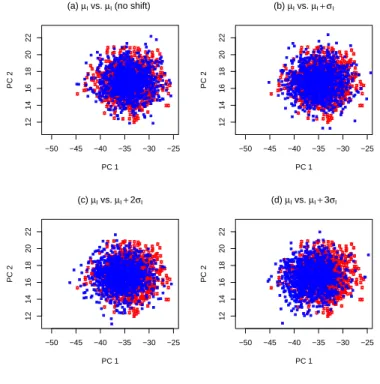
7 Scatterplots of score data for shifts in I from µI to (a) µI (no shift), (b) µI+σI, (c) µI+ 2σI, and (d) µI+ 3σI. . . 45
8 Scatterplots of score data for shifts in I from µI to (a) µI (no shift), (b) µI+σI, (c) µI+ 2σI, and (d) µI+ 3σI. . . 45
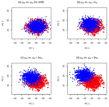
9 Scatterplots of score data for shifts in M from µM to (a) µM (no shift), (b) µM + σM, (c) µM + 2σM, and (d) µM + 3σM. . . 46
10 Scatterplots of score data for shifts in N from µN to (a) µN (no shift), (b) µN + σN, (c) µN + 2σN, and (d) µN + 3σN. . . 46
11 For detecting location shift in I, ARL (subgroups) curves of r-chart (using PC1 and PC2), PC-scores, Combined, and T2 charts. . . . 47
12 For detecting location shift in I, ARL (subgroups) curves of r-chart (using PC1 and PC3), PC-scores, Combined, and T2 charts. . . . 47
13 For detecting location shift in M, ARL (subgroups) curves of r-chart (using PC1 and PC2), PC-scores, Combined, and T2 charts. . . . 48
14 For detecting location shift in N, ARL (subgroups) curves of r-chart (using PC1 and PC2), PC-scores, Combined, and T2 charts. . . . 48
15 For detecting location shift in I, ARL (subgroups) curves of r, Q and DDMA charts using PC1 and PC2. . . 49
16 For detecting location shift in I, ARL (subgroups) curves of r, Q and DDMA charts using PC1 and PC3. . . 49
17 For detecting location shift in M, ARL (subgroups) curves of r, Q and DDMA charts using PC1 and PC2. . . 50
18 For detecting location shift in N, ARL (subgroups) curves of r, Q and DDMA charts using PC1 and PC2. . . 50 19 For detecting location shift in I, ARL (profiles) curves of r and Q charts using
PC1 and PC2. . . 51 20 For detecting location shift in I, ARL (profiles) curves of r and Q charts using
PC1 and PC3. . . 51 21 For detecting location shift in M, ARL (profiles) curves of r and Q charts
using PC1 and PC2. . . 52 22 For detecting location shift in N, ARL (profiles) curves of r and Q charts using
PC1 and PC2. . . 52 23 For detecting location shift in I, ARL (profiles) curves of DDMA charts using
PC1 and PC2. . . 53 24 For detecting location shift in I, ARL (profiles) curves of DDMA charts using
PC1 and PC3. . . 53 25 For detecting location shift in M, ARL (profiles) curves of DDMA charts using
PC1 and PC2. . . 54 26 For detecting location shift in N, ARL (profiles) curves of DDMA charts using
PC1 and PC2. . . 54 27 Scatterplots of score data for shifts in I from σI to (a) σI (no shift), (b) 3σI,
(c) 6σI, and (d) 9σI. . . 55
28 Scatterplots of score data for shifts in I from σI to (a) σI (no shift), (b) 3σI,
(c) 6σI, and (d) 9σI. . . 55
29 Scatterplots of score data for shifts in M from σM to (a) σM (no shift), (b)
3σM, (c) 6σM, and (d) 9σM. . . 56
30 Scatterplots of score data for shifts in N from σN to (a) σN (no shift), (b)
1.5σN, (c) 2σN, and (d) 2.5σN. . . 56
31 For detecting scale shift in I, ARL (subgroups) curves of r, Q and DDMA charts using PC1 and PC2. . . 57 32 For detecting scale shift in I, ARL (subgroups) curves of r, Q and DDMA
33 For detecting scale shift in M, ARL (subgroups) curves of r, Q and DDMA charts using PC1 and PC2. . . 58 34 For detecting scale shift in N, ARL (subgroups) curves of r, Q and DDMA
charts using PC1 and PC2. . . 58 35 For detecting scale shift in I, ARL (profiles) curves of r and Q charts using
PC1 and PC2. . . 59 36 For detecting scale shift in I, ARL (profiles) curves of r and Q charts using
PC1 and PC3. . . 59 37 For detecting scale shift in M , ARL (profiles) curves of r and Q charts using
PC1 and PC2. . . 60 38 For detecting scale shift in N, ARL (profiles) curves of r and Q charts using
PC1 and PC2. . . 60 39 For detecting scale shift in I, ARL (profiles) curves of DDMA charts using
PC1 and PC2. . . 61 40 For detecting scale shift in I, ARL (profiles) curves of DDMA charts using
PC1 and PC3. . . 61 41 For detecting scale shift in M, ARL (profiles) curves of DDMA charts using
PC1 and PC2. . . 62 42 For detecting scale shift in N, ARL (profiles) curves of DDMA charts using
1
Introduction
Profile monitoring is a relatively new research area in statistical quality control. Generally speaking, it is closely related to an area of statistics known as functional data analysis. It is useful when the product or process quality is well represented by a function (or a curve). It can be used to understand and to monitor the stability of the functional relationship over time. This functional relationship is called a profile in the literature. Such profiles are frequently modeled using linear or nonlinear regression models. Most research works on profile monitoring have been focusing on situations where the profiles are modeled by a linear model. However, it is often the case that the profiles are better described by a nonlinear model rather than by a linear model.
In this study, we focus on Phase II monitoring of nonlinear profiles with subject effects via nonparametric regression. The term “subject effects” here means a certain degree of profile-to-profile variation is allowable for an in-control process. A challenge arises: how to characterize nonlinear profiles? In practice, people have used some simple descriptive statis-tics to characterize nonlinear profiles, such as the average value, the maximum magnitude, etc. In this study, we first smooth the raw data profiles by smoothing techniques, then em-ploy the principal components analysis (PCA) to reduce the de-noised nonlinear profiles to some important features represented by specific principal component scores (PC-scores).
Most of the research that involves the development and evaluation of Phase II control charts assumes some stochastic model for the quality characteristic of interest. For example, univariate process data are often assumed to follow a normal distribution. For another exam-ple, Shiau, Huang, Lin, and Tsai [19] modeled nonlinear aspartame profiles as realizations of a Gaussian stochastic process. But in many applications, the underlying process distribution is unknown and hard to find a suitable approximation for it. So the statistical properties of commonly used charts, designed under the normality assumption, would be potentially affected. In the situation as such, development and application of nonparametric control charts are highly desirable.
Data depth is a multivariate data analysis method that assigns a numeric value to a multivariate data point based on its centrality relative to a data set. Simplicial depth [9]
is one of the notions of data depth. Liu [9] proposed three nonparametric control charts, referred to as r-chart [11], Q-chart [11], and DDMA-chart [14], which are derived from the notion of simplicial depth. The great advantage of these control charts is that they do not require knowledge of the underlying distribution of process data. As a nonparametric method, each of the three charts has much broader applicability than the traditional control charts such as the Hotelling T2 chart constructed from the multivariate Gaussian processes. For example, the DDMA-chart is shown in Liu, Singh, and Teng [14] to be quite effective in detecting changes in Cauchy distributions where the Hotelling T2 chart fails completely.
In our monitoring schemes, we monitor incoming nonlinear profiles by their specific PC-scores. After choosing the specific combination of PC-scores by considering particular features that we are interested in, we take the PC-scores of each profile as the input data to compute the simplicial depth of the profile. Once we have the simplicial depth values for profiles under study, we can proceed and construct r-chart, Q-chart, and DDMA-chart as described in the literature. The performances of our monitoring schemes will be evaluated in terms of the average run length (ARL).
The rest of the paper is organized as follows. Section 2 reviews literatures on profile monitoring and researches related to simplicial depth. Section 3 describes the proposed monitoring schemes in details. Section 4 presents some simulation results of a comparative study of the proposed schemes based on ARL for Phase II monitoring. Section 5 concludes the paper with a brief summary and some remarks.
2
Literature Review
2.1
Profile Monitoring
2.1.1 Introduction
Statistical process control (SPC) has been widely applied to a variety of industries. In most SPC applications, it is assumed that the quality of the product or process could be mea-sured by the distribution of a single (or multiple) quality characteristic(s). However, in many practical situations, the quality of the product or process is characterized and summarized
much better by a functional relationship between a response variable (Y ) and one or more explanatory variables (X’s) instead of the distribution of a single (or multiple) quality char-acteristic(s). Such a relationship that could be linear or nonlinear in nature is referred to as a profile.
2.1.2 Practical Examples
Kang and Albin [7] presented an example of linear profiles that occurs during the wafer etching step in the semiconductor manufacturing. The quality of a wafer depends on the performance of the mass flow controller (MFC). If an MFC is in control, the measured pressure (the response variable Y ) in the chamber is approximately a linear function of the set point for flow (the explanatory variable X). Mahmoud and Woodall [15] presented another example of linear profiles regarding calibration curves in the photometric determination of Fe3+ with sulfosalicylic acid. Jin and Shi [6] showed a complicated form of a stamping force profile. Kang and Albin [7] described an example of nonlinear profiles with regard to aspartame (an artificial sweetener). The important quality characteristic Y is the amount of aspartame dissolved per liter of water at different temperature X. For illustration, Figure 1 shows the plot of four hypothetical aspartame profiles. Walker and Wright [23] presented another example of nonlinear profiles named vertical-density profile (VDP) of engineered wood boards. The density which determines its machinability is measured by a profilometer that uses a laser device to take measurements at fixed depths across the thickness of the board. The data set is available at http://bus.utk.edu/stat/walker/VDP/Allstack.txt. Figure 2 shows the plot of the VDP data set containing n = 24 profiles, each was measured at p = 314 points.
2.1.3 Linear Profiles
Studies focusing on simple linear profiles have been particularly popular. For example, the following works are related to linear profile monitoring with the fixed-effect model as
where A0 and A1 are unknown constants and ² ∼ N(0, σ2). Kang and Albin [7] proposed two methods for monitoring linear profiles. The first method is the multivariate T2 method and the second is an R-chart in conjunction with an EWMA-chart. Kim, Mahmoud, and Woodall [8] proposed two two-sided EWMA-charts for monitoring respectively the intercept and slope where the explanatory values are centered previously, and a one-sided EWMA-chart for monitoring the process standard deviation. Using simulation, Mahmoud and Woodall [15] compared the performance of four control charts/methods for monitoring linear profile pro-cesses in Phase I in terms of the overall probability of a signal. The methods are: (1) the T2 chart proposed by Stover and Brill [22], (2) the T2 chart proposed by Kang and Albin [7], (3) the EWMA-charts proposed by Kim, Mahmound, and Woodall [8], and (4) their method of using the global F test based on a multiple regression model. Zou, Zhang, and Wang [29] proposed a control chart based on the change-point model to monitor linear profiles with estimated parameters. The chart can detect a shift in either the intercept, slope, or standard deviation. Gupta, Montgomery, and Woodall [5] compared the performances of two Phase II monitoring schemes for linear profiles, one based on the classical calibration method of monitoring the deviations from the regression line and the other one based on monitoring the intercept and slope of the linear profile individually. The works described above all concerned with the simple linear model. Zou, Tsung, and Wang [27] extended the focus to general linear profiles (meaning that profiles can be modeled by a general linear model) by proposing a novel multivariate exponentially weighted moving average monitoring scheme for such profiles.
Note that each of the above works are based on a fixed-effect model, which means the reference profile is a fixed function and the only randomness is caused by the noise (e.q., measurement errors) added to the fixed function at each of the set point X. However, the fixed-effect model does not allow profile-to-profile variations. For example, there might be some time-varying factors, such as the temperature, humidity, and so on, that cause small profile-to-profile variations. The profile-to-profile variations are all included in the error term under the fixed-effect model. But it seems not so appropriate since the time-varying factors may affect the parameter values of a linear profile. On the other hand, a “random-effect” (or more precisely, “subject-effect”) model allows profile-to-profile variations and considers them
as common cause of variations. Thus, a random-effect model that can cope with subject effects (the profile-to-profile variation) may be more suitable for certain applications.
For this, Shiau, Lin, and Chen [20] considered a random-effect linear model to develop monitoring schemes for linear profiles. Mahmoud and Woodall [15] studied the Phase I analysis of linear profile data. They proposed a method based on using indicator variables in a multiple linear regression model.
2.1.4 Nonlinear Profiles
However, there are many situations in practice where profiles cannot be well represented by a linear model. In other words, the response variable is a nonlinear function of the explanatory variables. In some cases, the expected parametric form of the underlying nonlinear function is known or the underlying function can be approximated well by a parametric nonlinear model. These types of nonlinear regression are known as parametric regression with a finite number of parameters required to be estimated. For each profile, one could fit a parametric model of a pre-specified form to the data. To discriminate the out-of-control profiles, one could monitor each estimated parameter with a separate chart or use a multivariate chart based on the vectors of estimated parameters.
Next, we review some related works on monitoring nonlinear profiles via parametric regres-sion. Williams, Birch, Woodall, and Ferry [24] illustrated their nonlinear profile monitoring methods to monitor the dose-response profiles used in high-throughput screening by fitting a particular nonlinear regression model to profile data. Williams, Woodall, and Birch [25] extended the use of the T2 control chart to monitor the coefficients resulting from fitting a parametric nonlinear regression model to profile data. They gave three general approaches to the formulation based on the nonlinear model estimation of the Phase I analysis. Colosimo, Semeraro, and Pacella [2] proposed a method based on combining a spatial autoregressive regression (SARX) model with control charting, and applied the approach to monitor real process data in which the roundness of items was obtained by turning.
In cases where the functional form is unknown and can not be parameterized, we could use smoothing techniques such as smoothing splines to estimate the function. This approach is known as nonparametric regression. The nonparametric regression model is usually expressed
as
Y = m(X) + ², (2)
where m(X) is a smooth regression curve and ² ∼ N(0, σ2).
Ding, Zeng, and Zhou [3] considered the Phase I analysis of nonlinear profiles. They proposed a two-component strategy for identifying the profiles that are from an in-control process. The first component is data reduction that projects the original data into lower dimension while preserving the data-clustering structure and the second is data separation that could detect single and multiple shifts.
The function m(X) is a fixed function for each profile in the fixed-effect model. Shiau and Weng [21] extended the linear profile monitoring schemes to a scheme suitable for profiles of more general forms with the fixed-effect model via nonparametric regression. Zou, Tsung, and Wang [28] stated that the parametric monitoring methods are generally powerful when matched with the specific out-of-control model for which they were designed, but they can have very poor ARL performance with other types of out-of-control models. They focused on a study of the Phase II method for monitoring a general profile that can be well represented by a nonparametric regression function. The proposed scheme could solve the aforementioned problem in parametric monitoring methods.
The function m(X) is a random function in the effect model. With the random-effect model, the profiles can be modeled as realizations of a stochastic process with a mean curve and a covariance function. Shiau, Huang, Lin, and Tsai [19] monitored nonlinear profiles with random effects by nonparametric regression. They utilized the technique of principal components analysis to analyze the covariance structure of the profiles and proposed monitoring schemes based on PC-scores. For Phase I analysis on historical data, they adopted and studied the Hotelling T2 chart to check the stability. For Phase II monitoring, they proposed and studied individual PC-score control charts, a combined chart that combines all the PC-score charts, and a T2 chart to monitor the nonlinear profiles.
2.2
Data Depth
2.2.1 Introduction
We usually analyze multivariate data or profiles under the normality assumption, for which the characteristics of the data can be estimated using classical statistical methods. Many multivariate statistical methods have been developed under normality, an assumption often not easy to justify or violated in some practical experiments. Hence nonparametric methods for multivariate analysis are desirable. Data depth is completely nonparametric because it analyzes data based on the relative position or rank of the data points without parametric assumptions on the underlying distribution.
A data depth is a measure for measuring the “centrality” or “outlyingness” of a multi-variate observation with respect to a set of reference data points (or their probability distri-bution). It provides a natural center-outward ordering of data points in a given sample. So we can utilize data depth to reduce each multivariate observation (or quantify some complex features of the underlying distribution) to its univariate center-outward rank. In general, the greater the depth of a point is, the more densely it is surrounded by other sample points. For example, in R, the median of a given set of points on the real line has the maximum depth. In R2, a point with high depth corresponds to “centrality”; on the other hand, low depth corresponds to “outlyingness”. A point has high depth when it is centrally located in the sample points.
Over the years, a large number of depth measures have been proposed. Existing data depths [14] include: Mahalanobis depth, half-space depth, simplicial depth, projection depth,
spherical depth, majority depth, location depth, Oja depth, zonoid depth, L-1 depth, etc.
Different notions of depth are capable of capturing different characteristics and may lead to different ordering schemes. However, all the depth orderings are based on the notion of center-outward ranking. All the notions of depth produce their “deepest” points, which have been considered as multivariate medians. For convenience, the simplicial depth will be used for the demonstrations throughout the paper.
2.2.2 Simplicial Depth
The simplicial depth of a point X with respect to a probability distribution F on R2 is the probability that X belongs to a random triangle in R2. The simplicial depth of a point X with respect to a data set S in R2 is defined by Liu [9] as the proportion of the triangles (constructed by three of the data points) that contain the point X (a point on the boundary is considered as contained in the triangle). The dimension can be easily extended to Rp, p > 2,
but we only consider the bivariate setting here. In this paper, we utilize simplicial depth as a measure of centrality of a given point relative to a given sample in R2. In general, a point with larger depth value indicates that the point is contained in many triangles constructed from the data set, so the point lies deeper within the data set.
It appears to require O(m3) computer operations to calculate the simplicial depth of a point X relative to a set of m points. Rousseeuw and Ruts [18] proposed a faster algorithm that computes the simplicial depth in O(m log m) operations, by combining geometric prop-erties with certain sorting and updating mechanisms. They implemented the algorithm and the “naive” method to verify the result. For instance, the efficiency of the algorithm is about 90000 times as fast as that of the “naive” method when m = 1000. The algorithm is very useful because in our simulation study, we require that the simplicial depth be computed at many X0s. Masse and Plante in 2009 compiled a package named “depth” in statistical
software R based on Fortran code from Rousseeuw and Ruts [18]. The description of the package is available at http://cran.r-project.org/web/packages/depth/depth.pdf.
The simplicial depth of a point X with respect to a continuous distribution F is defined as
SDF(X) = PF{X ∈ 4(Xi1, Xi2, Xi3)}, (3)
where Xi1, Xi2, Xi3 are three random observations from the distribution F . When the
dis-tribution F is unknown, a sample version of simplicial depth is defined as follows. Let T be the set of all triangles formed by vertices from a reference sample {X1, . . . , Xm} following
distribution F . Each triangle requires three vertices, so T has ¡m3¢ triangles assuming all m points are distinct and any three points are not on a line. For any X ∈ {X1, . . . , Xm}, the
sample version of simplicial depth SDFm(X) is defined as SDFm(X) = µ m 3 ¶−1 X 1≤i1<i2<i3≤m
I(X ∈ 4(Xi1, Xi2, Xi3)). (4)
Here I(·) is the indicator function, that is, I(E) = 1 if the event E occurs and I(E) = 0 otherwise. It is shown in Liu [10] that SDFm(·) converges uniformly and strongly to SDF(·)
under some regularity conditions. So we can approximate SDF(·) by SDFm(·) when F is
unknown. And it is shown in Liu [10] that Liu’s control charts are coordinate free because
SDF(·) is affine invariant.
Let {Y1, . . . , Yn} be the new observations to be monitored. Assume Y1, . . . , Yn are i.i.d.
following a continuous distribution G. The monitoring scheme is aimed at comparing G with
F by testing if there exist differences between F and G. We might attribute the differences
to a location shift and/or a scale shift. Now, in order to test if there is any difference, we need to calculate the simplicial depth of all X ∈ {X1, . . . , Xm} and Y ∈ {Y1, . . . , Yn}. It is
with probability one that Yi 6∈ {X1, . . . , Xm} for any i ∈ {1, . . . , n}. We remark that when
computing the simplicial depth of a new observation Y with respect to a reference sample, we should treat Y as one of the sample points. Hence the computation should be based on the total number of triangles generated from the m + 1 points {Y , X1, . . . , Xm}, and count
those triangles containing the point Y . Then the simplicial depth of Y can be calculated by
SDF∗ m(Y ) = µ m + 1 3 ¶−1" X 1≤i1<i2<i3≤m
I(Y ∈ 4(Xi1, Xi2, Xi3)) + µ m 2 ¶# . (5)
In the following, we introduce three control charts given in the literature, which are constructed based on the simplicial depth values of multivariate observations to detect si-multaneously the location change and/or the scale increase in a process [11] [14].
2.2.3 r-charts
Liu [11] proposed a control chart called the r-chart that monitors the values of the relative rank (r-value) of new observations with respect to a distribution or a reference sample. The
r-value of an observation Y is defined as
or, for the sample version, rFm(Y ) = 1 m m X i=1 I(SDFm(Xi) < SDFm∗(Y )). (7)
It indicates the relative position of point Y with respect to the reference sample {X1, . . . , Xm}.
A large r-value indicates that there are many points in the reference sample more outlying than point Y . Conversely, a small r-value means that Y is located at an outlying position with respect to the reference sample, which means that Y is unlikely to come from the same distribution F as that of the reference sample. Thus, a very small r-value of an observation
Y would suggest a possible deviation from the in control state of the process. This is the
main idea behind the r-chart and the other two charts.
Briefly speaking, the r-chart is analogous to the X-chart in the univariate case (also called the individual control chart), but it monitors the r-values {rFm(Y1), . . . , rFm(Yn)} rather than
the original value of {Y1, . . . , Yn}. Suppose the false-alarm rate is set at a. Now we can
choose the center line CL = 0.5 and the lower control limit LCL = a, based on the following proposition, which was established in Liu [11].
Proposition 2.2.1 Assume that F = G and Y ∼ G. Let U [0, 1] denote the uniform
dis-tribution on the interval [0, 1], and let the notation −→ stand for the convergence in law. IfL SDF(Y ) has a continuous distribution, then
(1) rF(Y ) ∼ U[0, 1]; (2) as m → ∞, rFm(Y )
L
−→ U[0, 1] along almost all {X1, . . . , Xm} sequences, provided that SDFm(·) converges to SDF(·) uniformly as m → ∞.
The process is considered to be out of control if rFm(Y ) falls below LCL = a. It means there
is quality deterioration such as loss of accuracy and/or loss of precision in quality control. The r-chart with LCL = a corresponds to an a-level test of the following hypotheses:
H0 : F = G vs. Ha: there is a location shift and/or a scale increase from F to G. (8)
In particular, while many r-values falling below LCL = a would indicate there is quality deterioration, many rFm(Y )’s close to 1 would suggest a possible reduction in dispersion,
If we are sure that there is no location change, the r-chart could be revised to detect the scale change only. Liu, Singh, and Teng [14] suggested that we could remove any possible location change by centering all data to the same location, i.e., subtracting the deepest point (with largest simplicial depth) from all data. Then we use the centered data to construct the
r-chart with CL = 0.5, LCL = a/2, and UCL = 1 − a/2.
2.2.4 Q-charts
Liu [11] proposed another control chart called the Q-chart that monitors the Q-values cal-culated from the r-values. The idea of the Q-chart is analogous to that of the univariate
¯
X-chart. It plots the subgroup averages of consecutive r-values. Denote the subgroup size
by q. Now we give the notation of Q-values. Denote the average of the rF(Yi)’s (rFm(Yi)’s)
by Q(F, Gj
q) (Q(Fm, Gjq)), where Gjq is the empirical distribution of the Yi’s in the j-th
sub-group, j = 1, 2, . . .. Then we can construct the Q-chart with {Q(F, G1
q), Q(F, G2q), . . .} (or {Q(Fm, G1q), Q(Fm, G2q), . . .}, if only {X1, . . . , Xm} are available). More specifically,
Q(F, Gq) = 1 q q X i=1 rF(Yi) (9) and Q(Fm, Gq) = 1 q q X i=1 rFm(Yi). (10)
The center line is always set at CL = 0.5, but the LCL depends on the choice of q. The following result regarding LCL was given in Liu [11] and Liu, Singh, and Teng [14]. When q is large, by the Central Limit Theorem, the LCL is approximately 0.5 − za(12q)−1/2 for plotting Q(F, Gj
q)’s and 0.5 − za[(1/m + 1/q)/12]1/2 for plotting Q(Fm, Gjq)’s. When q is relatively
small and a ≤ 1/q!, then LCL is exactly (q!a)1/q/q. In particular, this LCL could be a reasonable approximation when a is slightly over 1/q!. Similar to the r-chart, the Q-chart could be used to detect only scale changes by using the centered data as described before.
For a given reference sample {X1, . . . , Xm} ∼ F and an incoming new sample Y ∼ G,
Liu and Singh [13] proposed a quality index Q(F, G) = P {SDF(X) ≤ SDF(Y )|X ∼ F, Y ∼ G} (= EG(rF(Y ))), where rF(Y ) = P {SDF(X) < SDF(Y )|X ∼ F }, and used it to measure
Q(Fm, Gq) are sample approximations of Q(F, G). Based on this index, Liu, Singh, and
Teng [14] showed that the Q-chart could be inefficient in detecting a minor location shift. They proposed the following data-depth-moving-average chart (DDMA-chart) to overcome this drawback.
2.2.5 DDMA-charts
The idea of the DDMA-chart is analogous to that of the univariate Moving Average chart. The DDMA-chart monitors the DDMA-values calculated from the moving averages of the original reference sample {X1, . . . , Xm} and new observations {Y1, . . . , Yn} as follows. Let q
be the number of observations needed in computing moving averages. Let { ˜X1, . . . , ˜Xm−q+1}
be the reference sample of moving averages with ˜X1 = (X1+ · · · + Xq)/q, ˜X2 = (X2+ · · · +
Xq+1)/q, . . ., ˜Xm−q+1 = (Xm−q+1 + · · · + Xm)/q, and { ˜Y1, . . . , ˜Yn−q+1} be the moving
averages of new observations with ˜Y1 = (Y1 + · · · + Yq)/q, ˜Y2 = (Y2 + · · · + Yq+1)/q, . . .,
˜
Yn−q+1 = (Yn−q+1+ · · · + Yn)/q. Similar to equations (4) and (5), calculate the simplicial
depth for each ˜X ∈ { ˜X1, . . . , ˜Xm−q+1} and ˜Y ∈ { ˜Y1, . . . , ˜Yn−q+1} by SDF˜m−q+1( ˜X) =
µ
m − q + 1
3
¶−1 X 1≤i1<i2<i3≤m−q+1
I( ˜X ∈ 4( ˜Xi1, ˜Xi2, ˜Xi3)) (11) and SDF˜∗ m−q+1( ˜Y ) = µ m − q + 2 3 ¶−1" X 1≤i1<i2<i3≤m−q+1
I( ˜Y ∈ 4( ˜Xi1, ˜Xi2, ˜Xi3)) + µ m − q + 1 2 ¶# , (12)
where ˜Fm−q+1 is the empirical distribution of { ˜X1, . . . , ˜Xm−q+1}. With these simplicial depth
values, we can calculate the new r-value for each moving average ˜Yi with respect to the
reference sample { ˜X1, . . . , ˜Xm−q+1} by rF˜m−q+1( ˜Yi) = 1 m − q + 1 m−q+1X l=1 I(SDF˜m−q+1( ˜Xl) < SDF˜∗ m−q+1( ˜Yi)). (13)
The DDMA-chart detects possible deviations by plotting rF˜m−q+1( ˜Yi), i = 1, . . . , n − q + 1.
only difference is the data used for calculating simplicial depth values: the chart uses r-values of individual data points, while the DDMA-chart uses r-r-values of the moving averages of q data points.
Liu, Singh, and Teng [14] explained why the DDMA-chart is more sensitive to minor location shifts than the Q-chart, and yet retaining the same ability in detecting scale shifts. More specifically, let the length of moving window be q > 1 and assume there is only a location shift between F and G. Then the DDMA-chart will exhibit a location shift of √q
times in size. In other words, the DDMA-chart will amplify the effect of the location shift by a factor of √q. If the proportion of the points falling below LCL is larger than the
false-alarm rate a, it may suggest that there is a location shift and/or a scale increase between the distributions F and G. Furthermore, if the proportion increases as q increases, then there is a strong indication of a location shift. On the other hand, if the proportion does not increase as q increases, then it indicates a scale shift between the distributions F and
G. In summary, the DDMA-chart ameliorates the Q-chart in terms of the detecting power of
location shifts while retains the same detecting power of scale shifts as the Q-chart. Hence both Q-chart and DDMA-chart are suggested to be used side by side in general practice. If we observe that there is a same effect in both the Q-chart and DDMA-chart, we could conclude that there occurs a scale shift only. If we observe that the out-of-control proportion in the DDMA-chart is larger than that in the Q-chart based on the same moving window (q), then we could conclude that there is a location change in the process, in addition to potential scale changes.
3
Methodology
3.1
Data Smoothing
Data smoothing techniques are used to “eliminate” noise and extract real trends and patterns of profiles. For a given nonlinear profile, it returns a profile that contains less noise than the original profile and yet retains the basic shape and important features of interest in the original data. The most popular approach is to utilize the basis function expansion, such as Fourier, spline, power, exponential, wavelet bases, and so on. In this paper, we adopt the
spline smoothing by fitting a cubic smoothing spline to the data.
We use the command named “smooth.spline” in statistical software R to perform data smoothing. More commands are available in R for data smoothing, for examples “splineDesign” or “bs”, “locpoly”, “ksmooth” corresponding to other commonly used methods, B-spline gression, local polynomial smoothing, and kernel regression smoother, respectively. We re-mark based on our experiences that, by filtering out noises, the actual signals could be better extracted from the data and the subsequent principal component analysis (PCA) could ex-plore the variation among the profiles more effectively. In particular, smoothing tends to be more advantageous as the noise level (σ2
²) gets larger.
3.2
Principal Component Analysis
Principal component analysis was invented in 1901 by Karl Pearson. We introduce PCA following Everitt [4]. The aim of PCA is to describe the variation in a set of correlated variables, x1, x2, . . . , xp, in terms of a new set of uncorrelated variables, y1, y2, . . . , yp, each of
which is a linear combination of the x variables. The new variables are ordered decreasingly by its importance in the sense that y1is chosen to account for as much as possible of the total variation in the original data among all linear combinations of x1, x2, . . . , xp. More specifically, y1 = a01x, where x0 = (x1, x2, . . . , xp) and a01 = (a11, a12, . . . , a1p) is the eigenvector of the sample covariance matrix S, which has the greatest variance among all linear combinations subject to a0
1a1 = 1. Then y2 is chosen to account for as much as possible of the remaining variation by y2 = a02x, where a02 = (a21, a22, . . . , a2p) is the eigenvector of the matrix S, which has the greatest variance subject to the following two conditions:
a0
2a2 = 1, a02a1 = 0.
The second condition ensures that y1 and y2 are uncorrelated. Similarly, the subsequent i-th principal component yi is the linear combination of the x variables, yi = a0ix, which has the
greatest variance subject to the following conditions:
a0iai = 1, a0iaj = 0 (for all j < i),
with ai being the eigenvector of S associated with the i-th largest eigenvalue. The new
first few components will account for a substantial portion of the total variation in the original data and they would be used to provide a convenient and useful lower-dimensional summary of these variables.
Assume the eigenvalues of S are λ1 ≥ λ2 ≥ · · · ≥ λp. Then, since a0iai = 1, the variance of
the i-th principal component is given by λi. The total variance of the p principal components
will equal to the total variance of the original variance so that
p
X
i=1
λi = s21+ s22+ · · · + s2p,
where s2
i is the variance of xi. Consequently, the first k (k < p) principal components account
for a proportion p(k) of the total variation in the original data, where
p(k)= Pk i=1λi Pp i=1λi .
The representation of the principal components given above is in terms of the eigenvalues and eigenvectors of the sample covariance matrix S. Because the principal components derived from the covariance matrix will depend on the choice of units of measurement. Hence in practice, it is far more useful to extract the components from the sample correlation matrix R, which is equivalent to calculate the principal components from the original variables after each being standardized.
We need to decide how many components are needed to provide an adequate summary of a given data set. There exists many useful criteria, such as (i) retaining just enough components to explain large percentage (70% to 90%) of the total variation of the original variables, (ii) excluding those principal components whose eigenvalues are less than the av-erage Ppi=1λi/p, (iii) using cross-validation methods, and so on. Furthermore, Everitt [4]
mentioned that it is not always the first principal component that is of most interest to a researcher. A taxonomist will often be more concerned with the second and subsequent com-ponents since these might provide a convenient description of aspects of an animal’s “shape” when investigating variation in morphological measurements on animals, and the aspects of an animal’s “size” will be reflected in the first principal component. For another example, the first principal component derived from, say, clinical psychiatric scores on patients may only provide an index of the severity of symptoms, and it is the remaining components that
will give the psychiatrist important information about the “pattern” of symptoms. In sum-mary, according to different purposes of a researcher or different features that a researcher is interested in, the order of the importance of the principal components may be different.
After deciding that we need k principal components to adequately represent our data, we calculate the principal component scores (PC-scores) of the chosen components for each individual in our sample. Having obtained the components from the sample covariance matrix S (or the sample correlation matrix R), the k PC-scores for individual i with p×1 data vector
xi are then obtained by
yij = a0jxi, j = 1, . . . , k.
In practice, we can use the commands “prcomp” or “princomp” in statistical software R to get the eigenvalues and eigenvectors of the sample covariance/correlation matrix of a given data matrix as well as the PC-scores.
3.3
Phase II Monitoring
3.3.1 Monitoring Statistics
In this study, we focus on Phase II monitoring. The purpose of Phase II analysis is to detect shifts in the process parameters as quickly as possible. In most Phase II studies, it is usually assumed that the in-control process distribution has been characterized, either from prior experiences or estimated from the Phase I analysis. In our study, we do not require any assumptions about the process distribution because of the nonparametric nature of data depth. Hence we only assume that a set of m in-control profiles is available. We first apply a smoothing technique to each of the m profiles to filter out noise, and then apply principal component analysis to the smoothed profiles. Denote the p×1 data vector of the i-th smoothed profile by xi, i = 1, . . . , m, and the sample covariance matrix of {xi, i = 1, . . . , m}
by S. Calculate the eigenvalues and eigenvectors of S. The eigenvector vr corresponding
to the r-th largest eigenvalue λr is the r-th principal component. Sir ≡ vr0xi is the
PC-scores of the r-th principal component of the i-th profiles, where r = 1, . . . , p and i = 1, . . . , m. We could consider selecting the first k principal components for which the total variation explained by the chosen principal components,Pkr=1λr/
Pp
level. Alternatively, it is also a useful proposal that we consider the ability of each principal component in capturing a particular feature of the profiles. If a particular mode of process change could be caught more easily by certain principal components, then we select these particular principal components. That is, for detecting different modes of process change, we might choose different principal components. Denote the k × 1 score vector (Si1, . . . , Sik)0
by si, i = 1, . . . , m. Calculating simplicial data depth for many profiles is fairly
time-consuming, especially when k is large. For simplicity, with these principal components, we only consider k = 2 in the paper. We then simplify the m in-control profiles to m scores vectors si, i = 1, . . . , m. The resulting principal components will be used to compute the
PC-scores of incoming profiles in Phase II on-line process monitoring as follows. For each incoming profile in Phase II monitoring, we first smooth and then project it onto the k principal components chosen earlier to obtain the k × 1 PC-scores vector s∗
j, j = 1, 2, . . ..
Denote the set of scores vectors {si, i = 1, . . . , m} by {X1, . . . , Xm} and {s∗j, j = 1, 2, . . .}
by {Y1, Y2, . . .}. Then we compute the simplicial depth values of {X1, . . . , Xm} by equation
(4) and {Y1, Y2, . . .} by equation (5), which are viewed as a measure of centrality relative to the points {X1, . . . , Xm}. We denote the simplicial depth values by {SD(Xi), i = 1, . . . , m}
and {SD(Yj), j = 1, 2, . . .}. Set the desired in-control false-alarm rate at a. Consider
three monitoring statistics corresponding to the three control charts, r-chart, Q-chart, and
DDMA-chart.
• r-chart: According to the definition of r-value by equation (7), we have the r-values of {Y1, Y2, . . .} by comparing the magnitude of {SD(Yj), j = 1, 2, . . .} with respect to {SD(Xi), i = 1, . . . , m}. For the incoming samples, denote the monitoring statistics
of r-values by {r(Y1), r(Y2), . . .}.
• Q-chart: Additionally, we can monitor the Q-values by applying the idea of ¯X-chart
to the r-values {r(Y1), r(Y2), . . .}. Assume the subgroup size is q. Then the first monitoring statistic of Q-values is [r(Y1)+· · ·+r(Yq)]/q, the second monitoring statistic
of Q-values is [r(Yq+1) + · · · + r(Y2q)]/q, and so on. For the incoming samples, denote the monitoring statistics of Q-values by {Q1, Q2, . . .}.
that we compute the moving averages of {X1, . . . , Xm} and {Y1, Y2, . . .} to get new sets { ˜X1, . . . , ˜Xm−q+1} and { ˜Y1, ˜Y2, . . .} with the length of moving window q. Then the following monitoring procedure is exactly the same as that of the r-chart: compute the simplicial depth values {SD( ˜Xi), i = 1, . . . , m − q + 1} of { ˜X1, . . . , ˜Xm−q+1} by
equation (11) and {SD( ˜Yj), j = 1, 2, . . .} of { ˜Y1, ˜Y2, . . .} by equation (12), respectively. Compare the magnitude of {SD( ˜Yj), j = 1, 2, . . .} with respect to {SD( ˜Xi), i =
1, . . . , m − q + 1} to get the r-values {r( ˜Y1), r( ˜Y2), . . .} by equation (13), but referring to them as the DDMA-values here. For the incoming samples, the monitoring statistics are {r( ˜Y1), r( ˜Y2), . . .}.
3.3.2 Control Limits
Assume the false-alarm rate is set at a, the control limits of the three control charts are given below:
• r-chart: The r-chart monitors the r-values {r(Y1), r(Y2), . . .} with the LCL = a.
• Q-chart: The Q-chart monitors the Q-values {Q1, Q2, . . .} with LCL set under two different conditions: (i) when q is large, the LCL is set as 0.5 − za[(1/m + 1/q)/12]1/2;
and (ii) when q is relatively small and a ≤ 1/q!, the LCL is set as (q!a)1/q/q.
• DDMA-chart: The DDMA-chart monitors the DDMA-values {r( ˜Y1), r( ˜Y2), . . .} with LCL = a.
We will evaluate the performances of the proposed Phase II monitoring schemes described above in terms of ARL. Assuming the probability of detecting the shift by a control chart is
p, the value 1/p is the ARL of the chart. In this study, the probability p can not be obtained
4
Simulation and Comparative Studies
4.1
Generating Data
The comparative study is conducted with the aspartame example given in Kang and Albin [7] as an example. Since there are no available data, we use two methods based on the form
Y = I + MeN (x−1)2
+ ² to generate the in-control aspartame profiles in the following.
The idea is to perturb the parameters I, M, N randomly to create allowable profile-to-profile variations for the in-control profile-to-profiles. We first define the setting of the parameters with µI = 1, σI = 0.2, µM = 15, σM = 1, µN = −1.5, σN = 0.3, σ² = 0.3, p = 19,
and x = 0.64, 0.80, . . . , 3.52. Both of x and y values are scaled variables, not the actual temperature levels and the amount of aspartame dissolved in the dissolving process.
1. The first method is to model the in-control aspartame profiles as following MVN (µ0, Σ), where µ0 = (µ01, . . . , µ0p)0 with
µ0i = µI+ µMeµN(xi−1) 2
, i = 1, . . . , p (14)
and Σ is the covariance matrix as follows. For i, j = 1, . . . , p
Cov (Yi, Yj) = σ2I+ (µM2 + σM2 ) + [eµN[(xi−1) 2+(x j−1)2]+ σ2N [(xi−1)2+(xj −1)2]2 2 −µ2 MeµN(xi−1) 2+σ2N (xi−1)4 2 +µN(xj−1)2+ σ2N (xj −1)4 2 + σ2 ²δij, (15)
where δij = 1 if i = j and δij = 0 if i 6= j. This method was adopted by Shiau, Huang,
Lin, and Tsai [19] because their profile monitoring schemes are developed under the Gaussian assumption.
For out-of-control profiles, we can generate the “location-shifted” aspartame profiles as following MVN (µ, Σ), where µ = (µ1, . . . , µp)0 with
µi = (µI+ ασI) + (µM + βσM)e(µN+γσN)(xi−1) 2
, i = 1, . . . , p. (16) Then the shift on the mean of Y is δ ≡ µ − µ0.
2. The second method directly generates the parameters (I, M, N ), where I ∼ N(µI, σ2I), M ∼ N(µM, σM2 ), N ∼ N(µN, σN2), ² ∼ N(0, σ²2), and all the random parameters are
independent of each other. This model is also referred to as the random-coefficients model. Then use the following random-effect model to generate the in-control aspar-tame profiles with already generated (I, M, N, ²):
Yi = I + MeN (xi−1) 2
+ ²i, i = 1, . . . , p. (17)
We can generate the “location-shifted” aspartame profiles with the parameters (I, M, N, ²), where I ∼ N(µI + ασI, σI2), M ∼ N(µM + βσM, σ2M), and N ∼ N(µN + γσN, σN2). In
the same way, we can also generate the “scale-shifted” aspartame profiles with the parameters (I, M, N ), where I ∼ N(µI, (ασI)2), M ∼ N(µM, (βσM)2), and N ∼ N(µN, (γσN)2). The advantage of this method is that it is intuitive and interpretable.
However, the profiles generated in this way are no longer Gaussian.
4.2
Choice of Principal Components
Restricted by the statistical package R for simplicial data depth computation, we can only choose two principal components to summarize the original profile data in evaluating our monitoring schemes. In general, the first two principal components explain a fairly large percentage of the total variation in the profile data set. Hence we usually calculate the scores of the first two principal components for each individual profile. However, as restricted by only two principal components in our study, it might be a good idea to consider the ability of each principal component in capturing the variation of the profiles. To verify this, we simulate 1008 in-control aspartame profiles by the first simulation method. First, we de-noise the profiles by spline smoothing and then apply PCA to the sample covariance matrix of the smoothed profiles. It is found that the first three principal components account for 75.38%, 20.46%, and 2.71% of the total variation, respectively.
Figure 3 illustrates the first three eigenvectors of the sample covariance matrix. To see the effect of a particular principal component, Ramsay and Silverman [17] presented a visualizing tool that plots µ0± Lvr, where L is a suitable multiple. Figures 4 to 6 illustrate
the corresponding features captured by the first three principal components with L = 3. We observe the following features of the shift in I, M, and N:
• Shift in I: The shift of parameter I affects the vertical shifting of the profiles for the
entire region. PC1 could explain the vertical shifting of the profiles except for the right tail. On the other hand, PC3 explains almost all the variation in vertical shifting in the right tail and slightly the variation at the peak.
• Shift in M: The shift of parameter M mainly affects the scale of the profiles. PC2
captures the variation in the height of the peak. PC1 also explains some variation of the vertical shifting of the profiles at the peak. PC3 captures slightly the variation at the peak.
• Shift in N: The shift of parameter N mainly affects the declining steepness of the
curves. PC2 obviously can explain the variation of this sort, while PC3 just picks up a little of this mode of variation.
Based on the aforementioned features, we choose the first two PC-scores following the usual practice of PCA to detect the shifts of I, M, and N. In addition, we select the first and the third PC-scores of each individual profiles to detect only the shift of I. Then we compare the performances between the two different choices on detecting the shift in I.
4.3
ARL Comparison Study
In this subsection, we compare the ARL performances of our monitoring schemes to those of the schemes proposed in Shiau, Huang, Lin, and Tsai [19] for Phase II monitoring. Denote the in-control ARL by ARL0. Following Liu, Singh, and Teng [14], all charts are designed to
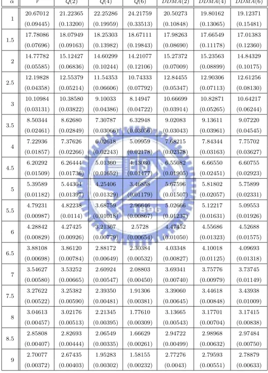
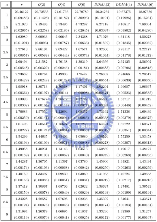
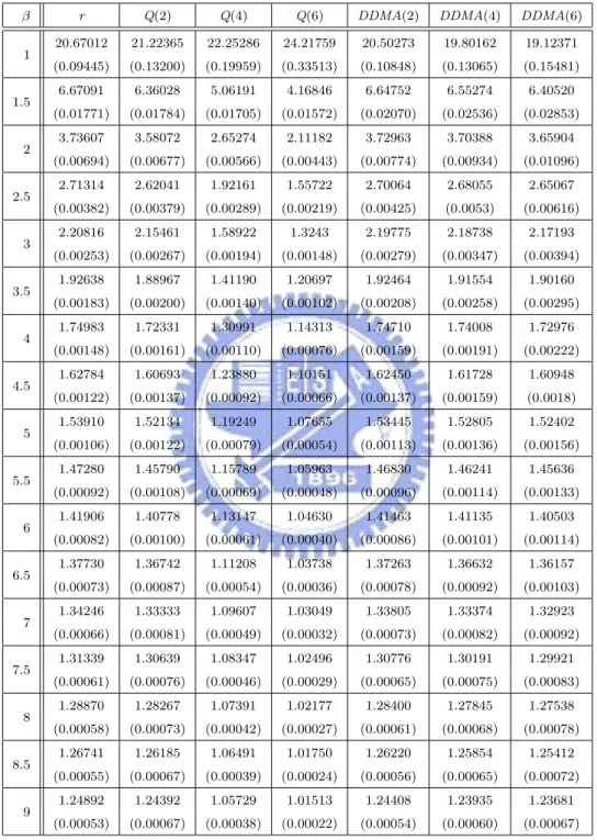
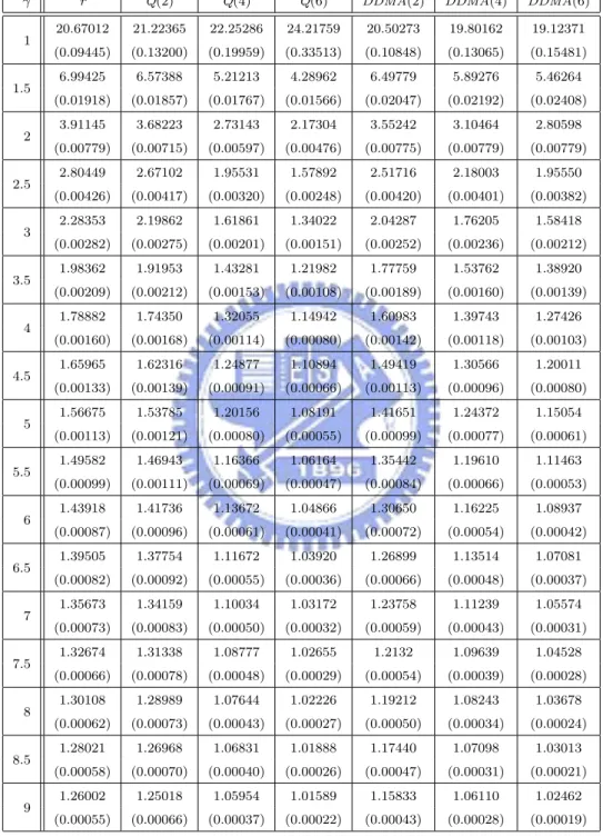
have the same ARL0 = 20, which corresponds to the false-alarm rate of a = 0.05.
For ARL comparison, we consider the I-shift from µI to µI + ασI, α = 0, 0.25, . . . , 3, M-shift from µM to µM + βσM, β = 0, 0.25, . . . , 3, and N-shift from µN to µN + γσN, γ =
0, 0.25, . . . , 3. We refer to these types of shifts as the location shift (or mean shift) of the parameters. Shiau, Huang, Lin, and Tsai [19] applied PCA to the covariance matrix Σ0 in equation (15) without the σ2
²δij term to obtain eigenvalues, λ1 ≥ · · · ≥ λp ≥ 0 and
the corresponding unit eigenvectors v1, . . . , vp. Choose an appropriate number k such that
the proportion of the total variation that the first k principal components account for (i.e., Pk
r=1λr/
Pp
smooth the profile and project it onto the first k principal components to obtain k PC-scores,
S1, . . . , Sk. They constructed a control chart for each of the k PC-scores. For a desired
false-alarm rate a, they constructed the r-th PC-score chart to monitor the statistic Srwith control
limits v0
rµ0± Za/2
√
λr, r = 1, . . . , k, because Sr∼ N(vr0µ0, λr) and the scores S1, . . . , Sk are
independent when the process is in control. If one of the first k principal components is capable in capturing a particular mode of variation of the profiles, then it would be a good choice to use the particular PC-score chart to monitor that particular mode of the process shift. Unfortunately, a process shift is often reflected in more than one principal component. When this happens, they considered a combined chart by combining all k PC-score charts. Therefore, it means to monitor the statistic
max 1≤r≤k|
Sr− v√ r0µ0
λr
|. (18)
The combined chart signals out of control when max1≤r≤k|(Sr− vr0µ0)/
√
λr| > Za0/2, where
the individual false-alarm rate a0 = 1 − (1 − a)1/k so that the overall false-alarm rate is at the desired level a. They also considered a T2 chart by monitoring the statistic
T2 = k X r=1 (Sr− vr0µ0)2 λr (19) with the upper control limit 100(1 − a) percentile of χ2
k since T2 ∼ χ2k when the process is in
control. Then they evaluated the aforementioned monitoring schemes by ARL values. However, we are unable to derive the ARL values of our Phase II monitoring schemes theoretically. Hence we estimate the ARL values by simulation. To do this, we use the first method in Subsection 4.1 to generate the aspartame profiles. For each simulation setting, we simulate 1008 in-control profiles and another 1008 location-shifted profiles to monitor in Phase II monitoring. To extract the trend better, we apply smoothing splines to each of the profiles and then apply PCA to the 1008 in-control profiles to obtain the principal components. As explained before, we choose two principal components for evaluating the simplicial depth values of each profile. Based on the simplicial depth values, we construct
r-chart, Q-chart, and DDMA-chart accordingly. Then we monitor the 1008 location-shifted
profiles with each of the charts, and compute the sample proportion ˆp of the out-of-control
reciprocal of ˆp. Then we repeat the above procedure 2000 times to obtain 2000 estimated
ARLs. Compute the sample mean and sample standard deviation of these 2000 estimated ARLs. Finally, we estimate the theoretical ARL of each chart by the sample mean. The standard error of this estimate can be obtained by dividing the sample standard deviation by√2000. The simulated ARL (in terms of subgroups) values and its standard error (in the parenthesis) are listed in Tables 1-4, where the ARL is the expected number of “subgroups” taken in order to detect shifts according to Montgomery [16].
Now, there is a problem about how the mean shifts in profile parameters react on the scores after PCA. Would a location change in the parameters of profiles be reflected as a location change on score data? To see this, we conduct a simulation study as follows. We generate 1008 in-control profiles as the reference sample, 1008 location-shifted profiles with
I-shift from µI to µI + ασI, α = 0, 1, 2, 3, 1008 location-shifted profiles with M-shift from µM to µM + βσM, β = 0, 1, 2, 3, and 1008 location-shifted profiles with N-shift from µN
to µN + γσN, γ = 0, 1, 2, 3. First we smooth the profiles, then apply PCA to the reference
sample, and finally project the profiles to obtain the specified two PC-scores. The scatterplots of the two PC-scores are shown in Figures 7 to 10, where the reference and Phase II points are represented by color red and blue, respectively. We observe the following:
• Shift in I: Figures 7(a) to 7(d) plot the bivariate points (PC-score 1, PC-score 2)
cor-responding to α = 0, 1, 2, 3, respectively. In Figures 7(b) to 7(d), we can see that there is a location change from the reference points to the Phase II points. As α gets larger, the location change is more apparent. The trend is accentuated as shown in Figures 8(a) to 8(d), which plot the bivariate points (PC-score 1, PC-score 3) corresponding to α = 0, 1, 2, 3. It means that the deviation from the reference points to the Phase II points captured by PC1 and PC3 is more obvious than that captured by PC1 and PC2 for the same α. Based on the result, we expect the performance of detecting location shift in I using PC1 and PC3 is better than that using PC1 and PC2.
• Shift in M: Figures 9(a) to 9(d) plot the bivariate points (PC-score 1, PC- score 2)
corresponding to β = 0, 1, 2, 3. In Figures 9(b) to 9(d), we can see that there is a location change from the reference points to the Phase II points. The location change
becomes more obvious as β gets larger.
• Shift in N: Figures 10(a) to 10(d) plot the bivariate points (PC-score 1, PC- score 2)
corresponding to γ = 0, 1, 2, 3. In Figures 10(b) to 10(d), we can see that there is a location change from the reference points to the Phase II points. The location change becomes more obvious as γ gets larger. The bivariate points are even separated into two clusters when γ = 3.
In summary, location changes in the different parameters in the aspartame example would result in location changes in the bivariate PC-scores points.
Figures 11/12, 13, and 14 display the ARL curves for shifts in I, M, and N, respectively. Each figure consists of six types of control charts, including the r-chart, three PC-score charts, combined chart, and T2 chart. From these figures, the following are observed:
• In catching the shift in I as shown in Figure 11, the r-chart using PC1 and PC2 is
only more powerful than PC2 chart, which hardly has any power. Because the mode of variation in vertical shifting of the profiles is mainly explained by PC1 for x < 2.5 and PC3 in the right tail, while PC2 only picks up a little for x < 2.5, we construct the r-chart using PC1 and PC3 instead of PC1 and PC2 to compare the detecting performances. As shown in Figure 12, the r-chart using PC1 and PC3 is almost equally powerful to the combined chart and T2 chart except for the small shift α ≤ 0.5, and more powerful than PC1 chart and PC2 chart. However, it is less powerful than PC3 chart, while the difference in ARL gets smaller as the shift gets larger.
• In catching the shift in M as shown in Figure 13, the r-chart using PC1 and PC2
performs better than the others, with the exception that PC1, PC2, T2, and combined charts are slightly better for the small shift α ≤ 0.5. For α > 0.5, the order of the performance is r > PC2 > T2 > Combined > PC1. The PC3 chart does not have much power because PC3 only captures slightly the variation at the peak.
• In catching the shift in N as shown in Figure 14, the r-chart using PC1 and PC2
performs the best for the shift α ≥ 0.5, but PC1, PC2, T2, and combined charts perform slightly better for the small shift α ≤ 0.5. PC3 chart has a strange ARL curve;