一個針對多樣化行動裝置上應用程式的視覺化開發工具
61
0
0
全文
(2) 一個針對多樣化行動裝置上應用程式的視覺化開發工具 A Visualized Kit for Developing Applications on Multiple Mobile Devices. 研 究 生:吳仁凱. Student : Jen-Kai Wu. 指導教授:袁賢銘. Advisor : Shyan-Ming Yuan. 國 立 交 通 大 學 資 訊 科 學 系 碩 士 論 文. A Thesis Submitted to Department of Computer and Information Science College of Electrical Engineering and Computer Science National Chiao Tung University in partial Fulfillment of the Requirements for the Degree of Master in Computer and Information Science June 2005 Hsinchu, Taiwan, Republic of China. 中華民國九十四年六月.
(3) 一個針對多樣化行動裝置上應用程式的視覺化開發工具. 學生:吳仁凱. 指導教授:袁賢銘. 國立交通大學資訊科學學系﹙研究所﹚碩士班. 摘. 要. 目前種類日益增加的手持行動裝置使得開發能在多種行動裝置 上執行的應用程式變得十分困難,目前行動應用程式的種類可分成兩 類:一種為可直接在行動裝置上執行的應用程式,另一種則是透過裝 置內建的 Web 瀏覽器來瀏覽在伺服器端執行的應用程式,然而目前的 行動應用程式開發工具大多只能單獨開發其中一種種類的應用程 式,因而造成了開發人員在開發行動應用程式的困擾,在本篇論文 中,我們介紹與實作了一套整合的行動應用程式開發工具,此工具可 讓開發人員透過視覺化的拖拉編輯方式建立一個泛用的應用程式介 面,接著再透過樣式表的轉換技術來產生此兩種不同種類的行動應用 程式。我們不僅嘗試將此工具設計的簡單易用,同時預留了一些元件 的擴充性以便日後的更新,另外此工具也整合到一個現有的整合開發 環境裡面,行動應用程式開發者得以在單一的開發環境中同時編譯與 測試多個自動產生的應用程式以達到節省開發時間的目的。. i.
(4) A Visualized Kit for Developing Applications on Multiple Mobile Devices. Student: Jen-Kai Wu. Advisor: Shyan-Ming Yuan. Department of Computer and Information Science National Chiao Tung University. ABSTRACT. The proliferation of various mobile devices makes the development of mobile applications becomes more and more complicated. Currently, the mobile application can be classified into two types: one is mobile application which can be directly executed in the devices; the other is mobile Web application which is executed through an embedded mobile Web browser. At this time, none of any existing toolkits has the ability to develop both types of applications through authoring a single generic application interface. For this reason, we propose a visualized toolkit within an integrated development environment and discuss the design issues in this thesis. The toolkit is capable of creating the generic application interface simply through intuitive drag-and-drop operations. The generic application interface can then be transformed into both types of applications through the style sheet transformation technology. Furthermore, we not only try to make an easy-to-use toolkit, but also to preserve some extensibility for future add-ons. Developers can utilize this integrated toolkit to compile or test both types of applications to save development time and reduce development efforts.. ii.
(5) Acknowledgement 本篇論文的完成,首先要感謝袁賢銘教授給予研究方向上的指導 與建議,讓我有充足的空間可以自由發揮,在這兩年以來,很感謝實 驗室各個博士班學長的寶貴意見讓我得以順利完成論文畢業,同時也 讓我得以獲得許多專案與比賽的寶貴經驗。 另外研二的同學們與學弟妹們也讓實驗室增添了許多的歡樂與 研究氣氛,讓我的研究得以順利完成,最後,感謝我的父母與家人給 予的支持讓我得以在良好的學習環境裡無後顧之憂的完成我的學業 生涯,繼續邁向人生的下一個里程。. iii.
(6) Table of Contents Acknowledgement ................................................................................... iii Table of Contents .................................................................................... iv List of Figures......................................................................................... vii Chapter 1 Introduction.............................................................................1 1.1 Preface..............................................................................................................1 1.2 Motivation........................................................................................................2 1.3 Research Objective ..........................................................................................3 1.4 Research Contribution .....................................................................................4 1.5 Outline of the Thesis........................................................................................4. Chapter 2 Background and Related Works ...........................................6 2.1 Toolkit Design Concept ...................................................................................6 2.2 User-interface Markup Language ....................................................................6 2.3 Document Model .............................................................................................6 2.3.1 SAX.......................................................................................................7 2.3.2 XML DOM ...........................................................................................7 2.3.3 JDOM....................................................................................................8 2.4 JavaBeans.........................................................................................................8 2.5 OpenTools API.................................................................................................8 2.6 Related Works ..................................................................................................9. Chapter 3 Authoring Framework .........................................................11 3.1 Overview........................................................................................................ 11 3.2 Designing User-interface ...............................................................................12 3.2.1 Toolkit Composition ...........................................................................13 3.2.2 Preparation ..........................................................................................14 iv.
(7) 3.2.3 Visualized Editing ...............................................................................15 3.3 Defining Logic Usage ....................................................................................18 3.4 Transforming..................................................................................................19 3.5 Programming Application Logic....................................................................20 3.6 Simulating ......................................................................................................20. Chapter 4 Toolkit Architecture..............................................................22 4.1 Model .............................................................................................................22 4.1.1 Document Model Design ....................................................................23 4.1.2 View Model Design ............................................................................23 4.2 View ...............................................................................................................25 4.3 Controller .......................................................................................................26 4.4 Other Mechanisms .........................................................................................27 4.4.1 Extensible Widgets..............................................................................27 4.4.2 The Attribute Constraints....................................................................29 4.4.3 Drag-and-Drop Framework ................................................................30 4.4.4 Widget-Generation Framework ..........................................................31 4.4.5 Collapsible and Disguisable Widgets..................................................32 4.4.6 Smart Position Inference.....................................................................32 4.5 Integration with JBuilder ...............................................................................33 4.5.1 PUML Node........................................................................................34 4.5.2 PUML Viewer .....................................................................................35 4.5.3 Wizard .................................................................................................35. Chapter 5 Implementation.....................................................................36 5.1 Model .............................................................................................................36 5.1.1 JDOM Model ......................................................................................36 5.1.2 JDOM Factory ....................................................................................37 v.
(8) 5.1.3 Customized Widget.............................................................................37 5.2 View ...............................................................................................................39 5.2.1 Layout Manager ..................................................................................39 5.2.2 Foldable Widget ..................................................................................40 5.2.3 Composite Cursor ...............................................................................40 5.3 Controller .......................................................................................................41 5.3.1 Designer Event....................................................................................41 5.3.2 Drag-and-Drop....................................................................................42 5.3.3 Cut/Copy and Paste.............................................................................42 5.4 Others.............................................................................................................43 5.4.1 Synchronization of Views ...................................................................43 5.4.2 Configuration Files .............................................................................43 5.4.3 Create a PUML document...................................................................44 5.4.4 Open a PUML document ....................................................................45. Chapter 6 Conclusions and Future Works ...........................................46 6.1 Conclusions....................................................................................................46 6.2 Future Works..................................................................................................48. Chapter 7 Bibliography..........................................................................49 Appendix A Common Widget Interface................................................51. vi.
(9) List of Figures Figure 1-1: The concept of combining mobile application and mobile Web application. ................................................................................................................................2 Figure 3-1: Workflow of building PUML-based applications. ....................................11 Figure 3-2: The user-interface design environment in JBuilder. .................................12 Figure 3-3: The visualized editing environment of the toolkit. ...................................13 Figure 3-4: Three categories of the toolbox.................................................................14 Figure 3-5: The structure pane which represents the structure of the source PUML file. ..............................................................................................................................14 Figure 3-6: The setup page of the PUML page generation wizard. .............................15 Figure 3-7: The helper dialog for defining logic usage. ..............................................18 Figure 3-8: The configuration dialog for extending the transformation style sheet. ...19 Figure 3-9: The transform target selection dialog for choosing either one or multiple targets. ..................................................................................................................19 Figure 3-10: The simulator configuration dialog for extending the third-party mobile simulators.............................................................................................................21 Figure 3-11: The simulating result in the NOKIA Mobile Browser Simulator............21 Figure 4-1: The toolkit architecture in the form of Model-View-Control design pattern. ..............................................................................................................................22 Figure 4-2: The UML representation of the mediator design pattern of the toolkit. ...26 Figure 4-3: The widget architecture with regard to the JavaBeans. ............................27 Figure 4-4: The structures for storing attribute constraints and used texts..................29 Figure 4-5: The process of generating a widget from the PUML tag element. ...........31 Figure 4-6: The smart position inference area. ............................................................32 Figure 4-7: The architecture of JBuilder. .....................................................................33 vii.
(10) Figure 5-1: The example widget bean structure of the widget which represents the “puml:user-interface” tag element in the PUML specification............................38 Figure 5-2: The example composition of two images to form a single cursor. ...........40 Figure 5-3: The sequence diagram of creating a new PUML document within JBuilder. ..............................................................................................................................44 Figure 5-4: The sequence diagram of opening an existing PUML document within JBuilder. ...............................................................................................................45. viii.
(11) Chapter 1 Introduction 1.1 Preface Nowadays, almost every pedestrian carried about one mobile device at least. These mobile devices such as mobile phone, Personal Digital Assistant (PDA), notebook, etc. are rapidly proliferating with miscellaneous functions. Within these functions, the Internet connectivity has significant influence since the mobile devices can either execute various applications online or download the applications to execute while offline. The first type of application is called “Mobile Web Application” while the second type is called “Mobile Application”. Since these two types of applications have many things in common, the demand of writing application once and executing it no matter online or offline increases. The researches for an integrated development toolkit which targets on authoring applications for multiple mobile devices starts to grow. PUML (Pervasive User-interface Markup Language) [1] is an XML-based language which describes a generic user-interface for the mobile application in the abstract level. It can be transformed into various languages by using multiple XSLT [2] style sheets. The target languages currently are manipulated in XHTML-MP [3], WML [4], and J2ME MIDP [5], and they are all executable in the mobile environment. Based on the PUML transformation framework, visualizing the user-interface presentation of PUML and providing an integrated development environment will be targeted in this thesis.. 1.
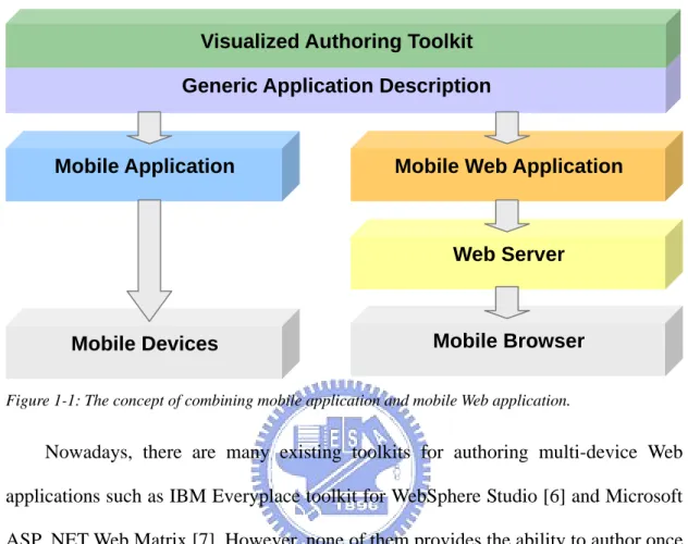
(12) 1.2 Motivation. Visualized Authoring Toolkit Generic Application Description. Mobile Application. Mobile Web Application. Web Server. Mobile Browser. Mobile Devices. Figure 1-1: The concept of combining mobile application and mobile Web application.. Nowadays, there are many existing toolkits for authoring multi-device Web applications such as IBM Everyplace toolkit for WebSphere Studio [6] and Microsoft ASP .NET Web Matrix [7]. However, none of them provides the ability to author once and generate both offline mobile applications and online mobile Web applications. Authoring applications becomes a time-consuming work; therefore, it motivates us to combine the development of both types of applications through authoring a single generic application interface. Figure 1-1 draws a picture about this concept. The single generic application interface is based on the XML-based mobile application development kit [1] from our laboratory (DCSLab of CIS NCTU), it proposed PUML as the user-interface transformation matrix, our toolkit can therefore adopt this language to achieve the goal of writing once, and generating both types of applications. Furthermore, for the sake of giving developers an easy-to-use and integrated development environment, our toolkit is integrated into a mature toolkit to gain more usability in accelerating the development process. 2.
(13) 1.3 Research Objective The research objectives can be categorized into the following four categories: Rapidly development Since PUML is not widely understood by every developer, the PUML document is visualized into a composition of graphical user-interface widgets. Developers therefore do not need to hand-write the PUML source code. The visualized toolkit tries to give developers a “What You See Is What You Get (WYSIWYG)” interface which can be used to generate corresponding PUML source code. This approach makes developers who do not comprehend the PUML specification can still author a PUML document. Furthermore, intuitive drag-and-drop operations are adopted over the entire toolkit to compose the application user-interface as easy as possible. Extensibility Extensibility always plays an important role in software component reuse. For instance, once the PUML specification revises in the future, the extensible toolkit can be updated simply through replacing some components. Moreover, once a new transformation style sheet is released, the extensible toolkit can also add it to generate a new language. Furthermore, new mobile simulators are to come out, the toolkit should provide a way for adding them to increase the toolkit usability. Integration There are existing toolkits which provide tons of features in shortening the development time. Integrating with one of these mature toolkits can utilize their features and provide an integrated development environment at the same time.. 3.
(14) Write once; generate multiple application user-interfaces Authoring multiple applications with the same functionalities is annoying and time-consuming, we try to save development time by writing a single generic application based on PUML and then generating the user-interface and logic skeleton of both mobile application and mobile Web application. The efforts of authoring applications for multiple mobile devices can therefore be simplified.. 1.4 Research Contribution A toolkit is designed and implemented based on these objectives, there are many problems encountered in the process. This paper provides not only solutions to these problems but also a new blueprint of the authoring approach. Four major contributions of this paper are listed below: 1.. A toolkit is crafted to visualize the PUML document and carried with some easy-to-use operations in a manner of editing operations.. 2.. The toolkit architecture is designed and constructed to be extensible.. 3.. The toolkit is integrated in the leading Java development software - Borland JBuilder [8]. The integration process is also discussed and detailed for referencing.. 4.. Three formats of languages are generated from a single PUML document to form both mobile application and mobile Web application.. 1.5 Outline of the Thesis In Chapter 2, background and related works of developing the visualized toolkit is introduced. In Chapter 3, components of the toolkit and the new authoring approach for multiple mobile devices are depicted through vivid pictures. In Chapter 4, 4.
(15) architecture of the toolkit is described to give an overview over the entire toolkit. In Chapter 5, implementations and problems encountered are detailed. In Chapter 6, we dwell on conclusions and future works for referencing.. 5.
(16) Chapter 2 Background and Related Works 2.1 Toolkit Design Concept The toolkit proposed mainly targets on the usability and flexibility; it gives developers an integrated development environment and some easy-to-use operations. The complex stuff such as tag mapping and transformation are hided from developers, developer can therefore develop the application user-interface as easily as developing HTML using visualized toolkit such as Microsoft FrontPage.. 2.2 User-interface Markup Language There are many markup languages for describing the user-interface. PUML, XUL, UIML, WML, XForms are among these languages, all of them has different focuses and purposes. PUML is a language first proposed by Shen [1] for describing the user-interface of applications on mobile devices. It works as a media for transforming the user-interface into various formats. In Shen’s work, the XSLT mechanism is utilized to transform it into WML and J2ME MIDP for running in WAP-enabled and J2ME-enabled mobile devices correspondingly. Since PUML is a language with flat-structure, it is simple to transform and the transform results can highly conform to the meaning of original PUML document. For this reason, PUML is adopted as our base language for authoring applications on multiple mobile devices.. 2.3 Document Model According to the XML-based PUML, the document model behind the program is then to be a model which can represent the XML structure. The model is built through 6.
(17) parsing the source XML document. Following are three models which are addressed with considerations about adopting them in the toolkit.. 2.3.1 SAX SAX [9] stands for Simple API for XML; it provides a programming interface for applications that need to parse XML documents. The SAX model triggers SAX events as it parses a XML document, therefore, it never creates a tree structure for the document in memory. However, it is allowed to programmatically instruct it to create our own data structure. Since SAX parser pushes data to the client application, it is relatively lightweight to the DOM parsers. For the above reasons, SAX parser is used as our major parser to create another model which can be stayed in memory.. 2.3.2 XML DOM XML Document Object Model (DOM) [10] is first standardized by the World Wide Web Consortium (W3C). It provides a standard set of objects for representing XML documents and a standard interface for retrieving and manipulating them. XML DOM views XML documents as a tree structure composing of multiple nodes. All of these nodes are stayed in memory; therefore, a node can be accessed or modified at anytime. However, a DOM tree node has many complex types and the node can not be further extended in the standard Java DOM API. Therefore, using XML DOM model will need to create another mechanism for mapping a node and a visualized widget which wastes lots of memory space. As a result, XML DOM is not adopted as our toolkit model.. 7.
(18) 2.3.3 JDOM JDOM [11] is a Java representation of an XML document. It provides a way for easy and efficient reading, manipulating, and writing XML documents. Moreover, it also has a lightweight, fast, and optimized Java API. Furthermore, it integrates well with both DOM and SAX models and allows us to build customized model which extends the default JDOM model. For these reasons, JDOM is adopted as our final document model representing the source PUML document.. 2.4 JavaBeans For the extensibility of the toolkit, the widget structure must be extensible to tolerate future changes. Since the toolkit is completely written in Java, JavaBeans [12] component architecture for Java 2 Platform, Standard Edition (J2SE) is therefore adopted as the base structure of widgets in the toolkit. JavaBeans are reusable software components that you can develop and assemble easily to create sophisticated applications. In JavaBeans architecture, a component can be described with a “bean” and a “bean descriptor”, the bean descriptor describes the bean class and the methods provided in the bean. Moreover, with combination of Java reflection mechanism, it is possible to create and manipulate widgets dynamically in the runtime. Accordingly, the widget structure becomes extensible as well, once a new PUML element is released, a corresponding widget can be developed rapidly through following JavaBeans specification.. 2.5 OpenTools API Borland JBuilder is a leading product in developing Java applications; it provides 8.
(19) a complete application programming interface (API) for developing tools integrated with JBuilder. The API is called OpenTools [13], it provides access to almost every component inside JBuilder, and it is therefore possible to integrate our toolkit into JBuilder as a plug-in. The OpenTools API is a full Java-based API with complete Java document released. Furthermore, Borland also releases a simple tutorial for developing OpenTools; the architecture of JBuilder can be comprehended easily through it. For the above reasons, JBuilder is selected as our final integration target.. 2.6 Related Works The mobile application development has already been evolved in our laboratory more than two years. One of the development kit proposed by Liu [14] is based on the thin-client platform called ART (Adaptive Remote Terminal). The other kit proposed by Shen [1] is based on the PUML and PGML. However, both kits lack a visualized development toolkit to develop the application user-interface easily and quickly. In the current market, there are some other products for visualizing the development of multi-device applications. One is Microsoft’s ASP .NET Web Matrix [7] which relies on runtime interpretation of a device-independent application. Another is also Microsoft’s product – Visual Studio .NET [15] which provides an integrated development environment and a rich set of widget controls. The other is the IBM Everyplace toolkit for WebSphere Studio [6] which provides the ability to adjust a part of the generic user-interface for a specific device. As for the academic researches, there are many researches related to the user-interface transformation mechanism design, however, few researches put their focus on authoring multi-device applications. One of these researches is published in [16]; a Platform-Independent Model for Applications (PIMA) is proposed to adapt the 9.
(20) user-interface in both design-time and runtime. It contains a generalization mechanism for extracting a model from device-specific interfaces such as HTML. A specialization mechanism that adapts the application to various target devices automatically is also included. Another research is published in [17], a Multi-Device Authoring Technology (MDAT) is proposed. The MDAT is a second-generation technology based on the PIMA stated above, it combines both design-time and runtime adaptation to provide a more complete authoring framework. Moreover, it is also the base technology used in the IBM Everyplace toolkit for WebSphere Studio. The other research is published in [18] which proposes a design environment for adaptive multi-device user-interfaces and generates both HTML and WML languages. From the authoring frameworks described above, the concepts of model-based user interface development and multi-device development are referenced in the design of our own authoring framework and toolkit.. 10.
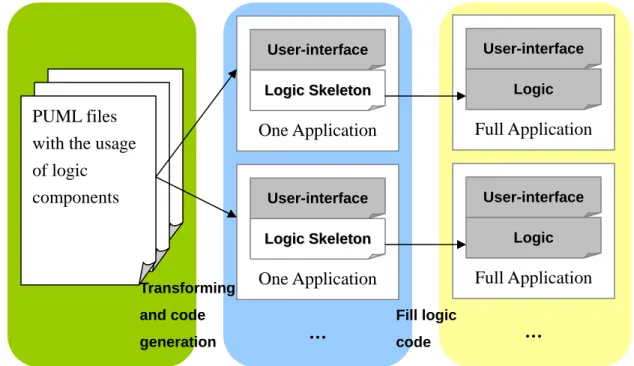
(21) Chapter 3 Authoring Framework The workflow of authoring PUML-based applications can be separated into three parts; one is designing the user-interface and defining the usage of the logic objects in PUML. Another is transforming PUML files and generating multiple applications with user-interface files and logic files separated. The other is writing the application logic for each applications being generated. The whole development process is shown in Figure 3-1.. PUML files with the usage of logic components. Transforming. User-interface. User-interface. Logic Skeleton. Logic. One Application. Full Application. User-interface. User-interface. Logic Skeleton. Logic. One Application. Full Application. and code generation. Fill logic. …. code. …. Figure 3-1: Workflow of building PUML-based applications.. 3.1 Overview The entire toolkit is embedded in JBuilder as a plug-in; therefore, entire authoring actions can be accomplished in this integrated development environment. Developers can simply drag-and-drop to create a generic user-interface and rely on JBuilder for constructing the application logic and testing the created applications. Moreover, developers can add any simulator to the configuration file and then select 11.
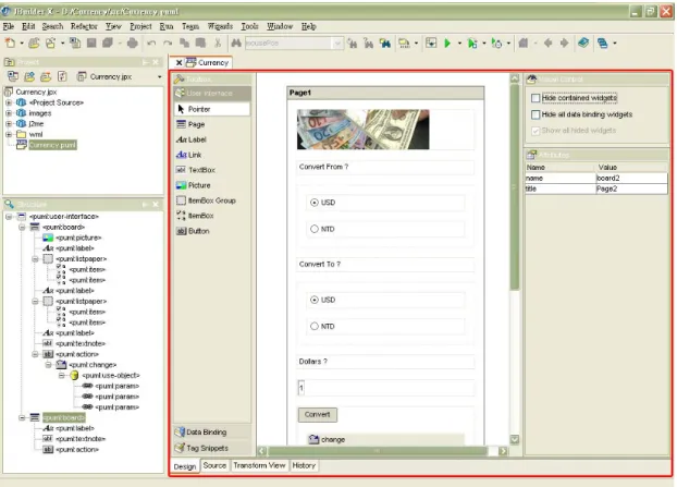
(22) one of the simulators to simulate and test the transformed files. The authoring framework of our toolkit contains designing user-interface, defining logic usage, transforming, programming application logic, and simulating, all of the details will be revealed in the following sections.. 3.2 Designing User-interface. Figure 3-2: The user-interface design environment in JBuilder.. The application user-interface is presented in PUML, an XML-based text file. Since it takes a lot of time to hand-write PUML source code, we propose a visualized toolkit to automatically generate PUML source code from editing a generic user-interface to reduce the efforts. A generic user-interface is composed of many widgets which can be dragged from the toolbox and dropped to the canvas. Figure 3-2 demonstrate the user-interface design environment in JBuilder, the circled part is the proposed toolkit with visualized editing functionality. 12.
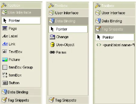
(23) 3.2.1 Toolkit Composition. Figure 3-3: The visualized editing environment of the toolkit.. The visualized toolkit depicted in Figure 3-3 is mainly composed of four parts. At the left side is a toolbox containing three different categories as depicted in Figure 3-4. The first category contains widgets for constructing user-interface. The second category contains widgets for binding the user-interface and the data objects. The last category initially contains no widgets; it is designed for developers to add some edited widgets tags. At the center is a canvas where widgets can be added to construct a generic user-interface. At the top-right corner is a visual control pane which contains some controls related to the widget visibility on the canvas. At the bottom-right corner is an attributes pane, it shows editable attributes of the selected widget and organize them in a table for quickly referencing and editing.. 13.
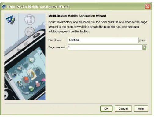
(24) Figure 3-4: Three categories of the toolbox.. Figure 3-5: The structure pane which represents the structure of the source PUML file.. The visualized toolkit has another part resided in the down-left side of Figure 3-2; it is enlarged in Figure 3-5. This part is constructed from PUML source file in a tree structure; this is due to the natural tag-based tree structure of an XML document. Developers who familiar with the PUML tags can quickly reference corresponding widget on the canvas by selecting the node in this tree structure pane.. 3.2.2 Preparation. Before editing the generic user-interface in JBuilder, there are two steps need to be performed. The first step is creating an empty project inside JBuilder; the JBuilder. 14.
(25) project is a basic container containing a variety of source components. These source components are organized into a tree which is shown in JBuilder’s project view as depicted in the top-left corner of Figure 3-2. The second step is creating a PUML file from the wizard shown in Figure 3-6. After filling those fields, a PUML file will be created and attached to the project tree as a node. Designers can then double-click the created node, and the visualized toolkit will be shown for authoring.. Figure 3-6: The setup page of the PUML page generation wizard.. 3.2.3 Visualized Editing There are plenty of features that we added to facilitate developers to build a user-interface quickly and easily. These features are categorized following based on the control operations: Drag-and-Drop / Click-and-Drop Through the mouse actions, developers can easily drag a widget from the toolbox and drop it onto the canvas. The widget will then be added in the position where the mouse button is released. Furthermore, if developers want to add a certain widget 15.
(26) continuously, the first step is to click a widget he preferred in the toolbox, the second step is to move the cursor to a position in the canvas and click again to add the selected widget on the canvas. Developers can then repeat the second step to add the same widget continuously. The actions described above are all foolproof; developers can only drop a widget onto the legal parent of the widget. Put the widget in a wrong position will not be allowed and the cursor will turn into a forbidden cursor to provide a clear hint. In this way, developers who do not familiar with PUML tags can avoid tag errors as well. An additional feature in the drag-and-drop is in the opposite way, developers can drag a widget from the canvas to the toolbox. The toolbox contains a category called “Tag Snippets” which is used to hold widgets in the form of PUML tags. Since developers may want to store a widget with modified attributes for using in the next time, tags in the “Tag Snippets” can be saved and manipulated through a popup menu showed by clicking the right mouse button. Widget Selection Developers can select a widget on the canvas simply by clicking on the widget. All feasible visual control items will then become selectable at the top-right corner, and all editable attributes of the selected widget will be shown in the attribute editing table at the bottom-right corner. Move / Move and Copy After dragging-and-dropping a widget onto the canvas, developers may want to change the position of a widget. Therefore, moving a widget on the canvas is also feasible by selecting a widget and then moves it through dragging the mouse. In addition, while moving a widget, developers can also press and hold the “Ctrl” key in 16.
(27) the keyboard to get an identical widget in the target position. The previous operation is called “move and copy” which works the same as standard copy and paste operation using the keyboard. Cut / Copy / Paste The visualized toolkit also involves the usage of the standard keyboard editing actions. Developers can cut, copy, and paste a widget on the canvas either through corresponding keyboard stroke or the popup menu by clicking the right mouse button. Visualized Control The visualized control includes three basic controls over showing/hiding widgets on the canvas. The first control controls if a selected widget should display all of the widgets it contains. The second one controls if all of the data binding widgets on the canvas should be displayed. Since the data binding widgets will not be showed after transforming to various formats, developers can make these widgets invisible to get a closer look to the final user-interface after transformation. The last control is responsible for showing all of the hided widgets at one time, no matter it is hided from selecting the first or the second control. Attribute Editing All of the editable attributes will be showed in the attribute table. Developers can rapidly get to the position of an attribute for editing, and the modified attribute value will reflect its change to the corresponding widget on the canvas. In this way, developers can get instant visual feedback of the editing result. Source Editing If developers want to modify the source code of a PUML file, he can click on the 17.
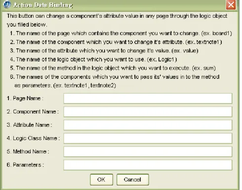
(28) bottom tab to change to the source view. The source view displays a PUML file with different highlight colors to make developers reference any editing position as soon as possible. Once developers complete the editing in the source view, they can change back to the design view, and all of the changes he made in the source view will be reflected to the canvas in the design view to provide a consistent view.. 3.3 Defining Logic Usage. Figure 3-7: The helper dialog for defining logic usage.. The defining logic usage operation is used to bind a user-interface component to a logic object behind; this operation is also related to the data binding widgets in the toolbox. Developers can drag-and-drop data binding widgets to the canvas as well, however, in order to let developers who do not familiar with the usage of the data binding widgets can also define the logic usage, another helper dialog is created to provide the information about defining logic usage as depicted in Figure 3-7. The logic usage is defined in a way of “changing what attribute of what component in. 18.
(29) what page through using what method of what logic object?”, developers only need to fill the five “what” statement and then the logic skeleton can be generated in the defined way.. 3.4 Transforming. Figure 3-8: The configuration dialog for extending the transformation style sheet.. Figure 3-9: The transform target selection dialog for choosing either one or multiple targets.. The transformation process is accomplished by using multiple style sheets. For the extensibility, transform targets can be further extended through the dialog shown. 19.
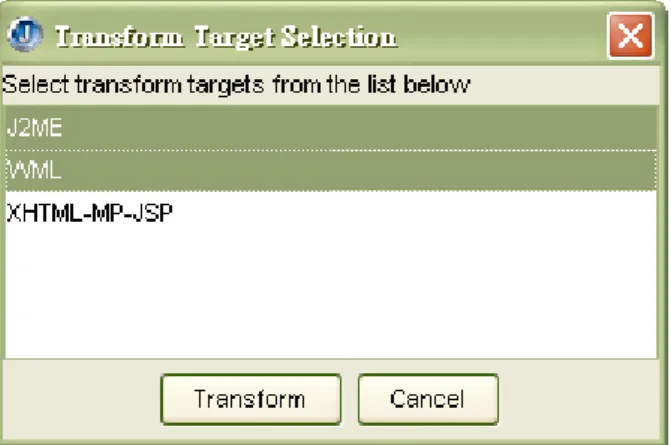
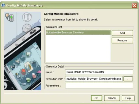
(30) in Figure 3-8. Developers can trigger a transformation process by clicking the “Transform Mobile Applications” in the “Run” menu of JBuilder, a small dialog will then jump out for developers to select transformation targets as shown in Figure 3-9.. 3.5 Programming Application Logic After multiple applications being generated, developers can write application logic inside the generated logic skeleton. Currently, three formats of logic skeletons are generated. One is J2ME MIDP which is used for user-interface generated in J2ME MIDP, another is WML Script [19] which is used for user-interface generated in WML, and the other is Java which is used for user-interface generated in XHTML-MP embraced in JSP.. 3.6 Simulating Once the application logic is filled, developers can build and test their applications in JBuilder. However, developers may want to preview the final outlook on the mobile simulator, therefore, our toolkit provides a configuration dialog as depicted in Figure 3-9 for adding an installed simulator which is executable through the command line interface. Furthermore, since JBuilder is widely used in the world, there are many leading mobile simulator providers provide their own plug-in for JBuilder. For instance, Openwave has provided their Openwave SDK plug-in for JBuilder [21]. Once simulators are set up, developers can select the “Run Mobile Simulator” option under the “Run” menu, a dialog will pop up for the developer to choose one or more simulators to simulate a opened file. Figure 3-11 shows the snapshot of simulating the generated WML files through NOKIA Mobile Browser Simulator [22]. 20.
(31) Figure 3-10: The simulator configuration dialog for extending the third-party mobile simulators.. Figure 3-11: The simulating result in the NOKIA Mobile Browser Simulator.. 21.
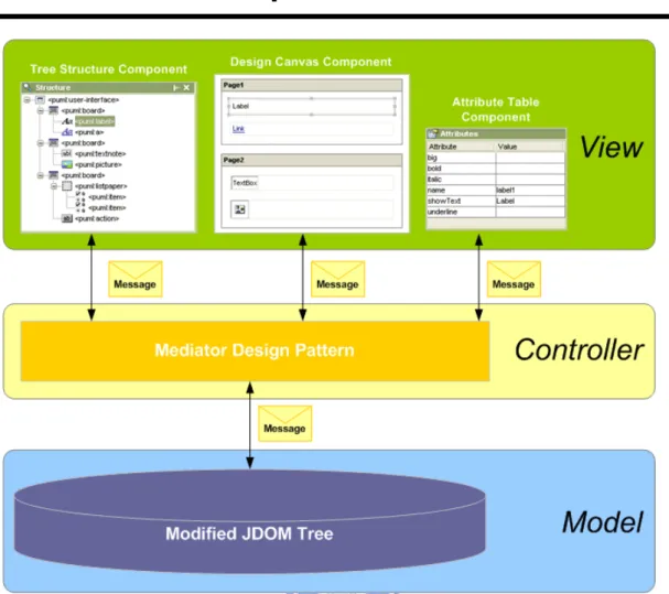
(32) Chapter 4 Toolkit Architecture. Figure 4-1: The toolkit architecture in the form of Model-View-Control design pattern.. The architecture of our toolkit follows the design principle of the MVC (Model-View-Controller) design pattern as depicted in Figure 4-1. In this chapter, each part of the architecture will be detailed in this chapter; furthermore, the way of integrating the toolkit into JBuilder will be detailed as well.. 4.1 Model A model is a structure which maintains the application data under the surface. The toolkit basically contains two kinds of models inside, one is the document model which represents a single PUML document, and the other is the view model which manipulates the data inside each view. 22.
(33) 4.1.1 Document Model Design. For the sake of abstracting a PUML document into visualized widgets on the screen, an internal model is needed to represent the structure of the source PUML document. Since PUML is an XML-based language, it can be easily parsed and built into a DOM (Document Object Model) tree. DOM tree is composed of various kinds of nodes such as element node, text node, entity node, etc.; however, the only node we concerned about is the element node. Since each element node corresponds to a tag in a PUML document, what left behind is to make the connection between a DOM element node and a corresponding widget on the screen. The link between the DOM element node and the widget can be connected through a unique identification. In this way, both of them need to add an identification field for mapping between each other. Unfortunately, in the Java reference implementation of DOM, it is not allowed to make an extension to the DOM element node to add an identification field. For this reason, we use another third-party API called JDOM instead. JDOM provides an easy way to extend both the element node and the builder of the DOM tree, therefore, building a DOM tree and adding unique identifications to element nodes can be processed at the same time.. 4.1.2 View Model Design. As shown in Figure 4-1, there are mainly three view components in the toolkit; each of them has its own view model inside. Following sections describe the design of each view model in detail. Tree Structure Model. 23.
(34) Since the document model already contains a unique identification in each element node, the model of tree structure view can be generated from the document model in order. A tree structure model provides not only the tag text but also an icon corresponding to the widget icon in the toolbox; in addition, the unique identification is retrieved from the element node in the document model and added to each tree node. Moreover, for the purpose of quickly retrieving a node in the structure model, there is a map mapping between the unique identification and the tree node. In this way, change events can instantly update to the corresponding tree node to provide immediate feedback on the screen. Design Canvas Model The design canvas contains various visualized widgets on it; each widget maintains its own data model behind. In this way, the only thing the design canvas model does is to maintain a map mapping between the unique identification and the widget, therefore, accessing the widget can be done through directly retrieving instead of searching through entire widget structure. However, a unique identification still needs to be included in the widget for mapping purpose; hence every change to the document model can be mapped to a corresponding widget for reflecting the change on its outlook. Attribute Table Model The attribute table model changes while the selected widget on the canvas changes. Each attribute of the selected widget is corresponded to an element attribute inside the document model. An element attribute is basically composed of a name and a value; however, some constraints must be added to ensure its correctness. These constraints will be described later in this chapter as an extensible structure design of. 24.
(35) the widget. At this point, what the most significant is that there is also a unique identification added in the model to let the attribute modifications can be correctly respond to the widget with the same identification on the canvas.. 4.2 View A view is a visualized representation of the internal data model. The views related to the document model in the toolkit are described below. Tree Structure View The tree structure view is composed of multiple tree nodes, and each tree node represents a tag element in the document model. A tree node visualizes the tag element with an icon following with a string which comes from the qualified name of the tag element and is enclosed between “<” and “>”. The tree nodes in this form simplify the representation of the source document; hence developers can pick out any node as soon as possible. In this way, this view not only provides access facilities but also a whole view over the structure of the source document. Design Canvas View A design canvas on the screen is composed of various widgets which are visualized with its own outlook. For the sake of customizing each outlook of the widget, the widget structure is designed as a base container containing a visualized component. The base container is responsible for drawing the selection border of the widget while the visualized component is in charge of drawing the outlook and holding the data inside. In this way, every component can perform its own works to form a visualized view out of the document model. Attribute Table View 25.
(36) The attribute table view provides an organized presentation of the element attributes, the table is formed in two columns and many rows according to the number of attributes. The first column shows the attribute names while the second column shows the attribute value, moreover, the cell in the second column provides a customizable editor for editing the attribute value. In this regard, developers can edit the attribute value more easily and quickly.. 4.3 Controller. Figure 4-2: The UML representation of the mediator design pattern of the toolkit.. A controller is a mechanism that handles the interaction between the views and the model. The controller designs in the toolkit utilize the mediator design pattern as depicted in Figure 4-2. The mediator design pattern in the toolkit is mainly composed of two interfaces; one is EditMediator while the other is EditViewAdapter. The EditMediator maintains a list of EditViewAdapters and is in charge of broadcasting incoming events to every EditViewAdapters in the list. Each EditViewAdapter represents the view which intends to receive or broadcast the change event, in this way, changes on each view can be reflected to another view for. 26.
(37) keeping the views display the data in consistent. In the toolkit, EditMediator is implemented by the document model; therefore, EditMediator can update the document model whenever the event message. is. received. before. broadcasting. the. message. to. all. registered. EditViewAdapters. EditViewAdapter is implemented by each view component which handles the incoming event by itself. Through the mediator design pattern, the document model can work as a central coordinator between different views, furthermore, the correctness of the data model can be ensured while the data is changed in any views.. 4.4 Other Mechanisms There are many components to form the whole toolkit architecture; following is some remarkable designs in the toolkit which make the toolkit more flexible, friendly, and easy-to-use.. 4.4.1 Extensible Widgets. Figure 4-3: The widget architecture with regard to the JavaBeans.. Since the version of PUML specification changes over time, the design of a widget which represents a PUML tag element must be extensible to increase the software usability. For this reason, JavaBeans component framework described in the second chapter is conducted into the widget design, each widget is regarded as a pluggable component in the toolkit and the composition of an extensible widget is 27.
(38) illustrated in Figure 4-3. Widget User-Interface The widget user-interface is a component which is responsible for drawing a customized outlook; however, this component is not essential since we provide a default user-interface component for those widgets without any user-interface components. While adding a widget to the design canvas, the widget user-interface component will be wrapped inside a wrapper component. The wrapper component not only provides a unify interface to access the widget it contains but also draws a dotted border while the widget is selected, developers can then visually identify the selected widget in this manner. Widget Bean The widget bean follows the JavaBeans design principle to store data inside and expose access methods outside through the widget bean description. In the toolkit, a widget bean’s field contains not only all of the attributes of its corresponding PUML tag element but also other values which provide necessary information about drawing the widget user-interface. Nevertheless, for the purpose of mapping a widget to the corresponding PUML tag element, the widget bean is therefore required to implement a common interface which is listed at Appendix A. The common interface provides five essential information to the program inside, the first is the qualified name of the corresponding PUML tag element, the second is whether a tag element passed in is a legal parent of the contained tag element, the third is whether the widget is a container which can contain other widgets inside, the fourth is whether the widget is able to contain the data binding widgets, and the last one is whether the widget itself is a data binding 28.
(39) widget. Through the common information provided in the program, we can add or modify any widgets to conform to future changes of the PUML specification with less effort. Widget Bean Description Each widget bean exposes its access methods through a widget bean description. The widget bean descriptions are loaded while the toolkit starts up, hence the content of a widget bean could be accessed while running the toolkit. Moreover, the constraints of the attributes embraced in each PUML tag element will also be described inside the corresponding widget bean description. The program can therefore verify the editing attribute result according to the constraints.. 4.4.2 The Attribute Constraints. Figure 4-4: The structures for storing attribute constraints and used texts.. The attribute constraints in the toolkit contains two items, one is the “Required” constraint which describes if an attribute value needs to be set with an non-empty value, the other is the “Unique” constraint which describes if an attribute needs to have an unique value over entire PUML document. Once the “Unique” is set as true, the attribute values must be stored to avoid overlapping and ensure the uniqueness. The toolkit preserves two tables for storing attribute constraints and used attribute values as depicted in Figure 4-4. Both tables utilize the name of tag element 29.
(40) and the attribute name as a pair to form the reference key. The attribute constraints table stores every attribute constraints while the used attribute value table stores thee attribute value only when the attribute has the “Unique” constraint set as true. Furthermore, if the attribute has “Unique” constraint set as true, the toolkit automatically generates a unique value when creating a widget on the design canvas. At the same time, the toolkit does not allow developers input an attribute value which conflicts with any existing attribute value. In this way, the toolkit can prevent possible errors before transforming the PUML document into other formats.. 4.4.3 Drag-and-Drop Framework. A drag and drop operation is a data transfer request that has been specified by a gesture with a graphical pointing device, and what the operation does in the background is simply transferring the data from the drag source to the drop target. There are mainly two scenarios to drag-and-drop components in the toolkit, one is to drag a button from the toolbox onto the design canvas, and the other is to drag a widget from the design canvas onto the toolbox. Since the drag-and-drop framework has already integrated into Java, it is quite easy to add transfer handling mechanism into every visualized components, however, the transferring data still needs customizations, therefore, a string represents the class path of the widget bean is transferred in the first scenario, and a widget object is transferred in the second scenario. The transferring data is designed to contain the least information required for the overall performance. Through the drag-and-drop framework, developers can operate the toolkit without knowing how the data being transferred in the background.. 30.
(41) 4.4.4 Widget-Generation Framework. On the one hand, the created PUML document can be saved for next time usage; on the other hand, generating visualized widgets back to design canvas while opening a saved PUML document is required as well. The widget generation framework recursively generates all of the widgets from each tag element, a widget-generation process is not only used in opening a document, the actions such as move, paste, and drag-and-drop widgets are also utilize this process for code-reusing purpose.. Figure 4-5: The process of generating a widget from the PUML tag element.. A widget-generation process example is depicted in Figure 4-5; the first step is to generate a widget bean according to the tag element name. The second step is to set fields of the widget bean according to all available attributes in the tag element. Following step is to generate a widget user-interface component according to the widget bean and wrap the component inside a widget wrapper at last. The example widget can then be added to its legal parent widget in the design canvas.. 31.
(42) 4.4.5 Collapsible and Disguisable Widgets. A collapsible widget is allowed to have some child widgets in it, and the child widgets can be visible or invisible according to the options in the visual control pane. Once the child widgets are hided, the parent widget will adjust its size to the minimum size it allows. It will be look like the widget is collapsed and that is where the word “collapsible” comes from. The disguisable widget is mainly to indicate the data binding widgets which will not show in the final transformed user-interface. The reason why it shows on the generic user-interface is to make developers using familiar drag-and-drop operations in adding widgets. The data binding widgets can be easily selected and their attributes can be edited in the same way. Therefore, through controlling the visibility of the data binding widgets, we can utilize existing features on the one side and still preserve the outlook of the generic user-interface on the other side.. 4.4.6 Smart Position Inference. The layout of a generic user-interface is in a vertical way for fitting into the small screen size of mobile devices. In this vertical layout scenario, smart position inference mechanism is added to facilitate the layout arrangement.. Figure 4-6: The smart position inference area. 32.
(43) While adding a widget onto the design canvas, there are mainly three areas which could be put on. Figure 4-6 depicts these areas with a dashed line circled around and a number marked on each area. Once the developer drag-and-drop a widget to the area marked with n, the widget will be added above “Widget One” in Figure 4-6. In the same way, the widget will be added between “Widget One” and “Widget Two” while drag-and-drop it to the area marked with o. Obviously, the widget will show up under “Widget Two” while drag-and-drop it to the area marked with p. Although it seems simple to add a widget according to the position above, before, under, or after a certain widget, the insertion action actually requires finding out what widget to insert before and then insert the widget with size and position adjustments. Developers therefore do not need to know what happened in the background, simply drag-and-drop to a position and get an intuitive result is the goal we have achieved.. 4.5 Integration with JBuilder. Figure 4-7: The architecture of JBuilder.. 33.
(44) The integration with JBuilder is mostly relied on the highly extensible API (Application Program Interface) provided with JBuilder. The API is officially called OpenTools; it provides the ability to access almost all of the JBuilder resources in the runtime. Moreover, JBuilder also provides an integrated environment for creating and testing the tools developed by the OpenTools API. Before describing details about the integration within JBuilder, the architecture of JBuilder will be introduced briefly. Figure 4-7 draws a picture about the architecture of JBuilder; it is classified into six categories as following. The “Core” category manages the subsystems about OpenTools, files, and projects. The “Browser” category provides a framework for interacting with projects and files on the screen. The “Views and Editors” category provides tools for manipulating source codes. The “Common Processed” category handles the compiling and running of projects. The “Code Generation” category provides a wizard framework and the infrastructure to generate code. The “User Experience” category manages the user preferences and provides some facilitate utilities. The integration of our toolkit involves all categories stated above except the “User Experience” category. Since each component may be involved with many categories, following integration details will be described in a component-based fashion.. 4.5.1 PUML Node. The PUML node is a node representing the PUML document in the JBuilder. Since PUML is an XML-based language, the PUML node extends the XML node in the OpenTools API to have the source code editor with highlight colors. Natively, JBuilder does not support a file with “.puml” extension; the PUML node will register this extension into JBuilder and also provide an icon representing the PUML 34.
(45) document in the project pane. Since the XML node only provides the source editor, our visualized toolkit is therefore integrated into it as a design view to provide visualized editing facilities.. 4.5.2 PUML Viewer. The PUML viewer includes a factory which provides a design viewer and a structure viewer. The factory not only maintains the viewer lifecycle but also control the activation and deactivation of each viewer. The viewers provided here will be our visualized toolkit components instead of default text viewers. Therefore, the design viewer will show our editing screen in a tab along with the source tab, and the structure viewer will show our tree view of the PUML document as well.. 4.5.3 Wizard. The wizards we integrated into JBuilder basically include three wizard pages. One is for generating default PUML document, the other two is for configuring transformation style sheets and mobile simulators in the toolkit. The PUML generator wizard register itself into JBuilder, hence developers can create a PUML document through the “new project” dialog. The transformer and simulator wizards utilize the wizard framework in JBuilder to keep their outlook consistent with JBuilder. Both wizards are integrated under the “Tools” menu; developers can easily trigger the configuration wizards through the added menu items. After the configuration is done, all configurations will be saved into the hard disk. Therefore, without restarting JBuilder, newly added transformers or simulators can be chose immediately while selecting transform targets or simulate devices.. 35.
(46) Chapter 5 Implementation In this chapter, we will go deep into the implementation details of the toolkit. The ways to solve the problems we encountered will be detailed as well. The third-party API used in the toolkit includes JDOM and OpenTools which are all Java-based with complete Java API documents. Since JBuilder is written in Java, we also choose Java as our programming language to implement entire toolkit. The implementation of a GUI (Graphical User Interface) toolkit is quite complicated in logic sequences; therefore, we describe the details according to the components which are classified into model, view, and controller categories.. 5.1 Model The model described here includes the most essential JDOM model, the way to parse the source document into a JDOM model, and the implementation of a customized widget model.. 5.1.1 JDOM Model. The biggest problem of utilizing JDOM API is encountered while integrating with JBuilder. JBuilder currently runs an old version of JDOM API in the runtime; however, the old version does not conform to our requirement of customizing element node. Therefore, the new JDOM API is needed to bundle into JBuilder, unfortunately, while using the new JDOM API in the runtime, the class used will be referenced to the old JDOM API originally in JBuilder instead of the new one, this is due to the new API has the same package path with the old one. For this reason, the source of new JDOM API is modified with different package paths, after recompiling and 36.
(47) repackaging the new JDOM API, it can be used without errors.. 5.1.2 JDOM Factory. The JDOM factory extends DefaultJDOMFactory in JDOM API to provide customized JDOM elements. All of the methods for creating JDOM elements is overrode by this factory, therefore, the customized JDOM elements can be created instead of default JDOM elements during parsing into a JDOM tree. Furthermore, while creating each element, the factory also put them into an element cache in the model. The element cache is implemented through a hash map which uses the unique identifier inside each customized JDOM element as a key to retrieve the corresponding element in the cache.. 5.1.3 Customized Widget. Each customized widget has a bean object in the core; the object follows JavaBeans principle with a pair of “get” and “set” method for each field. The user-interface for a widget is also written in the core bean object for simplicity, therefore, each core bean object must extend either “JPanel” or “JComponent” object of the Java Swing API [23] to have a customized outlook. There is no easy way to design a customized outlook; each abstract outlook is designed through composing either squares or circles. Moreover, a customized outlook also needs to respond to the change of attribute value, in this regard, a “set” method of the widget bean may tell the user-interface to repaint its outlook while an attribute has been changed. For the extensibility, the widget bean also implements a common interface described in 4.4.1. Furthermore, a widget bean description object is accompanied with each core bean object, the description object provides the way of accessing the fields in the core bean 37.
(48) object, the icon representing the widget in the toolbox, and the constraints of each property. Figure 5-1 shows the structure of an example widget bean.. Figure 5-1: The example widget bean structure of the widget which represents the “puml:user-interface” tag element in the PUML specification.. Each widget bean object is contained by a widget wrapper which provides a unify access toward multiple widget components and handles the mouse operations before delegating them to the contained widget. The widget wrapper extends “JPanel” component in the Java Swing API to provide a container for the contained widget, furthermore, it also has customized outlook for drawing the selection border while being selected. Therefore, the lack of a widget bean, a widget bean description, or a widget wrapper will not be allowed to construct a concrete widget with customized outlook on the screen.. 38.
(49) 5.2 View The influential view component is the layout manager which is customized and using through the entire toolkit. The foldable widgets and the dynamic combined cursors will also be detailed in this section.. 5.2.1 Layout Manager. The layout of components inside a container is managed by a layout manager. There are many existing layout manager in Java, however, none of them conforms to our layout requirements. Therefore, we especially designed three different layout managers – VerticalBorderLayout, VerticalCascadeLayout, and VerticalFillLayout. All these layout managers arrange components in a vertical fashion. The first layout extends the contained component’s width to the parent component’s width and the contained component’s height remains the same. Moreover, it can set one component to be extensible in height; therefore, the extensible component will extend its height to the remained height in the container. For example, the toolbox utilizes this layout to make each category foldable, once a category is expanded; it is set to be the extensible component in this layout manager. The second layout is quite different from the first one, it layouts components only by using the preferred size of each component, therefore, the size of each contained component can remains the same. This layout is mainly used to layout the widgets in the design canvas. The last layout is similar to the first one, the only difference is that it can not set the extensible component; therefore, this layout only extends the component size in horizontal. For instance, the widget button container in the toolbox utilizes this layout to adjust the width of each widget button to fit the container width 39.
(50) when dragging the split bar.. 5.2.2 Foldable Widget. The widget which contains one or more child widgets inside can be foldable through the visual control items. The visual control item makes contained widgets visible or invisible through setting the visible property of the contained component. Although the layout manager handles all the layout stuff, we still need to notify the layout manager of the parent component to re-layout while folding the widget. However, notifying only the parent component is not enough, the parent of the parent component may also needs to layout. The layout manager of each parent component is therefore called recursively until the root container. In fact, while adding, moving, and pasting widgets on the design canvas, the layout managers will also be called in this way to provide a concrete and proper layout of widgets.. 5.2.3 Composite Cursor. Figure 5-2: The example composition of two images to form a single cursor.. After selecting a widget in the toolbox, the cursor of mouse will change to a cursor with cross hair and a small icon while moving on the design canvas. The cross hair indicates the widget under the cursor can add the selected widget while the small 40.
(51) icon represents the selected widget. The purpose of adding an icon beside the cross hair is to facilitate the developer of knowing which widget is to be added now. In order to construct this cursor, we composite a cross hair image with an icon of the selected widget button to form a new image. The trickiest part here is to combine a 9 x 9 image and a 16 x 16 image to a 32 x 32 image. Since the image size less than 32 x 32 will be extended to this size and the image result may have mosaic pixel look, the above two images will be combined into a 32 x 32 image with unused pixels being filled with a transparency color. Figure 5-2 shows an enlarged example of this composite cursor where the grid line is drew one pixel apart.. 5.3 Controller The controller controls views and model through designer events, therefore, the designer event will be detailed. Other featured operations related to the controller will be detailed as well.. 5.3.1 Designer Event. The designer event is used as a material to transfer between the views and the controller. The designer event is classified into four categories – InsertEvent, RemoveEvent, SelectionEvent, and UpdateEvent. The InsertEvent, RemoveEvent, and SelectionEvent is understand obviously from the literal meaning, they are triggered while adding, deleting, and selecting a widget on the canvas. The UpdateEvent is used while modifying an attribute value. All of these four events extend the DesignerEvent to have a unified access interface. The DesignerEvent has a field for identifying the event type; furthermore, it also indicates the source component which triggered the event. In this way, the component 41.
(52) which receives the event can judge if it should handle the event.. 5.3.2 Drag-and-Drop. The Java drag-and-drop framework is adopted to realize the visual drag-and-drop operation. The special part of this operation lies on the judgment of whether a drop target component can accept the dragging source component. The judgment happens while a drag gesture enters a component’s range; it takes the target component’s PUML tag and the source component’s parent PUML tags to compare. Once the two tags matches, the drop operation is accepted and the cursor changes to a cross hair icon to indicate the drop operation is allowed. However, once these two tags don’t match, the drop operation is not allowed and the cursor will turn into a forbidden icon. Therefore, the drag-and-drop framework becomes more intelligent than ever, and developers can arrange components on the design canvas without worrying placing them in the wrong place.. 5.3.3 Cut/Copy and Paste. The cut and copy operations on the widget are designed to utilize the widget generation framework which is capable of generating a widget from a PUML tag element. Both cut and copy operation duplicate the selected PUML tag element and all of its children. The duplicated one will then be stored in a temp clipboard. What differs from each other is that a cut operation will remove the selected widget, and a remove event will be trigged at first to notify the change. The paste operation pastes widgets from the clipboard; however, it is not a real paste operation. Instead, it generates the corresponding widgets from the PUML tag elements. The reason we doesn’t store a whole widget is because of the widget is a 42.
(53) complex structure and there are some fields must be unique inside the program scope. Using the widget generation framework can prevent this problem and ensures the integrity of widgets.. 5.4 Others In this section, the most essential implementation details are picked out to describe. Moreover, the sequence of creating and opening the document will be depicted to give you a basic concept of the program flow.. 5.4.1 Synchronization of Views. Since there are design view, tree view, and source view in the toolkit, the synchronization of these views is quite influential to give developers a unify look over the source document. The design view and tree view is already synchronized through the mediator design pattern. However, the source view is the only view which does not included in the design pattern, this is due to the mapping of text and model is quite difficult and complex, therefore, we adopt another way to synchronize the source view. The way is to generate the source code in source view while changing form design view to source view and vice versa. For the sake of reducing the generation times, the generation will happen only when a view has been modified, therefore, the source code will be generated only when the design view has any modifications take place and the widgets will be regenerated only when the source view has been modified.. 5.4.2 Configuration Files. There are mainly three configuration files in the toolkit, one is for the toolbox components, another is for the transformers, and the other is for the simulators. These 43.
(54) configuration files are put in a folder under the user’s home directory. The toolbox configuration records all the widgets which are to be loaded while initializing the toolbox. The transformer and simulator configurations record the detail information of transformers and simulators correspondingly. The configuration files are read/wrote through the “Properties” object in Java API, however, this object has a problem of reading Unicode strings, therefore, the configuration file is wrote through the object serialization mechanism in Java to preserve the original encoding.. 5.4.3 Create a PUML document. Figure 5-3: The sequence diagram of creating a new PUML document within JBuilder.. Figure 5-3 shows the sequence of creating a new PUML document using the wizard. After confirming to generate a new file, the wizard first composite the file URL from the user input, then create a new node which represents the PUML source document. Each file node has a buffer for storing the modification history; therefore, the buffer will be retrieved to set its content using the default PUML source code. Finally, the browser instance of JBuilder will be called to set the active node to the 44.
(55) created node, in this way, JBuilder will open the new node and initialize each views representing the new PUML node after all.. 5.4.4 Open a PUML document. Figure 5-4: The sequence diagram of opening an existing PUML document within JBuilder.. Figure 5-4 depicts the sequence diagram of opening a saved PUML document. After double-clicking on the PUML node in the project pane, the PUML document model will be created at first through the builder object, once the model is build without error, the visual designer will be initialized. As depicted by a loop rectangle in Figure 5-4, the design view creates the widgets from the PUML document model in a recursive way. However, if by any chance the building process has an error occurred, the design view will continue the initialization process. What different is that the error message will show on the design canvas instead of creating widgets. Therefore, developers still can modify the source code in the source view according to the error message, once the source is modified without error, the design view will be reinitialized again to provide visualized editing facility.. 45.
(56) Chapter 6 Conclusions and Future Works In this paper, we propose a visualized toolkit within an integrated development environment for authoring a single generic application to generate both mobile application and mobile Web application. Base on the existing PUML transformation technology from our laboratory, this paper focuses on the design issues in crafting a visualized toolkit in JBuilder instead of detailing the transformation of both application types. In this chapter, we make some conclusions related to the objectives described in section 1.3, and some future works are listed to provide a direction for future extensions.. 6.1 Conclusions The main purpose of crafting this toolkit is to reduce the efforts of developing applications for multiple mobile devices. For this reason, we discuss them in four criteria: rapidly development, extensibility, integration, and write once, generate multiple application user-interfaces. From the rapidly development aspect, it is important to reduce the efforts of learning how to use a new toolkit for developers. Therefore, the toolkit is provided with the intuitive drag-and-drop operations as the interaction medium. Developers can develop the user-interface of application in the same fashion as developing in other visualized editing software. Multiple views over a single document is designed based on the mediator design pattern, developers can perform operations in any views they familiar with. The visualized control over the foldable widget can facilitate developers of editing widgets without dragging the scrollbar. Furthermore, the defining logic 46.
數據
+7
相關文件
Robinson Crusoe is an Englishman from the 1) t_______ of York in the seventeenth century, the youngest son of a merchant of German origin. This trip is financially successful,
fostering independent application of reading strategies Strategy 7: Provide opportunities for students to track, reflect on, and share their learning progress (destination). •
Strategy 3: Offer descriptive feedback during the learning process (enabling strategy). Where the
How does drama help to develop English language skills.. In Forms 2-6, students develop their self-expression by participating in a wide range of activities
Now, nearly all of the current flows through wire S since it has a much lower resistance than the light bulb. The light bulb does not glow because the current flowing through it
(a) A special school for children with hearing impairment may appoint 1 additional non-graduate resource teacher in its primary section to provide remedial teaching support to
O.K., let’s study chiral phase transition. Quark
Doing-undoing (the capacity not only able to use a process to get to a goal, but also to understand the process well enough to work backward from the answer to the starting
