國
立
交
通
大
學
資訊科學與工程研究所
碩
士
論
文
專 為 行 動 裝 置 設 計 的 網 頁 調 適 工 具
Web Page Tailoring Tool for Mobile Devices
研 究 生:蔡紀暘
指導教授:袁賢銘 教授
專為行動裝置設計的網頁調適工具
Web Page Tailoring Tool for Mobile Devices
研 究 生:蔡紀暘 Student:Chi-Yang Tsai
指導教授:袁賢銘 Advisor:Shyan-Ming Yuan
國 立 交 通 大 學
資 訊 科 學 與 工 程 研 究 所
碩 士 論 文
A ThesisSubmitted to Institute of Computer Science and Engineering College of Computer Science
National Chiao Tung University in partial Fulfillment of the Requirements
for the Degree of Master
in
Computer Science
June 2006
Hsinchu, Taiwan, Republic of China
專為行動裝置設計的網頁調適工具
研究生:蔡紀暘 指導教授:袁賢銘 國立交通大學資訊科學與工程研究所 摘要 由於行動裝置日益普遍,使用它們上網瀏覽網頁的機會也變得越來越高。然而, 絕大多數的網頁都是設計給桌上型電腦看的。當使用行動裝置瀏覽這些頁面時, 由於螢幕大小的限制,使用者往往必須一再地捲動畫面,在使用上十分不便。目 前雖然有些網站特地為了行動裝置提供一個額外的濃縮版本,然而透過這種作 法,網頁開發者就要花費更多的時間來設計與維護同個網站;另外,市面上有些 產品則是會將原始網頁的內容重新排版,例如:讓網頁變成長條狀,藉此免去左 右捲動的困擾。但是,重新排版過的網頁卻未必能夠讓使用者更快地找到想要的 資訊,因為網頁中依舊存在一些不重要的資訊。有鑒於此,本篇論文提出一個網 頁調適工具,讓使用者可以透過一般常見的瀏覽器來對網頁做設定。使用者可以 根據個人的喜好決定網頁中資訊的去留。留下來的部分還可以進一步地調整它們 的先後順序。爾後,再次使用行動裝置瀏覽這些網頁時,就只會看到當初選擇保 留下來的那些資訊。Web Page Tailoring Tool for Mobile Devices
Student: Chi-Yang Tsai Advisor: Shyan-Ming Yuan
Department of Computer Science and Engineering National Chiao Tung University
Abstract
It is not uncommon to browse Web pages via mobile devices because of their popularity today. However, most Web pages were designed for desktop computers that are equipped with big screens. When browsing on the mobile devices, a user might have to scroll up and down all the time to find the information they want simply because of the limited visible area, which is really not user-friendly at all. Although some famous websites have already provided additional condensed version of their content, it would be cumbersome to spend the time on maintaining multiple versions of the same content from the Web developers’ perspective. Besides, some commercial products choose to reformat Web pages to fit the screen width of mobile devices, thereby eliminating the need for horizontal scrolling. However, the result of reformatting Web pages doesn’t necessarily help the user a lot. Since the result page still contains the irrelevant information. On this basis, we propose a system to help users personalize Web pages. For example, a user can determine which blocks of content in a Web page should be retained when he/she browses that page on mobile devices. The sequence of those blocks can also be altered according to individual preferences.
Acknowledgement
能夠完成這篇論文要感謝的人很多,首先是袁賢銘教授,感謝教授在論文方 向的引導與建議,讓我得以從不同的角度來思考問題的解決方式;還有,要感謝 實驗室的學長們,研究所這兩年的訓練著實讓我成長不少;同時,也要謝謝實驗 室的學弟妹在幾次口試預演時所給的寶貴建議。最後,也是最重要的,我要謝謝 一直在背後默默支持我的父母親,有了你們的鼓勵,我才能一直堅持下去。Table of Contents
Acknowledgement ...v
Table of Contents ... vi
List of Figures... viii
List of Tables ...1
Chapter 1 Introduction ...1
1.1 Preface...1 1.2 Motivation...1 1.3 Research Objectives...2 1.4 Research Contribution ...41.5 Outline of the Thesis...5
Chapter 2 Background ...6
2.1 Document Object Model (DOM)...6
2.1.1 DHTML and DOM ...6
2.1.2 Definition of Document Object Model ...6
2.1.3 XML DOM and HTML DOM ...7
2.2 Asynchronous JavaScript and XML (AJAX) ...7
2.2.1 The Origin of AJAX ...8
2.2.2 Technologies behind AJAX...8
2.2.3 The Communication Model ...8
2.3 Ruby on Rails Framework ...9
2.3.1 What is Ruby?...9
2.3.2 What is Ruby on Rails?...10
2.4 Muffin ...11
2.5 Related Works...13
2.5.1 Client-based Adaptation...13
2.5.2 Proxy-based Adaptation...15
2.6 Summary ...16
Chapter 3 System Design ...17
3.1 Overview...17
3.2 Page Tailor ...19
3.2.2 Execution and Initialization ...21 3.2.3 Visual Manipulations ...21 3.2.4 Controls...23 3.2.5 User Preferences ...24 3.3 Configuration Manager...25 3.3.1 Query Service...26 3.3.2 Update Service ...26 3.3.3 Administration Interface ...27 3.4 Mobile Proxy ...27 3.5 Summary ...28
Chapter 4 System Implementation...29
4.1 Page Tailor ...29
4.1.1 The Page Tailor Bookmarklet...30
4.1.2 Loading external JavaScript Libraries ...30
4.1.3 The Containment Hierarchy of Page Tailor...33
4.1.4 The Style Rules ...33
4.1.5 Generating XPath Expressions ...34
4.1.6 The Same Origin Policy...35
4.1.7 Accessing the User Preferences ...36
4.2 Configuration Manager...39
4.2.1 Web Services Implementations...39
4.3 Mobile Proxy ...40
4.3.1 Pre-processing the Web Content...40
4.3.2 Transforming to XHTML ...41 4.4 Summary ...42
Chapter 5 Evaluation...43
5.1 Usability Test ...43 5.2 Stability Test ...44 5.3 Example ...44Chapter 6 Conclusion and Future Work...46
6.1 Conclusion ...46
6.2 Future Work ...46
Reference and Bibliography ...47
List of Figures
Figure 1-1: Browser Market Share for April, 2006...3
Figure 2-1: Classic Web Application Model vs. AJAX Web Application Model ...9
Figure 2-2: Rails framework ... 11
Figure 2-3: Browse edition.cnn.com through the Opera Mini TM simulator...14
Figure 2-4: (a) Google Mobile Proxy (b) Pagination (c) Links collapsing...15
Figure 3-1: Overview...17
Figure 3-2: Personalize Web pages using PC or laptop ...18
Figure 3-3: Browse Web pages via mobile devices ...19
Figure 3-4: Page Tailor in Firefox Web browser...20
Figure 3-5: Select blocks at different granularity ...22
Figure 3-6: Rearrange the selected blocks ...23
Figure 3-7: Controls of Page Tailor ...24
Figure 3-8: Internal expression of user preferences about a Web page ...25
Figure 3-9: The Web-based management interface ...27
Figure 3-10: The communication between these three components...28
Figure 4-1: This is the bookmarklet used to launch Page Tailor...30
Figure 4-2: How to use Script.aculo.us...31
Figure 4-3: The flowchart of loading JavaScript libraries ...32
Figure 4-4: The containment hierarchy of elements ...33
Figure 4-5: The selected block (a) and its corresponding subtree (b)...35
Figure 4-6: How to load the user preferences (pseudo-code) ...37
Figure 4-7: The response of query service (pseudo-code)...38
Figure 4-8: How to update the user preferences (pseudo-code) ...39
Figure 4-10: A new DOM tree (right) would be created to hold the replicas of selected elements in original DOM tree (left) ...41 Figure 5-1: Usability test (a) Page Tailor in Internet Explorer (b) Page Tailor in
Firefox Web browser...43 Figure 5-2: Stability test...44 Figure 5-3: A practical example of how to use our tool...45
List of Tables
Table 2-1: MVC architecture of a Muffin filter ...12 Table 4-1: Examples of origin comparisons ...36
Chapter 1 Introduction
1.1 Preface
Today, building a mobile Web application is much easier then before. Take the ASP.NET mobile controls [18] (formerly known as MMIT, short for the Microsoft Mobile Internet Toolkit) for example, it reduces the work required for developers to develop applications that target different types of mobile devices, like mobile phones and PDAs. At runtime, MMIT will automatically detect the target device and return the proper presentation format. Thus the developers can focus on the application logic without worrying about the presentation issues.
Similar academic researches on this topic include [31] and [32]. Both of them provide plug-ins for famous IDEs, such as JBuilder and Visual Studio .NET respectively, to let developers author a single generic application. Accompany with the PUML transformation technology [30], this generic application can be further transformed into specific target formats for different mobile devices.
1.2 Motivation
It is not uncommon to browse Web pages via mobile devices because of their popularity today. However, most Web pages were mainly designed for desktop computers that equipped with big screens. When browsing in the mobile devices, a user might have to scroll up and down, left and right all the time to find the information they want simply because of the limited visible area, which is really not
user-friendly at all.
Fortunately, some famous websites have another simplified version of Web content specially provided for mobile devices, such as Google Mobile [25] and Yahoo Mobile [26]. On the other hand, it is a heavy burden on Web developers, however, to craft and maintain multiple versions of the same website, even with the help of the fascinating toolkits mentioned in the previous section.
In this research, we propose a system that is designed to help users personalize Web pages for handheld device browsing.
1.3 Research Objectives
In this section, four major research objectives are listed and introduced briefly.
Easy-to-use
It doesn’t make sense to launch another program other then the browser to personalize a Web page. When a user surfs on the Internet and finds a Web page that interests him/her, the configuration tool of this system should be able to pop up in the browser window somehow right away. Moreover, all the code needed to accomplish this job (i.e. personalize Web pages) should be downloaded on the fly when accessed, and thus allow a user to work on different computers at different places.
Personalizing Web Pages Visually
Web pages are usually composed of header, footer, sidebar, and content areas [34]. Parts of them are used to maintain a consistent style for the website, and parts are
used for navigation. Some renowned websites may even contain a lot of advertisements in it. Perhaps only some information is really needed to be shown on the mobile phone screen. This research also aims at allowing a user to determine which parts of a Web Page to retain while browsing this page through mobile devices.
A friendly user interface thus should be available for a user to do that work. For example, with appropriate visual aids (such as highlight) a user can choose blocks in a Web page one by one with different granularity. Through drag-and-drop, a user can determine the relative position of those chosen blocks according his/her personal preferences. In short, a user can re-construct a Web page simply with visual manipulations, and doesn’t have to write any line of code.
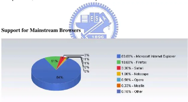
Support for Mainstream Browsers
Figure 1-1: Browser Market Share for April, 2006
According the browser market share survey [29] (Figure 1-1), Microsoft Internet Explorer is still far and away the most dominant browser on the Web, with 83.88 % usage market share, and Firefox has increased its share to 10.68%, and the other alternatives, such as Safari, Netscape, Opera, and Mozilla, occupy the remaining
share.
The downloaded mobile code should work with at least the top two popular browsers, i.e. Microsoft Internet Explorer and Firefox Web browser.
Reducing Wireless Bandwidth Consumption
More than screens size constraints, the limited memory and wireless network bandwidth also make it unsuitable to deliver the entire Web page untouched to mobile devices. Before returning a Web page to mobile devices, some action must be taken to pre-process a Web page according to a user’s preferences, so that the volume of data transmission to mobile phone could be reduced, and thus reduce the wireless bandwidth consumption as well.
1.4 Research Contribution
In order to achieve the objectives mentioned in Section 1.3, we have encountered many difficulties during implementation. This thesis discusses those problems encountered and our corresponding solutions. The major contributions of this research are listed below:
1. A cross-browser configuration tool is designed and implemented.
2. The Web-based nature of our configuration tool allows a user to configure the settings from different computers, and requires no pre-installation of any software
3. Blocks in a Web page can be chosen correctly, under the premise that the layout of a Web page doesn’t change frequently.
4. A Web-based management interface is provided.
1.5 Outline of the Thesis
This dissertation is divided into six chapters. Following is a brief description of the content of each chapter:
1. In Chapter 2, the background of developing this system and the related work including some commercial products and academic efforts are introduced.
2. In Chapter 3, an overview of the proposed system and its three major components are given.
3. In Chapter 4, the implementation details, problems encountered, and our corresponding solutions are illustrated.
4. In Chapter 5, some tests are conducted to evaluate our system. Besides a practical example showing how to make use of the proposed tool to eliminate unnecessary scrolling is also presented.
Chapter 2 Background
This chapter gives you the background of our research. Some technologies for implementation are briefly reviewed in the first few sections. And we give an introduction on other related work including several commercial products and academic efforts on this topic.
2.1 Document Object Model (DOM)
2.1.1 DHTML and DOM
Dynamic HTML (or DHTML) is a term used by some vendors to describe the combination of HTML, Cascading Style Sheets and JavaScript that allows documents to be animated. Some disadvantages of DHTML are that it is difficult to develop and debug due to varying degree of support among Web browsers of the aforementioned technologies.
Therefore, compatibility with DHTML was a motivating factor in the development of DOM. The scripting interfaces provided in DHTML have a significant overlap with DOM, particularly with the HTML module.
2.1.2 Definition of Document Object Model
According to the W3C’s definition, the Document Object Model [4] is a “platform- and language-neutral interface that will allow programs and scripts to dynamically
access and update the content, structure and style of documents. The document can be further processed and the results of that processing can be incorporated back into the presented page.”
2.1.3 XML DOM and HTML DOM
The DOM is separated into three parts: Core, HTML, and XML. The Core DOM provides a low-level set of objects that can represent any structured document. While this interface by itself is capable of representing any HTML or XML document, the core interface is a compact and minimal design for manipulating the document’s contents. Hence it may not be adequate in all situations. The purpose of the HTML and XML specifications is to provide additional, higher-level interfaces to facilitate direct access into the specific types of documents.
2.2 Asynchronous JavaScript and XML (AJAX)
Recently, AJAX has become such a hot topic in the Web design community, because of the popularity of Web applications such as Gmail [27] and Google Maps [28].
Frankly speaking, this technology is nothing more than an approach to Web interaction. This approach involves transmitting only a small amount of information to and from the server in order to give a user the most responsive experience possible.
2.2.1 The Origin of AJAX
In February 2005, Jesse James Garrett of Adaptive Path, LLC published an online article [33] entitled, “Ajax: A New Approach to Web Applications”. In this essay, Garrett explained how he believed Web applications were closing the gap between themselves and traditional desktop applications. And he also coined the term AJAX, shorthand for Asynchronous JavaScript and XML. From then on, a tidal wave of Ajax articles, code samples, and debates began popping up all over the Web.
2.2.2 Technologies behind AJAX
AJAX is an umbrella term of many Web development technologies. The technologies behind AJAX include HTML [1]/XHTML [3]/DHTML, CSS [7], DOM, XML [2], XSLT [6], XMLHttpRequest, and JavaScript. Among them, only three are required: HTML/XHTML/DHTML, DOM, and JavaScript. HTML/XHTML/DHTML is necessary for the display, while the DOM is necessary to change portions of a Web page dynamically. And the last part, JavaScript, is the core code of an AJAX application. It helps facilitate communication with a server and is necessary to manipulate the DOM to update a Web page without reloading the whole thing.
2.2.3 The Communication Model
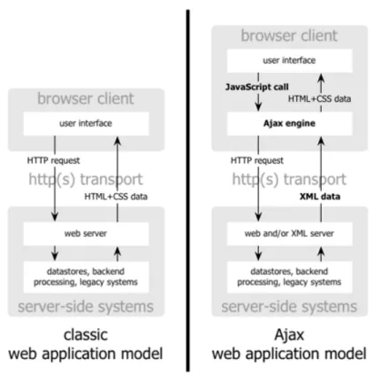
In traditional Web application model, it is the browser’s duty to initiate requests to, and process responses from, the Web server. While in AJAX Web application model, an intermediate layer, what Garrett calls an AJAX engine, is responsible for this
communication. An AJAX engine is merely a JavaScript object or function that is utilized whenever information needs to be submitted to or requested from the server. Every call to AJAX engine is done asynchronously without stalling a user’s interaction with his/her browser. Therefore, a user can feel much more responsive than before. Figure 2-1 excerpted from [33] displays the differences between AJAX and classic Web application models:
Figure 2-1: Classic Web Application Model vs. AJAX Web Application Model
2.3 Ruby on Rails Framework
2.3.1 What is Ruby?
Ruby [11] is a pure object-oriented programming language originated in Japan in the early 1990s. It successfully combines Smalltalk’s conceptual elegance, Python’s ease
of use and learning, and Perl’s pragmatism.
2.3.2 What is Ruby on Rails?
Ruby on Rails (short for Rails) [12] is an open source framework written in Ruby for developing database-backed Web applications according to the Model-View-Control (MVC) pattern. Three components are included in Rails to take charge of them separately: Active Record, Action View, and Action Controller.
Model
Active Record is the object-relational mapping (ORM) layer supplied with Rails. It closely follows the standard ORM model: tables map to classes, rows to objects, and columns to object attributes. It also makes things easy to implement the four basic operations on database tables: create, read, update, and delete (CRUD).
View
Action View is an Embedded Ruby (ERb) based system for defining presentation templates for data presentation. Every request to a Rails application results in the displaying of a view.
Controller
Action Controller is a data broker sitting between Active Record and Action View. It provides facilities for manipulating and organizing data from the database and/or from Web form input, which it then hands off to Action View for template insertion and display.
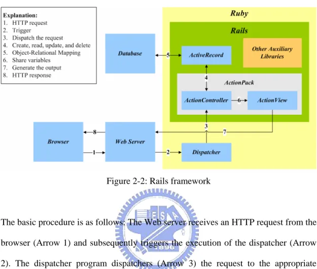
A figure showing how Rails works internally is presented bellow.
Figure 2-2: Rails framework
The basic procedure is as follows: The Web server receives an HTTP request from the browser (Arrow 1) and subsequently triggers the execution of the dispatcher (Arrow 2). The dispatcher program dispatchers (Arrow 3) the request to the appropriate controller, which it can figure out from the request URL. The controller then takes over. On the one hand, the controller has access to the models (Arrow 4), through which it can manipulate data stored in the backend database (Arrow 5), and on the other it is able to share data with the view template (Arrow 6). The view template gets expanded into HTML (or other formats) by means of variable substitutions (Arrow 7), and finally the Web server hands the result back to the browser (Arrow 8).
2.4 Muffin
Muffin [13] is a World Wide Web filtering system written entirely in Java that can filter any HTTP data sent and received by your Web browser. It has a public API to
allow third-party developers to extend the functionality of this proxy by implementing additional filters of their own.
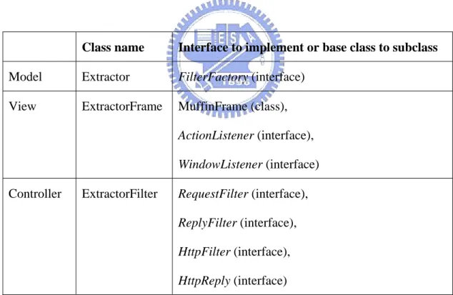
Muffin filters use the Model-View-Controller paradigm. Most filters are made up of three classes, one for your data, one for the user interface, and one for your filter logic. Muffin expects you to give your data class the same name as your filter, and then use that name as a prefix for the names of your user interface and filter logic classes. Add “Frame” to create your user interface class and “Filter” for the name of your logic class. Table 2-1 lists one example of how a Muffin filter could be composed by three classes. The interfaces to implement (or the base classes to subclass) of each class are also given.
Class name Interface to implement or base class to subclass
Model Extractor FilterFactory (interface) View ExtractorFrame MuffinFrame (class),
ActionListener (interface), WindowListener (interface)
Controller ExtractorFilter RequestFilter (interface),
ReplyFilter (interface), HttpFilter (interface), HttpReply (interface)
2.5 Related Works
Content adaptation can occur in the client device, on the content server or in an intermediate proxy server. In client-based adaptation, the required transcoding is performed by the client device. In the service-based approach, one common way of providing content to different devices is to store the content as XML, and then use XSLT to convert the content to appropriate markup languages. In the proxy-based approach, a proxy server analyzes and transcodes the content on-the-fly, before sending the result to the client.
In the next two sections, we would further discuss the client-based and the proxy-based approaches, because in some respects they are more similar to our situation. For example, content authors do not need to create different versions of the content since the same content is always delivered.
2.5.1 Client-based Adaptation
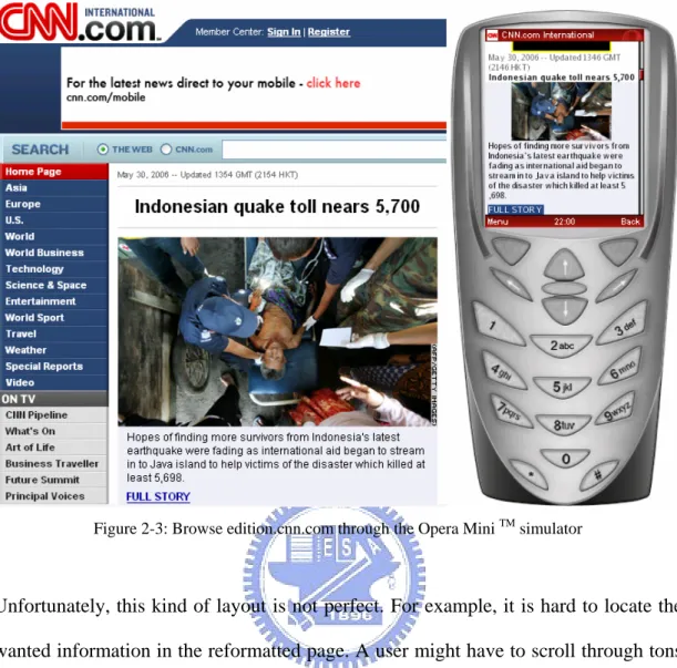
Opera Small Screen Rendering TM Technology
Opera’s mobile browser includes Small Screen Rendering technology [22]. This technology intelligently reformats today’s Web pages to fit the screen width of mobile devices, thereby eliminating the need for horizontal scrolling. It is only the layout of the page that is changed. All the content and functionality remains. A full-featured Opera Mini (Opera’s Web browser product) simulator is available at [23].
Figure 2-3: Browse edition.cnn.com through the Opera Mini TM simulator
Unfortunately, this kind of layout is not perfect. For example, it is hard to locate the wanted information in the reformatted page. A user might have to scroll through tons of irrelevant stuff before he/she can really find what he/she wants, not to mention Web pages containing substantial information.
ACCESS Smart-Fit Rendering TM Technology
Another company named ACCESS also has their proprietary browser product NetFront. The rendering technology adopted by this browser is what they call Smart-Fit Rendering [24]. Smart-Fit Rendering, just like Opera’s Small-Screen Rendering, also renders Web pages to fit the narrow screen width of mobile devices. Therefore, the same problem still exists.
2.5.2 Proxy-based Adaptation
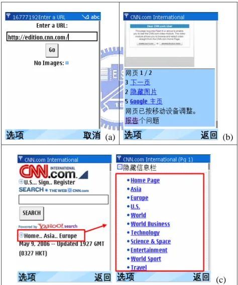
Google had quietly released a service to the public, similar to [20] and [21]. Since this service still lacks official statements, here we temporarily call it “Google Mobile Proxy” [19]. This proxy provides some distinctive features, such as pagination and links collapsing. Pagination means the process of dividing and numbering documents into pages (Figure 2-4).
(a) (b)
(c) Figure 2-4: (a) Google Mobile Proxy (b) Pagination (c) Links collapsing
2.6 Summary
In this chapter we first briefly reviewed some technologies that would be used in chapter 4 to implement our system. Then, content adaptation approaches were introduced in the related work section. We mainly focus on two of these approaches, i.e. the client-based and proxy-based approaches. Commercial products that fall into these two categories ware described subsequently. After practical testing, we found some inadequacies in certain areas of those products. And these observations have influential impact in our design.
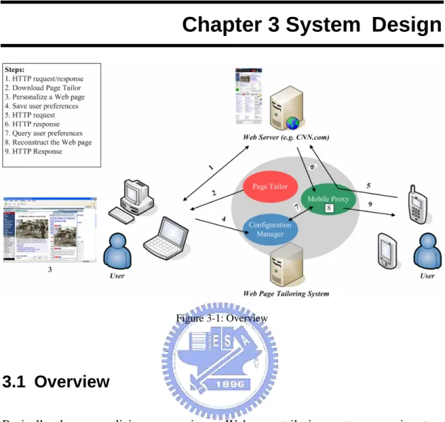
Chapter 3 System Design
Figure 3-1: Overview
3.1 Overview
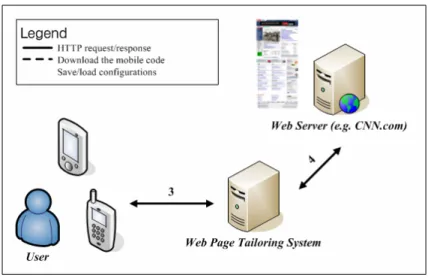
Basically, the personalizing process in our Web page tailoring system comprises two steps. First of all, a user must specify him/her preferences of a Web page using a PC or laptop. And second, he/she has to configure the browser on his/her mobile device to go through a specially made proxy which is responsible for adjusting the content of Web pages according to the preferences set in the first step.
Two pictures are given bellow to illustrate separately the relationship between a user, our Web page tailoring system, and a remote Web server (such as CNN.com) in each step.
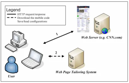
Figure 3-2: Personalize Web pages using PC or laptop
Figure 3-2 describes the interaction in the first step. When a user enters a URL in his/her Web browser, a HTTP request is sent to (Line 1) the corresponding Web server specified in the URL. After processing the request by the server, a HTTP response is sent back (Line 1). If the user wants to personalize that page, a program hosted on a tiny Web server included in our system would be downloaded (Line 2) and executed in his/her browser. With the help of that program, the user can specify his/her preferences simply by visual manipulations. After finishing the job, preferences about this page will be sent back and store in a database for later use (Line 2).
Figure 3-3: Browse Web pages via mobile devices
Figure 3-3 pictures the interaction in the second step. Since the user would configure the browser on his/her mobile device to use a proxy included in our system, we would snoop each HTTP request and modify its corresponding response (Line 3 and 4) in between. For example, if the user visits a Web page that had personalized before, some actions would be taken to tailor the Web page to meet the user preferences.
In order to achieve the above tasks, three components are designed in our system: Page Tailor, Configuration Manager, and Mobile Proxy. The purpose and functions of each component will be introduced separately in the next three sections. Implementation details are left to chapter 4.
3.2 Page Tailor
Page Tailor in the form of mobile code can be downloaded and executed in a user’s browser when he/she is about to personalize a Web page. It provides some visual manipulations for users to help them specify their preferences about a Web page. The
preferences here include: which blocks of a Web page should be retained and what is the final arrangement of them? All the preferences about this page would be saved in a remote database that is managed by Configuration Manager (introduced in Section 3.3). Figure 3-4 is a snapshot when executing Page Tailor in Firefox Web browser.
Figure 3-4: Page Tailor in Firefox Web browser
3.2.1 Installation
Mobile code differs from traditional software in that it need not be installed. By installation here we mean to add a bookmark in one browser, and use it to trigger the download process of Page Tailor when getting ready to personalize a Web page.
How could possibly a bookmark accomplish this mission? In general, bookmarks, or called favorites in Internet Explorer, are pointers to URLs. However, a small JavaScript program can also been stored as a URL within a bookmark in most popular
web browsers. This kind of bookmark is also called bookmarklet [8].
Actually the new bookmark is itself a bookmarklet. The source code (Figure 4-1) of this bookmarklet and its explanations are left for the next chapter.
3.2.2 Execution and Initialization
As browsing Web pages, a user can click on the installed bookmarklet to download and execute Page Tailor. From the other perspective of users, it seems that the Web page itself provides the personalizing functions.
After the Page Tailor window launches in the user’s browser, some actions are taken in the background automatically. First, Page Tailor will connect with Configuration Manager to retrieve the user preferences about this current visited page. If the user had personalized this page before, Page Tailor would get the old preferences. And it could then use the data retrieved to reconstruct the past such as which blocks were selected and what were their order? On the contrary, if there are no preferences about this page, nothing will happen, of course.
The purpose of this action is to help users accelerate the setting time; in particular, he/she only want to do a little modification.
3.2.3 Visual Manipulations
provides some visual manipulations.
Figure 3-5 demonstrates the feature that a user can select a block in a Web page at different granularity. For example, in the top half of this picture, a block containing more information than that in the bottom is selected. A selected block is highlighted in yellow.
Figure 3-5: Select blocks at different granularity
Figure 3-6 illustrates another feature – drag and drop. In this picture, three views are shown from left to right. At the beginning, three blocks has already been selected (left). Next, we switch the last two blocks (middle), and then the final result comes out (right). The sequence of blocks in the Page Tailor window would be the same as that in the browsers on mobile devices.
Figure 3-6: Rearrange the selected blocks
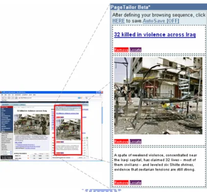
3.2.4 Controls
In the Page Tailor window, a number of controls are provided. Some kinds of them only belong to the selected blocks, and others don’t. For every selected block, there are two controls at the bottom: remove and locate controls. The remove control, as the word itself implied, is used to remove the selected block from the Page Tailor window. And the locate control is used to help users find the location of this block in the Web page.
Besides, the save control is used to submit the user preferences about this page to Configuration Manager. And the auto-save control could be clicked to toggle between on/off. When auto-save is on, which by default is set to off, Page Tailor will periodically check the current preferences. As long as it finds that something had changed (e.g. add/remove blocks or change their order), it would update that accordingly and automatically.
Figure 3-7: Controls of Page Tailor
3.2.5 User Preferences
XPath [5]is a language that describes how to locate specific elements in a document. In our Web page Tailoring system, the user preferences stored are composed of XPath expressions. In other word, when a user adds a block to the Page Tailor window, Page Tailor would internally generate an XPath expression for that block. By using XPath expressions, we can uniquely identify this block in the future provided that the layout of this page doesn’t change too frequently.
As regards the sequence of selected blocks, the XPath expressions of selected blocks are concatenated together according to their order in the Page Tailor window (separated by commas) to form the user preferences about this page. Figure 3-8 is a practical example:
Figure 3-8: Internal expression of user preferences about a Web page
3.3 Configuration Manager
The preferences specified by a user will be stored in a database. Configuration Manager serves as a gatekeeper to control the access to the backend database. It provides a Web-based interface (Figure 3-9) for a user to manage his/her preferences. Two Web services are also exported to allow other components in this system to access the preferences programmatically. One is used for querying the database and the other for updating.
The reason why we adopted the Web service approach ultimately is because of its language- and platform- specific nature. Hence, other components utilizing those services in our system could be implemented in different programming languages that are more appropriate for specific tasks. For example, Page Tailor (introduced in Section 3.2) is implemented in JavaScript, and Mobile Proxy (introduced in Section
3.4) in Java.
3.3.1 Query Service
Configuration Manager provides this service for the other two components to retrieve user preferences about a Web page. Page Tailor would make a Web service call after launching. In addition, Mobile Proxy (introduced in Section 3.4) does the same thing whenever receiving a HTTP request.
To use this service, a parameter must be supplied: URL. Then Configuration Manager would use this value to find the user preferences. Internally, every URL has only one corresponding user preferences.
3.3.2 Update Service
This service is only used by Page Tailor to update or add user preferences about a Web page. When a user finishes his/her preference setting, Page Tailor would make this Web service call accompanied by a URL of the current page and the internal expression of user preferences. In fact, for a user, there is no difference between whether he/she had personalized this Web page or not. As receiving this Web service call, Configuration Manager would first use the URL in the query string to find the corresponding user preferences. If there exists such a record, the old user preferences would be updated accordingly. Otherwise, a new record would be created in the database.
3.3.3 Administration Interface
As shown in Figure 3-9, the Web-based management interface lists the user preferences of about every Web page that had personalized. With this, users can create, edit, and delete their preferences online. Validations of user input are also provided.
Figure 3-9: The Web-based management interface
3.4 Mobile Proxy
Mobile Proxy is a specially made proxy that is responsible for the final step to complete the personalizing process. It would monitor every HTTP request and makes Web service calls (query service) with the request URL as the parameter to Configuration Manager. The returned user preferences, if any, then could be used to filter the unwanted Web page content and rearrange the remaining blocks
3.5 Summary
In the beginning of this chapter, we introduce how to use our system. A user first personalizes a Web page using PC or laptop and then browses the same page via his/her mobile device. Next, we describe three components in our system: Page Tailor, Configuration Manager, and Mobile Proxy. The design concepts and functions provided by each component are detailed in separate sections.
Figure 3-10 summarizes the communication between these three major components. Page Tailor is downloaded and executed in a user’s browser first. And the Web services exported by Configuration Manager are used by it and Mobile Proxy to access the backend database where user preferences are stored.
Chapter 4 System Implementation
In this chapter, we will describe the implementation details of the three major components in our system and the problems encountered during implementation. Of course, our solutions to these problems are also depicted.
4.1 Page Tailor
Page Tailor is implemented in JavaScript because of the following considerations:
1. JavaScript was designed to add interactivity to HTML pages. This point conforms to the first objective of this thesis, i.e. easy-to-use, since we can embed the configuration tool in a Web page so that users can configure their settings directly in the browser.
2. By using JavaScript, we can manipulate a Web page through the Document Object Model interface. In other words, we can change the appearance of a Web page to reflect the user’s choice. This one conforms to the second objective, i.e. personalizing Web page visually.
3. JavaScript is one of the most popular scripting languages on the Internet, and works in all major browsers, such as Internet Explorer, Firefox, etc. This one agrees with the third objective, i.e. support for mainstream browsers.
4.1.1 The Page Tailor Bookmarklet
Figure 4-1: This is the bookmarklet used to launch Page Tailor
The source code of this bookmarklet is shown in Figure 4-1. When a user clicks that, an element with tag name “script” is created (Line2). After being created, the new element contains no properties. So, next we assign some attributes to that element (Line 3 to Line 5). Among them, the src property (Line 5) is used to indicate the location of a remote JavaScript file.
A created element exists only in the browser’s memory, and not as part of this Web page. In order to let the “script” element take effect, we have to add it to the Web page. For that reason, we find the first occurrence of “body” element (Line 6) in the Web page, and then append the “script” element as a child of it (Line 7).
By this way, we can dynamically load an external JavaScript file on demand to do something with a Web page. As regards other types of files such as CSS, this approach can work too.
4.1.2 Loading external JavaScript Libraries
already incorporated the commonly used functions such as drag-and-drop and visual effects. In Page Tailor, we do not reinvent the wheel but take advantage of the Script.aculo.us JavaScript framework [9]. According to the instructions on the official website, we have to add two lines (Figure 4-2) in a Web page so as to enjoy all of the functions and features. It is noteworthy that they must appear in the same order because the Script.aculo.us framework is built on another JavaScript framework, i.e. Prototype [10].
Figure 4-2: How to use Script.aculo.us
Unfortunately, things are not so simple. Through the method introduced by the previous section, we can dynamically load those two JavaScript files. The exact time to load, however, depends on the browsers. In other words, even if we add the “script” elements to a Web page in this order, first the one to load prototype.js and then scriptaculous.js, the results are still not expected.
To address the above problem, we must postpone the loading of scriptaculous.js until after prototype.js has been loaded. By choosing a unique identifier from a file and periodically checking whether this identifier has been defined or not, we can indirectly deduce the current state of that file. That is to say, if an identifier has been defined, the file containing it must have been loaded.
For example, we choose the identifier named Prototype in prototype.js and Draggable in scriptaculous.js. The following figure shows the actual flow:
Figure 4-3: The flowchart of loading JavaScript libraries
After finishing loading the required JavaScript libraries, we can finally load Page Tailor which is another JavaScript file named pagetailor.js. All the things mentioned above in this section are written in a file named loader.js, and actually it is also the one specified in the Page Tailor bookmarklet (Figure 4-1, Line 5).
4.1.3 The Containment Hierarchy of Page Tailor
Figure 4-4: The containment hierarchy of elements
As pagetailor.js loaded, it would create the containment hierarchy of elements that together compose the Page Tailor window. And then the entire hierarchy would be appended to the Web page. Figure 4-4 shows the correspondence between each element and their appearance displayed in the browser. The tag name of each element contained in this hierarchy is labeled on the left hand side of this figure.
4.1.4 The Style Rules
For the sake of keeping consistent, the attributes of the Page Tailor window must be specified explicitly. The main reason lies in that for each attribute, different browsers have their own default value. To increase the readability of the program, we put the
style rules in a separate CSS file, and load that file by means of the technology described in Section 4-1-1.
4.1.5 Generating XPath Expressions
The degree of support for XPath over HTML varies in different types and brands of browsers, so that we must deal with the conversion between a selected block and its corresponding XPath expression by ourselves in Page Tailor. But in fact a full-feature XPath implement is not necessary. Since the XPath expressions contained in the user preferences are restricted to internal use only. Then, we will make a statement on how to generate the XPath expression of a selected block.
As we can see in Figure 4-5, every selected block corresponds to a subtree of the document. The way to find its XPath expression can be divided into two steps. First, start from the selected block (or node) and recursively walk up the tree to find all ancestors of that. Then, for each node in the path count the number of its siblings which have the same tag name as the node. With these two data we can finally generate the XPath expression of the selected block.
(a) (b) Figure 4-5: The selected block (a) and its corresponding subtree (b)
4.1.6 The Same Origin Policy
It is the XMLHttpRequest object that can be used by JavaScript to transfer data to and from a Web server using HTTP. It is supported by almost all popular browsers. For security reason, however, browsers often impose some restriction (also referred as the “same origin policy”) on this object.
The “same origin policy” dates from Netscape Navigator 2.0. This policy prevents a document from one origin from getting or setting properties of another document from a different origin. In general, two documents are considered to have the same origin if they are identical in three aspects: protocol, host, and optionally port. Table 4-1 lists some examples of origin comparisons against to the URL “http://store.company.com/dir2/other.html”.
URL Result Description
http://store.company.com/dir2/other.html Success http://store.company.com/dir/inner/another.html Success
https://store.company.com/secure.html Failure Different protocol http://store.company.com:81/dir/erc.html Failure Different port http://news.company.com/dir/other.html Failure Different host
Table 4-1: Examples of origin comparisons
From the comparisons in the above table, it is not difficult to imagine that in Page Tailor it is impossible to retrieve data from Configuration Manager by using the XMLHttpRequest object, because a Web page surely comes from the Web server that situates in a different origin than where Configuration Manager might lives. In regard to our solution, see the next section.
4.1.7 Accessing the User Preferences
Using an aforementioned technique, we can overcome the restriction imposed by the “same origin policy”. Remember that in the Page Tailor bookmarklet, we dynamically create a “script” element, assign some attributes to it, and add this element to the Web page. After the remote file has been loaded, the JavaScript code written in that file would be executed accordingly.
This time, we still create a “script” element. However, the value assigned to its src attribute doesn’t point to a remote file. It points the query service provided by Configuration Manager. Therefore, adding this element to a Web page is equivalent to use the query service. Besides, since the type attribute of the “script” element has a value of “text/javascript”, the response of the query service should be in the form of
JavaScript, or some runtimes error might occur. As for how to make use of the response of query service, let’s first take a look at Figure 4-6.
Figure 4-6: How to load the user preferences (pseudo-code)
The pseudo-code is taken from pagetailor.js. When we need the user preferences about a Web page, the function named query would be invoked (Line 01). What the function does is as what we said in the last paragraph. However, two things had not been addressed yet. One is the meaning of the parameters involved in the query string (Line 08 to Line 10) to the query service, and the other is the purpose of the “id” attribute assigned to the “script” element (Line 07).
There are three parameters in the query string: url, callback, and id. When Configuration Manager receives a request, it would extract the values of each parameter. Among them, the value of url is used to query the database to find the corresponding user preferences about this Web page. The value of callback contains the name (“callback” in this case) of a function implemented in pagetailor.js to
process the response of query service. And id, the last one, is used to identify the “script” element that make this request, since more than one “script” element could be added to a Web page at the same time
As mentioned before, the response will be interpreted as JavaScript. What Configuration Manager returns is actually a function invocation like the one in Figure 4-7. The function name, “callback”, is identical to the one involved in the query string. There are two parameters passed to this function. The first one contains the user preferences about the URL specified in the query string. And the second one is the id specified in the query string as well, which is left intact.
Figure 4-7: The response of query service (pseudo-code)
When the response is sent back to the client side, the function named “callback” would be invoked with the user preferences filled by Configuration Manager. Since Page Tailor has gotten the user preferences now, the reconstruction of the past could be performed in the body of this function. Finally, it comes to the id’s turn. We can use the id to find the “script” element that was added to the Web page to trigger this series of events and remove it.
All the above statements illustrate how to load the user preferences without being restricted by the “same origin policy”. Figure 4-8, on the contrary, illustrates how to update the user preferences. It is not surprising that these two operations are very similar. They differ only in two respects. First, one more parameter is involved in the
query string, which is the data required to update. And second, the callback function only serves as scavenger to remove the “script” element.
Figure 4-8: How to update the user preferences (pseudo-code)
4.2 Configuration Manager
4.2.1 Web Services Implementations
Controllers are the subprograms in a Rails application that perform tasks. Typically, a Rails application has several controllers, and each controller is capable of multiple actions. Controller actions are sequences of Ruby code that correspond directly to the tasks this application can be asked to do. When an action is executed, it not only has access to the data from a submitted form but also to the models, through which it can manipulate data stored in the backend database. In our case, the two Web services exported by Configuration Manager are implemented as separate actions.
4.3 Mobile Proxy
Mobile Proxy in our system is based on Muffin. By implementing a filer of our own1, we can modify the content of the Web page before it is sent back to the client according the user preferences specified by the user.
The interfaces needed to be implemented in the filter logic class depend on what kind of filtering we want to do. In our case, two interfaces have been implemented in total: RequestFilter and ReplyFilter. The RequestFilter interface is implemented to filter requests before they go out to a server. And, on the contrary, the ReplyFilter is implemented to modify replies after a server responds.
4.3.1 Pre-processing the Web Content
If a request issued by the client is destined for a URL which has corresponding user preferences stored in our database, Mobile Proxy would start a chain of processing steps. First of all, it would use a HTML parser [16] to parse that Web page and produce a corresponding DOM tree (Figure 4-9). After that, an XPath engine [17] is used to process XPath queries over the DOM tree. Some specific elements would be selected at this time, and a new DOM tree would be created alongside to hold the replicas of those elements (Figure 4-10). The sequence of the replicas in the new DOM tree would refer to the sequence of the XPath expressions in the user preferences.
1
Figure 4-9: Produce a corresponding DOM tree
Figure 4-10: A new DOM tree (right) would be created to hold the replicas of selected elements in original DOM tree (left)
4.3.2 Transforming to XHTML
The result page (i.e. the new DOM tree) has already been constructed now. However, it is not necessarily self-validating. Since what we have done already is to find, clone and collect the blocks of content directly. To further polish that, a lovely open source utility, JTidy [15]2, would be used. This tool was originally designed to fix up mark-up errors and also offers a means to convert existing HTML content into well-formed XML, such as XHTML. After the process of JTidy, a well-formed and validated result page is finally turned up.
2
4.4 Summary
This chapter includes all the implementation details of the three major components that together compose our Web page tailor system. The implementation issues and their corresponding solutions are addressed here, too
Chapter 5 Evaluation
In this chapter, we evaluate our Web page tailoring system in different aspects. A practical example is also given in the end to show that how this system can eliminate the unnecessary scrolling by filtering the unwanted Web page content.
5.1 Usability Test
To test the usability of Page Tailor on different browsers, we personalize a Web page in Internet Explorer and launch Page Tailor (on the same Web page) in Firefox Web browser to check that the same result can be obtained, and vise versa. Figure 5-1 shows the result of the test.
(a) (b)
5.2 Stability Test
To test whether the user preferences about a Web page can be really applied and be used to extract accurately the blocks of content, we make a check on the result continuously. Figure 5-2 contains two snapshots that are taken from different days without modifying the user preferences.
(a) (b)
Figure 5-2: Stability test
5.3 Example
In this section, we make use of our system to show how to eliminate the unnecessary scrolling. In Figure 5-3 (a) we can see that only parts of the Web page can be presented on the limited screen at one time. There is plenty of room for scrolling no matter in horizontal or vertical direction. In Figure 5-3 (b) we personalize this Web
page by selecting three blocks of content that are located in the middle of this page. After the personalizing process, as we can see in Figure 5-3 (c) that the unwanted Web page content has already been filtered.
(a) (c)
(b) Figure 5-3: A practical example of how to use our tool
Chapter 6
Conclusion and Future Work
6.1 Conclusion
Motivated by the increasing need to browse Web pages on mobile devices, this dissertation consider the inconvenience of limited screen size, which is the common feature of the vast majority of mobile devices. We propose a Web page tailoring tool to help end users personalize Web pages. As we saw in the last chapter, several functions can be achieved through the proposed tool.
6.2 Future Work
There are several improvements available for our Web page tailoring system. First, the functionality of Mobile Proxy can be further extended. At this point it is only capable of generating XHTML, and the mechanism for detecting the capabilities of mobile devices has not been integrated yet.
Next, algorithms of detecting the structure of Web pages could be developed, and incorporate into Page Tailor to accelerate the personalizing process. Since Web pages from different website might look very similar, perhaps the user preferences of a Web page could be applied to others directly.
Reference and Bibliography
[1] W3C. HTML 4.01 Specification, http://www.w3.org/TR/html4/
[2] W3C. Extensible Markup Language (XML) 1.0 (Third Edition),
http://www.w3.org/TR/REC-xml/
[3] W3C. XHTMLTM 1.0 The Extensible HyperText Markup Language (Second Edition), http://www.w3.org/TR/xhtml1/
[4] W3C. Document Object Model (DOM), http://www.w3.org/DOM/
[5] W3C. XML Path Language (XPath) Version 1.0. http://www.w3.org/TR/xpath
[6] W3C. XSL Transformations (XSLT) Version 1.0. http://www.w3.org/TR/xslt
[7] W3C. Cascading Style Sheets, level 1, http://www.w3.org/TR/REC-CSS1
[8] Bookmarklet, http://www.bookmarklets.com/
[9] Script.aculo.us JavaScript framework, http://script.aculo.us/
[10] Prototype JavaScript framework, http://prototype.conio.net/
[11] Ruby, http://www.ruby-lang.org/en/
[12] Ruby on Rails, http://www.rubyonrails.org/
[13] Muffin World Wide Web Filtering System, http://muffin.doit.org/
[14] HTML Tidy, http://www.w3.org/People/Raggett/tidy/
[15] JTidy, http://jtidy.sourceforge.net/
[16] NekoHTML, http://people.apache.org/~andyc/neko/doc/html/index.html
[17] Jaxen, http://jaxen.org/
[18] Mobile ASP .NET Web Applications,
http://www.asp.net/default.aspx?tabIndex=6&tabId=44
[19] Google Mobile Content Proxy (still lack of an official name),
[20] Skweezer, http://www.skweezer.net/
[21] IYHI, http://www.iyhy.com/
[22] Opera’s Small-Screen Rendering TM,
http://www.opera.com/products/mobile/smallscreen/
[23] Opera Mini TM simulator,
http://www.opera.com/products/mobile/operamini/demo.dml
[24] ACCESS Smart-Fit Rendering TM technology,
http://www.access-us-inc.com/Products/client-side/Prod_NetFront.html
[25] Google Mobile, http://www.google.com/mobile/index.html
[26] Yahoo Mobile, http://mobile.yahoo.com/
[27] Gmail, http://gmail.google.com/
[28] Google Maps, http://maps.google.com/
[29] Browser Market Share Survey by NetApplications.com,
http://netapplications.com
[30] Sheng-Po Shen, Shyan-Ming Yuan, “XML-based Mobile Application
Development Framework”, 國立交通大學電資學院碩士班論文,民國 93 年 6 月
[31] Jen-Kai Wu, Shyan-Ming Yuan, “A Visualized Kit for Developing
Applications on Multiple Mobile Devices”, 國立交通大學,電資學院碩士班 論文,民國 94 年 6 月
[32] Chi-Han Kao, Shyan-Ming Yuan, “A Multi User-Interface Generation Plug-in for Visual Studio .NET”, 國立交通大學,電資學院碩士班論文,民國 94 年 6 月
[33] Ajax: A New Approach to Web Applications,
http://www.adaptivepath.com/publications/essays/archives/000385.php
“Function-based object model towards website adaptation”, Proceedings of the 10th international conference on World Wide Web, p.587-596, May 01-05, 2001, Hong Kong, Hong Kong
Appendix A:
How to Install a Muffin Filter
By default, there are several filters provided with Muffin. Here, we show you how to add a filter of our own to Muffin.
1. Under the Edit menu select “Filters…”
3. Type the name of the filter, e.g. “Extractor”. Then the new filter would appear in the “Supported Filters” list of Filters dialog.