行政院國家科學委員會專題研究計畫 成果報告
使用者後設認知策略在互動介面愉悅性設計之研究(I)
計畫類別: 個別型計畫
計畫編號: NSC91-2213-E-011-067-
執行期間: 91 年 08 月 01 日至 92 年 07 月 31 日 執行單位: 國立臺灣科技大學工商業設計系
計畫主持人: 陳建雄
計畫參與人員: 邱柏清、蔡佳穎
報告類型: 精簡報告
處理方式: 本計畫可公開查詢
中 華 民 國 92 年 10 月 21 日
Designing Pleasurable Interactive User Interfaces based on Users' Metacognitive Strategies (I)
Abstract: Metacognitive strategies refer to one’s knowledge of his/her own cognitive
process and the strategies adopted for self-controlling of these processes. Recently, interaction designers have begun to realize the importance of incorporating pleasure into their user interface design process. However, most of the current studies are mainly focused on product pleasure. Very few research studies on interface pleasure are available. The purpose of this research study is to investigate users’metacognitive strategies pertinent to their perceptions of interface pleasure when interacting with a Website user interface, such as their browsing strategies, the way to recover from disorientation, and the way to solve potential interaction problems.
Two experiments were conducted for this research. The first experiment was to investigate 10 participants’ metacognitive strategies regarding their perceptions of interface pleasure when interacting with 10 pre-selected Websites. Both observation and think-aloud techniques were used to collect qualitative data. In the second experiment, three different design factors generated from the first experiment pertaining to users’ perceptions of interface pleasure were used to help create five different Websites. Another 15 participants were recruited to interact with these five Websites and fill out a questionnaire. The results generated from one-way ANOVA revealed: (1) Most users felt that a simple and clean Website designed together with fresh colors can give them better perceptions of interface pleasure; (2) A Website designed by adopting a large, dynamic, and interesting image on the introduction page will also provide pleasurable perceptions; (3) A dynamic button on the Website may increase users’ perceptions of interface pleasure as well, though the size of the dynamic button can be very small. It is hoped that by investigating users’
metacognitive strategies regarding their perceptions of interface pleasure, interaction designers are able to create better Website user interfaces that are more fun to interact with.
Keywords: Interface Pleasure, Metacognitive Strategy, Website, Interaction Design
摘要:後設認知策略意指一個人對其自身進行事物認知過程的感知與如何調控這 些過程所運用的策略,近來互動設計師逐漸了解到在介面設計過程中加入愉悅性 的重要,然而現階段大部分的研究以針對產品的愉悅性為主,對於介面愉悅性的 研究則非常缺乏。本研究的目的即在調查符合使用者與網頁介面互動時所產生愉 悅性感覺之後設認知策略,例如:使用者所採用的瀏覽策略、如何導正瀏覽方向 之迷失、及如何解決潛在的互動問題等方法。本研究包含兩階段實驗,第一階段 實驗為針對 10 個預先選定的網頁,調查 10 位受測者與樣本網頁互動時對介面愉 悅性感覺之後設認知策略,採用觀察法及有聲思考法收集質性資料;第二階段實 驗則利用第一階段實驗中使用者對愉悅性介面感覺的三個設計因素,創造五個不 同的實驗網頁。另外再邀請 15 位受測者瀏覽此五個測試網頁並填寫問卷。根據 單因子變異數分析之檢定的結果顯示:(1)大部分的使用者覺得「簡潔的」及「明 亮的」網頁設計可以產生較高的網頁愉悅性感覺;(2)採用「大的」、「動態的」
及「有趣的」網頁主圖亦可以提供使用者愉悅的感覺;(3)即使網頁中的「動態 按鈕」非常小,仍然可以增加使用者介面愉悅性的感覺。本研究希望透過對使用 者介面愉悅性感覺的後設認知策略調查,可以幫助互動設計師創造出更有趣的互 動網頁介面。
關鍵詞:介面愉悅性、後設認知策略、網頁、互動設計
1. Introduction
As the progress of Internet technology, we are able to browse through the World Wide Web (WWW) to acquire up-to-date information to increase our life quality. As
a result, the time we spend in interacting with the Internet is also increasing steadily.
Kraut, Lundmark, Kiesler, Mukhopadhyay, and Scherlis (2003) investigated 100 households in the Pittsburgh area trying to understand people’s use of the Internet at home. Their results demonstrated that people’s foremost use of the Internet was for pleasure (see Figure 1). Therefore, to an interaction designer, in order to fulfill a user’s interaction requirements, the functional aspect of a Website design is no longer the primary concern. Instead, a user’s psychological needs should be taken into serious account. That is, modern Internet users prefer to obtain fun or enjoyment while navigating through the Internet. Bailey (1996) also argues that in addition to achieving the task goal, a computer user will also like to have fun while using the computer. Therefore, to an interaction designer, designing a pleasurable Website user interface is one of the design challenges that s/he faces in the 21st century. To meet this challenge, the researchers started to investigate Internet users’ metacognitive strategies pertinent to their perceptions of interface pleasure while interacting with the WWW. Metacognitive strategies refer to one’s knowledge of his/her own cognitive process and the strategies adopted for self-controlling of these processes.
Figure 1. Frequency of Using the Internet for Different Purposes (Adopted from Kraut, Lundmark, Kiesler, Mukhopadhyay, and Scherlis, 2003)
Recently, interaction designers have begun to realize the importance of
incorporating pleasure into their user interface design process. However, most of the current research studies are primarily focused on product pleasure (Jordan, 1998, 2000, 2001; Jorden and Green, 2002; Jorden and Jorden, 2000; Norman, 2002) with emphasis on going beyond interface usability. More specifically, to design a pleasurable product, this product should be equipped with design factors like useful functions, easy-to-operate tasks, and easy-to-understand user interfaces.
Nonetheless, very few research studies on interface pleasure are available. For instance, Malone (1981) argues that challenge, fantasy, and curiosity are the important factors in the design of computer games, which may affect a user’s internal
motivation and enjoyment. Marcus (2002) contends that if an interaction designer is able to create a “cute” user interface, it may be fun to interact with. The purpose of this research study is to investigate users’ metacognitive strategies pertaining to their perceptions of interface pleasure when interacting with a Website user interface, such as the browsing strategies, the way to recover from disorientation, and the way to solve potential interaction problems. It is hoped that by conducting this type of research, an interaction designer can create a Website user interface which not only possesses enhanced interface usability to meet the users’ functional requirements but also provides better interface pleasure to satisfy their psychological needs.
2. Research Methods
This research study consisted of two experiments. The first experiment adopted both observation and think-aloud methods. Participants were invited to interact with
10 pre-selected Websites and, at the same time, spoke out their perceptions of interface pleasure occurring during the interacting processes. Both note-taking and voice-recording techniques were used to help collect the data. By so doing, the researchers could investigate the participants’ metacognitive strategies used to help browse through the Websites. In the second experiment, three important Website design factors that might affect a user’s perceptions of a Website’s interface pleasure were adopted. Based on these factors, five Websites were created and used for the experiment including one from the previous experiment for the control purpose. The aim of this experiment is to validate if these design factors can actually affect a user’s perceptions of a Website’s interface pleasure.
3. The Experiments
Before the experiments, participants were asked to interact with several
pre-selected Websites. The Website design guidelines regarding interface pleasure were then generated and summarized based on this process. A total of seven
important Website design factors were found, such as introduction animation, overall perceptions of the introduction page, the relationship between the introduction page and the content pages, music, button design, overall structure, additional functions, and others.
3.1 The First Experiment
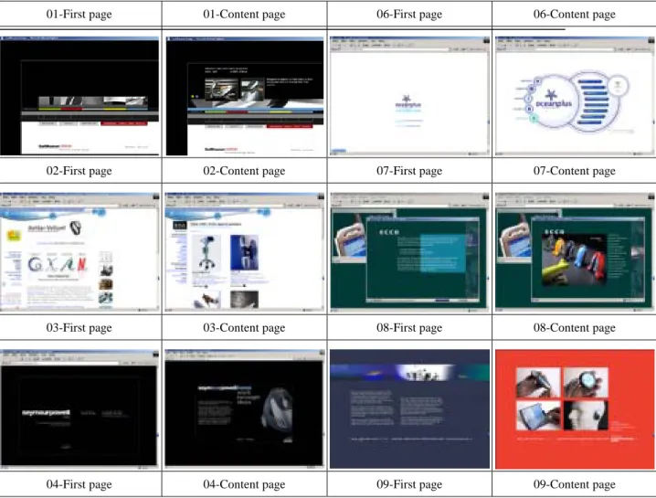
The purpose of the first experiment was to generate potential Website design factors that may influence a user’s perceptions of interface pleasure. A total of 10 student volunteers were recruited from the Graduate School of Design in National Taiwan University of Science and Technology. None was paid for taking part in this experiment. They all have at least five years computer experience. They were asked to interact with 10 pre-selected Websites (see Table 1). These Websites were
chosen because of their unique structures and they were all design-related. While interacting with the Websites, participants were required to think out loud their perceptions of interface pleasure and the metacognitive strategies they used to help them browse through the Websites. The participant’s think-aloud protocols were further analyzed and a list of twelve pairs of polar adjectives was generated for the second experiment. These polar adjectives were displeasure vs. pleasure, dirty vs.
clean, blurred vs. clear, colorless vs. colorful, formal vs. lively, static vs. dynamic, unlovely vs. lovely, uncomfortable vs. comfortable, dislike vs. like, ordinary vs.
extraordinary, dull vs. vivid, and dark vs. bright.
Table 1. The Websites Adopted for the First Experiment
01-First page 01-Content page 06-First page 06-Content page
02-First page 02-Content page 07-First page 07-Content page
03-First page 03-Content page 08-First page 08-Content page
04-First page 04-Content page 09-First page 09-Content page
05-First page 05-Content page 10-First page 10-Content page
3.2 The Second Experiment
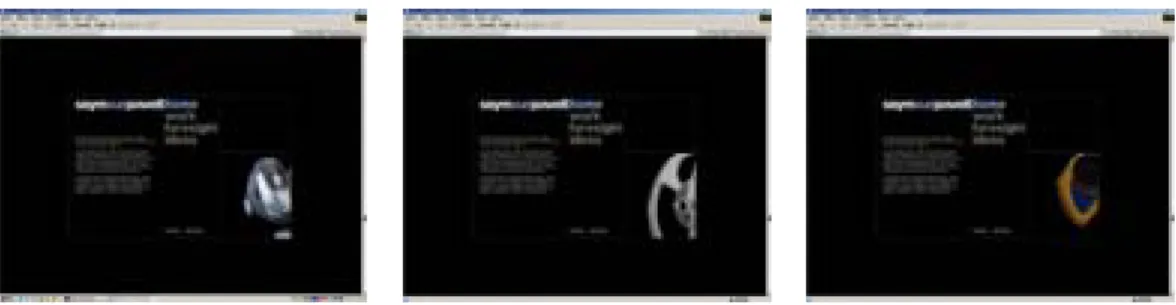
From the first experiment, three important Website design factors affecting the user’s perceptions of interface pleasure were generated. These factors: (1) There should exist large and interesting dynamic images on the introduction page of the Website; (2) The Website should be designed with simple and clean feels, and with fresh colors; (3) The Website should be equipped with dynamic icons. In order to know if the above-mentioned Website design factors do affect the user’s perceptions of interface pleasure, the Website, 03-Content page, from the first experiment was chosen as the control group in the second stage for comparison purpose. This is because this Website is designed with one image and some description texts that are easy to be modified for further experiment. Furthermore, in order to know how large the dynamic image should be used on the Website introduction page, two smaller scales, 70% and 40% reduction from the original image of the control group, were adopted for the experiment. By reducing the image into smaller scales, the researchers would be able to verify if they might result in negative effects.
In the end, a total of five different websites was used in the second experiment (see Figure 2).
Website 1 was the 03-Content page without any modifications for control purpose. Website 2
was designed with 70% size reduction on its dynamic image from the control group. Website 3 was designed with 40% size reduction on its dynamic image from the control group. Website 4 was designed with simple, clean, and fresh colors. Website 5 was designed with dynamic icons.
In this experiment, fifteen student volunteers were recruited from the Graduate School of Design in National Taiwan University of Science and Technology. None was paid for taking part in this experiment, and they did not participate in the first experiment. They all have at least five years computer experience. The participants were asked to interact with these five different Websites in a random order to prevent possible sequential effects. After that, they were required to fill out a questionnaire and accepted a brief interview. The questionnaire was designed based on a 7-interval Likert Scale. By so doing, the researchers could investigate their perceptions of interface pleasure among these five Websites.
4. Results and Discussions
4.1 Results Generated from the First Experiment
The results generated from the first experiment were mainly from the observation and think-aloud techniques. That is, the participant’s metacognitive strategies used for interacting with testing Website were observed and recorded for further analysis.
In addition, the participant’s think-aloud protocols were first transcribed into written texts. After that, the contents of the protocols were analyzed and summarized. The important design factors regarding the participant’s perceptions of interface pleasure were pointed out and the frequency of mentioning pertaining to interface pleasure or displeasure was also calculated. These Website design factors that affect a user’s perceptions of interface pleasure were summarized as design guidelines to help create pleasurable Website user interfaces. Participants’ detailed descriptions are provided as follows:
A. Introduction animation
a.1 Require introduction animation Need loading feedback (9) Animation should be simple (6) Need “Skip” button (4)
B. The overall image of the introduction page b.1 The perception of the introduction page
Should be simple, clear and understandable (18) Users can read the whole page at one time (14) Should provide eye focus (9)
b.2 The color of the introduction page
Need to have appropriate vivid colors (11) Need to adopt fresh colors (7)
b.3 The perception of the primary image The size of the image should be large (10)
Website 1: Original 03-Content page
Website 2. Designed with 70% size reduction on its dynamic image
Website 3. Designed with 40% size reduction on its dynamic image
Website 4. Designed with simple, clean, and fresh colors
Website 5. Designed with dynamic icons
Figure 2. Five Website Designs for the Second Experiment
The image should be consistent with the theme of the Website (7) b.4 The figure and ground perception
The text visibility should be clear (42)
The description text should be of appropriate size (30)
The figure and ground should be simple, clean, and clear (10) b.5 The frame and layout of the introduction page
The frame should be design with consistency (19) The frame should be clearly presented (14) C. The overall perception of content pages c.1 The design of content pages
Should be consistent with the introduction page (82) Should be designed with clear visibility (6)
c.2 The color of content pages Should be simple and clear (14)
c.3 The images and texts of the content pages
The images and texts should be in similar proportions (10) c.4 The size of the texts
Should adopt an appropriate text size (30) c.5 The dynamics of background
Should adopt a simple dynamic background, but should not affect users’
text-reading activity (19) c.6 Pleasurable animations
Better to have pleasurable animations (9) c.7 The frame of the content pages
Users should be located in the same frame while browsing through pages (8) c.8 The layout of the content pages
The content pages should be designed with consistency (18) Avoid slow loading time (9)
D. Screen buttons
d.1 The overall perceptions of screen buttons The screen buttons should be sensed easily (31) Provide clear functional indications (26)
Buttons should be designed with appropriate icons (23) Need to provide interactivity and feedback (22)
The visibility of the button text should be clear (20)
4.2 Results Generated from the Second Experiment
The results generated from the questionnaire of 7-interval Likert Scale were first analyzed.
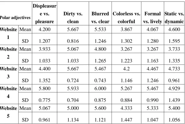
The mean and standard deviation of each pair of polar adjectives among these five Websites were summarized in Table 2. After that, the one-way Analysis of Variance (ANOVA) was used to test if there existed statistically significant differences (under α=0.05) among these five Websites. A subsequent Least Significant Difference (LSD) post-hoc test was conducted if the significant difference did exist. The results were described as follows:
4.2.1 Displeasure vs. pleasure
Based on the results from one-way ANOVA, there existed a statistically significant difference among these five Websites (F=7.244, p=0.000<0.05). The subsequent LSD test results suggested:
(1) Website 1 is different from Website 4 and 5; (2) Website 2 is also different from Website 4 and 5; (3) Website 3 is different from Website 4. We may infer that if a Website is designed with simple, clean, and fresh feels, it may provide participants with pleasurable perceptions. Similarly, if a Website is designed with dynamic buttons, it may also increase its interface pleasure.
Table 2. The Mean and Standard Deviation of the 12 Polar Adjectives Among Five Websites
Polar adjectives
Displeasur e vs.
pleasure
Dirty vs.
clean
Blurred vs. clear
Colorless vs.
colorful
Formal vs. lively
Static vs.
dynamic
Mean 4.200 5.667 5.533 3.867 4.067 4.600
Website
1
SD 1.207 0.816 1.246 1.302 1.280 1.595Mean 3.933 5.067 4.800 3.267 3.267 3.733
Website
2
SD 1.033 1.033 1.265 1.223 1.163 1.335Mean 4.400 5.667 5.467 4.2 4.467 4.733
Website
3
SD 1.352 0.724 0.743 1.146 1.246 0.961Mean 5.800 5.933 6.000 5.267 5.467 4.929
Website
4
SD 0.775 0.704 0.875 0.884 0.990 1.439Mean 5.067 5.000 5.600 4.333 5.333 5.400
Website
5
SD 0.961 1.134 1.121 1.447 1.047 1.056Polar
adjectives Unlovely vs. lovely
Uncomfortabl e vs.
comfortable
Dislike vs. like
Ordinary vs.
extraordinar y
Dull vs.
vivid
Dark vs.
bright
Mean 3.533 5.2 5.467 4.733 4.000 4.400
Website
1
SD 1.407 1.014 1.302 0.961 1.069 1.454Mean 2.867 4.533 4.667 3.667 2.800 3.467
Website
2
SD 0.834 0.915 0.976 1.345 1.207 1.302Mean 3.667 4.867 5.067 4.333 3.933 4.067
Website
3
SD 1.175 1.407 1.223 1.291 1.335 1.280Mean 4.933 5.800 5.467 5.400 5.533 6.067
Website
4
SD 1.335 1.014 1.125 1.121 0.834 1.387Mean 4.200 5.067 5.400 5.133 4.467 4.467
Website
5
SD 1.320 1.223 1.056 0.990 1.187 1.1254.2.2 Dirty vs. clean
The ANOVA results indicated that there existed a statistically significant difference among these five Websites (F=3.137, p=0.020<0.05). The subsequent LSD test results indicated: (1) Website 1 is different from Website 5; (2) Website 2 is different from Website 4; (3) Website 3 is different from Website 5; (4) Website 4 is different from Website 5. The post-hoc test results indicated that a large, dynamic, and interesting image will provide users with clean and clear feels, which will lead to their perceptions of interface pleasure. A small image will cause negative perceptions.
4.2.3 Blurred vs. clear
The ANOVA results indicated that there existed no statistically significant difference among these five Websites (F=2.478, p=0.052>0.05). Therefore, participants’ interface perceptions regarding blurred vs. clear towards these five Websites were the same. This may be due to the fact that all the Website samples were recreated based on the control group, so the difference was not significant.
4.2.4 Colorless vs. colorful
The ANOVA results indicated that there existed a statistically significant difference among these five Websites (F=5.428, p=0.001<0.05). The subsequent LSD test results revealed: (1) Website 1 is different from Website 4; (2) Website 2 is different from Website 3, 4, and 5; (3) Website 3 is different from Website 4; (4) Website 4 is different from Website 5. The post-hoc test results showed that using simple and clean design strategies and providing the Website user interface with fresh colors will result in users’ colorful perceptions, which will lead to their perceptions of interface pleasure.
4.2.5 Formal vs. lively
The ANOVA results indicated that there existed a statistically significant difference among these five Websites (F=9.453, p=0.000<0.05). The subsequent LSD test results showed: (1) Website 1 is different from Website 4 and 5; (2) Website 2 is different from Website 3, 4, and 5; (3) Website 3 is different from Website 4 and 5. The post-hoc test results revealed that using simple and clean design strategies and adopting fresh colors and dynamic buttons will provide users with vivid interface feels, which will lead to their perceptions of interface pleasure. A large, dynamic, and interesting image will also offer users with the same perceptions.
4.2.6 Static vs. dynamic
The ANOVA results indicated that there existed a statistically significant difference among these five Websites (F=3.305, p=0.015<0.05). The subsequent LSD test results suggested that Website 2 is different from Website 3, 4, and 5. The post-hoc test result showed that dynamic buttons would provide users with more dynamic feels, which will lead to their perceptions of interface pleasure. A large, dynamic, and interesting image will also allow users to have more dynamic interface perceptions.
4.2.7 Unlovely vs. lovely
The ANOVA results indicated that there existed a statistically significant difference among these five Websites (F=5.927, p=0.000<0.05). The subsequent LSD test results indicated: (1)
Website 1 is different from Website 3; (2) Website 2 is different from Website 4 and 5; (3) Website 3 is different from Website 4. The post-hoc test results revealed that Websites designed with simple and clean strategies and with fresh colors may make users have feelings of loveliness, which will lead to their perceptions of interface pleasure.
4.2.8 Uncomfortable vs. comfortable
The ANOVA results indicated that there existed a statistically significant difference among these five Websites (F=2.579, p=0.045<0.05). The subsequent LSD test results showed: (1) Website 2 is different from Website 4; (2) Website 3 is different from Website 4. The post-hoc test results showed that Websites created with simple and clean strategies and with fresh colors may give users feelings of comfort, which will lead to their perceptions of interface pleasure.
4.2.9 Dislike vs. like
The ANOVA results indicated that there existed no statistically significant difference among these five Websites (F=1.390, p=0.246>0.05). Therefore, participants’ interface perceptions regarding dislike vs. like towards these five Websites were the same.
4.2.10 Ordinary vs. extraordinary
The ANOVA results indicated that there existed a statistically significant difference among these five Websites (F=5.283, p=0.001<0.05). The subsequent LSD test results revealed: (1) Website 1 is different from Website 2; (2) Website 2 is different from Website 4 and 5; (3) Website 3 is different from Website 4. The post-hoc test results revealed that Websites designed by using simple and clean strategies and adopting fresh colors may give users extraordinary feelings, which will lead to their perceptions of interface pleasure. A Website designed with a large, dynamic, and interesting image will also cause users to have similar perceptions.
4.2.11 Dull vs. vivid
The ANOVA results indicated that there existed a statistically significant difference among these five Websites (F=11.291, p=0.000<0.05). The subsequent LSD test results indicated: (1) Website 1 is different from Website 2 and 4; (2) Website 2 is different from Website 3, 4, and 5; (3)
Website 3 is different from Website 4; (4) Website 4 is different from Website 5. Based on the post-hoc test results, we may infer that Websites created with simple and clean strategies and with fresh colors may give users feelings of vividness, which will lead to their perceptions of interface pleasure. A Website designed by using a large, dynamic, and interesting image will also cause users to have similar perceptions.
4.2.12 Dark vs. bright
The ANOVA results indicated that there existed a statistically significant difference among these five Websites (F=8.077, p=0.000<0.05). The subsequent LSD test results showed: (1) Website 1 is different from Website 4; (2) Website 2 is different from Website 4 and 5; (3) Website 3 is different from Website 4; (4) Website 4 is different from Website 5. The post-hoc test results revealed that Websites designed with simple and clean strategies and with fresh colors may give users feelings of brightness, which will lead to their perceptions of interface pleasure. A Website designed by using a large, dynamic, and interesting image will also cause users to have similar perceptions.
In summary, based on the statistical results, most of the participants felt that Website 4 was equipped with simple and clean feels, and with fresh colors, which offered them better perceptions of interface pleasure than the control group, i.e., Website 1. In addition, Website 2 was created based on 70% size reduction and Website 3 was designed with 40% size reduction on the dynamic image of the control group. Because Website 2 had more size reduction, it might cause greater impact on users’ perceptions of interface displeasure than Website 3. After comparing the average ratings of twelve pairs of polar adjectives, the means of Website 3 were all higher than those of Website 2. This means that most of the participants agree that adopting a large, dynamic, and interesting image on the Website can result in better perceptions of interface pleasure.
Finally, though the size of the dynamic button only takes up a small interface portion, participants still can feel its existence. In fact, a dynamic button on the Website may increase users’
perceptions of interface pleasure as well.
5. Conclusions
This paper is intended to investigate users’ metacognitive strategies pertaining to their perceptions of interface pleasure when interacting with the Internet, such as the browsing of various Websites, the way to recover from disorientation, and the way to solve potential interaction problems. This research study was conducted by two experiments. The first experiment adopted both observation and think-aloud methods. Participants were invited to interact with the pre-selected Websites and think out their perceptions of interface pleasure occurring during the interacting processes. Both note-taking and voice-recording techniques were used to help collect the data. Based on the results, the important design factors regarding the participant’s perceptions of interface pleasure were identified and summarized as design guidelines to help create pleasurable Website user interfaces. In the second experiment, three important Website design factors that might affect a user’s perceptions of a Website’s interface pleasure were adopted to help create new Websites. Based on these factors, a total of five different websites were used for the second experiment. A 7-interval Likert Scale questionnaire was created to investigate participants’ interface perceptions of twelve pairs of polar adjectives among these five different Websites. The results generated from the ANOVA indicated that most users felt that a simple and clean Website designed together with fresh colors can give them better perceptions of interface pleasure. Furthermore, a Website designed by adopting a large, dynamic, and interesting image on the introduction page will also have the same effects. Finally, though the size of the dynamic button only takes up a small interface portion, participants still can feel its existence. A dynamic button on the Website may increase users’ perceptions of interface pleasure as well. It is hoped that by investigating users’ metacognitive strategies regarding users’
perceptions of Website interface pleasure, interaction designers will be able to create better Website user interfaces that are more fun to interact with.
6. Self Evaluation
Based on the various interface design concepts generated by this research, the author produced a paper for an international conference, The 6th Asian Design International Conference (See References [2]).
References
1. Bailey, R. W. Human Performance Engineering: Designing High Quality
Professional User Interface for Computer Products, Applications and Systems.
(3rd ed.). Upper Saddle River, NJ: Prentice Hall PTR (1996).
2. Chen, C.-H., Chiu, B.-C., & Tsai, C.-Y. (2003). Designing Pleasurable Website Interfaces with the Consideration of Users' Metacognitive Strategies, Proceedings
of the 6th Asian Design International Conference, October 14-17, Tsukuba, Japan,
p.1-11. (in CD-ROM form)3. Jordan, P. W. Human factors for pleasure in product use. Applied Ergonomics, Vol.
29, p.25-33 (1998).
4. Jordan, P. W. Designing Pleasurable Products: An Induction to New Human
Factors. London: Taylor and Francis (2000).
5. Jordan, P. W. National cultures and design. In Baumann, K. & & Thomas, B.
(Eds.), User Interface Design for Electronic Appliances. London: Taylor and Francis (2001).
6. Jordan, P. W., & Green, W. S. Pleasure with the Use of Products. London: Taylor and Francis (2002).
7. Jordan, P. W., & Jordan, P. Designing Pleasurable Products: An Introduction to the
New Human Factors. London: Taylor and Francis (2000).
8. Kraut, Lundmark, Kiesler, Mukhopadhyay, & Scherlis. Why People Use the
Internet? Carnegie Mellon University,
http://homenet.hcii.cs.cmu.edu/progress/purpose.html (2003).
9. Malone, T. W. Heuristics for Designing Enjoyable User Interface: Lessons from computer games. Proceedings of the 1st
Major Conference on Human factors in Computer Systems. Gaitherburg, Maryland, USA, p.63-68 (1982).
10. Marcus, A. The cult of cute: The challenge of user experience design. Interactions,
9(6), p.29-34 (2002).
11. Norman, D. Emotion & design: Attractive things work better. Interactions, 9(4), p.36-42 (2002).