行政院國家科學委員會專題研究計畫 成果報告
商業圖像設計之情緒類目建構與腦事件相關電位探究 研究成果報告(精簡版)
計 畫 類 別 : 個別型
計 畫 編 號 : NSC 97-2410-H-011-019-
執 行 期 間 : 97 年 08 月 01 日至 98 年 07 月 31 日 執 行 單 位 : 國立臺灣科技大學工商業設計系
計 畫 主 持 人 : 王韋堯 共 同 主 持 人 : 李佳穎
計畫參與人員: 碩士班研究生-兼任助理人員:黃冠豪 碩士班研究生-兼任助理人員:邱珮華
報 告 附 件 : 國外研究心得報告
出席國際會議研究心得報告及發表論文
處 理 方 式 : 本計畫涉及專利或其他智慧財產權,2 年後可公開查詢
中 華 民 國 98 年 09 月 25 日
行政院國家科學委員會補助專題研究計畫成果報告
※※※※※※※※※※※※※※※※※※※※※※※※
※ ※
※ ※
※ 商業圖像設計之情緒類目建構 ※
※ 與腦事件相關電位探究 ※
※ ※
※ ※
※※※※※※※※※※※※※※※※※※※※※※※※
計畫類別:□個別型計畫 □整合型計畫 計畫編號: NSC 96-2410 -H-011 -019-
執行期間:97 年 08 月 01 日至 98 年 07 月 31 日
計畫主持人:王韋堯
計畫參與人員:陳汶軍、郭志龍、邱珮華
本成果報告包括以下應繳交之附件:
□赴國外出差或研習心得報告一份
□赴大陸地區出差或研習心得報告一份
□出席國際學術會議心得報告及發表之論文各一份
□國際合作研究計畫國外研究報告書一份
執行單位:國立台灣科技大學 工商業設計系
中 華 民 國 98 年 09 月 24 日
1
行政院國家科學委員會專題研究計畫成果報告
商業圖像設計之情緒類目建構與腦事件相關電位探究
Research on the Emotional Categorization of Commercial Graphic Designs and Event-Related Brain Potential (ERP) Electrophysiology
計畫編號:NSC 96-2410 -H-011 -019- 執行期限:97 年 8 月 1 日至 98 年 7 月 31 日
主持人:王韋堯 國立台灣科技大學工商設計系
計畫參與人員:陳汶軍、郭志龍、邱珮華 國立台灣科技大學工商設計系
一、 中文摘要
本研究以「商業圖像設計」為主題,探究範圍 為「食品包裝插畫」,提出插畫之「技法」與「簡 化程度」進行「情緒類目」以及「事件相關電位」
之探討。研究分為三個階段:第一階段透過焦點團 體法與內容分析法,暸解現況包裝插畫設計之趨 勢;第二階段彙整 Izard(1977)、Plutchik(1980 )、
Holbrook and Batra(1987)以及 Yoo et al.(1998)
學者所提出之消費情緒類型搭配情緒認知問卷,進 行插畫設計之情緒類目探討;第三階段以插畫引起 之「情緒類目」與「大腦位置」交互作用結果,探 討對於「事件相關電位平均振幅」誘發之影響。研 究結果發現:(1)商業包裝插畫圖像設計之「技 法」可分為:低銳利度、中銳利度、高銳利度;「簡 化程度」亦可分為:精細描繪、繪畫描繪、象徵描 繪。其中「高銳利度」搭配「精密插畫」是目前設 計趨勢;「中銳利度」搭配「象徵描繪」及「低銳 利度」搭配「繪畫描繪」於市場中最少見。(2)
情緒類目調查結果:不同「技法」與「簡化程度」
對「情緒效價」有影響,單一觀察技法的情緒效價 喚起程度,結果為:高銳利度>中銳利度>低銳利 度;單一觀察簡化程度時,結果為:象徵描繪>繪 畫描繪>精密描繪,即銳利度越高、簡化程度越高 所誘發之情緒效價越大。(3)腦事件相關電位之 平均振幅探測結果:高銳利度+繪畫描繪、低銳利 度+精密插畫>低銳利度+繪畫描繪所引發之振 幅,且在 N200 及 P300 時對平均振幅之影響最顯著。
關鍵詞:商業圖像設計、技法、簡化程度、情緒類 目、事件相關電位
Abstract
This study centers on commercial graphic design and explores the topic of food packaging illustrations by analyzing specific areas of drawing techniques and degree of simplification with categorization and event-related potential (ERP). The study is separated into three parts. The first part of this study seeks to gain understandings of current packaging illustration trends with focus group study and content analysis.
The second part of this research takes consumer valence and arousal degree related theories developed by Izard (1977), Plutchik (1980), Holbrook and Batra (1987), and Yoo et al. (1988) for an exploration in
emotional dimension vs. illustrations. The third part of this research conducts a comparative analysis of the effects that emotion dimensions and location in brain may have on the average ERP evoked. This research finds that: 1) the variations in commercial packaging illustrations can be organized by two factors, techniques and degree of simplification. Within each factor are three levels of intensity, low, medium, and high in sharpness for technique and detailed, normal, and symbolic for illustration. Within these variations, the contemporary trend of illustrations found more frequently are detailed illustration with high degree of sharpness. Other combinations are rarely seen on the market. 2) In analysis of emotion dimensions, this study finds that technique is positively related to valence/arousal degree and simplification is negatively related to valence/arousal degree, which shows that degree of valence/arousal is highest when viewers is shown a symbolic illustration with high sharpness. 3) In the ERP analysis, high sharpness with normal illustration (positive valence) and low sharpness with detailed illustration (negative valence) showed greater amplitudes when compared to low sharpness with normal illustration (neutral valence) and was most evident in N200 and P300.
Keywords: commercial graphic design, drawing technique, simplification, emotion
dimension, event-related potential(ERP)
二、動機與目的
商業圖像設計是透過圖像設計直接展現商品 的特色與功能、解釋、歸納、分析或隱喻等等不同 的概念。商業包裝上如果運用插畫作為圖像設計,
不論消費者是否熟悉該項商品,消費者皆會給予正 面 且 較 高 的 評 價 , 並 認 為 該 包 裝 較 具 吸 引 力
( Underwood and Klein, 2002 , 引 自 鄭 雅 瑄 , 2004)。且插畫讓人感受親近、容易閱讀,此種感 受容易激發內心的情緒,進而影響購買。透過文獻 研究(潘東波,2003)和觀察商業包裝插畫後,依 商業包裝插畫之線條表現形式,可將「插畫技法」
分為:插畫線條力求平均且工整,運筆時紋理最 少,甚或沒有,且每塊彩色塊面之色彩均勻漸變的
「高銳利度」;插畫線條為不平均且破碎,形成特 殊渲開、滲染的畫法,呈現出矇隴、滲透、界定不
明之特別效果的「低銳利度」;以及插畫線條介於 兩者之間的「中銳利度」。依 Meyer, R. P. and Laveson, J. I. (1981)所提出之「圖形簡化過程」
作為商業包裝插畫「簡化程度」表現形式,可分為:
將描繪物的視覺元素作更精細的修飾與呈現,精緻 度接近於攝影效果的「精密插畫」;簡化實際物體 的某些細部特徵,以手繪的風格呈現,創造一種詩 意風格或是自然景致的「繪畫描繪」;以及簡化視 覺元素呈現物體的樣貌,形成幾何圖案或自由線條 構成的「象徵描繪」(林演慶、王韋堯,2002)。
有關情緒的測量方法,情緒類目論是將個體自 身的感覺和知覺所引發的情緒,透過水平軸的「效 價(valence)」:其等級由低效價的反感(repulsive,
代號:-)至高效價的吸引(attractive,代號:+);
與垂直軸的「喚醒度(arousal)」:其等級由低喚 醒度的放鬆(relaxing,代號:R)至高喚醒度的激 活(activating,代號:A),而後將每張圖片之效 價和喚醒度進行標準化之後繪於座標軸上,即可將 所有圖片分類為:高喚醒正效價(A+)、高喚醒負 效價(A–)、中喚醒中效價(N)、低喚醒正效價
(R +)以及低喚醒負效價(R–)等五大情緒圖片
(Lang et al., 1999;引自 Olofsson et al., 2007);可 作為消費者情緒類型與程度的參考。
3 相關的情緒研究,主要以心理認知問卷進行測 量,但有些時候受測者並無法精確的描述自己對於 某些事物的看法或是情緒反應(Baumeister, 1982;
Tedeschi, Schlenker & Bonoma, 1971,引自 Windy Dryden, 1997)。而事件相關電位(event-related potentials,簡稱 ERP)的腦波探測技術,是以最不侵 入人體的方式,客觀紀錄由內在或外在事件刺激所 誘發(evoked)的腦波變化,且不同「情緒類目」
之圖片在左、右、腦及額、中、頂葉的平均振幅有 不同影響。本研究所紀錄之腦電位平均振幅觀測波 段參考 Jonas 等(2007)統合 47 年來有關於情緒相 關的 ERP 研究包括:N100、P200、N200、P300、
N400 及 SW 波 段 ; 腦 波 實 驗 電 極 位 置 則 參 考 Carretie, Iglesias, & Garcıa(1997)所提出之 F3、FZ、
F4、C3、CZ、C4、P3、PZ、P4,且進一步在「左、
中、右腦」部分,將 F3、C3、P3 電極位置所得之 數據合併為左腦;FZ、CZ、PZ 合併為中央;F4、
C4、P4 則合併為右腦。在「額、中、頂葉」部分,
將 F3、FZ、F4 電極位置所得之數據合併為額葉;
C3、CZ、C4 合併為中間;P3、PZ、P4 合併為頂 葉。作為腦事件相關電位之情緒類目誘發探討依 據。希冀研究結果能建立商業圖像設計的準則、提 供跨領域學科的研究合作模式與相關學術研究與 後續研究之參考。本計畫研究目的為︰
(1)釐清商業包裝插畫之「技法」及「簡化程度」
的重要性。
(2)暸解插畫之不同「技法」及「簡化程度」對 消費者「情緒類目」的影響。
(3)探討插畫在「大腦位置」對「事件相關電位 平均振幅」的影響。
「食品包裝插畫」是商業圖像設計的探究範
圍。本研究包裝插畫樣本蒐集來源為歐洲第一、世 界第二大零售集團家樂福(Carrefour)量販店之台 北民生店食品部。樣本收集時間為 97 年 12 月至 98 年 5 月,並以數位相機拍照存檔,將觀察結果與記 錄,繪製成表格呈現,如表 1 所示;總計現況樣本 322 個。再透過焦點團體(focus group)之專家群
(expert panel)【註 1】與內容分析(content analysis)將市售樣本依據包裝插畫之「技法」及
「簡化程度」所交乘出 3x3 共 9 層樣本進行分類;
其中技法包含了︰高銳利度、中銳利度、低銳利 度;簡化程度包含了︰精密插畫、繪畫描繪、象徵 描繪。調查之分類樣本為避免色彩、尺寸所造成的 影響,將所有樣本影印放大縮小為黑白 13x13 公分 紙卡;分類結果參照表 2。
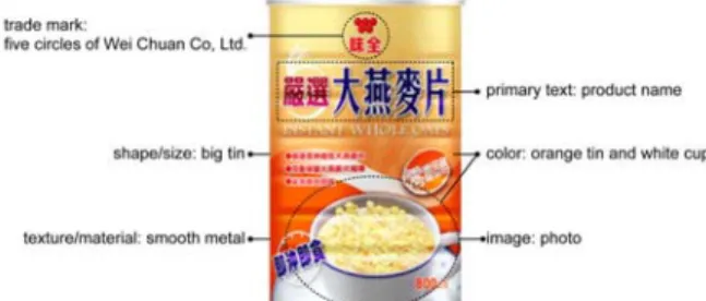
表 1 包裝樣本觀察記錄表格範例
樣本圖片 包裝樣本內容分析
品名 Nestle COOKie CRiSP
插畫媒材 水彩
插畫技法 高銳利度
插畫簡化程度 繪畫描繪
蒐集時間 2006/12/23 表 2 「技法」及「簡化程度」圖像樣本
技法
簡化 程度
低銳利度 中銳利度 高銳利度
精細插畫
繪畫描繪
象徵描繪
三、研究方法
根據上述之探討動機與結果,提出研究假設
(hypotheses)(如圖 1)為:
H1:不同插畫之「表現形式(技法與簡化程度)」
對消費者不同「情緒類目(效價與喚醒度)」
的喚起有影響(詳見 3.1 節、4.1 節)。
H2:插畫在「大腦位置」對「事件相關電位」平均 振幅有交互作用的影響(詳見 3.2 節、4.2 節)。
圖 1 研究假設
3-1. 商業圖像設計之情緒類目研究方法 受訪者為台灣科技大研究所學生 12 人(男女各 6 人),採非隨機抽樣方式進行;年齡介於 23 歲至 33 歲之間,因調查結果需與腦波實驗結果進行探 討,故受測者必須在腦波測試結束後一個月,再進 行情緒類目問卷調查。
情 緒 類 目 的 研 究 採 調 查 法 搭 配 語 意 差 別 法
(semantic differential)測量插畫樣本之情緒效價,
並搭配數值尺度(numerical scales)以測量樣本之 喚醒度。
3-1-5. 資料分析方法 3-1-1. 樣本設計
將情緒認知問卷結果透過 SPSS12.0 中文版統 計軟體中,描述統計分析(descriptive statistics)、
雙因子變異數分析(repeated -measures Two-Way ANOVA)以及事後比較 LSD(least significance difference test)檢定,進行問卷數據的統計與分析。
研究結果詳見 4-1 節。
商業圖像設計情緒認知之問卷樣本,是以日本 精密插畫家飯田正美的作品,作為「高銳利度」搭 配「精密插畫」樣本,以 3x3「技法」及「簡化程 度」交互作用製作樣本共 9 件(如表 3)。樣本設計 需控制其插畫內容、文字、商標名及色彩之干擾 後,再進行情緒類目之關係探討。
表 3 「技法」及「簡化程度」圖像設計樣本
3-2. 商業圖像設計對於腦事件相關電位研究方法 技法
簡化 程度
低銳利度 中銳利度 高銳利度
精細插畫
繪畫描繪
象徵描繪
本研究將利用 ERP 進行商業包裝插畫之情緒 電位實驗,令每位受測者觀看 9 張不同「技法」及
「簡化程度」搭配之插畫,並以腦波測量儀量測受 測者觀看到不同的插畫時之事件相關電位變化。
3.2.1. 樣本設計
商 業 包 裝 插 畫 之 腦 事 件 相 關 電 位 實 驗 之 樣 本,是將情緒類目問卷調查結果(詳見4.1節)作一 標準化設計後,再進行腦事件相關電位之實驗。在 情緒效價方面,等級6為最高,將平均等級超過 ”4 ” 者歸類為正效價(代號為+),低於 ” 3 ” 者歸類 為負效價(代號為-),於 ” 3與4 ” 之間的數值為 中效價;而在喚醒度方面,平均程度超過 “ 3.5 ” 者 歸類為高喚醒度(代號為A),低於 “ 2.5 ” 者歸 類為低喚醒度(代號為R),介於兩者之間為中喚 醒度,如圖2。
3-1-2. 研究工具
商業圖像設計情緒認知之樣本製作,首先以手 繪方式統一樣本呈現之色彩進行繪製;再透過高解 析度之掃描,將手繪樣本轉成為電子檔案;藉由繪 圖軟體(Adobe Photoshop CS2)增加插畫圖像樣本 之銳利程度,以避免造成模糊不清的狀況;最後修 整去除其它元素干擾,並裁切成為相同大小之圖卡 進行測量。
圖 2 插畫樣本情緒類目之標準化方式 3-1-3. 研究設計
情緒類目問卷調查結果發現,插畫樣本僅能分 作三類,即A+(正效價高喚醒刺激)、N(中性刺 激)及A-(負效價高喚醒刺激)。本研究依照每張 圖之效價及喚醒度之平均分數及標準差,並參考其 代表情緒,選出最終進行腦波實驗之雙因子變異數 分析之代表樣本,其中包含「高銳利度+繪畫描繪
(A+)」、「低銳利度+繪畫描繪(N)」及「低 銳利度+精密插畫(A-)」。
本研究依據 Izard(1977)、Plutchik(1980)、
Holbrook and Batra(1987)以及 Yoo et al.(1998)
提出的消費情緒類型,交集出 29 個情緒形容詞【註 2】作為消費購物情緒類型問卷之探討依據。再將消 費 購 物 情 緒 類 型 卷 結 果 , 經 由 集 群 分 析 (agglomerative Hierarchical Methods);重新歸納為 6 種情緒類型,做為商業圖像設計情緒認知問卷之情 緒「效價」選項,由低效價至高效價依序為反感、
不愉快、單調乏味、輕鬆、愉快、著迷。並在各情 緒類型後增設 5 階數值尺度(numerical scales),
令受測者在觀看過商業圖像設計樣本後,除了勾選 一個其所感受到的情緒類型,也勾選出當下感受的 強弱程度,此即情緒之「喚醒度」,以進行商業圖 像設計之情緒類目調查。
3-2-2. 研究工具
腦事件相關電位實驗是透過22吋之電腦螢幕 播 放 插 畫 樣 本 ; 記 錄 實 驗 之 設 備 是 使 用 美 國 NeuroScan 公 司 生 產 的 SymAmp2 系 統 , 透 過 NuAmps 40 導 DC 放 大 器 以 及 Scan 4.3.3 版 Scan Acquire軟體記錄並儲存受試者的腦電波訊號;以及 分析軟體Scan Edit加以切割、基線較準、雜訊校正 3-1-4. 調查對象
5 以及平均後加以比較。電極帽Quik-Cap則依據國際 10-20系統放置。
3-2-3. 研究設計
本研究實驗場地設置於國立台灣科技大學之 腦波觀察實驗室,受測者保持舒服的姿勢面對螢幕 進行受測,螢幕放置於70公分高的桌面,調整螢幕 位置於受測者視線10 - 20∘之間,並距離受測者60 - 70公分(操作電腦終端機視力保健須知)(行政 院衛生署國民健康局)。室溫控制在23 - 25℃,正 式實驗時,研究人員會退至布幕後觀察腦波接收情 形,以降低外在環境對實驗之影響。
正式實驗前,先以藥用磨砂膏清潔受測者欲黏 貼電極之臉部及耳骨位置,做去角質之動作。再將 9個欲探測腦波之電極位置,按照國際10-20系統連 接於受測者頭顱各部分,另外連結A1、A2兩個分 別位於受測者左、右耳後乳突 (mastoid) 位置之參 考 電 極 點 , 以 及 兩 對 記 錄 眼 動 相 關 肌 肉 訊 號 (electrooculogram, EOG) 的 雙 極 式 電 極 HEOL 、 HEOR、VEOU及VEOL作為眼動參考電極。並在各 電極點施打凝膠,幫助電導體附著頭皮以及促進電 荷的傳送。於電極帽黏貼完成後,打開腦波測量儀 之記錄軟體,以確認所有電極都連接完善,最後將 活動電流頻譜與參考電流頻譜加以記錄於硬碟。實 驗開始後,每張樣本均會隨機重複出現25次,每次 出現時間為3秒鐘(3000ms),間隔時間(呈現空 白頁面狀態)為1秒鐘(1000 ms),實驗完成需費 時共計15分鐘。
3-2-4. 調查對象
因歷年來之相關研究中,受測人數均為 10 人 以上,因此本研究從國立台灣科技大學設計所學生 中,選取研究所學生 12 人(男女各 6 人)作為受 測者,其年齡介於 23 歲至 33 歲之間,學生皆無視 覺障礙且矯正後視力達 0.8 以上。
3-2-5. 資料分析方法
將腦波實驗之腦電波結果,經過分析軟體Scan Edit加以切割、基線較準、雜訊校正以及平均處理;
再使用SPSS12.0中文版統計軟體中,雙因子變異數 分析與事後比較LSD檢定;進一步將平均振幅之數 據,進行統計檢定與事後比較。研究結果詳見4-2 節。
四、結果與討論
4-1. 消費者「情緒類目」
本研究此階段欲驗證【H1:不同插畫之「表現 形式」對消費者不同「情緒類目」的喚起有影響】。
由情緒類目調查後發現:插畫所使用之不同「技法」
及「簡化程度」對「情緒效價」之影響存在一共同 趨勢;且經由雙因子變異數分析發現:「技法」對
「情緒效價」之影響達到相當顯著之效果(F(2.22)
=13.998,P=0.000<0.01)。而插畫所使用之不同「技 法」及「簡化程度」則對「喚醒度」無明顯趨勢;
且經由雙因子變異數分析發現:不論是「技法」亦
或「簡化程度」對「喚醒度」均無顯著影響,且無 交互作用顯著影響。由此可知 H1 驗證結果為:不 同插畫之「表現形式」對消費者「情緒效價」有影 響的驗證成立;對「喚醒度」則沒有影響。
經由插畫樣本所喚起之「情緒效價」調查發 現,若單一觀察「技法」,「高銳利度」所能喚起 情緒效價最大(4.22)。其次為「中銳利度」(3.25),
最小為「低銳利度」(2.69)。結果顯示,不論插 畫內容或是品牌知名度為何,高銳利度都具有一定 喚起消費者正情緒之力量;且消費者喜歡較為整齊 邊緣之高銳利度筆觸跟線條。因為「高銳利度」為 喚起最大情緒效價之技法,其所呈現出畫面上光滑 的質感,和平整不見筆觸的表現手法,色層平整,
顏色柔和漸變,具有很強的裝飾效果,這種感受可 能是造成觀者喚起正效價情緒之原因。而「低銳利 度」為喚起最小情緒效價之技法,其是最具有表達 設計者風格之表現方式,這種自由、大膽的筆觸,
其表現物件的形式便越破碎,零亂的筆觸破壞了物 體的邊緣線,構成了物體內部的嘈雜世界,這樣的 技法,使所有表現物件都處於不安之中(蘇新平,
2007),造就了不確定的層面(廖雯,2006),這 種感受可能是造成觀者喚起最小情緒效價之原因。
倘若單一觀察「簡化程度」可以發現「象徵描 繪」所能喚起之情緒效價最大(3.81)。其次為「繪 畫描繪」(3.42),最小為「精密插畫」(2.94)。
結果顯示,不論插畫內容為何,象徵描繪都具有一 定喚起消費者正情緒之力量。因為注重形式感的象 徵表現手法較容易喚起消費者之正效價情緒,它能 產生富麗的裝飾效果(陳芳,2004),充滿動感和 變化,給人生命的感覺(陳俊宏、楊東民,1998)。
相較於其他表現手法,象徵描繪不但可以表達作者 自己的情緒、思想和觀念,觀眾也可以根據作品來 瞭解設計者的想法,它給了觀眾較多的思考、想像 的空間(劉子建,2008),因此容易帶出觀者正效 價情緒。而一般消費者並不喜歡過分精細的插畫,
因為會使人覺得與照片無異;且造成外型繁瑣,重 要特徵不易彰顯,以致使消費者針對精細描繪反應 不悅的部分不一,難以觸及和表達物象重點的感受
(許峻誠,2005),這可能是造成消費者喚起最小 情緒效價之原因。
倘若觀察「技法」搭配「簡化程度」,平均效 價最大的為「高銳利度」搭配「繪畫描繪」(4.42),
其次為「高銳利度」搭配「象徵描繪」(4.25),
所喚起之情緒類型為「輕鬆」及「愉快」,為本實 驗中較高的正情緒類型。而喚起最小效價之搭配方 式為「低銳利度」搭配「精密插畫」(1.75),所 喚起之負情緒類型為「反感」及「不愉快」。
經由插畫樣本之「喚醒度」調查發現,若直接 觀察「技法」,「高銳利度」所能喚起的喚醒度最 高(3.66),其次為「低銳利度」(3.5),最低為
「中銳利度」(3.44)。倘若直接觀察「簡化程度」
可以發現,「精密插畫」所能喚起之喚醒度最高
(3.88)。其次為「象徵描繪」(3.6),最低為「繪 畫描繪」(3.1)。倘若觀察「技法」搭配「簡化程
度」,平均喚醒度最高的為「低銳利度」搭配「精 密插畫」(4.08);其次為「中銳利度」搭配「精 密插畫」(3.83);而所喚起之喚醒度最低為「中 銳利度」搭配「繪畫描繪」及「低銳利度」搭配「繪 畫描繪」(2.91)。
綜觀效價及喚醒度,在插畫樣本中,能喚起最 小效價的兩者均有最強的喚醒度,也就是說消費者 在觀看包裝插畫進而誘發其負面情緒時,通常都伴 隨著現強烈的感受,此即最差之包裝設計方式,是 包裝設計者最應該避免的。
4-2. 「大腦位置」與「事件相關電位」
此階段欲驗證【H2:插畫在「大腦位置」對「事 件相關電位平均振幅」有交互作用的影響】。結果 發現:在不同情緒類目之插畫類型影響平均振幅達 顯著時,其結果均為A+(高銳利度+繪畫描繪)/A-
(低銳利度+精密插畫)>N(低銳利度+繪畫描 繪),N與A+及A-均具有顯著差異。由此可知H2 驗證結果為:插畫在「大腦位置」對「事件相關電 位平均振幅」有交互作用的影響之驗證成立。相關 研究結果指出:中性刺激所誘發之事件相關電位振 幅小於正效價高喚醒刺激以及負效價高喚醒刺激 之結果相符合(Schupp et al., 2003a ;Schupp et al. , 2003b; Pollatos et al., 2005; De Cesarei & Codispoti;
2006 ; Hot et al., 2006; Olofsson & Polich , 2007)。
本 研 究 在 N200 ( 200-250ms ) 及 P300
(250-350ms)時,A-、A+及N對平均振幅的影響 最顯著,此結果與Jonas(2007)指出,從受到情感 刺激物開始的100ms到數秒鐘之內,情感的效價及 喚醒度均會對ERP的結果造成影響,尤其是在200 至400ms之間相符合。且大量的研究均顯示,P300 受刺激的重要性、決策、刺激的不肯定性、注意、
記憶、情感等多重因素的影響,可以清楚呈現對不 同 面 向 情 緒 刺 激 的 感 受 ( Carretie & Iglesias, 1994),證實P300確實為一可靠是測量的波段。
在不同情緒類目之插畫類型與左、中、右腦位 置發生交互作用達顯著影響時,P300 在左腦部位 其平均振幅為 A+(高銳利度+繪畫描繪)/A-(低 銳利度+精密插畫)>N(低銳利度+繪畫描繪)且 達顯著,代表正情緒在左腦部份較為激發,此結果 與 Davison, R. J.(1995)指出正效價刺激與左腦較 為相關符合。
各種波段在左、中、右腦之事件相關電位平均 振幅並無一定趨勢。波段在左、中、右腦影響平均 振幅達顯著時,觀察P200波段,平均振幅為中央>
左腦/右腦;觀察N200波段,平均振幅為左腦>右 腦/中央;P300為右腦/中央>左腦。各種波段在額、
中 、 頂 葉 之 大 腦 位 置 影 響 平 均 振 幅 達 顯 著 時 , N200、N400以及SW均為頂葉最大,此結果顯示在 插畫圖片所誘發之情緒事件相關電位中,頂葉會有 明顯振幅增加情形且是由額葉往後漸漸增加,此結 果與Delplanque et al.(2006a,b)以及Sabatinelli et al.
(2007)研究中顯示典型的情感ERP都是在頂葉的
部分有最高的振幅結果相符。
五、計畫成果自評
本研究是以「商業圖像設計」中食品包裝插畫 對消費者「情緒類目」與「腦事件相關電位」之關 係進行探討。提出插畫「技法」與「簡化程度」兩 表現形式作為自變項;其中技法包含了︰高銳利 度、中銳利度、低銳利度;簡化程度包含了︰精密 插畫、繪畫描繪、象徵描繪。其中「高銳利度」為 商業包裝插畫的常見手法,它可以呈現出產品的細 膩質感(林演慶,2001),再搭配「精密插畫」來 表現食物的真實樣貌,容易增加產品的形象以及品 牌的認同,因此市場中大多使用此一插畫方式。而
「中銳利度」搭配「繪畫描繪」是一般常見的水彩 表現形式,較容易引起消費的者熟悉感,亦常被用 在商業包裝插畫上。
情緒類目認知問卷調查,驗證H1結果為:不同 插畫之「表現形式」對消費者「情緒效價」有影響 之驗證成立。研究結果顯示:銳利度越、簡化程度 越高所誘發之情緒效價越大成正向相關。一般消費 者並不喜歡過分精細的插畫,因為會使人覺得與照 片無異,雖使在產品辨識上較強,但也因此在創意 表現受到限制(江蘭、杜瑞澤,1999),較難喚起 較消費者之正效價情緒。但此種精細描繪手法,卻 佔有市場上相當大的比例(62.11%);而最受消費 者喜歡的「象徵描繪」卻僅佔市場少數(15.84%)。
且目前市售最常使用之包裝插畫設計表現形式,與 能引起消費者最大情緒效價之表現形式亦呈現倒U 字型的關係;此結果與Mandler(1982)提出,「消 費者預期之一致性」與「價值評估」是呈現倒U字 型的關係相符。即市占率最高的插畫表現形式(「高 銳利度」搭配「精密插畫」/ 58.39%),與觀者的 預期性相仿,所以在效價排名並非最大;市占率第 4高的插畫表現形式卻引起最大效價的結果(「高 銳利度」搭配「繪畫描繪」/ 8.07%);而市占率最 低的插畫表現形式(「低銳利度」搭配「精密插畫」
/ 0%),因消費者無法接受並調適其對訊息刺激之 反應,導致出現負向且強烈的情感評估反應,引起 最小效價。因此包裝設計者在進行包裝插畫設計 時,的確需要掌握市場設計流行趨勢,並注意「新 奇感」對消費者情緒之重要性;必要時應在產品辨 識與較能喚起消費者正效價情緒之間做取捨。
最後,經事件相關電位平均振幅結果探討,驗 證H2結果為:插畫在「大腦位置」對「事件相關電 位平均振幅」有交互作用的影響之驗證成立。結果 發現:高銳利度+繪畫描繪(正效價高喚醒)、低 銳利度+精密插畫(負效價高喚醒)>低銳利度+
繪畫描繪(中性)所引發之振幅;且在N200及P300 時對平均振幅之影響最顯著。建議研究者欲探討有 關 不 同 情 緒 類 目 之 商 業 圖 像 設 計 所 誘 發 之 情 緒 ERP 時 , 可 採 用 N200 ( 200–250ms ) 及 P300
(250–350ms)波段,作為波段觀測對象。
針對本研究之成果,提出後續相關研究之建議 與方向:(1)本研究僅就商業包裝插畫「表現形
7 式」構成元素中,不同「技法」及「簡化程度」之 搭配對消費者「情緒類目」的影響。但在一個包裝 插畫表現形式上,尚有媒材、色彩、紋理、質感等 不同變項可供研究,建議後續研究者可以依不同插 畫表現形式構成元素,探討其與情緒類目之關係。
(2)本研究插畫設計樣本缺少低喚醒度之R+(低 喚醒正效價)及R-(低喚醒負效價)樣本,建議後 續研究者可以進一步將R+及R-插畫圖片,進行雙因 子變異數分析,並探討其與高喚醒度及中性刺激所 誘發之平均振幅之差異。
本計畫成果達到計畫研究目標,透過了設計、
生理與心理之三個層面的聯合分析,使設計者在主 觀的插畫創作上輔以科學客觀的方式,建構影響消 費者情緒之商業圖像設計準則。研究成果適合作學 術期刊發表與協助設計者進行商業圖像設計時之 參考與依據。
註釋
本研究之現況樣本趨勢分類,是由 6 位具備插 畫相關實務經驗及專業知識達 6 年以上之專家,組 成焦點團體之專家群,於 98 年 5 月 12 日,藉由面 對面(face to face group)的方式進行。焦點團體成 員之背景資料整理如【註 1】。情緒類目認知問卷 所彙整之不同學者觀點而交集出 29 個消費情緒類 型之形容詞如【註 2】。
【註 1】專家團體成員資料 表 4 專家小組名單
姓名 服務機構 職稱 設計相關年資
A 君 旭創意 美術設計 13
B 君 博報廣告 美術設計 12
C 君 MiniMax 美術設計 11
D 君 Wiwi 圓騰 美術設計 9
E 君 樺隆紙器 美術設計 6
F 君 維傑爾廣告 美術設計 6
【註 2】消費購物情緒類型 表 5 29 個消費情緒類型之形容詞
滿足(satisfaction) 快樂(joy)
悠閒(relax) 愉悅(pleasure)
興奮(excitement) 亢奮(arousal) 驚訝(surprise) 懼怕(fear)
憎惡(disgust) 焦慮不安(anxiety) 生氣(anger) 悲傷(sadness) 不愉快(displeasure) 無聊(boredom) 懷疑(suspicion) 慾望(desire)
迷人(attraction) 驕傲(flatulency)
社會情緒(social emotion) 感謝(appreciation)
煩惱(vexation) 期待(expectancy)
興趣(interest) 羞愧(shame)
藐視(contempt) 罪惡(guilty)
放棄(abandonment) 不理會(ignorance)
領受(acceptance)
六、參考文獻
1. Carretie, L., & Iglesias, J. (1994). ERPs elicited by photographically mixed facial expressions [Abstract]. Psychophysiology, 8, 252–253.
2. Carretie, L., Iglesias, J. and Garcıa, T. (1997).
A Study on the Emotional Processing of Visual Stimuli through Event-Related Potentials, Brain and Cognition, 34, 207–217.
3. Davison, R. J. (1995). Cerebral asymmetry, emotion and affective style, brain asymmetry.
Cambridge, MIT Press.
4. De Cesarei, A., Codispoti, M. (2006). When does size not matter? Effects of stimulus size on affective modulation. Psychophysiology, 43, 207–215.
5. Delplanque,S.,Silvert,L.,Hot,P.,Rigoulot,S.,Seq ueira,H. (2006a). Arousal and valence effects on event-related P3a and P3b during emotional categorization. International Journal of Psychophysiology, 60, 315–322.
6. Delplanque,S.,Silvert,L.,Hot,P.,Sequeira,H.
(2006b). Attentional modulation of appraisal in emotion: the case of the P3b. Psychophysiology, 43, S7.
7. Holbrook, M. and Batra, R. (1987). Assessing the Role of Emotions as Mediators of Consumer Responses to Advertising, Journal of Consumer Research, 14, 404-420.
8. Hot, P., Saito, Y., Mandai, O., Kobayashi, T., Sequeira, H. (2006). An ERP investigation of emotional processing in European and Japanese individuals. Brain Research, 1122,171–178.
9. Izard, C. E. (1977). Human Emotions. Plenum, New York.
10. Jonas, K. O., Nordin, S., Sequeira, H., Polich, J.
(2007) Affective picture processing: An integrative review of ERP findings, Biological Psychology, 77, 247–265.
11. Mandler, G. (1982). The structure of value:
according for taste. Affect and cognition: the 17th annual Carnegie symposium on cognition, ed. Marget, S.C., Susan, T., and Fiske, H.,NJ:
Erbaum, 22.
12. Meyer, R. P., & Laveson, J. I. (1981). An experience judgment approach to tactical flight training. Proceedings of the Human Factors Society-25th Annual Meeting, 659-660.
13. Olofsson, J. K., Polich, J. (2007). Affective visual event-related potentials: arousal, repetition, and time-on-task. Biological Psychology, 75, 101–108.
14. Olofsson, J. K., Polich, J. (2007). Affective visual event-related potentials: arousal, repetition, and time-on-task. Biological Psychology, 75, 101–108.
15. Plutchik, Robert (1980). Emotion: A Psychoevolutionary Synthesis, New York:
Harper &Row.
16. Pollatos, O., Kirsch, W., Schandry, R. (2005).
On the relationship between interoceptivea wareness, emotional experience, and brain
processes. Cognative Brain Research, 25,948–962.
17. Sabatinelli, D., Lang, P.J., Keil, A., Bradley, M.M. (2007). Emotional perception: correlation of functional MRI and event-related potentials.
Cerebral Cortex, 17, 1085–1091.
18. Schupp, H. T., Junghofer, M., Weike, A. I., Hamm, A. O. (2003a). Attention and emotion:
an ERP analysis of facilitated emotional stimulus processing. Neuroreport, 14, 1107–1110.
19. Schupp, H. T., Junghofer, M., Weike, A. I., Hamm, A. O. (2003b). Emotional facilitation of sensory processing in the visual cortex.
Psychological Science, 14, 7–13.
20. Wang, R.W.Y., Chen, W. C. (student) (2007), The Study on Packaging Illustration Affect on Buying Emotion, Proceedings of 2007 International Design Congress: Emerging Trends in Design Research, Hong Kong:
International Association of Societies of Design Research (IASDR).
21. Windy Dryden 著,武自珍譯(1997)。理性 情緒心理學入門。台北:心理。
22. Yoo, C., J. Park. and D. J. Macinnis (1998).
Effects of store characteristics and in-store emotional experiences on store attitude, Journal of Business Research, 42, pp.253-263.
23. 水墨的重生——實驗水墨(與劉子建的訪談)
(2007)。2008 年 4 月 11 日取材自︰
http://blog.sina.com.cn/s/blog_4b7063a5010009 8y.html
24. 江蘭,杜瑞澤(1999)。消費者心理認知對 產品包裝視覺設計之影響--以臺灣飲料包裝 為例。大葉學報。8(2) ,23-31。
25. 林演慶(2001)。包裝插圖式樣化設計對辨 識效率之影響。國立台灣科技大學設計研究 所碩士論文。
26. 林演慶、王韋堯(2002)。圖形式樣化在零 售商品包裝插圖設計之應用。設計學報,7
(2),77-93。
27. 許峻誠(2005)。圖形抽象化文法之建構。,
國立台灣科技大學設計所博士論文。
28. 陳芳(2004)。論商業插畫在包裝設計中的 運用。裝飾,1,129。
29. 陳俊宏,楊東民(1998)。視覺傳達設計概 論初版。台北:全華科技。
30. 陳俊宏、黃雅卿、沈美吟、胡文淵(2001)。
以食品包裝為例探討包裝內容物提示手法。
科技學刊。10(2) ,151-165。
31. 廖雯(2006),評單凡《工業風景》的審美 情緒和抽象原則。2008 年 3 月 15 日取材自︰
http://arts.tom.com
32. 潘東波(2003)。平面設計創意手法 72 變。
台北:視傳文化。
33. 鄭雅瑄(2004)。產品包裝不一致性對包裝 吸引力及產品評價之影響:產品類別及自我
監控調和效果之探討。元智大學國際企業碩 士論文。
34. 操作電腦終端機視力保健須知(2009)。行 政院衛生署國民健康局。2008 年 5 月 13 日取 材自:
http://health99.doh.gov.tw/media/public/pdf/s11 122.pdf。
35. 蘇新平的風景(2007)。2008 年 2 月 28 日取 材自︰
http://cul.c029.com/mssk/20070326200337.htm 2007-3-26.
2008 東京國際包裝展覽考察報告
計畫類別:國科會人文處A 類
計畫編號:NSC 97-2410-H-011-019
考察期間:97 年 10 月 06 日至 97 年 10 月 10 日
考察活動主持人:王韋堯
考察活動參與人員:王韋堯、邱珮華、黃冠豪
執行單位:國立台灣科技大學 工商業設計系
中 華 民 國 97 年 10 月 20 日
2008 東京國際包裝展考察報告
考察期間:2008 年 10 月 06 日至 97 年 10 月 10 日 考察活動主持人:王韋堯 國立台灣科技大學工商設計系
考察活動參與人員:王韋堯、邱珮華、黃冠豪 國立台灣科技大學工商設計系
一、 東京國際包裝展介紹
2008 東京國際包裝展由「社團法人日本包裝技術協會」主辦,為亞洲地區規模最大、
最完整的綜合包裝展。展覽資訊如表1.1。
此展覽的展示內容是由代表日本國內外的包裝產業參展商展出最新的產品、技術、資 訊,並且在展期中舉辦研討會、論壇以及「2008 日本 Good Packaging 展覽 」,通過召開豐 富多彩的活動,解決所有行業的各種包裝相關經營課題。
表1.1 東京國際包裝展資訊 展覽名稱 2008 東京國際包裝展
Tokyo International Packaging Exhibition 2008 ─TOKYO PACK 2008─
展覽主題 包裝工業為一個好的環境和清潔的地球做貢獻
展覽展期 2008 年 10 月 7 日(週二)~11 日(週六) 展期 5 天 開場時間 10 月 7 日(週二)~10 日(週五)10:00 點~17:00 點
10 月 11 日(週六) 最後一天 10:00 點~16:00 點 展覽場館 Tokyo Big Sight(東京國際展覽場)東館全館
展覽目的
通過此次展覽會尋求從包裝材料、包裝機械到包裝加工機械、食品機械、包 裝相關器材、環境相關器材、物流機器的生產、包裝、流通領域的技術振興,
同時作為傳播最新的洽談、交流及包裝資訊的平台,以全球化的視角為社會 的發展做出貢獻。
主辦單位 社團法人日本包裝技術協會(會長 小江紘司)
支援機構
經濟產業省/外務省/國土交通省/農林水產省/環境省/防衛省/東京 都/日本商工會議所/日本貿易振興機構/社會經濟生產性本部/亞洲生 產率組織/世界包裝組織/亞洲包裝聯盟/日本包裝機械工業會/日本M H協會/東京國際展覽場
協辦單位 100 個包裝相關團體
展品分類 包裝材料、包裝機械、包裝材料加工機械、食品機械、包裝相關器材、環境
相關器材、MH 物流機器,海外展品 召開規模 約550 家廠商 2,400 個展位
觀展人數 日本海內外共196,566 人
同時舉辦 2008 東京國際物流搬運設備(MH)展
1
二、 東京國際包裝展對包裝設計發展的重要性
東京國際包裝展是國際上最大的包裝展覽之ㄧ,從 1966 年開辦以來,每隔兩年舉辦一 次,今(2008)年為第 22 屆,展覽期間吸引來自工、商、農、漁、教育等各產業的參觀者,
受到日本國內外的高度重視。
此包裝展的展出重點包括最新、最先進的包裝素材和包裝機械,共分成六大類:(1)包 裝材料,(2)包裝機械,(3)包裝材料加工機械,(4)食品機械,(5)包裝和環境相關器材,
(6)MH 物流機器。展出的類目非常豐富,綜括完整的包裝設計流程相關之軟硬體,完整 呈現包裝產業的所有需求。
超越 20 個國家,500 家以上參與產出的日本海內外包裝製造商,藉由東京國際包裝展 搭起互相交流的平台,共同面對世界性的挑戰,例如環境保護問題及通用設計,並提出新產 品與新設計理念,透過最新的技術、最新的機器,做技術交流,對於包裝產業的振興和發展 有極大的貢獻。本展除了與包裝相關的產出內容之外,會場也同時舉辦「2008 東京國際物 流搬運設備(MH)展」,展示各種最新穎的物流設備,提供業者更多物流設備的選擇。從 展示會場的規模、產出內容的種類、參展與觀展人數看來,東京國際包裝展是亞洲地區具有 指標性的世界級展覽。
三、 包裝新式樣與新材質
2008 東京國際包裝展在包裝新樣式與新材質的方面,為了符合在工、商、農、漁等各 領域的產業上的需求,針對包材的材料、結構、塗佈、緩衝、印刷等方面有各種的展示內容。
3.1 包裝新式樣
瓦楞紙的特性在包裝結構設計上,提供了保護、緩衝等功能。在花材的包裝應用上,堅 固的瓦楞紙提供了保護和提攜的功能(如圖3.1.1)。包裝上拉鏈開口的設計更提供消費者能 方便的開啟包裝(如圖3.1.2)。而開啟後剩餘的包裝底座結構具有展示的功用(如圖3.1.3)。
圖3.1.1 保護與提攜功能 圖 3.1.2 開口之拉鍊設計 圖 3.1.3 包裝底座
瓦楞紙在水果類的包裝上,經過不同的結構設計,也提供了緩衝與固定的功能(如圖 3.1.4、3.1.5)。
2
圖3.1.4 緩衝固定結構 圖3.1.5 緩衝固定結構
在電子類產品的包裝緩衝應用上,瓦楞紙經由刀模設計後,增加彈性,賦予產品固定與 緩衝的功能(如圖3.1.6、3.1.7)
圖3.1.6 紙箱內的瓦楞紙緩衝結構 圖3.1.7 刀模增加瓦楞紙的彈性
禮品包裝材的部份,內置鐵絲的綁帶材質多樣,造形可塑性佳,比起絲帶或塑膠帶,
更能讓包裝有變化性及保留造形之美感(如圖3.1.8、3.1.9)。
圖3.1.8 紙箱內的瓦楞紙緩衝結構 圖3.1.9 刀模增加瓦楞紙的彈性
3.2 包裝新材質
包裝為因應各種產品在運送過程的需求,在包裝材的選用上會考慮到耐水性(如圖 3.2.1)、防滑(如圖 3.2.2)等經過塗布處理的材料。
3
圖3.2.1 經過防水處理的紙箱 圖3.2.2 防滑的處理增加紙材的固定性
蜂巢紙(如圖 3.2.3)應用在玻璃製品等易碎的產品包裝上,提供了良好了緩衝保護功 能,特殊的蜂巢型結構除了提供緩衝的空間之外,結構之間所產生的摩擦力也讓包裝的包覆 具有良好的固定性。
環保也是包裝設計中必須注意的部份,目前除了可以由玉米提煉原料作為環保包裝材質 外,新的技術可以將其他植物轉換成包裝材(如圖3.2.4)。
圖3.2.3 蜂巢紙 圖3.2.4 防滑的處理增加紙材的固定性
在包裝印刷的方面,印刷技術可以很逼真地模擬其他材質(如圖 3.2.5、3.2.6),在金屬 材質的包裝罐上創造瓷器或漆器的精緻質感,能夠增加商品的價值感。
圖3.2.5 仿瓷器材質 圖3.2.6 仿漆器材質
4
四、 東京國際包裝展對台灣包裝設計發展的影響
日本包裝技術的創新與生產在世界上有舉足輕重的地位,每一屆的東京國際包裝都吸引 全世界的專業包裝人士前往,會場展示各種最新的包裝資訊,是一個國際上包裝產業發展的 重要據點。此包裝展作為台日包裝設計的交流管道,對於台灣的包裝設計產業有一定的影響 程度。
日本的包裝一向有簡潔的特性和注重功能性,精緻的風格更能增加消費者的接受度,在 美觀與實用性上兼備的話,便是成功的包裝設計。目前台灣的包裝業尚不如日本的包裝產業 專精,日本的設計精神值得取法,台灣的設計應當吸取日本的成功經驗,作為台灣包裝設計 的參考。台灣包裝業者經由每次的參展,除了擴展業務之外,藉由廠商之間情報的交流、技 術交換,獲得最新的相關資訊,並帶回台灣,加強台灣包裝設計能力。除了產業界相當重視 東京國際包裝展之外,對於學術界,此展也是一大包裝相關知識的寶庫,對於培訓台灣未來 的專業包裝設計人才來說,是個重要的資訊站。
在包裝的硬體方面,日本目前為全球前三大包裝機械生產國,亦為我國包裝機械第一大 進口來源及第三大出口對象。面對來自於全球的競爭,台灣的包裝機械在價格上是具有競爭 力的,經由參與東京國際包裝展,可以開發國際市場並拓展知名度。
世界級的東京國際包裝展是包裝產業的朝聖之地,台灣與日本的地緣之利,讓包裝的資 訊流通更加即時,台灣的包裝設計者該好好把握此利基點,發展屬於台灣的包裝風格。
5
International Conference on Research into Design, ICoRD’09
Consumer Comprehension of the Communication Designs for Food Packaging
Regina W.Y. Wang
Graduate School of Design, National Taiwan University of Science and Technology, Taipei, Taiwan
Tel: +886-2- 2730-1016 Fax: +886-2- 2737-6303 email: [email protected]
Mu-Chien Chou
Graduate School of Design, National Taiwan University of Science and Technology, Taipei, Taiwan
Tel: +886-2- 2730-1016 Fax: +886-2- 2737-6303 email: [email protected]
Abstract: When consumers have to choose from an array of products, package design plays a significant role in consumer communication. Specifically, the package design reveals the content and details of the product to the consumers.
It likewise helps a product stand out in the market, and this is what package designers should focus on. This paper seeks to discover how consumers comprehend the communication designs in food packaging in order to elicit ideas for designing effective packages. Two steps are performed in this study:
collection of food packaging samples and conduct of focus group interview among consumers.
The information gathered from the focus group interview serves as basis for several conclusions. First, in terms of effective relay of messages in food packages, “texts” appear to achieve this better than do the other design elements; this is followed by “shape.” Second, the communication design pattern that best facilitates understanding is “brand name and product image.”
Third, the preferred design elements of the respondents are ranked as follows:
texts>shape>image>color. Overall, this research study can provide information on how consumers comprehend communication designs for food packaging and hence can serve as a guide for designers towards achieving effective food package designs.
Keyword : Food Package, Comprehension, Communication Design
1 Foreword
1.1 Background and Motivation of this Research
PACKAGE plays a silent marketing role in the buying context. It is used to attract the attention of consumers to achieve its self-marketing [1], with comprehensibility is the basis for its design [2]. However, it is worth discussing whether the communication design, which is developed out of the comprehension of the designer, can be understood by the consumer in the same way as well.
Once a package is presented to the consumer, he or she will give selective responses depending on the package communication design stimulus during the comprehension stage. For instance, upon seeing the package of ABSOLUT vodka, people may comprehend the commodity according to the brand ABSOLUT as seen on the package, while somebody may understand the commodity by looking at the shape of the bottle.
Wang, Chou
The purpose of this study is to explore the consumers’ cognitive methods for package comprehensibility communication design and determine the possible element combina- tions that are easy to understand and are helpful in enhancing the effectiveness of the package designer’s work.
1.2 Aim of the Research
Focus group interview is adopted in this study to discuss the comprehensibility communication design of food package by consumers. Collection of related interview data according to the above motivation is also conducted. The aims of this research are as follows:
(1) To determine consumers' interpretation of the comprehensibility communica- tion design of food package through focus group interviews.
(2) Make a conclusion from the analysis of consumer interpretation and com- prehension of the design element combination of food package.
2 Literature Discussion
This study looked into relevant literature and gave an analysis of the design elements as well as the communication design of the package and its corresponding consumers’
comprehensibility perception process, which will be needed for the subsequent procedure.
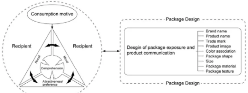
2.1 Design elements and Communication Design of the Package
The package presents the communication design (Figure 1) of the enterprise or commod- ity subject to consumer interpretation, with the goal to achieve the sales target through the design elements [3], which is the primary principle in package comprehensibility communication design [4]. Therefore, if the package design can present the visual charm of the commodity to consumers for their interpretation and perception, then consumers’
purchasing desire will be stimulated, and the buying action will be fulfilled.
Figure 1 Design elements and Communication Design of the Package
2.2 Consumer Comprehensibility Perception Process of the Food Package Communication Design
The consumer has developed a stable perception for the commodity content conveyed through the package design. For instance, the red color symbolizes hot taste, and the symbol represents Nike [4]. Hence, the design should be clear and discernable, taking into account the comprehension and acceptance competence of the information receiver, when conveyed through the design elements by the designer.
Consumer perception will be affected by individual subjective conditions (physical and psychological) as well as by objective environmental stimuli (the product, brand and the package). Apart from the objective stimuli being manipulated by the manufacturer, individual perception and comprehension competence will vary depending on the differ- ent experiences and recall capabilities [5]. As a result, the consumer will take the initiative to search for those marketing stimuli which will facilitate comprehension of the product information [6].
Consumer Comprehension of the Communication Designs for Food Packaging
Figure 2 Relationship between Recipient and Commodity Package
Packages attract various sets of consumers; they exhibit great individual differences, and these attract consumers’ market interest [5]. Consumer’s perception preference of the package design will be varied as well. Some people may focus on the price, while others pay attention to the product’s appearance or design. Some even focus on the after-service and the convenient operation information design [7, 8, 9]. Additionally, individual mood will greatly affect purchasing intention [5]. Consumer perception will facilitate decision making in spite of the confusing stimuli according to past experience (recall), present needs, motive, and mood [5]. The perception model of consumers’ comprehension of the commodity content (Figure 2) is proposed in this research in order to determine the individual preferred design elements after the commodity’s communication design is revealed. A sufficient amount of time is required [5, 8] in order to get a more intensive interpretation and comprehension of the commodity. Only when consumers’ past experi- ence (recall), existing beliefs, and attitudes are coincident can their purchasing behavior be triggered [5].
3 Methodology and Implementation of the Research
A focus group is often used to understand consumers’ response and identify the objective for the package design [10, 11, 12]. The food package used daily is examined in this study to explore the perception process involved in consumer comprehensibility of a food package’s communication design through focus group interviews. The consumers’
psychological sensation and the quality of food package content, as well as consumer satisfaction and experience are factors that are excluded in this research. In particular, the focus is to investigate how consumers perceive the design elements of a food package at first sight, and how they interpret and understand the food contained in the package. Two research steps are involved: collection of samples of the food package and implementa- tion of the focus group interviews, which are described as follows.
3.1 Collecting the Food Package Samples
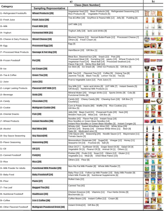
Food package being sold in RT-Mart was taken as the test sample either by convenience sampling or accidental sampling. It includes all food items on the optional product samples. Moreover, stratified sampling was adopted to acquire the actual testees because of the various kinds of food package available in the market. The source and steps in the sample collection process are as follows:
1. Source: The top 80% of the normal sales list1 of RT-Mart in December 2006 was identified as the basis for the selection of the food package sample.
2. Step: a) The subgroup with the greatest quantity was selected as the sampling representative group from 30 commodity classifications.
b) The top three articles on the sales list were selected from each sampling representative group as the final actual test samples in this study. A total of 90 food packages are presented in Figure 3.